Smogon Premier League Banner Request

LonelyNess

Makin' PK Love
is a Tournament Director Alumnusis a Forum Moderator Alumnusis a Tiering Contributor Alumnusis a Smogon Media Contributor Alumnusis a Battle Simulator Moderator Alumnus
When I meant a Pokeball instead of a Soccer Ball, I was referring to the Soccer ball that surrounds the bird's silhouette.

Also is there any way to get maybe a different Koffing pose?
 

bugmaniacbob

Was fun while it lasted
is an Artist Alumnusis a CAP Contributor Alumnusis a Top Contributor Alumnusis a Top Smogon Media Contributor Alumnus
When I meant a Pokeball instead of a Soccer Ball, I was referring to the Soccer ball that surrounds the bird's silhouette.

Also is there any way to get maybe a different Koffing pose?
Oh, right.

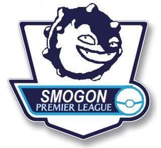
Different Koffing poses are pretty difficult, as it isn't that much more than a ball, but still, I tried to get a different one in:


Were you looking for a more dynamic or static pose? Also, I'll need to add shadows and whatnot to it, but are there any other stylistic issues that need ironing out?
 

reyscarface

is a Tournament Director Alumnusis a Social Media Contributor Alumnusis a Forum Moderator Alumnusis a Community Contributor Alumnusis a Tiering Contributor Alumnusis a Smogon Media Contributor Alumnusis a Dedicated Tournament Host Alumnusis a defending SPL Championdefeated the Smogon Frontier
World Defender
Maybe make the Pokeball less... pixelish? Like using an actual pokeball art for that space. Very good job nonetheless.
 

LonelyNess

Makin' PK Love
is a Tournament Director Alumnusis a Forum Moderator Alumnusis a Tiering Contributor Alumnusis a Smogon Media Contributor Alumnusis a Battle Simulator Moderator Alumnus
I hope you don't mind my tinkering with your design, BMB. After looking at it, I think it looks nicer without the Ho oh (or any bird) in the middle of the pokeball.

I also changed the color because I REALLY didn't like the contrast between the cool blues and then the random red.

I was thinking something like the following:


Feel free to clean it up (I'm no artist). But something like that would be perfect!

Oh, and is there any way we could incorporate Koffing's trademark poison mark on its belly?
 

bugmaniacbob

Was fun while it lasted
is an Artist Alumnusis a CAP Contributor Alumnusis a Top Contributor Alumnusis a Top Smogon Media Contributor Alumnus
I hope you don't mind my tinkering with your design, BMB. After looking at it, I think it looks nicer without the Ho oh (or any bird) in the middle of the pokeball.

I also changed the color because I REALLY didn't like the contrast between the cool blues and then the random red.

I was thinking something like the following:

(piccy)

Feel free to clean it up (I'm no artist). But something like that would be perfect!

Oh, and is there any way we could incorporate Koffing's trademark poison mark on its belly?
Newest incarnation(s):


+ possible banner:


Basically, I updated the Pokeball logo to something less pixelish, removed Ho-oh, and smoothed all the edges, as well as adding a small shadow layer around Koffing (manually >.<) to bulk it up a little and make it seem a bit more three-dimensional. Any other stylistic complaints about the banner or logo would be appreciated.

As for the poison symbol, I'm working on it, but it''s difficult to get it to look right on a contrast silhouette. If I find a way, I'll upload it.
 
bmb, if you don't mind me saying, but I think it looked better before you blurred the edges. I can understand why you blurred it, but maybe if you made it less drastic, or maybe if you dropped only added the blur/shadow around koffing and not the whole image.

It just seems to me like the mainly text is too blurred as well as the edges. I hope you don't mind me coming in and saying that.
 

LonelyNess

Makin' PK Love
is a Tournament Director Alumnusis a Forum Moderator Alumnusis a Tiering Contributor Alumnusis a Smogon Media Contributor Alumnusis a Battle Simulator Moderator Alumnus
Some people complained about the color of the pokeball. Could I see it with a few different shades of blue just so we can pick the one we like best?
 
I'm sorry that my submission is so late.


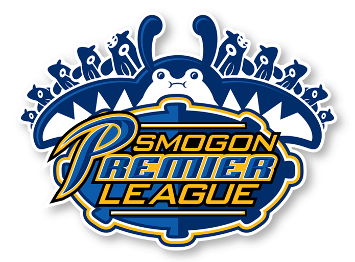
Tried to take it in a pro-sports direction. Mantine and Remoraid were chosen as the primary visuals because they seem to be a good analogy for the manager/player relationship. Additionally, the logo has ten Remoraid as homage to the ten teams that the competition will involve. There's a subtle koffing-esque control shape behind the typography.

The color scheme could change, but I tried to steer away from a combination of red/white/blue.

Your thoughts/feedback appreciated! I will probably try to get another submission in if I get the chance.
 

Shiv

mostly harmless
is a Site Content Manager Alumnusis a Programmer Alumnusis a Forum Moderator Alumnusis a Smogon Discord Contributor Alumnusis a Battle Simulator Moderator Alumnusis a Two-Time Past WCoP Champion
man Zracknel, as usual, it looks amazing.

when you'd pm'ed me telling me you were going to make a banner, i remember telling LN that i have half a mind to just blindly accept what Zracknel comes up with, glad to see I was right :D
 

Users Who Are Viewing This Thread (Users: 1, Guests: 0)

Top