
-
Welcome to Smogon! Take a moment to read the Introduction to Smogon for a run-down on everything Smogon, and make sure you take some time to read the global rules.
-
Congrats to the winners of the 2023 Smog Awards!
Worst Pokemon Sprites?
- Thread starter Rankumander
- Start date

What is this monster.

I actually really like that sprite, and its one of the best in Gen I as far as I'm concerned. It actually shows off the main unique feature of Raticate well (its teeth) and its eyes look pretty fierce.
What is this monster.
I've never been able to see it as anything but a hypnotizing disc. When I first heard people reference it as a lollipop, I had to look hard to see it.I've heard both, but I went with Bulbapedia's answer for lack of any better credible source. They think it's supposed to be some "carrot & stick" metaphor.
Although honestly I always thought it looked like a paddleball toy then anything else. I guess they got to do something to pass the time standing in one spot waiting for you to walk by.
(Plus, a lollipop doesn't exactly make much sense in context)
That's actually one of the best sprites from R/B actually.
What is this monster.
Especially when compared to THIS monstrosity.

Well, that is worse. But something about the first Raticate sprite makes it look so horrible... it is one of the best of R/B though.That's actually one of the best sprites from R/B actually.
Especially when compared to THIS monstrosity.


Maybe it's just the design, but to me Raticate just doesn't look good as a model either.
What is this monster.
I have always liked Raticate and I love that sprite and that model.Well, that is worse. But something about the first Raticate sprite makes it look so horrible... it is one of the best of R/B though.

Maybe it's just the design, but to me Raticate just doesn't look good as a model either.
Also, bonus points on the sprite for looking like Cuddles the Hamster from Monster Blood II.
That's actually one of the best sprites from R/B actually.
Especially when compared to THIS monstrosity.
I think in terms of sprites Raticate's actually had a pretty good time. It's supposed to be the mutated, monstrous rat and all of them work for that.
Something bizarre to note tho is that it's DPPt/Gen 5 sprite is almost identical to it's japanese Red/Green one.


Yeah, I agree. Raticate's design is bland, but it seems to work out for it a majority of the time. That one was the worst I could find, which, even then, it's OK I guess.
I think in terms of sprites Raticate's actually had a pretty good time. It's supposed to be the mutated, monstrous rat and all of them work for that.
Something bizarre to note tho is that it's DPPt/Gen 5 sprite is almost identical to it's japanese Red/Green one.


I'm actually pretty fond of that Grimer sprite... it looks really cute.Grimer from MD2 looks... surprised
 Boo
Boo
Sad Larvitar
What the heck is Tyranitar doing with its neck?
DPP Rayquaza
Demon Jirachi
The tables have turned for Jirachi's eyes.
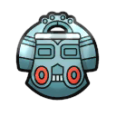
Bronzor as seen from the side
Bronzong's new haricut

Gold Umbreon (shiny to see better)
...
Some of those are actually really cute I mean look at that second Jirachi and that Eevee why are they here those are adorableGrimer from MD2 looks... surprised
Boo
Sad Larvitar
What the heck is Tyranitar doing with its neck?
DPP Rayquaza
Demon Jirachi
The tables have turned for Jirachi's eyes.
Bronzor as seen from the side
Bronzong's new haricut
Gold Umbreon (shiny to see better)
...
Bronzor's thing is more of a design quirk that's pretty funny
I've always loved Gen 4's Rayquaza sprite; there was always something... sort of cool about it.
Gen 3 Tyranitar tho I've never understood yeah. It's neck was so out of whack
But that Umbreon is completely black and blue... oh god it's the white and gold dress all over again
Some of the sprites I put there for comedic effect instead of them being horrible. For example, that Grimer sprite looked like it was scared by Muk's (horrifying) Platinum Action sprite.
More bad trainer sprites!

Oh boy those limbs.

Are you going to flash me?


These are the same sprite from Gen 1 and 2, and somehow it got worse in the future. I don't know if it's the flat tire or just a bad color job. Speaking of which...


Gambler got bling in Gen 2.

This one is so bad it's good. Such pose.

Sir! Your face! Are you having a stroke?

Oh boy, where do I begin? The red light district? No wonder the Beauty trainer class got censored in Gen 2.

Why does his hair look like a glove?


I know it was supposed to be a "lion tamer" thing, but what was with all the whips in Gen1!
You can't expect high-quality boots from a bootmaker if you give him horrible material. Slowbro had to be dopey, I understand that. Sadly, whenever they tried making him look like so, he either looked:I always thought the original design of Slowbro was stupid.
First of all, the "Shellder" on his tail doesn't even look like a Shellder. It just looks like a shell with anime-eyes.
And why is it holding it like that?
It looks like he's literally licking the Shellder.
◘ as if it was having a heart attack (HGSS Sprite is a nice example),
◘ borderline creepy (FRLG sprite, Trozei! sprite),
◘ sad...really sad (Yellow, also the second gen backsprites).
The RSE sprites were nice, in Emerald's case, when it stopped moving. The fifth gen ones were okay, I can't think of a better posture. The developers couldn't think of anything better, too. This is why we got a horrible XY model.
Last edited:
When I was really young I didn't notice the shell's eyes, so I thought he was just eating a cake. In fact, one of my friends described him as "a dumb alligator with a cake for a tail."I always thought the original design of Slowbro was stupid.
First of all, the "Shellder" on his tail doesn't even look like a Shellder. It just looks like a shell with anime-eyes.
And why is it holding it like that?
It looks like he's literally licking the Shellder.
Heatmor
Banned deucer.
Oh my gosh you are soo right!When I was really young I didn't notice the shell's eyes, so I thought he was just eating a cake. In fact, one of my friends described him as "a dumb alligator with a cake for a tail."
That looks like a cake!
This guy looks like a prevo of Pawniard..
This one is so bad it's good. Such pose.
I always disliked Catnea's sprite from saphire/ruby/emerald. It's so confusing which was supposed to be the head. I worked out from an anime episode.
Trainer sprites:

"Hmmm...I wonder what happens when I touch these wires together?"

On the subject of whips...

"whatcha looking at...eh... Eh?"
There are a lot more annoying and funnier sprites for trainers you should see in RBY
Also, if this sprite was ever in the first games I would have been creeped out:

Last edited:
My thoughts were more "can't find the bathroom."This guy looks like a prevo of Pawniard..

YEEEEEAH!
I love that one. It looks like he's thinking: *takes sunglasses of* "yep, you just lost to me and there's nothing you can do about it ¯\_(ツ)_/¯"
YEEEEEAH!
8-BIT Luster
Completely Unviable
that face is so bad tho