
-
Welcome to Smogon! Take a moment to read the Introduction to Smogon for a run-down on everything Smogon, and make sure you take some time to read the global rules.
-
Congrats to the winners of the 2023 Smog Awards!
Worst Pokemon Sprites?
- Thread starter Rankumander
- Start date


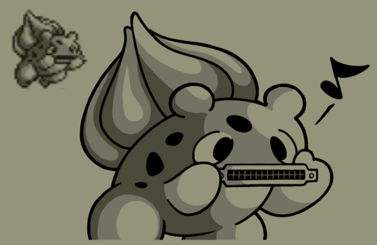
Kinglers sprite always confused me:

Here we can see one claw is bigger than the other-but this claw is being placed in front of the other?

In this pokemon red version Kingler appears to have the same sized claws, however in the anime and the above sprites, kingler has one claw which is bigger!

Here we can see one claw is bigger than the other-but this claw is being placed in front of the other?

In this pokemon red version Kingler appears to have the same sized claws, however in the anime and the above sprites, kingler has one claw which is bigger!

Really?Pretty sure having one claw bigger than the other is biologically accurate to many (if not most) species of crabs.
Old Sugimori art showed that was part of its design back in the day. I'm actually sure I've said that in this same topic somewhere.Kingler is canonically supposed to have one claw bigger than the other, yes. Kingler's RB sprite is either a trick of perspective or an error (for instance, RB also depicted Kakuna as having scythe arms.)
It may have been the original concept but it didn't actually survive as what it canonically was in Gen 1. It was just a rejected, scrapped idea that somehow found it's way into the game.Old Sugimori art showed that was part of its design back in the day. I'm actually sure I've said that in this same topic somewhere.
Here's my aforementioned post:It may have been the original concept but it didn't actually survive as what it canonically was in Gen 1. It was just a rejected, scrapped idea that somehow found it's way into the game.
This image was a card that was commercially (and officially) available in Japan in the early days of Generation I.Actually, some early Sugimori artwork shows those odd arms:

It was likely part of the original design that got abandoned early on with leftovers in the first generation games. And now I'm imagining RBY Mewtwo with Leftovers. It is a thing of nightmares.

And the thought of RBY Mewtwo with Leftovers is STILL a nightmare.

"Hmm, I do believe someone took a dump in the bathroom and forgot to flush."
This was all I could think when seeing this sprite. Funny thing is, its not even all that bad as a sprite.

"HEY MAN, DID YOU SEE WHAT HE DID AT THE PARTY LAST NIGHT?!"
I've never been a big fan of moltres' sprite, but I've never outright hated it, seeing as how Nidoquen's is so much uglier.
Sorta.Really?
Most crabs have claws of about the same size (maybe one is just slightly larger than the other), including the most famous one the Dungeness Crab

But the male Fiddler Crab does have that one giant claw!
But Kingler's name is based off of the King Crab, which uh... looks more like a spider.

So maybe the even-clawed Kingler is a girl? Or a rejected sexual dimorphism pokemon?
This Omanyte has some serious sass.

But this one likes to flex.

And this one loves to dance! :D

The dancing one must be the only survivor to evolve...


But this one likes to flex.

And this one loves to dance! :D

The dancing one must be the only survivor to evolve...


Now you've given me the idea of naming an Omanyte Dancing Star!This Omanyte has some serious sass.
But this one likes to flex.
And this one loves to dance! :D
The dancing one must be the only survivor to evolve...
Here's a challenge: which Regice is Shiny?


The sad thing is it is more obvious in previous generation (regular Regice are a dull blue, Shiny Regice are a bright blue).


It's the one on the left.
The sad thing is it is more obvious in previous generation (regular Regice are a dull blue, Shiny Regice are a bright blue).
Maybe this deserves to be on the unpopular opinion thread, but... this kind of fits the name shiny Pokémon more than actual most shiny Pokémon. Because instead of being a different colour it's the same colour but shinier.Here's a challenge: which Regice is Shiny?
It's the one on the left.
The sad thing is it is more obvious in previous generation (regular Regice are a dull blue, Shiny Regice are a bright blue).
That's probably not the best thing; gimme gold Sableye over sort-of-prettier normal Sableye any day but
Shiny doesn't actually refer to the color. It is a reference to how there are sparkles when you send out or encounter a Shiny.Maybe this deserves to be on the unpopular opinion thread, but... this kind of fits the name shiny Pokémon more than actual most shiny Pokémon. Because instead of being a different colour it's the same colour but shinier.
That's probably not the best thing; gimme gold Sableye over sort-of-prettier normal Sableye any day but
Also, it was originally coined by fans. It became an official term in Generation IV (in promotional material)/Generation V (in game), similar to how Eeveelution was a fan term, then gradually became official thanks to the Pokémon Stadium 2 strategy guide, a TCG theme deck, and Pokémon Ranger: Shadows of Almia.
Oh true, forgot about that. Still, it seemed kind of funny to me that the Shiny Regice actually looked... 'shinier' than the normal Regice (only completely scientific terms and definitions from me)Shiny doesn't actually refer to the color. It is a reference to how there are sparkles when you send out or encounter a Shiny.
Also, it was originally coined by fans. It became an official term in Generation IV (in promotional material)/Generation V (in game), similar to how Eeveelution was a fan term, then gradually became official thanks to the Pokémon Stadium 2 strategy guide, a TCG theme deck, and Pokémon Ranger: Shadows of Almia.
Playing Blue for the first time has opened my eyes to so many quality sprites.

Like this. The beak is way too big, head and wings just look wrong and.... well look at it.

While not really a bad sprite, it's actually pretty decent, it looks really creepy for Sandshrew. It looks like someone decided to go hyper-realistic on this one. Too bad it evolves to this:


The head looks like it doesn't belong on the body. It isn't shaded properly compared to the body and wings.
#Attention to detailPlaying Blue for the first time has opened my eyes to so many quality sprites.
Like this. The beak is way too big, head and wings just look wrong and.... well look at it.
While not really a bad sprite, it's actually pretty decent, it looks really creepy for Sandshrew. It looks like someone decided to go hyper-realistic on this one. Too bad it evolves to this:
The head looks like it doesn't belong on the body. It isn't shaded properly compared to the body and wings.
imo, Sandshrew actually looks really cute! It doesn't look all that realistic, and the pose and dot-eyes makes it adorable.
While not really a bad sprite, it's actually pretty decent, it looks really creepy for Sandshrew. It looks like someone decided to go hyper-realistic on this one. Too bad it evolves to this:
Sandslash, on the other hand...
Personally, I've always found Wigglytuff's Blue sprite to be quite scary:

It looks incredibly soulless with those humongous eyes and its head looks somewhat flattened too. As a kid, I always dreaded going into the maze in Cerulean Cave because of this thing. At least the Green sprite is unintentionally funny.

It looks incredibly soulless with those humongous eyes and its head looks somewhat flattened too. As a kid, I always dreaded going into the maze in Cerulean Cave because of this thing. At least the Green sprite is unintentionally funny.
Poliwag's beta sprite is just bad. It looks depressing, scary, and awkward all at the same time (at least IMHO). For whatever reason, I decided to recreate how the sprite might've looked like had it been used in Red and Green. It's not perfect, but I did the best I could. The scan (possibly a mockup?) as seen here is on the left, while my recreation is on the right:


Last edited:
What the hell?! I mean, you did a good job, actually. But the sprite as it was first pitched. What the hell?!Poliwag's beta sprite is just bad. It looks depressing, scary, and awkward all at the same time (at least IMHO). For whatever reason, I decided to recreate how the sprite might've looked like had it been used in Red and Green. It's not perfect, but I did the best I could. The scan (possibly a mockup?) as seen here is on the left, while my recreation is on the right:
Good work, this is exactly how it would look like if it were in there because GF were so bad at making beta sprites...?Poliwag's beta sprite is just bad. It looks depressing, scary, and awkward all at the same time (at least IMHO). For whatever reason, I decided to recreate how the sprite might've looked like had it been used in Red and Green. It's not perfect, but I did the best I could. The scan (possibly a mockup?) as seen here is on the left, while my recreation is on the right: