-
Welcome to Smogon! Take a moment to read the Introduction to Smogon for a run-down on everything Smogon, and make sure you take some time to read the global rules.
-
Congrats to the winners of the 2023 Smog Awards!
Worst Pokemon Sprites?
- Thread starter Rankumander
- Start date
You could say you are in... DOUBT.
Came across this monster in Pinball RS the other day. I mean, seriously, what is going on with this Graveler? It looks like it has fingernails or something and it's kinda freaking me out.

While looking for the sprite of said Graveler, I came across this Slaking. I...Don't know anymore.
Anyway, Pokémon Pinball RS did have some weird sprites.
Wait... is that a Graveler?! I had to look twice before I believed it to even be an actual Pokemon sprite.
Came across this monster in Pinball RS the other day. I mean, seriously, what is going on with this Graveler? It looks like it has fingernails or something and it's kinda freaking me out.
I like to play Pokemon games multiple times, but never want to restart. In addition to buying both versions as a simple solution, sometimes this is simply not enough. So I buy games double, and I try to create teams consisting of Pokemon that I haven't used in a playthrough before. Well, me and foxes go way back. My most ancient relic of early childhood, one that I still own and cherish, is a fox plush. Back then, my favourite movie used to be the Fox and the Hound, contrary to all the other kids (who all preferred the Lion King). My grandmother lives in the city of the fox Reinaert, and I have spent a lot of time there growing up. Needless to say, I was bound to play through some of the games with Ninetales or Delphox at some point, and I was actually looking forward to it. Until I saw their 6th Generation models, that is.

Ninetales, once graceful and fluffy, now seems to have had her tails turned into rubber. I am mourning the beautiful and elegant BW sprite. Rest in peace.


Delphox irks me more because of its design as opposed to its 3D model per se. I loved Fennekin and Braixen, but man, what a disappointment Delphox was. Once you have seen the similarities between her dress and a mustache, there is no going back.

Well, I think that it was too early for the models to be used instead of sprites. So many models killed the color scheme, the posture, and many other things. Models can't hide the tiny flaws and leaves every pokémon to be nitpicked. Take Alakazam for example.


It can't clench its fingers if they are shaped and positioned like that, but the BW sprite actually hides this. The XY model also reminds me of Alakazam's Stadium model.
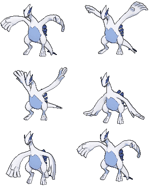
My next example is a legendary.


I think this speaks for itself. If it ain't broke, don't fix it.
It can't clench its fingers if they are shaped and positioned like that, but the BW sprite actually hides this. The XY model also reminds me of Alakazam's Stadium model.
My next example is a legendary.
I think this speaks for itself. If it ain't broke, don't fix it.
Last edited:
Omg... no words for these two. Lost it.Pokémon Red and Pokémon Green:
Well, there's Hitmonchan's sprite that looks like a Togekiss watching a constipated Doduo try to poop:

Charizard looks derpy as hell:


Hippowdon's Platinum sprite (right) reaaaallly irks me. It goes from something that's very intimidating to something so flat and atrocious. It looks so off when the mouth is closed, and the red eyes stand out so much (in a bad way, like it's really tired) when it doesn't have the intimidating open mouth. I think what bothers me the most is it enhances the design flaw that it doesn't actually have ears to at least add some visual interest on the top of its head, and this just really bothers me for some reason.


Hippopotas isn't as bad, but the Platinum sprite really comes off as very lazy (like a few Platinum sprites in general actually). It just look like it fell down, I mean sure if they want to give off a clumsy personality like Slowpoke they could but I feel a fallen down Hippopotas isn't the best way to do it. Even if th DP is just a generic standing pose, it is visually more pleasing as it's not so 'off-balance' as a pose.
On another note, I actually really like some of the RB pinball sprites since they can be more dynamic or just different in general. I like the foreshortening in the Graveler's hand to give a sense of dynamism, even if Graveler is kind off off-model overall.
Yeah, first time I saw it with a 3D model I was really surprised they didn't have it be underground like its normal sprites.... there was an opportunity there to just change the color of the sand/dirt/grass depending on where you were battling with it, but they made that thing instead.
Blastoise suffers from that, too.Nothing uglier than its 3D model though :C

The 3D model can't hide the spike-like toes and the void inside its shell. Also, its arms look tiny and impractical.
Last edited:
The toes bother me a lot more in the Hippowdon model, because they are much flatter than in the Blastoise one. I'm more bothered about another flaw in Blastoise's model. It does not seem to be anatomically capable of using its arms, so why are they even there?Blastoise suffers from that, too.
View attachment 59484 View attachment 59485
The 3D model can't hide the spike-like toes and the void inside its shell.
Reminds me of this:

But seriously, how is it even able to learn punching moves looking like that? Ice Punch, Power-Up Punch, Focus Punch, they would probably look more like awkward facepalms without the required power behind it. This power could only be built up by drawing back your arm first, something which Blastoise cannot do because its shell does not allow it.
KAAAAAAAAAAAAAAAHHHHHHHHHHHHHHHHHHHHHHHWWWWWWWWWWWWWWW!!!!!!!!!!!!!!!Ho-oh, say "ah."

AH

AAAHHH

AAAAAAAAAAAAAAAAHHHHHHHHHHHHHHHHHHHHHHHHAAAAAAAAAAAAAAAAAAAAAHHHHHHHHHHHHHHHHHHHHAAAAAAAAAAAAAAAHHHHHHHHHHHH
Er hem, couldn't help myself. I imagine Ho-oh definitely cawing like a Spearow or Fearow.
Now spit!Ho-oh, say "ah."

AH

AAAHHH

AAAAAAAAAAAAAAAAHHHHHHHHHHHHHHHHHHHHHHHHAAAAAAAAAAAAAAAAAAAAAHHHHHHHHHHHHHHHHHHHHAAAAAAAAAAAAAAAHHHHHHHHHHHH
...I couldn't resist. That's what it made me think off.
Great, now you scarred Weepinbell for life. He looks ready to spit after saying "AAARLGARBLAAAH!"
I know that we can't expect Game Freak to make Weepinbell look at least slightly appealing but this sprite from Silver is the worst.
Why is it nearly all green? It wouldn't be nearly as bad if they had gotten the colors right.
The sprites in every game until Generation III could only support 2 colors besides black and white. I'm guessing that ugly pea green tried to match the yellow skin in Weepinbell's official artwork without making the leaves look oddly colored, so that's what the sprite designers went with.Why is it nearly all green? It wouldn't be nearly as bad if they had gotten the colors right.
Generation III Pikachu:

This is an ugly Pikachu sprite. I think it looks very wonky and more like a meh plushie than an actual Pikachu.
This is an ugly Pikachu sprite. I think it looks very wonky and more like a meh plushie than an actual Pikachu.

this suicune sprite looks so weird man. It's front legs look normal but it's back legs are like in the air and in a weird ass position. It's face makes it look like it's distracted by some bug on the ground or something lol. If they just tilted it so it's standing on 4 legs and made the eyes point forward it would look aight.
...Like this

I'm not seeing the issue here, though then again I'm not an artist or art critic.Generation III Pikachu:

This is an ugly Pikachu sprite. I think it looks very wonky and more like a meh plushie than an actual Pikachu.
Probably because it looks like a mix between fatchu and thinchu. It's like Pikachu just suddenly decided that a diet would be good, but is cheating every so often.I'm not seeing the issue here, though then again I'm not an artist or art critic.
This is just an awful sprite, his head is unnaturally twisted to the left with his body facing to the right. And why is his hand raised up? Makes him look derpy as hell.
That brown and silver coloring looks so bad. I'm glad they changed it to a blue and red coloring.
Wouldn't you love to do your pokemon battles with that thing staring at you the entire time?
I actually quite like this sprite in comparison to some sprites. I also think that some Platinum sprites were worse than D/P sprites!Generation III Pikachu:

This is an ugly Pikachu sprite. I think it looks very wonky and more like a meh plushie than an actual Pikachu.


Since this is my 500th post, i'd like to thank noone. Why should I?
Last edited:


