TrainerSplash
Alolan Form
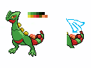
I wanted some feed back on how the back sprite is doing. (yes I'm doing the back sprite first I find it easier for mega sceptile)


Mega Pinsir Update:Tyrell D. Barnes, I'm not really a fan of your new Mega Pinsir sprite, but literally the only reason why is because of the arm positions are really weird. The old arms were much better, if you can make the new sprite have that pose then it'll look awesome. Also, I think that transparent wings will probably cause animation issues, and would suggest that they simply be made opaque to make things easier.

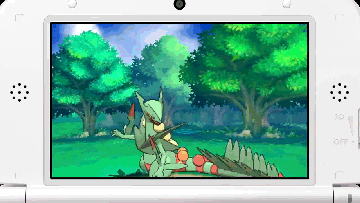
Personally, I don't like this pose for the mega sceptile. It's very strange in a combat, and, if I'm not mistaken, there aren't Gen V's Pokemon with this pose (maaybe yes, but i don't remember anyone). It's my opinion.TrainerSplash, just use this, it'll be easier.

Tyrell D. Barnes, I'm not really a fan of your new Mega Pinsir sprite, but literally the only reason why is because of the arm positions are really weird. The old arms were much better, if you can make the new sprite have that pose then it'll look awesome. Also, I think that transparent wings will probably cause animation issues, and would suggest that they simply be made opaque to make things easier.
Zygarde is proving to be a MASSIVE pain which is requiring a lot of redoing stuff, but I can probably get that animation out in the span of the next couple of days.
There actually are a couple of pokemon that do turn their heads in a similar fashion. Teddy is probably the best example though. Everyone else is less extreme.Personally, I don't like this pose for the mega sceptile. It's very strange in a combat, and, if I'm not mistaken, there aren't Gen V's Pokemon with this pose (maaybe yes, but i don't remember anyone). It's my opinion.


Thanks, I'll start working on this soon.Fixed this up to be more similar to reference images.


The right leg is missing because that leg literally does not exist on the original sprite, and I don't have the time to spend scratch spriting one. But yes, this pose is absolutely correct, and should be used as a base for the Mega sprite.


It looks fine!! One think that i would change is to add some movement at the arms.Woo, 400th post.


I'm pretty happy with how this came out, but I may revisit it at a later time. I don't have much else to say, except that snakes are a total pain to animate and this took like 4 tries to get right. It's loosely based on Rayquaza's motions.
Zygarde has no arms. The tendrils on the sides of its body only vibrate when using certain moves, including Earthquake and Land's Wrath.It looks fine!! One think that i would change is to add some movement at the arms.
If possible, although I know this would be hard as hell to do, I'd love to see this thing do the tail undulations it does in the game, although we'd probably need a second sprite pose for that. Barring that remarkably difficult suggestion, my other suggestion would be to add the blinky lights of in-game Zygarde, as those shouldn't be too hard to add and will increase the coolness of the animation by at least 100%.Woo, 400th post.
I'm pretty happy with how this came out, but I may revisit it at a later time. I don't have much else to say, except that snakes are a total pain to animate and this took like 4 tries to get right. It's loosely based on Rayquaza's motions.

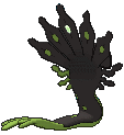
I actually think that this would be a better animation in general. The other one looks great, don't get me wrong, but Zygarde's not really something that would move an awful lot; it's supposed to watch over the world from under the earth like some vengeful sentinel and be generally rather creepy, so the slight movement [and the blinky lights] staring ominously fit more from a flavour standpoint. You can especially tell in Amie, as you can never tell what its expression is due to it not having eyes, thus making it hard to really hard to tell what its expression is; making it even more unsettling.If possible, although I know this would be hard as hell to do, I'd love to see this thing do the tail undulations it does in the game, although we'd probably need a second sprite pose for that. Barring that remarkably difficult suggestion, my other suggestion would be to add the blinky lights of in-game Zygarde, as those shouldn't be too hard to add and will increase the coolness of the animation by at least 100%.


Ok first of all I thought you said Anime not Amie xDI actually think that this would be a better animation in general. The other one looks great, don't get me wrong, but Zygarde's not really something that would move an awful lot; it's supposed to watch over the world from under the earth like some vengeful sentinel and be generally rather creepy, so the slight movement [and the blinky lights] staring ominously fit more from a flavour standpoint. You can especially tell in Amie, as you can never tell what its expression is due to it not having eyes, thus making it hard to really hard to tell what its expression is; making it even more unsettling.


