Zracknel's logo thread

Hello !

I've decided it's time to edit my OP a bit to clean it up

Tools Used: Adobe Illustrator mostly, Adobe Photoshop for small added effects

>>no requests please unless it's for the site<<


I've done a few very mildly famous things, including a minor league sports team and the old logo for the united states' most expensive stadium among others


The SPL primary Logo


SPL Secondary Logo


The Indie Scooters


The Ever Grande Bigs


Les Trous du Cul Elegants:

metang art stolen from a pokemon card; my regret is colossal


The Alpha Ruiners


Smogon's Greatest Brits
Kinneas said:
I'm going to be referring to you as "Smogon's Greatest Buts" in all future articles, as I'm convinced that's what it says on your logo.


The Firebot Charmanders


Congregation of the Classiest


The Cryonicles


The Circus Maximus Tigers

pieces stolen from various places; I'm a terrible person
Sonuis said:
If you're talking about mascots, then you really should be asking, "Why is Raikou the mascot of the Circus Maximus Tigers?" A dog is not a cat.


The Wi-fi Wolfpack, Season I


The Stark Sharks

based on this logo


The Team Raiders
Iconic said:
based on what burungeru appears to be doing to nattorei i think 'raided' is an excellent choice of words
A mistake I'll not make again (although the the congregation of the classiest logo and the shadows of the original wolfpack logo tread in similarly dangerous water).

Scofield said:
Even though I have to admit it's cool that you're the first team with 5th gen mons in their logo, did you really have to pick the overrated no skill trash combo of natty and bung?


The Wi-Fi Wolfpack, Season II

The Chaser said:
Dog ≠ Wolf


SPL Semi-Finals, Season One


SPL Finals, Season One


Smogon Frontier Logos

reference logo


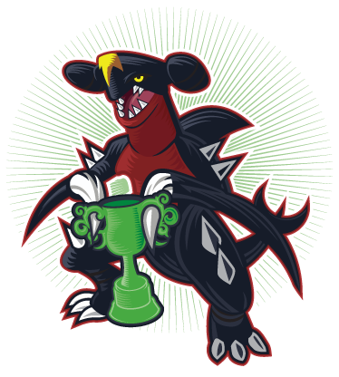
Frontier Champion Atticus


The Smogon Tour Logo


The Shoddy Battle II logo

reference, scanned


The Pokemon Laboratory Logo


Bloo and Setsuna's Spanish Translations project


Updates, in order posted (older at the top, more recent at the bottom):
Pokemon Laboratory Logo 1
Pokemon Laboratory Logo 2
Pokemon Laboratory Logo 3
Pokemon Laboratory Logo 4
Battling 101 Logo
Team Trials
Luvdisc'd
Overall: B+
Wishmkr
Jirachis
Wishmkr Database
Wishmkr Trophy
Wyoming Tournament
Smog Icon: Blue Kirby Interview
Bloo's Morty Avatar
Nastyjungle's Shelgon
Official Smogon Tournament Logo
Muk Yeah!
Grumpig/Lilligant Secret Santa Collab
Sollux Captor & Drifloon Brofist
Team Raiders Logo Season 3
Circus Maximus Tigers Season 3
Stark Sharks' Championship Banner
Stark Sharks Secondary Logo
The Dragonspiral Tyrants
Smeargle's Studio, a collab with Nastyjungle
Alchemator's Arterview Avatar
Zracknel the Unown Avatar
Personal Avatar
Wolfpack Shirt
Manectric Laser-Engraved Pendant
The Competitor Logo
Competitor News Icon
Competitor Koffing Backdrop
Smogon Grand Slam Logo
UU Open Logo
RU Open Logo
Ubers Open Logo
NU Open Logo
LC Open Logo
Past Gens Hub Logo


Thank you for taking the time to look at my thread!
 
I was always fascinated by the Premier League logos. I always thought they were made by different people.
You have a lot of talent and great stuff here. I hope to see more in the near future.
 

Nastyjungle

JACKED and sassy
is a Top Artist Alumnusis a Community Leader Alumnus
Just wanted to say that I have been seeing your logos around the site for a while, and they are absolutely fantastic. Wifi Wolfpack (original) is undoubtedly one of the coolest things I've ever seen.

Huge fan here, keep up the excellent work!
 

Its_A_Random

A distant memory
is a Forum Moderator Alumnusis a Community Contributor Alumnus
Yeah, I like the Premier League Logos, I now see the reference for the Firebot Charmanders Logo, I can see the Arceus Reference in the Premier league Trophy, & that Garchomp Avatar looks amazing & I could hardly believe you actually drew that. Great work, hope to see more of your work in the near future. :)
 

Oglemi

Borf
is a Top Contributoris a Tournament Director Alumnusis a Site Content Manager Alumnusis a Community Contributor Alumnusis a Researcher Alumnusis a Tiering Contributor Alumnusis a Top Smogon Media Contributor Alumnusis an Administrator Alumnusis a Top Dedicated Tournament Host Alumnus
Hah, I knew you were still doing stuff. Great to see you post in Smeargle's Studio, since what, like two years ago, lol (I've been periodically ransacking old art threads for cool stuff).

I really, really, really like the logos and I hope you can keep doing them as a career.
 
Really good art. You definitely have potential. Your illustrations for the teams are pretty insane. I could totally imagine wearing a hat with the scooters and the cryonicles on it. Keep up the good work!
 

reyscarface

is a Tournament Director Alumnusis a Social Media Contributor Alumnusis a Forum Moderator Alumnusis a Community Contributor Alumnusis a Tiering Contributor Alumnusis a Smogon Media Contributor Alumnusis a Dedicated Tournament Host Alumnusis a defending SPL Championdefeated the Smogon Frontier
World Defender
and he used his 1000 post on saying that Zracknel!

anyways your stuff is incredible, youre such an amazing artist, every single one of your logos are beautiful
 

tennisace

not quite too old for this, apparently
is a Site Content Manager Alumnusis a Top Social Media Contributor Alumnusis a Community Contributor Alumnusis a Researcher Alumnusis a Top CAP Contributor Alumnusis a Tiering Contributor Alumnusis a Contributor Alumnusis a Smogon Media Contributor Alumnusis an Administrator Alumnus
Fun Facts: Another logo I don't really want to talk about, since some of the elements were either borrowed from other places. The Tigers don't seem to like the logo themselves, since few if any of them are using it, so it seems safe to assume that this one was a flop. Besides which, ["dog=/=tiger"]
There are no tiger pokemon, except for raikou, which is based on a saber-toothed tiger. So yes, right choice of mon!

Amazing work all around though, you are going to go far with this!
 
i rarely post in smeargle's studio, but just popping in here to say that you are an amazing artist with an incredibly bright future ahead of you. i mean, i don't know anyone else who could make houndoom look so cuteeee o^____^o

keep it up man, and thank you for all your fantastic logos.

EDIT: hahahaha oh man i just saw my quote about the raiders' logo. ahh i feel really bad now, i really didn't mean to disrespect your work or anything. i was just doing my usual trash talking, the logo itself is amazing just like all your other work.
 
Wow. I'm a sucker for logo design, and if I had artistic talent, I'd try my best to do a tenth as decently as you design! My favorite of yours is definitely Indie Scooters. It's probably due to it being more minimalistic than the other ones you've posted in the thread and me being a sucker for minimalism just because it's minimalism (favorite major corporate logos are Target, FedEx, H&R Block).

Also, I'm like super extremely impressed at both the fact that you designed the New Meadowlands logo and the fact that you kinda just played it off. I would not mind seeing more non-Pokemon stuff if you don't mind.
 

makiri

My vast and supreme will shall be done!
is a Forum Moderator Alumnusis a Smogon Discord Contributor Alumnusis a Contributor Alumnusis a Battle Simulator Moderator Alumnusis a Three-Time Past SPL Championis a Two-Time Past WCoP Champion
I've worked as a pro designer for a little over two years now. My most "famous" real-world work includes the current logo of the most expensive sports stadium ever built, as well as a minor-league baseball team. I've developed logos for a whole bunch of collegiate athletic programs and properties, but nothing quite as big as those two.
That is incredible, is there a story on how your design was selected for NMS? My favorite football team plays there (the Giants) and now I can say I semi-know the person who designed the logo. I was always impressed with your work and seeing that your work has applications beyond our little site is amazing. The Sharks logo is one of my favorite pieces of art I have ever seen, it is absolutely fantastic and I can't thank you enough for the work you put into it.
 
I've seen these logos around Smogon for over a year now, always wondering who actually made them. I must say, pretty much every single one of them is fantastic. The Ever Grande Bigs, Wi-Fi Wolfpack, Firebot Charmanders and Chryonicles are my favourites. Keep up the good stuff!

I hope you'll be doing every single logo for this year's SPL.
 

Setsuna

Prototype
is a Top Tutor Alumnusis a Site Content Manager Alumnusis a Team Rater Alumnusis a Researcher Alumnusis a Contributor Alumnusis a Smogon Media Contributor Alumnusis an Administrator Alumnusis a Battle Simulator Moderator Alumnus
I remain speechless in front of every single piece of art that you have made, Zracknel. You are amazing.
 
I remain speechless in front of every single piece of art that you have made, Zracknel. You are amazing.
This more or less covers it. I assume since you're using illustrator that these were all made with the pen tool (which I've heard is vastly superior to that of Photoshop, which I use). If that is indeed the case, then holy shit. You definitely have a solid career ahead of you.

I'd like to know if you make your font/typefaces or if you use other resources, as your typography skills are pretty damn baller in terms of selecting/creating and manipulating fonts that are contextually perfect.

EDIT: I'll also be linking to this thread in my own art thread next to Yilx's and CyzirVisheen's. This deserves far more attention than it's gotten.
 

Focus

Ubers Tester Extraordinaire
Jeez! You designed all those fantastic logos!?! That's really impressive! I've seen them for as long as I have been here, and I loved every last one of them. Good luck with your future logo-designing!
 
As a graphic designer, I have to express much admiration for your work.

Excellent illustrations and clean execution. Great color choices, and the typefaces are -mostly- on point. I really wish I could watch you work, I think I'd learn some things about Illustrator haha.

I enjoy your attention to detail, including proper 3D perspectives and whatnot throughout.

May I ask, are you custom making your typefaces or are you simply adding the beveled and angled edges yourself?

I've not seen typefaces so clean like these appear, while also having the 3D quality and all that good stuff. Mind if I ask what they are, if they are existing typefaces?

I also like the textures where applicable.

overall, i think my favorite piece would be the Stark Sharks, followed by the Air Raiders one, but really, i like them all. Both Wolfpacks, the Scooters, the Bigs... All well done :D


good stuff!
 

Pokemon Lab Primary Logo #1


Icon


Pokemon Laboratory Primary Logo #2


Pokemon Laboratory Primary Logo #3


Pokemon Laboratory Primary Logo #4
 
Some are made from scratch (The word "Raiders" in the Team Raiders, for example) but usually I start with an existing typeface. I tend to overuse fonts like Impact and Machine as starting points, since they resemble the heavy/geometric typefaces that a lot of the pros seem to go for in sports branding. Sometimes the typeface will go through heavier modification, but sometimes not. Heavier typefaces in general have better visual impact and allow more room for details.

All the beveling, dimensional effects, and even the arcs/arches in the typography are done by hand (rather than filter). This is just how I learned to do them. There are effects within illustrator and photoshop to do arcs and curves and whatnot for type... I'm well aware. However, there are subtle advantages to producing these effects manually, even if it does take longer.

There are probably scripts/filters out there for the beveling/dimensional stuff by now, although I'm not aware of any. I should probably look into that.


Hahaha, feel free to call me out on bad type choices... Some (like the Zapfino used for Les Trous du Cul Elegants) would never fly in the real world because it would limit the logo's application (probably couldn't read it on a business card) but to that end I know I'm making all sorts of poor choices with regard to number of colors, reproducibility issues, details, and so on...
Ah, yes, nice. I want to work with type more, though its already one of my favorite facets to work in, yours is really clean.

i wasn't suggesting you were using filters or anything, any seasoned user of design suite basically avoids them always unless its like, blur or certain other ones

also yeh, you might not be able to translate these to shirts or hats or w/e well, because you use lots of complex shapes, and many shades etc. (non-limited palette) but these are done with the intent of being purely digital, it seems, so its okay

but, yeah, i like a lot of your work man, some good visual inspiration :D


oh, no offense or anything, and i like the design personally, but your pokebeaker looks a LOT like a particular poke-bong i've seen haha, and the smoke billowing doesn't help! ha


i think a poke atom would have actually been really cool
 

Users Who Are Viewing This Thread (Users: 1, Guests: 0)

Top