


uwu
By popular demand, it's finally here. The OFFICIAL Bidoof Princess art thread. (Also known as the world's best artist (objectively)). Been meaning to get around to making this for a while. (Ever since Inktober ended really) but never ended up doing it, mostly because I'm lazy but also because I fell off doing art completely. But now this thread exists, giving me motivation to actually do art next year. I don't have many pieces done so far outside of Inktober, and my medium of choice is MS Paint, so don't accept high quality art in these next few dropdowns.
This is a DTIYS I did of Violet 's purple hair OC. (I call her Mervin). Idk I think she's cute.
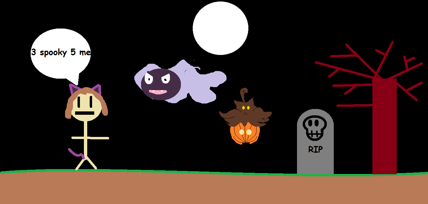
aaaaaaand this is a piece that was initially meant for the Artd and Crafts PS room's spooky DTIYS event. Kinda sad it went unused since I put a ton of work into those two pokemon. First and only full colour piece I've done so far, but I think I could do much better if given more time and real tools.
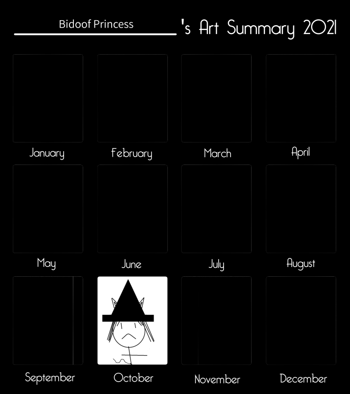
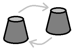
also a 2021 year in review because i thought it was funny
So now I don't have an excuse to not do art this year. Ultimate goal for 2022 is to at some point acquire real software that isn't MS Paint, and then also a drawing pen since doing this on mouse is HELL. Honestly did not expect at all to be a part of this community even slightly at the start of this year, and I'm really proud of how far I've come. Really excited to see what I can do next year!
By popular demand, it's finally here. The OFFICIAL Bidoof
Princess art thread. (Also known as the world's best artist (objectively)). Been meaning to get around to making this for a while. (Ever since Inktober ended really) but never ended up doing it, mostly because I'm lazy but also because I fell off doing art completely. But now this thread exists, giving me motivation to actually do art next year. I don't have many pieces done so far outside of Inktober, and my medium of choice is MS Paint, so don't accept high quality art in these next few dropdowns.Day 1 - Fairy. Honestly this one's still a big mood.

Day 2 - Witch. Stay tuned for more eared anime girls. They'll probably end up being a theme.

Day 3 - Raven. Personally I think he's quite cute. I discovered the fill tool here and I think it really adds to the piece.

4. Moon - This is when I discovered the shapes tool and really tried to push what I could do with it. I think it turned out really striking.

5. Wisp - First fanart I did. It's Wisp from Animal Crossing. I don't really like his lips but aside from that I'm proud of this. But limited time and tools were in play here so I wasn't really sure how to improve it.

6. Teeth - I'm very proud of this one. Bidoof Princsus would be too.
7. Villain - It's him, the most villainous of all. The super criminal.
8. Ghost - Honestly I think the quality dips around the middle point of the month. I think I got really lazy with this one, and I think I could do a much better job now.
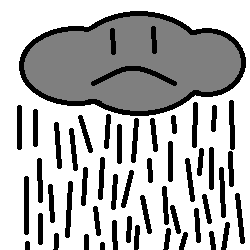
9. Rain - Tried for something more stylistic here. Big fan of the big cute face on inanimate objects aesthetic, and I think I pulled it off with a moderate degree of success.
10. Pumpkin - Another kinda lazy one imo. I like how the face turned out but I need to work on studying body types I think.
11. Water - Honestly this one's just a meme. That being said it's very complex and meticulously crafted, so I'm proud of you if you understand the font choice.
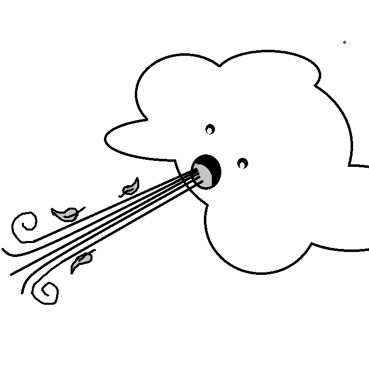
12. Clouds - Went for something more abstract here. This one definitely could have been better.

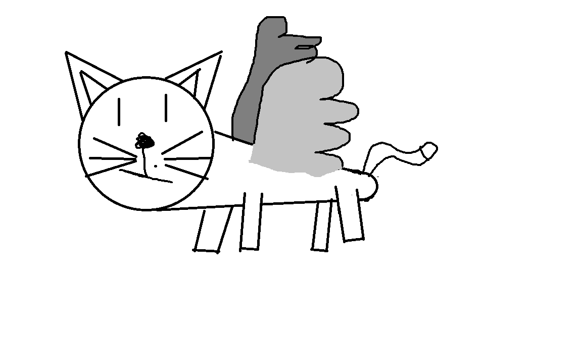
13. Wings - This was unfortunately before I discovered references, so the cat looks a tad derpy. This could have used some colour to really make it pop I think. It was my first (poor) attempt at shading, and I really don't think it worked.
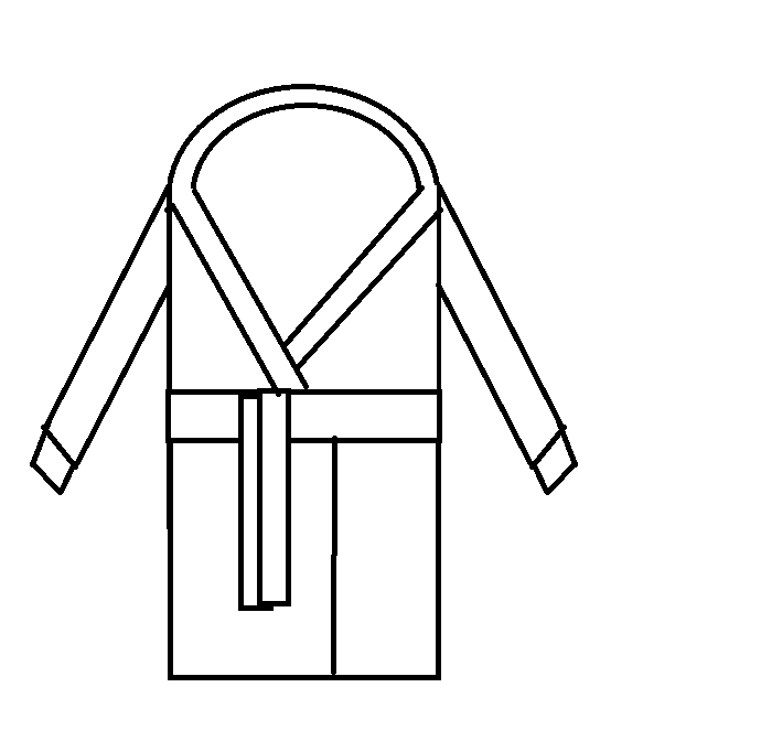
14. Robes - This is where I learned what references are and began using one. I still went fairly offmodel, though. That being said I think I have a career as a fashion designer ahead of me. This got some drip fr.
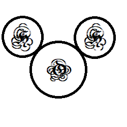
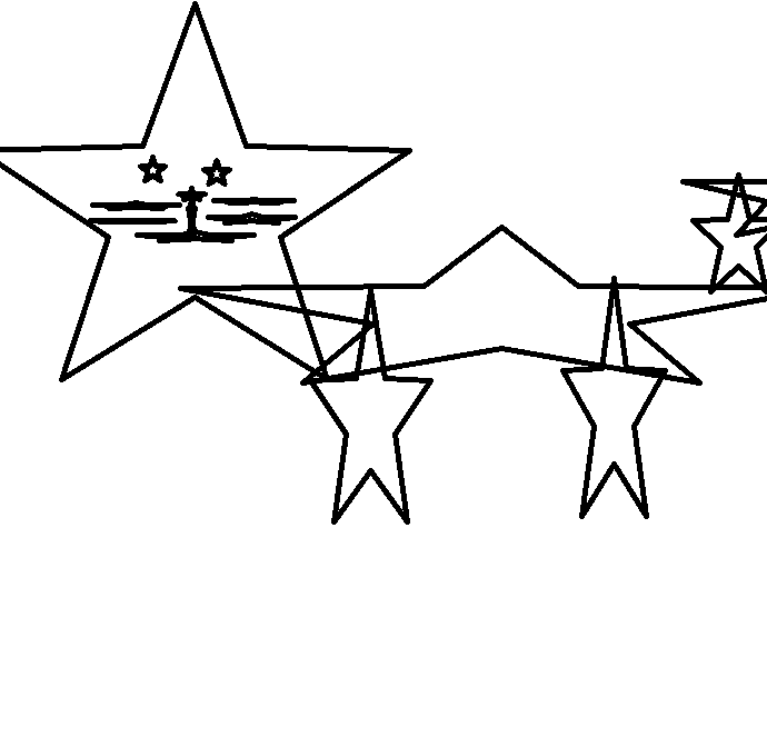
15. Stars - The third and final attempt at drawing a cat, this time entirely using the star tool. Not really sure what to say about this one honestly.
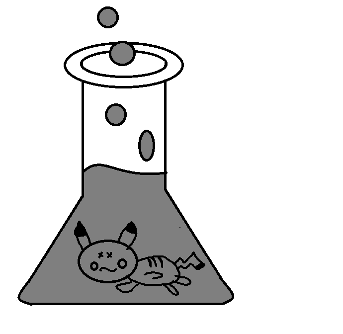
16. Potion - Really like this one. I wish the Erlenmeyer Flask had more depth but idk hard to complain with this one for me. I think it's really cute.
17. Haunted - This was a low point in the month for me, so I really didn't try that hard here. Honestly just traced this one from the Sugimori art because I was NOT in the mood LOL. Had to play around with the proportions a bit to get it to look right. A lot of C+P+Stretching and that makes the right side look a bit funky tbh.
18. Ghoul - i realized very quickly i do not want to draw a gHoul, and do not know how to draw a ghoul. so instead i drEw a gremlin, but not just any gremLin, a heckin' chonky one. i started Playing around with shading here. only really looks good when you zooM out imo, but i think it was a good first attEmpt. should have studied a reference more honestly
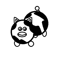
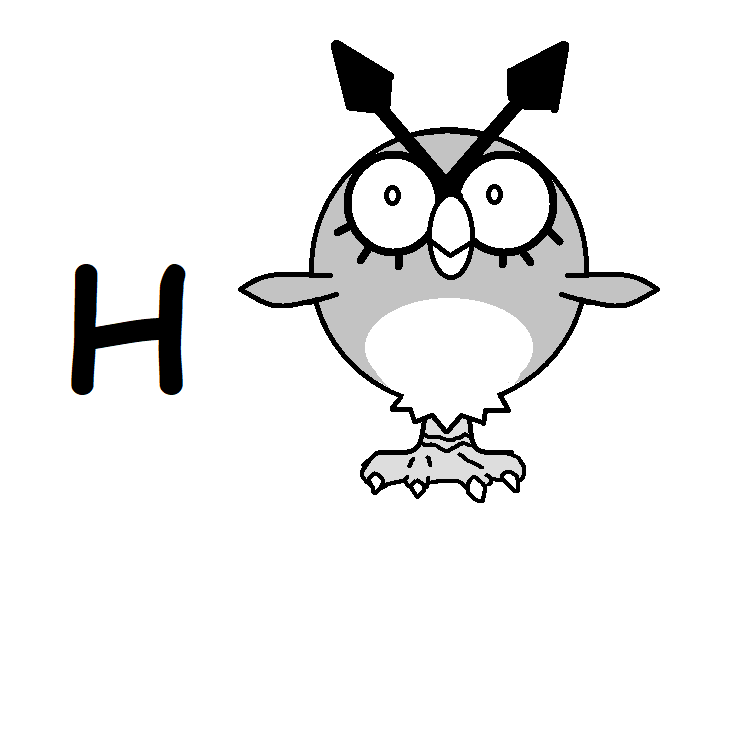
19. Howl - My magnum opus. Honestly really love this one. I think I did a really good job on the Hoothoot and I discovered I really like drawing that mon. Ended up studying the Sugimori art weirdly intensely here, and I think it turned out for the better, since I learned a lot of cool things about how to improve my art, especially from its feet.
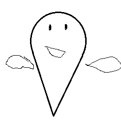
20. Wind - Well there wasn't any way to go up from there anyways :/ I don't hate this one honestly. I think the leaves are really good for being drawn with a mouse, and I like how I did the eyes. Eyes are something I don't think I've ever gotten good at, so I like what happened here. Don't really like the cloud guy's shape tho. I feel like that could have used some touchups.
21. Rot - Absolutely the piece I put the most effort into, using a whopping two references, and me experimenting with a light source. I remember this one being really painful to make bc I only had so many colours to work with and kept fucking up and having to restart. I think the lighting looks awkward still, but that mostly comes down to paint's limitations when working with an artist of my caliber. Still proud of it, but I think I got a bit too ambitious for the medium, and the piece suffered for it.
22. Fog - Honestly I think this piece captures the idea of fog pretty well. Can't even tell what I was trying to draw because of how much fog's in the way :(

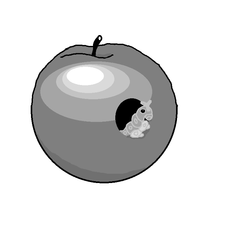
23. Sweet - There's a reason I only drew one modern Pokemon in this entire month. That being said I'm happy with this. Probably needed to put more effort into studying the reference though.
24. Enchant - Don't ask me why this is on enchant. I genuinely don't remember. I remember putting a lot of work into getting everything to fit perfectly together here. Of the abstract pieces I did, this one's probably the most pedestrian, but it's definitely my favourite.
25. Orb - Was gonna try something more complex in terms of shading here, but considering how rot turned out, I didn't want to get too ambitious and went for a back to basics approach.
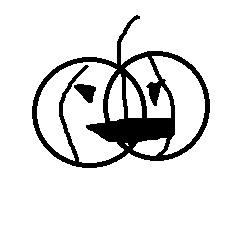
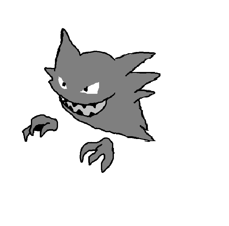
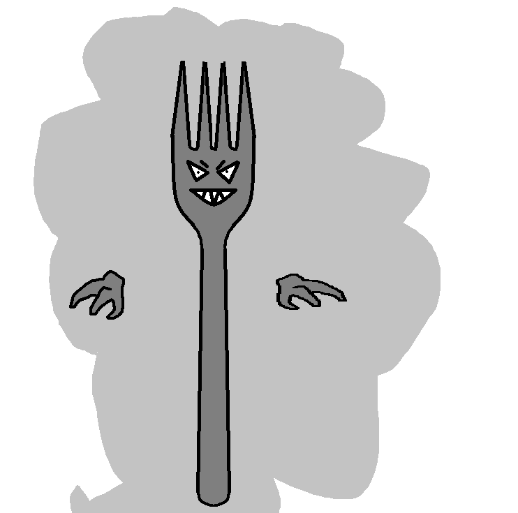
26. Possess - Here's where I ran out of ideas. Spooky fork rawr :3 Hate the concept I came up with but love how I executed it. I think the fork looks surprisingly nice honestly. Used the Sugimori Haunter again to reference the hands, and I think they turned out really nice too.
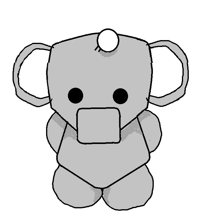
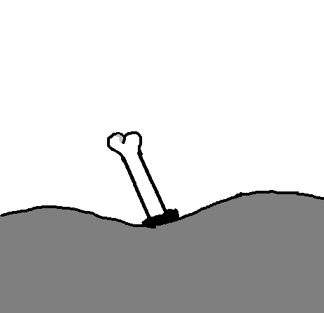
27. Bone - Another really lazy one. Honestly just have nothing to say here.
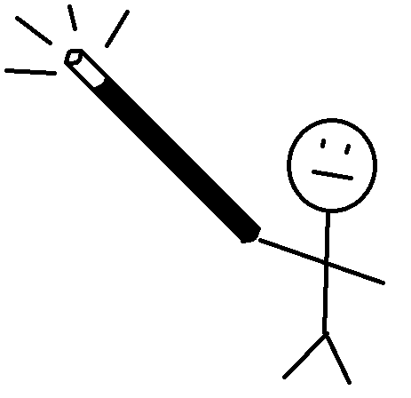
28. Wand - This one's really simple so I probably shouldn't be that proud of it but I honestly kinda am. Just love the guy's stoic expression as he commits magic.
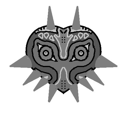
29. Mask - I'm really proud of this one. This is easily the piece here I put the most time into. Making this symmetrical on my own sounded like hell, so luckily I was able to discover the flip tool, and I think it turned out much better for it.
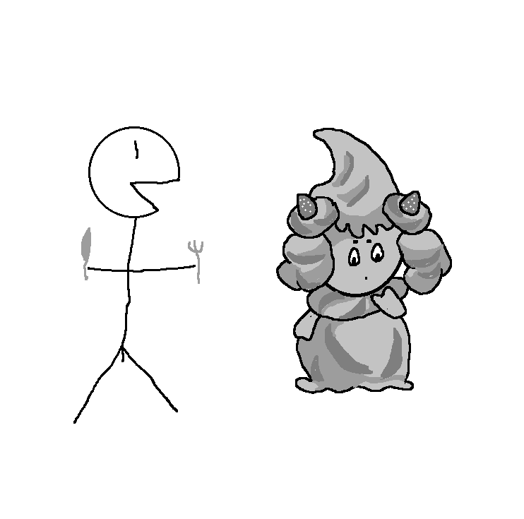
30. Trick - LOL she made a Pokemon reference she's a gamer too. Honestly I stopped trying after the mask one. Mostly just because I had no good ideas tbh. Trick and Bizarre are hard to plan for.
31. Bizarre - Honestly I kinda gave up here. I was going for something more abstract and while I do like the piece's use of texture, I think it's a bit direction/meaningless, so I'm not the biggest fan of this one. Set out to make something bizarre but idk if I really succeeded.

Day 2 - Witch. Stay tuned for more eared anime girls. They'll probably end up being a theme.

Day 3 - Raven. Personally I think he's quite cute. I discovered the fill tool here and I think it really adds to the piece.

4. Moon - This is when I discovered the shapes tool and really tried to push what I could do with it. I think it turned out really striking.

5. Wisp - First fanart I did. It's Wisp from Animal Crossing. I don't really like his lips but aside from that I'm proud of this. But limited time and tools were in play here so I wasn't really sure how to improve it.

6. Teeth - I'm very proud of this one. Bidoof
Princsus would be too.7. Villain - It's him, the most villainous of all. The super criminal.
8. Ghost - Honestly I think the quality dips around the middle point of the month. I think I got really lazy with this one, and I think I could do a much better job now.
9. Rain - Tried for something more stylistic here. Big fan of the big cute face on inanimate objects aesthetic, and I think I pulled it off with a moderate degree of success.
10. Pumpkin - Another kinda lazy one imo. I like how the face turned out but I need to work on studying body types I think.
11. Water - Honestly this one's just a meme. That being said it's very complex and meticulously crafted, so I'm proud of you if you understand the font choice.
12. Clouds - Went for something more abstract here. This one definitely could have been better.
13. Wings - This was unfortunately before I discovered references, so the cat looks a tad derpy. This could have used some colour to really make it pop I think. It was my first (poor) attempt at shading, and I really don't think it worked.
14. Robes - This is where I learned what references are and began using one. I still went fairly offmodel, though. That being said I think I have a career as a fashion designer ahead of me. This got some drip fr.
15. Stars - The third and final attempt at drawing a cat, this time entirely using the star tool. Not really sure what to say about this one honestly.
16. Potion - Really like this one. I wish the Erlenmeyer Flask had more depth but idk hard to complain with this one for me. I think it's really cute.
17. Haunted - This was a low point in the month for me, so I really didn't try that hard here. Honestly just traced this one from the Sugimori art because I was NOT in the mood LOL. Had to play around with the proportions a bit to get it to look right. A lot of C+P+Stretching and that makes the right side look a bit funky tbh.
18. Ghoul - i realized very quickly i do not want to draw a gHoul, and do not know how to draw a ghoul. so instead i drEw a gremlin, but not just any gremLin, a heckin' chonky one. i started Playing around with shading here. only really looks good when you zooM out imo, but i think it was a good first attEmpt. should have studied a reference more honestly
19. Howl - My magnum opus. Honestly really love this one. I think I did a really good job on the Hoothoot and I discovered I really like drawing that mon. Ended up studying the Sugimori art weirdly intensely here, and I think it turned out for the better, since I learned a lot of cool things about how to improve my art, especially from its feet.
20. Wind - Well there wasn't any way to go up from there anyways :/ I don't hate this one honestly. I think the leaves are really good for being drawn with a mouse, and I like how I did the eyes. Eyes are something I don't think I've ever gotten good at, so I like what happened here. Don't really like the cloud guy's shape tho. I feel like that could have used some touchups.
21. Rot - Absolutely the piece I put the most effort into, using a whopping two references, and me experimenting with a light source. I remember this one being really painful to make bc I only had so many colours to work with and kept fucking up and having to restart. I think the lighting looks awkward still, but that mostly comes down to paint's limitations when working with an artist of my caliber. Still proud of it, but I think I got a bit too ambitious for the medium, and the piece suffered for it.
22. Fog - Honestly I think this piece captures the idea of fog pretty well. Can't even tell what I was trying to draw because of how much fog's in the way :(
23. Sweet - There's a reason I only drew one modern Pokemon in this entire month. That being said I'm happy with this. Probably needed to put more effort into studying the reference though.
24. Enchant - Don't ask me why this is on enchant. I genuinely don't remember. I remember putting a lot of work into getting everything to fit perfectly together here. Of the abstract pieces I did, this one's probably the most pedestrian, but it's definitely my favourite.
25. Orb - Was gonna try something more complex in terms of shading here, but considering how rot turned out, I didn't want to get too ambitious and went for a back to basics approach.
26. Possess - Here's where I ran out of ideas. Spooky fork rawr :3 Hate the concept I came up with but love how I executed it. I think the fork looks surprisingly nice honestly. Used the Sugimori Haunter again to reference the hands, and I think they turned out really nice too.
27. Bone - Another really lazy one. Honestly just have nothing to say here.
28. Wand - This one's really simple so I probably shouldn't be that proud of it but I honestly kinda am. Just love the guy's stoic expression as he commits magic.
29. Mask - I'm really proud of this one. This is easily the piece here I put the most time into. Making this symmetrical on my own sounded like hell, so luckily I was able to discover the flip tool, and I think it turned out much better for it.
30. Trick - LOL she made a Pokemon reference she's a gamer too. Honestly I stopped trying after the mask one. Mostly just because I had no good ideas tbh. Trick and Bizarre are hard to plan for.
31. Bizarre - Honestly I kinda gave up here. I was going for something more abstract and while I do like the piece's use of texture, I think it's a bit direction/meaningless, so I'm not the biggest fan of this one. Set out to make something bizarre but idk if I really succeeded.
This is a DTIYS I did of Violet 's purple hair OC. (I call her Mervin). Idk I think she's cute.
aaaaaaand this is a piece that was initially meant for the Artd and Crafts PS room's spooky DTIYS event. Kinda sad it went unused since I put a ton of work into those two pokemon. First and only full colour piece I've done so far, but I think I could do much better if given more time and real tools.
also a 2021 year in review because i thought it was funny
So now I don't have an excuse to not do art this year. Ultimate goal for 2022 is to at some point acquire real software that isn't MS Paint, and then also a drawing pen since doing this on mouse is HELL. Honestly did not expect at all to be a part of this community even slightly at the start of this year, and I'm really proud of how far I've come. Really excited to see what I can do next year!
Last edited:


