CAP1 - Part 14.5 - (Pre-Evo Sprite Submissions)

Status
Not open for further replies.
well this is a big post
I agree with Ice-cold's choices here, in that 2, 4, and 6 are the best options. Despite Ice's resistance to commenting on 4, it does look pretty good.
To compare yellow-skins in general I prefer #2 over #4.

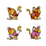
On the subject of drastic color changes, I really like #6, but after browsing through the BW Pokedex I found it impossible to find any shiny-evo-chains that had that much variation. The general theme with shiny pokemon in Gen 5 seems to be, keeping one shiny palette the same and changing the other one. (Pretty often they even use the exact same color palette for both parts) So while its less 'fun', 'creative', and 'original' to use the same shiny colors, it does match the standards of Gen 5.

Summary/Conclusion: My best idea is to use Tomohawk's shiny skin color and either Black or Purple feathers, whichever you prefer.

EDIT: Or if you really want to be creative you can keep Tomohawk's feather color and find a skin color that doesn't make someone want to tear out their eyes.
EXAMPLE OF ~SAME COLOR: Solosis/Duosis/Reuninclus
EXAMPLE OF SINGLE PALETTE SWAP: Ducklet/Swanna
 
Thanks ICC, haha, yours is amazing, its not over yet at all! :D

RD, so I just changed my old post to say Final Sub as the title, that's ok right? That counts as bold?

Moved comments:
@Steam, your backsprite looks really great. I like your purple feathered, yellow skinned shiny the most :D

@Paint, it's looking a lot better with the eyes and such. I have one nitpick: the left foot claws look pretty blunt. From your art I think they should be ending in a point, if you see what I mean.
 
@Steampowered: I don't really want to comment on shiny colors because I'm of the opinion that shiny color schemes are generally pretty ugly, so I'd only be able to suggest ugly colors, haha. (It was pretty hard to stop myself from making Tomohawk's shiny sprite radioactive green). Although I will say I like all the ones with purple in them.

But, I agree with what paintseagull said before about the tail... it's really strange the way it's positioned in relation to the hand. I also think it looks too long and too thin, so you could really solve all three of those issues by making it shorter, thicker, and a bit closer to the body.

Anyway, when's the deadline on submissions? I'd really like to make one (I've started, actually) but it makes me a bit nervous to see people finalizing things already. Have I still some time?
 
Thanks Attract. I guess.
Steam: Goin' with my own suggestion, purple-yellow. It's the most comfortable to look at.
Wekhter: You...no. You're...making...I...aagh...AAAAAAAAAAAAAAAA NOOOOOOOOOOOO NNNNNNNNOOOOOOOOOOOOOOOOOGAH god help me
...You better be fast then...
 
Attract said:
RD, so I just changed my old post to say Final Sub as the title, that's ok right? That counts as bold?
Put it in the post itself for good measure, I'd say.
wekhtar said:
Anyway, when's the deadline on submissions? I'd really like to make one (I've started, actually) but it makes me a bit nervous to see people finalizing things already. Have I still some time?
Plenty. We have to get through Scratchet's DW ability stage, and then Scratchet's movepool stage, which will be a few days in itself just for submission development, then polling on top of that.
 

Focus

Ubers Tester Extraordinaire
well this is a big post
Okay, let's have a non-artist judge :P
1. It is simple and perhaps a bit obvious, but it is pleasing to the eye. The red and blue parts go well together.
2. That looks pretty cool! The spots of blue are nice features. However, could you try a version with a slightly grayer or more golden color for the fur on the face, legs, ect.? I want to see where that road leads.
3. I really dislike this one. It is not a good color, and it looks too monochrome.
4. This one's pretty good. It is a cool color like #1, but it is a bit more subtle color difference when compared to the orange of the non-shiny sprite. I have to say that #1 might be more visually appealing, however. I think is needs a different face/legs/tail color, though. Perhaps something a bit lighter?
5. Well, it gets the "shiny" idea right. Actually, could you try this with the face fur a silver color, just for giggles? I am not really a fan of the purple face/yellow hair thing going on there.
6. I don't really like this one. Just not the right colors.
7. Nice. If I were playing a fighting game, this is the coloration I would choose! For PO purposes however, the face is just too dark. It is difficult to make out the facial expression, and there is the optical illusion that the nose is too big.
 
final shinnies

Well if you guys have been following my posts you would know that I had a dilemma with shinnies. The winner (by a landslide) was the yellow and purple
Yay!


The purple and yellow ended up working really well together. After all they are complimentary colours.

Anyways, for all of you who where urging me about the tail, I got it fixed... kind of. It looks kind of fat to me but that may just be me. I didn't change the tail on the shinnies because I might want to change it back. After all the thin tail is just as big as some of the other spriters tails.

wekhter is doing a sprite, aw crap, may as well give up now :)
 
Well if you guys have been following my posts you would know that I had a dilemma with shinnies. The winner (by a landslide) was the yellow and purple
Yay!
Yay indeed! I suggested it :D
wekhter is doing a sprite, aw crap, may as well give up now :)
Exactly what I was thinking.
Wekhter, you know there are better, kinder ways to murder me. Like tying me to a burning pole and having swarms of Murkrow peck my guts out.
Seriously.

Ah, Steam, I say you keep the new tail. According to the concept art, that's the right thickness and length and everything. It looks better too.

Paintseagull down there: NO TAKE IT BACK TELL HIM NOT TO NNNNOOOOOOOOOO just kidding. Go ahead Wekh I'm itching to see it.
~:nerd:~
 
final post

Well this is it.
Probably my final post before I do my final submission


If no one can find anything wrong with the sprite then these will be my final submission.

All thats left to do is to bullshit some random elaborate explanation for the sprites so that I can compete with Attract, Ice, paint and soon wekhter

I will continue to support from the side lines

Thanks to everyone who helped me and gave me feedback
 
If no one can find anything wrong with the sprite then these will be my final submission.
Oh Steampowered, sometimes I wonder why I'm just so mean. =(
But note that in the backsprites, the foot on the right still looks wrong. Notice how the one in your front sprite looks much more beautiful.
Make that foot the same shape as the front sprite's. The foot claws too, if possible at all.
That's all. Nothing else ;)
You've done a very good job on this, Steam.
 

jas61292

used substitute
is a Community Contributoris a Top CAP Contributoris a Forum Moderator Alumnusis a Battle Simulator Moderator Alumnus
Steampowered, maybe it's just me, but on the front sprite it looks like there is one grey pixel outside of the outline on the bottom of the foot.

But besides that, it looks great.
 
O.K. now then all thing aside
I think I'm done

yes there was a small grey spot outside the outline and by the edge of the canvas (I meant to erase it earlier when I first saw it)
 

paintseagull

pink wingull
is a Top Artistis a Forum Moderator Alumnus
Shinies!


All shiny sprites also have fattened cheeks, is that better Ice? I think I agree with you, I like it better with the fatter cheeks.
 
Shinies!


All shiny sprites also have fattened cheeks. I like it better with the fatter cheeks.
Wow. Those are coming along well paint. For the colours (spelled the canadian way), I like the teal one the best, not sure why, but I do. I like Scratchet better withe the cheeks for sure. If you wanted to you could push the cheeks out even more. They still look a little flat, but other then that they look amazing, good job!
 
Yup Steam, yours is done. :)
Paint, the fattened cheeks do look good, but I think Steam's right - push them out a bit more.
As for the shiny...hmm...the second one has a slightly sick-looking banana colour, the 4th looks kinda dark so I'll say teal too.

Nice sprites everyone, this is going to be a very fun poll.
Wait...Wekhter's joining. I forgot. Oh well :(
 
Final Submission

This is it, now or never. May as well make it final.
Alright, lets do this!

Ok lets get down to the explanation. Firstly the pose for Scratchet. I did paintseagull's original art. It is both aggressive with the arm raised and cute at the same time. Just like Cartoons! original art for Tomohawk. It goes with the the Scrappy/Prankster abilities given to it. It doesn't deviate from the original artist's ideas and artwork (unlike my Tomohawk sprites), so kudos to paintseagull for achieving all of that within a single piece of artwork
Next the shinnies. The purple and yellow work really well together in my opinion (after all they are complimentary colours). Throughout the submissions I held a mini poll with a whole bunch of shinnies that I compiled. I had some that changed the skin colours (something no one had done yet) and by a landslide the purple and yellow one won. I also didn't want to keep the same colour as DarthVader because, for the most part almost all shinnies have a different colour scheme then the evolution e.g. Charmeleon/Charizard, Cottonee/Whimsicot. I didn't want to make it the same as Ice-cold Claws either, I wanted to give you guys (the voters) more options. The shinnies I think are really cool in my opinion.
Finally for Scratchet's gender differences. I was considering making the purple eyebrows different sizes because in paintseagull's drawing it stated that the eyebrows become the purple eye spots, but I didn't. This is because of many things. As Attract said, Pokemon rarely change what the gender difference is in the evolution chain e.g. Scither has abdomen larger, Scizor has abdomen larger. Because Scratchet doesn't have the same eye hood spot it seems illogical to do a gender difference. Also for some reason or other, Nintendo has stopped doing minor gender differences in the 5th generation so it gives me less incentive to do so.

Anyways thats all for now
Good luck to all the other spriters and thank you to everyone who helped me in creating these sprites.
 
Ice, Attract and Steam down.
Paint: Near completion.
Wekhter: Not here yet. When he's here we're all dead
....Mos-Quitoxe where did you go?

Find the hidden message.
 
Loving ICC's and Steampowered's a lot. I love yours, paintseagull, but it just doesn't look as much like the original design. If it was just a random sprite you decided to post on the Net, though...Everyone makes such good sprites. How to choose?!?!?
 
I'll throw my hat into the ring... Obviously this is incredibly rough and nowhere close to complete (and way too big to boot, but that's how I scratch sprite). I felt the design lent itself best to being on all fours in sprite form - it keeps the cuteness intact while still making the pose somewhat aggressive, so that it actually looks like a fighting-type. I don't have any fur/feathers in yet, but I'd like some feedback on the pose.


EDIT: Added the back... same stuff goes and all that though. Let me know what y'all think.
 
Ruwisc, I'm 100% sure that's larger than the 96x96 pixel limit, and even then it looks way too big for a preevo. Also, the ears should be bigger in relation to the face.
 
Ruwisc, I'm 100% sure that's larger than the 96x96 pixel limit, and even then it looks way too big for a preevo. Also, the ears should be bigger in relation to the face.
In retrospect, I probably shouldn't have even posted that one... it was just a rough idea. Here's my first actual shot at it.


The chest fur and the eyes still bug me, but all things considered I like where it's going.
 
Your posing definitely brings too much 'monkey' to mind. The arms are far shorter and more cute-sized than that. Its proportions are nearer to Darmanitan right now.
 
@Ice: Man, you're too much, you know that? :p Remember, I didn't even garner enough votes with my Tomohawk sprite to make it to a final round with DarthVader317. No worries, dude. Also I'm a she not a he but whatevs

@Ruwisc: Hm, I don't really think the all fours pose feels right, I think it makes the proportions look a little strange.

Anyway, I basically finished all my work today but still have one class next week so I guess I've got some free time to try to sprite this guy. :> I did a couple of sketches when this thread was first posted, but was wayyy too busy to really get much headway, so I'm pretty far behind the rest of you guys. Oh well.


I figure I'd show you guys a little of my progress... leftmost is my first crack at it, but I just wasn't really feeling it. It felt too big and not cute enough. Also no left arm derp. The center one is me completely starting over from scratch. The third is me trying a different arm position because I wasn't totally pleased with both arms being down.

Still... still not totally happy with my sprite (either arm position) but I think I'm probably just a bit burned out from drawing so much lately, urf. Comments/suggestions appreciated.
 
Status
Not open for further replies.

Users Who Are Viewing This Thread (Users: 1, Guests: 0)

Top