


Welcome to the voting stage of Smogon's Flying Press Logo Contest! We asked the artists of our community to create logos that they would most accurately represent our project, and now we need you to decide which one is the best. We accepted one submission from each artist (and decided amongst ourselves which one to include if multiple were submitted) and are allowing voters to vote for only one logo to assure that the fan favorite is chosen. 
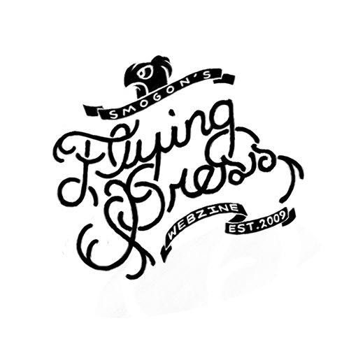
Logo #1

Logo #2

Logo #3

Logo #4
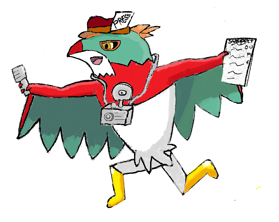
Logo #5

Logo #6

Logo #7
Logo #1

Logo #2

Logo #3

Logo #4
Logo #5

Logo #6

Logo #7

Last edited by a moderator:


