
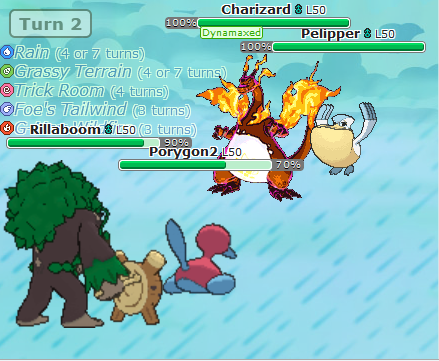
When there's a field effect active, it gets listed in the top left corner of the screen, and sometimes it also covers the whole background with a graphic. This is pretty good, but when multiple effects with backgrounds get stacked, it can get hard to keep track of, and effects that are only listed as text are easier to forget about. That's why I'm suggesting putting little icons before the effects in the list.
(though probably shifted over to the right a bit)
Even though some things like Trick Room and Light Screen would share an icon, having an icon there would still make it easier to tell at glance what effects are active. A colorful icon disappearing is much more noticeable than some faint text disappearing, so it would also make it more obvious that an effect without any visual indicator like Tailwind or Trick Room under terrain has worn off.


I modeled the icons after the modern symbols from Let's Go and SwSh, using the colors of Showdown's existing type icons.
(though probably shifted over to the right a bit)
Even though some things like Trick Room and Light Screen would share an icon, having an icon there would still make it easier to tell at glance what effects are active. A colorful icon disappearing is much more noticeable than some faint text disappearing, so it would also make it more obvious that an effect without any visual indicator like Tailwind or Trick Room under terrain has worn off.
I modeled the icons after the modern symbols from Let's Go and SwSh, using the colors of Showdown's existing type icons.


