
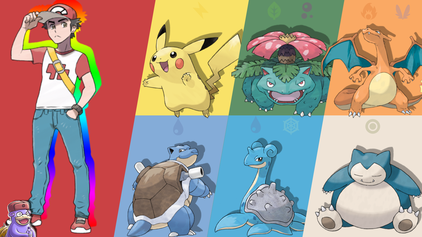
I create wallpapers from official pokemon art and sprites.
To see my entire collection go to https://pokewallpaps.myportfolio.com!
If you have request's please make them below! I am always happy for some inspiration.
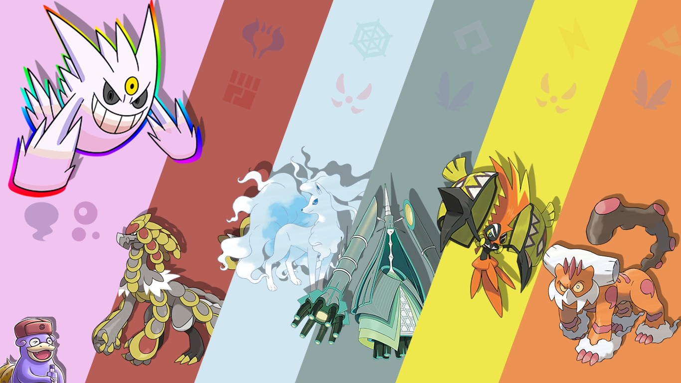
To see my entire collection go to https://pokewallpaps.myportfolio.com!
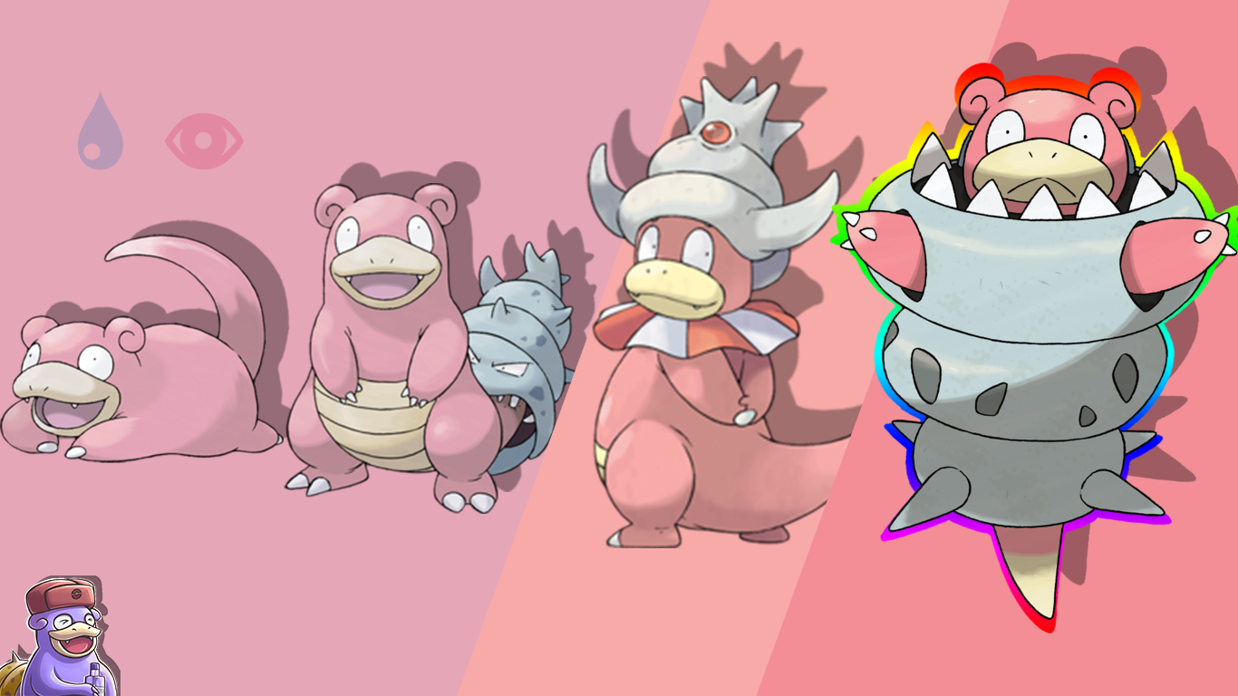
If you have request's please make them below! I am always happy for some inspiration.


