I discovered that there were some redesigns from Blue's front sprites in the GSC 1998 sprite cache, so I colourized some of them with their RB palettes and made transparent versions on PS canvases. As far as I can see, the back sprites are the same as SW97, so I haven't done anything with them. This is the last time the RB spriting art style was employed. I haven't done all of them though, as the full extent of the differences is largely undocumented...and there's not a good comparison resource. Nobody seems to care much for the back sprites...I know Dodrio, Weepinbell and Victreebel have different ones, though.
This sprite is extremely similar to SW97, but more refined and with bigger wings. It's one of the prettiest sprites I've ever seen, honestly...I really like it.
This Abra seems to have claws; the arms make me think the person who designed it did Rhydon and the Charmander line. Not sure, though, so don't hold me to it.
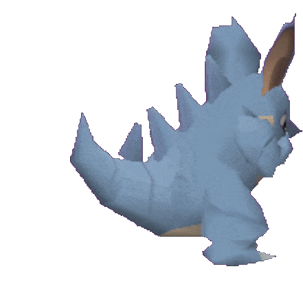
I'll be honest, I've never liked Kadabra's design, but this one is very significant. This is the first documented appearance of the star on Kadabra's head, and its belly stripes became much more pronounced. Seeing it in this colour scheme is interesting for sure.
To the right on my scratchpad is the SW97 back sprite, for comparison. One of only two different back sprites that I know of, this sprite bridges Bellsprout's RB and GSC designs. Gone is the black stalk, and the eyes are more defined. I'm not sure why Bellsprout specifically got this revision, nor why there are so many, but yeah, it exists.
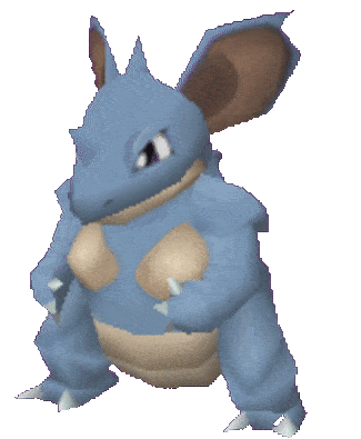
This Seadra design pronounces the belly more prominently. I didn't really think of it until now, but it looks a bit like a cravat. In later iterations of Seadra though, they tone down the cravat thing and make them more like scales. Comparing this and RB...they look so different, almost like different Pokemon, considering the more "pointy" design. Man, how far we've come...
Received a visual overhaul, presumably by a different artist.
This Magmar design doesn't outline the fire on its tail, which is curious, as it lines it up with the Charmander line designs, as well as Yellow Magmar. I believe it may have had a different sprite artist because of this. Furthermore, the fire on the belly is more defined, with fewer flames "rising", which aren't present in any other Magmar design of the generation. This design would not be seen until Emerald, where it would remain until now! There seem to be fewer stripes/sections on the arms too, but it still lacks the weird frills given on the Yellow redesign. Thus, you could say this is an intermittent design stage for Magmar.
Even as Smogon's resident
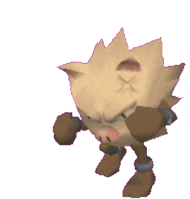
genwunner Kanto enthusiast, I can't bring myself to like this sprite, and all 20 minutes I put into colourizing it I could tell it wasn't gonna look good. What I can say though, is it looks very similar to the Yellow design pose-wise. Thus, I believe this sprite may have been a precursor to it, and I regard that sprite as one of the best Game Freak has ever done. We all have rough beginnings...
This is similar to the Yellow sprite, eye-wise. The tentacles are also a bit fatter and more pronounced. Like Magmar, I believe there was a different sprite artist at play here.
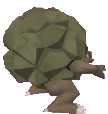
Despite the back sprite and everything saying Omastar had spikes, in this 1998 sprite revision, they were removed. I am assuming the sprite is unfinished or something, I can't imagine an Omastar without spikes happening after everything that was done at the time. It even got Spike Cannon!
Seen this art style around on a bunch of bird Pokemon that went unused, I think a bunch of them were scrapped. I believe it's the RB Pidgey artist. Honestly, this design just looks completely different. A different chest, modern tail, and a different face. Very interesting sprite.
Moltres received a visual overhaul, matching its modern design. Not much else to say...it's completely different and likely came from Ken Sugimori's redesign period, before later going to Yellow.


 RBY Sprites Project

 822 bytes Views: 54