Pokemon Evolutions that disappointed you?

A simple thread idea that might've been done before. What is a Pokemon line who's evolution only made it worse, or wasn't as good as you were hoping? For me, it's these evolutions.

:sm/crabrawler: --> :sm/crabominable:
WHY. Why did they do this? They took such a charming design and ruined it with Crabominable. Now I don't think Crabominable is the worst design ever, but as an evolution it's definitely the most disappointing ever.

:sm/Frogadier: --> :sm/Greninja:
I've made it clear that I'm not a big fan of Greninja. I don't actually think it's a bad design, in fact it's a good design...it's just that the tongue scarf is very gross. Clever, but gross. I wish they stuck to Frubbles.

:sm/Hakamo-o: --> :sm/Kommo-o:
I don't necessarily think Hakamo-o is the greatest design in the world, I just think Kommo-o is really ugly
 

Oh Coalossal, Game Freak did you dirty.

They had a nice thing going. Rolycoly looks great, and is based on a wheelbarrow of sorts. Carkoal, even though it looks like a Banjo-Kazooie enemy, I can still respect it.
With Coalossal, it's like they gave up and just decided to make a generic monster in the end. There's so much more they could have done with the design. An escavator, a dump truck, a bulldozer, a drill.
Nope, just rock monster. So tragic.
 
1630691910949.png
1630691917033.png

I think Charmeleon is great. The red coloring is just so cool. But with Charizard, it changed it back to orange, which feels like a step back from the coolness of Charmeleon. Red feels more suitable for a Fire-type starter IMO. Fortunately, there is Mega Charizard X, which saves Charizard for me.

1630691929648.png
1630691946834.png

I think Pidgeotto is pretty cool, it was one of my favorite Pokémon when I was a kid. I have never really cared much for Pidgeot though. It feels like a big step back as I think it loses all the coolness it had as a Pidgeotto.

1630692044426.png
1630692065354.png

Poliwhirl is a pretty fun Pokémon, but Poliwrath never really felt like a "final evolution" to me. It feels more like a Poliwhirl 1.2 or something. It goes from tadpole -> tadpole -> tadpole, without ever becoming a frog. Politoed feels much more like a final evolution than Poliwrath ever did.

1630692135375.png
1630692140766.png

Krabby is a fun little crab, it looks so jolly! Kingler looks like they tried to make a cool and edgy version of Krabby, but without going all out, leaving it half-finished. Plus, I have never liked how one of its claws is bigger than the other, I wish its sprite in R/B (or something similar) was its official design instead.

1630692175797.png
1630692181638.png

1630692197198.png
1630692200474.png

1630692213170.png
1630692220510.png

Not sure if these count since the baby was introduced after the evolution. But even so, I think Cleffa, Igglybuff and Smoochum are really adorable, while Clefairy, Jigglypuff and Jynx have none of that adorableness.

1630692252602.png
1630692258613.png

Skitty is also super adorable, and while I think Delcatty is okay, it is not nearly as cute as Skitty.

It seems like I am mostly disappointed by evolutions from Gen 1. When it comes to my preferences, I guess the newer generations just did a better job with final evolutions. While there are many evolutions that were completely different compared to what I had expected, notably from the newer generations, I wouldn't say I was disappointed in any of them.
 

ScraftyIsTheBest

On to new Horizons!
is a Top Contributor Alumnusis a Smogon Media Contributor Alumnus

Oh Coalossal, Game Freak did you dirty.

They had a nice thing going. Rolycoly looks great, and is based on a wheelbarrow of sorts. Carkoal, even though it looks like a Banjo-Kazooie enemy, I can still respect it.
With Coalossal, it's like they gave up and just decided to make a generic monster in the end. There's so much more they could have done with the design. An escavator, a dump truck, a bulldozer, a drill.
Nope, just rock monster. So tragic.
I still stand in my opinion on how Coalossal should have looked more like a train. Rolycoly is a piece of coal on a wheel, in addition to looking like a wheelbarrow, and it's no secret that it's found in a mine in Galar, hence the theme. Carkol is on theme in spite of its appearance because it looks more like a mine cart. Coalossal straight up breaks the theme entirely unfortunately and it's a shame because the theme Rolycoly and Carkol were heading towards was not only fun and creative, it was remarkably fitting for them being based on coal and living in coal mines.

Coalossal would've been much more awesome if it looked like a full blown mine train, as that would've further driven the theme its pre-evos had and it would've been remarkably fitting for a coal mine-based Pokemon to have it become a full blown vehicle designed for carrying coal out of the mine en masse. From a wheelbarrow, to a mine cart, to a full blown mine train would've been a wonderfully cohesive theme for the Rolycoly line to head toward.

It's a true shame Coalossal broke the theme and ended up as a poor man's Golem or Gigalith.
 
:rs/torchic: :rs/combusken: :rs/blaziken:

This line just doesn't work for me. Torchic starts off quite cute. Then Combusken comes along and doesn't look much anything like Torchic not to mention looking quite bizarre with its obviously phallic shape. And finally Blaziken who doesn't look like a natural evolution of either Torchic or Combusken and looks quite ugly to me frankly with its weird hairdo and bell bottom pants. Not a good start for Fire Fighting starters in my opinion.
 

Oh Coalossal, Game Freak did you dirty.

They had a nice thing going. Rolycoly looks great, and is based on a wheelbarrow of sorts. Carkoal, even though it looks like a Banjo-Kazooie enemy, I can still respect it.
With Coalossal, it's like they gave up and just decided to make a generic monster in the end. There's so much more they could have done with the design. An escavator, a dump truck, a bulldozer, a drill.
Nope, just rock monster. So tragic.
I still stand in my opinion on how Coalossal should have looked more like a train. Rolycoly is a piece of coal on a wheel, in addition to looking like a wheelbarrow, and it's no secret that it's found in a mine in Galar, hence the theme. Carkol is on theme in spite of its appearance because it looks more like a mine cart. Coalossal straight up breaks the theme entirely unfortunately and it's a shame because the theme Rolycoly and Carkol were heading towards was not only fun and creative, it was remarkably fitting for them being based on coal and living in coal mines.

Coalossal would've been much more awesome if it looked like a full blown mine train, as that would've further driven the theme its pre-evos had and it would've been remarkably fitting for a coal mine-based Pokemon to have it become a full blown vehicle designed for carrying coal out of the mine en masse. From a wheelbarrow, to a mine cart, to a full blown mine train would've been a wonderfully cohesive theme for the Rolycoly line to head toward.

It's a true shame Coalossal broke the theme and ended up as a poor man's Golem or Gigalith.
I think y'all are letting Carkol off the hook too easily. It may not abandon Rolycoly's wheel, but it does abandon its giant asymmetric glowing eye. I can't think of an evolutionary line more set on systematically erasing everything unique about a Pokemon than Rolycoly's.
 
Incineroar. It traded out Litten's a aloof cuteness and Torracat's ferocity to turn into some cringey tiger mascot. I was really hoping for a third fire evolution that was going to be less humanoid.

Its ridiculously broken in competitive doubles. Just haivng fake out and intimidate on the same mon was enough to make Hitmontop pretty good. Throw in parting shot, roar, snarl and significantly better stats and its just broken. I wouldn't be so annoyed with Incineroar's design if I didn't have to see it in over half the teams in VGC for almost all of the last three years.
 
Last edited:

QuentinQuonce

formerly green_typhlosion
Crobat.

Golbat's design is so much neater, sleeker, and imposing than Crobat's. Later generations have really toned down its weirdness, but its original design from RB was like a giant, drooling mouth with wings...

1630706408423.png


...and its animations from the GameCube games had it obsessively covering up its mouth until the time came for it to use an attack, which was both endearing and bizarre. This was even made a plot point in the Adventures manga, in which Koga's Golbat can be distinguished from others of its species in that it has an unusually small mouth.

1630706450429.png


It did need an evolution, but Crobat just stinks. It isn't particularly brilliant statwise aside from its insane Speed, and is an incredibly underwhelming battler. The design is awful, particularly in later games. Crobat didn't look utterly terrible pre-BW, but the massive, ungainly wings coupled with its tiny body make it look cumbersome and inelegant, particularly in 3D - the GameCube titles gave it a pinwheeling animation where it launches itself at the foe on its side, which - while A* for effort - makes it look even clumsier. It doesn't look at all like something with blazing speed or agility. Plus it doesn't look anything like the other members of its line and the inconsistency turns me off - the design motif of Golbat's massive mouth is dropped. To add insult to injury, Zubat and Golbat's shiny forms look pretty decent (dark green nearly always looks good, imo) but I strongly dislike Crobat's shiny.
 
This is something that almost never happens. When a line starts good, it ends good (think reptiles, including birds), and when a line starts bad, it ends bad (think canids). Sure, it can end up not as good as the previous stage, but I can't call that a disappointment if my opinion of it is not much worse than the previous one.

That being said, a very small amount of examples exists where I like a Pokémon but not its evolution...

:sm/torracat:

Whereas Litten and Incineroar's personalities were something I found endearing, Torracat feels completely forgettable to me. It's just kind of there... and does not stand out at all in any way or form. It's forgettable to the point I was about to forget to place it on this list!

:ss/obstagoon:

Linoone, both Hoennian and Galarian, is one of my favourite non-reptilian Pokémon. A sleek design that goes pretty well and with an often serious demeanor on its face. You know the memetic complain "They are now Digimon"? Well, Obstagoon is perhaps the sole Pokémon that I think applies to it. There's still some badger things there, and technically the KISS motif was already present in Zigzagoon and Linoone, but it still feels completely out of place.

Perhaps another example exists, but my mind prefers to ignore it - I might only remember these two because they are recent. Take it as you will.
 
What is the deal with fire starters? Almost no grass or waters have been mentioned, but everyone seems to have a fire-type final evo that ruined the mon you started your journey with.
:fennekin: :delphox:
For me it was XY. Fenneken was revealed and I was in love. An adorable fennec fox? Obviously I'm picking that. And then the evos were revealed. Went from a fox to actual furbait, and the ears look so much worse on a humanoid. It's just bad.
 

Oh Coalossal, Game Freak did you dirty.

They had a nice thing going. Rolycoly looks great, and is based on a wheelbarrow of sorts. Carkoal, even though it looks like a Banjo-Kazooie enemy, I can still respect it.
With Coalossal, it's like they gave up and just decided to make a generic monster in the end. There's so much more they could have done with the design. An escavator, a dump truck, a bulldozer, a drill.
Nope, just rock monster. So tragic.
I actually think Coalossal was supposed to be based on a coal furnace. This is much more evident in its G-Max form... but they just should’ve made it that obvious from the get-go!
 
Later generations have really toned down its weirdness, but its original design from RB was like a giant, drooling mouth with wings...

View attachment 369542
Actually it's ORIGINAL design did not have that tongue. This is the original Japanese Red and Green sprite:


Also remember that the Red and Green sprites were designed before Sugimori made art for the Pokemon(The art itself was his personal interpretations of the sprites), or even before deciding what colors each Pokemon would be(which wasn't thought up until later in development when they decided to add extra functionality when played on the Super Game Boy)
 
Last edited:
What is the deal with fire starters? Almost no grass or waters have been mentioned, but everyone seems to have a fire-type final evo that ruined the mon you started your journey with.
:fennekin: :delphox:
For me it was XY. Fenneken was revealed and I was in love. An adorable fennec fox? Obviously I'm picking that. And then the evos were revealed. Went from a fox to actual furbait, and the ears look so much worse on a humanoid. It's just bad.
I still think my most unpopular opinion is that I like Delphox way more than Greninja. I've noticed I tend to have a higher tolerance for humanoid starters, outside of the ones that are way overboard (Cinderace) or ugly outside of the humanoid aspect (Blaziken). Pokemon like Delphox and Incineroar are Pokemon I really like but won't go out of my way to defend, because I can understand why someone would dislike them. The transition from cute 4 legged animal to bipedal humanoid creature is pretty jarring, even if I like the designs.
 

ScraftyIsTheBest

On to new Horizons!
is a Top Contributor Alumnusis a Smogon Media Contributor Alumnus
I actually think Coalossal was supposed to be based on a coal furnace. This is much more evident in its G-Max form... but they just should’ve made it that obvious from the get-go!
The G-Max form's dex entries upon reading them do really emphasize this in a sense:


SwordIts body is a colossal stove. With Gigantamax energy stoking the fire, this Pokémon's flame burns hotter than 3,600 degrees Fahrenheit.
ShieldWhen Galar was hit by a harsh cold wave, this Pokémon served as a giant heating stove and saved many lives.

It even has lore that its G-Max form is not only a massive stove, but at one point in Galar's history it literally functioned as a giant living furnace for the entire region when Galar was hit with a cold wave that made the region cold and thus made it livable even in spite of that.

The G-Max form is a lot neater and stands out a lot more than Coalossal itself who kind of doesn't really nail the whole "furnace" look with its design imo.
 
There are some unevolved Pokemon I prefer (like Ivysaur, Sealeo and Torracat) but I will only list major examples of evolutions I consider significantly worse.

:ss/Pikachu: ---> :ss/Raichu-Alola:
Alolan Raichu: Not only does it look worse than Pikachu, it also looks much worse than the original Raichu.
:ss/Seadra: ---> :ss/Kingdra:
Kingdra: It looks fine but Seadra is one of my favourite water types so its evolution being just fine is a pretty big downgrade.
:ss/Vigoroth: ---> :ss/Slaking:
Slaking: I like its power but its ability and design disgust me a bit.
:ss/Bunnelby: ---> :ss/Diggersby:
Diggersby: This is so ugly, Jesus Christ.
:ss/Swirlix: ---> :ss/Slurpuff:
Slurpuff: Swirlix looks cute, its evolution does not.
How dare you disrespect the almighty Alolan Raichu. Everything else I agree with (except Slurpuff), especially Kindra. I'm not saying it's the worst out of these but I feel like it's really overrated, plus the mouth and fin on it's back look dumb
 
:ss/Vigoroth: ---> :ss/Slaking:
Slaking: I like its power but its ability and design disgust me a bit.
My issue there is the Slakoth-Vigoroth-Slaking line as a whole. I like the idea of a mon that radically changes in appearance and method of battling as it evolves, so I'm fine with either Slakoth-Vigoroth-Bigoroth or Vigorlittle-Vigoroth-Slaking. But going from Tiny/Brown/Lazy to Big/White/Energetic to Giant/Brown/Lazy doesn't work. It should pick a direction and stick to it. Also, the gen 4 sprite was gross.
 
This is obviously very YMMV thread.
For one, I personally liked Braixen and AloRaichu. They're perfect, thank you.

Now, to get to the point.

Cinderace

Galar trio, among the others, I personally see to be unable to live up the expectations of Kalos and Alola trio. As someone not British, I feel like their themes are kinda disjointed and not complementary to each others. But I'm willing to look past that for the grass gorilla, while Inteleon is barely okay, with that uncannily human looks.
Cinderace, however, is difficult to be liked for me. It went from a bunny into a soccer player wearing fursuit. Less of what they want to envision than a soccer team mascot.
I think it's the "hair" thing. Or could it be the "fur pants"? Or maybe how they made its hand stubby in official artwork... Idk.
GF giving it Libero only shows to me their blatant nepotism. Just what kind of dark magic did it use to be able to change types? (At least frogge can be excused as he's ninja.) I only like the bunny because of Gou in anime now.
Shame, I actually liked the fake possibly Fire/Steel rocket rabbit concept that was around....
 
Last edited:

CTNC

Doesn't know how to attack

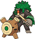
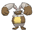
I like Rillaboom a lot, but I don't like how different is is from its pre-evolutions. The theme is there, but it's such a sudden massive change. Grookey evolving into Thwackey is very easy to see, but the sudden massive change makes it hard to see how Thwackey evolves into Rillaboom. Rillaboom's so much bulkier and the color's completly different. It's almost like there's a stage missing.
What is the deal with fire starters? Almost no grass or waters have been mentioned, but everyone seems to have a fire-type final evo that ruined the mon you started your journey with.
:fennekin: :delphox:
For me it was XY. Fenneken was revealed and I was in love. An adorable fennec fox? Obviously I'm picking that. And then the evos were revealed. Went from a fox to actual furbait, and the ears look so much worse on a humanoid. It's just bad.
I can't argue with the fur part. It went from a fox to fur.

Weight According to Pokedex: 86.0lbs/39.0kg
My Shaved Weight Estimate: 43.0lbs/19.5kg

I'm partly joking, partly seriously thinking I can't be that far off. As for the bait part of furbait, I'm willing to bet that people that hate that started hating the chain at Braixen. I don't care about furry stuff, (except Rule 34... 0_o) but how much the "skirt" sticks out and the ear fur was bad enough and it hinted that the final evolution would be even worse. Chespin's evolution, Quilladin, was at least unclear with what direction it was going. Chesnaught made Chespin go from my least favorate (but still not bad) to my favorate starter in XY.
I still think my most unpopular opinion is that I like Delphox way more than Greninja. I've noticed I tend to have a higher tolerance for humanoid starters, outside of the ones that are way overboard (Cinderace) or ugly outside of the humanoid aspect (Blaziken). Pokemon like Delphox and Incineroar are Pokemon I really like but won't go out of my way to defend, because I can understand why someone would dislike them. The transition from cute 4 legged animal to bipedal humanoid creature is pretty jarring, even if I like the designs.
The Underrated Pokemon thread (Bottom of Page 2 and Top of Page 3) changed my opinion of Delphox from terrible to it'd probably be really cool if there was less ear fur, if the robe split into actual legs at some point instead of being 1/4 of its weight, and/or we got to see it in 2D first. At least I don't hate it any more.


Speaking of Greninja, I'm not complaining. I'm just comparing it to Rillaboom because Frogdier is a really good transition so it doesn't feel like as massive of a change. That said, it's still a massive change and I definitely understand why some people don't like it and, as much as I think it's cool, something about it makes me think it feel angular or something. Something about the pose? Maybe how flat parts of it are? Something about it feels a little off to me...


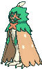
The Cute owl starter evolving into a what looks like a waiter is odd, but I don't dislike Dratix. The disappointment comes from Decidue. It just looks plain to me. I know it's supposed to be an archer but the hood and face being solid green, the cloak wings being light brown with white spots, and the body undernaith being just white is just boring.


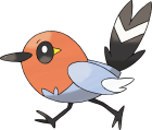
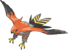
Using the official art for this one so you can understand my first reaction. "It looks like it's wearing an ugly pair of sweatpants!" That and the unorigional name Talonflame on top of the Fairy type being real made me quit Pokemon. (I came crawling back 10 days after the games came out and bought Y. Turns out I can't quit. I'm here forever.) It's much better in game because you never see it from that angle.

There's another Pokemon revealed at the same time that I'm still annoyed about. Why doen't Flabébé doesn't become part Grass when its final evolution litteraly becomes part of the flower?


I'm mostly joking about this one but I wouldn't be suprised if it's a popular opinion just because Dubwool makes Wooloo stop being Wooloo after evolution. Not being Wooloo is only complaint about Dubwool. Dubwool grew on me and I think it's kind of majestic.
 
Honestly everything about Greninja's design is cool except for the gross tongue scarf.

I'm also not a fan of Decidueye. Design wise it's cool but the wings act really weird in it's 3D model. Go on Pokemon Home, tap it a few times and you'll see what I mean.
 
What is the deal with fire starters? Almost no grass or waters have been mentioned, but everyone seems to have a fire-type final evo that ruined the mon you started your journey with.
Well, if you see the post-Gen 3 Fire-type starters, you can easily guess why. You have the mediocre Chimchar and Tepig lines, the hideous Fennekin line, and the okay-ish Litten and Scorbunny lines.
 
pretty much every since Gen 6 Starter Final Forms. I feel the starters should have designs were you can imagine their characters and feel like actual animals instead of a soccer playing furry.
Also I don't like some of the Cross Gen Evolution we got in Gen 4.
Pokémon-Icon 125.png
Pokémon-Icon 466.png

The dangerous and wild looking Electebuzz became the derby looking E-Vire

Pokémon-Icon 299.png
Pokémon-Icon 476.png

Nosepass isn't my favorite design but it's fine for what it is. But it's evolution looks very ugly and derby, a combination I don't really appreciate

Pokémon-Icon 112.png
Pokémon-Icon 464.png

Badass Dinosaur with horn that was hard to get and already pretty powerful. Then it became... whatever that other thing is. It's tail is a bolder. It can't even list its arm and looks like something you can build with legoblocks

Pokémon-Icon 108.png
Pokémon-Icon 463.png

The Pokemon known to have pride for his long tongue got an evolution where his range got shorter. It feels like it regressed. Wish we got that Gold Spaceworld Demo evolution instead. It would also have a cooler name like Licking B)
Punsters finest work
 

Daylight

angels roll their eyes
is an Artistis a Contributor to Smogon
Well, if you see the post-Gen 3 Fire-type starters, you can easily guess why. You have the mediocre Chimchar and Tepig lines, the hideous Fennekin line, and the okay-ish Litten and Scorbunny lines.
The only Fire starters I’ve picked have been Torchik and Fennekin, so I can’t comment on the others, but I do think Fennekin is mostly hurt by Delphox’s in-game model being kind of awful. If you look at its official art or artists’ renderings of it (like the one below by bluekomadori) it looks much ooler.

1630739757421.jpeg


Speaking of in-game models and fiery foxes though, one ‘mon I was disappointed by upon evolution was actually Ninetales—but specifically only in Pokémon XD.
1630740877071.png
1630740928419.png

Vulpix’s model is kinda dated looking in the Orre games, but it’s still pretty cute. But Ninetales…

1630740697847.png


It’s just… not good. And it looks particularly bad next to the gen 2 & 3 mons. I know that has everything to do with model basically being taken straight from the stadium games… but Ninetales is actually one of my like… top 5 favorite Pokémon, so it hurts.

Probably the evolution I was most disappointed by though… is Galarian Rapidash. And I actually still really like Galarian Rapidash! It’s more that I just was in LOVE with Galarian Ponyta when it was unveiled, and I was so hyped to see Rapidash!

1630741728799.png


And then this was leaked… and, simply put, it just did not measure up to my expectations. The wild & pure charm of Galarian Ponyta was traded for… a very strangely and overly groomed show-horse.

And of course by then I had seen a ton of cool fan interpretarions of what Rapidash-G could look like—like my personal favorite by artsy-theo:

1630741844570.jpeg


I mean, damn. Can you imagine if Rapidash had looked like this? What an incredible design. It’s majestic and fierce yet elegantly simple all at once. The beard and the lion’s tail are particularly nice touches, and I love the colors the artist chose. They’re beautifully nuanced and communicate iridescence in an incredibly effective way. And you gotta love that rainbow spiral horn. Pastels done right!

…Damn. No wonder I was disappointed. If Galarian Rapidash had looked like this it might have even eclipsed Milotic as my favorite Pokémon. (Well maybe it would be more like a tie, but still!) Maybe in an alternate universe.
 
oh boy... Galarian Rapidash doesn't even look like Rapidash except that both are Unicorns... Honestly, they should have given it a completely different name if they make it look like that.
Persian looks ugly in its galarian form, but at least you can tell its a Persian.
 

Users Who Are Viewing This Thread (Users: 1, Guests: 0)

Top