Shadowshocker's Smogon Sketch Section

Shadowshocker

It shall rest here in peace. Forever, if you wish.
is a Top Artistis a Smogon Media Contributor
Don't mind me lads, I'm mostly using this as a vanity dump for Smogon contributions because there's only so many browser tabs I can open up


bio might come when I'm less embarrassed
 
Last edited:

Shadowshocker

It shall rest here in peace. Forever, if you wish.
is a Top Artistis a Smogon Media Contributor
"Who's Golem? RHYDUNNO, LOL"


If you told me half a year ago that previous generations as old as the original tricolour cartridges had a metagame I wouldn't have believed it, but here we are. And had it not been for Plague von Karma's initial RBY message-style art I mightn't have been inspired to draw Golem getting toppled from its VERUSED position, with a little help from its rival. I'm still pretty terrible at rendering convincing rock textures, I'd say, but the RBY-coloured letters is my usual way of diverting attention from incompetence with jokes.

https://www.smogon.com/articles/rby-golem-fall
 

Shadowshocker

It shall rest here in peace. Forever, if you wish.
is a Top Artistis a Smogon Media Contributor


So with the official launch of Team Spain for the Unofficial Retro Cup 2021 tournament I think it's fair to drop my first attempt at a logo request. My shading approach in Illustrator certainly doesn't work as well as I'm used to in Photoshop and I'd certainly say I haven't quite nailed the edgy inevitable bull/canid/dragon/lycanthrope aesthetic. But at the very least this request by Kiry4n was fun to work on.

Does it mean requests or commissions? Likely not in the immediate future. I'm not certain I want to open that can of worms sliding down the slippery slope just yet. I'm perfectly at peace with CAP and Flying Press being my primary requestors (read: volunteer...ees? What's the word for the recipient of volunteer work?)
 

Shadowshocker

It shall rest here in peace. Forever, if you wish.
is a Top Artistis a Smogon Media Contributor
"I like shorts! They're comfy and easy to High Jump Kick your face in!"


I don't actually have a particularly clever quip for this one aside from thinking that Mienfoo kinda looks like it's wearing an outfit, and also Little Cup = Youngster Trainer Class, right? I'd already rendered Vullaby as the bratty bully of the nursery so Mienfoo as the kid who's too cool for school sorta made sense, and that way I got to use actual spotlights like I did for Dynamax Yveltal, and building blocks spelling out something. I was certainly not keen on replicating the original SS Youngster's intricate shirt design so replacing it with the kick graphic both made total sense and saved me from doing extra work or feeling guilty about avoiding it. I think convincing yourself "I'm right and I'm okay with this" is something artists need to do more to themselves in general.

https://www.smogon.com/articles/ss-lc-spotlight-mienfoo
 

Shadowshocker

It shall rest here in peace. Forever, if you wish.
is a Top Artistis a Smogon Media Contributor
Fly high into space to charge my
Laser Powered Goblin SMASHER
With the force of solar fusion
FLOOOOOWING THROOOUGH MYYY VEINS


Smearglers familiar with the Flying Press process know that article release is a tricky thing, which is why the brush style I used here is still quite messy because this piece was actually worked on before articles like ReCAP 28. Background art is still something I heavily struggle at until Zephyri suggested that I play around with some brushes and opacity. Since then I've been abusing the default media brushes, colour and size variance for my very basic backgrounds and not looking back.

The premise of two Monotype champions jousting was always the base idea for this, which I briefly ignored for fear that I'd complicate it, but that's also what makes such pieces fun. Dreepy wearing baby armour while parked in Dragapult's helmet might be the most entertaining thing I did. Team Electric was originally supposed to be Team Flying until I decided "Nah, I'm not drawing a Landorus-Therian mount". That said, I'd already found myself way too deep in before realising that Tapu Koko should really be impaled by Magnezone's antenna. Whoops!

https://www.smogon.com/articles/monotype-crown-tundra
 

Shadowshocker

It shall rest here in peace. Forever, if you wish.
is a Top Artistis a Smogon Media Contributor
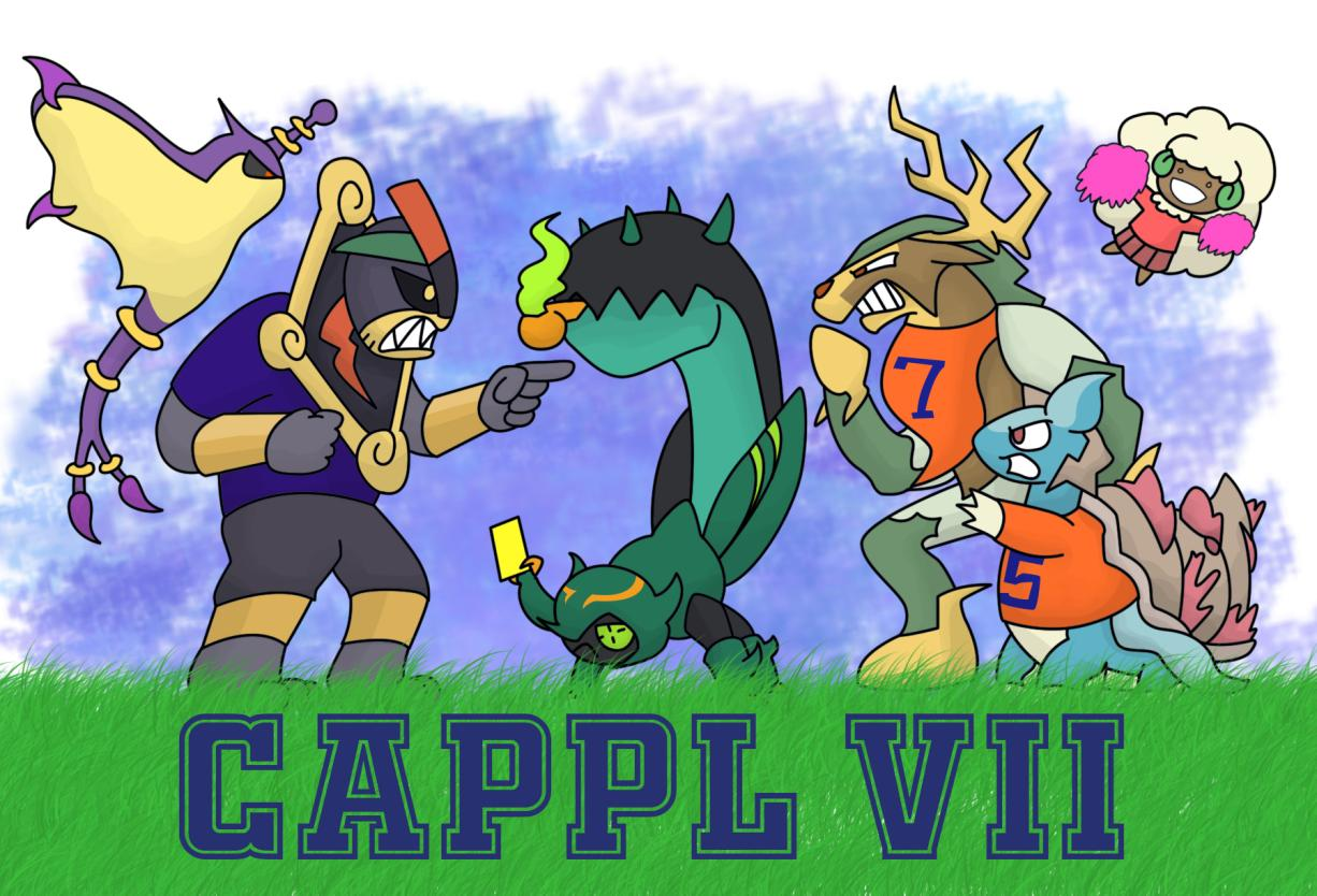
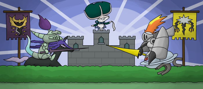
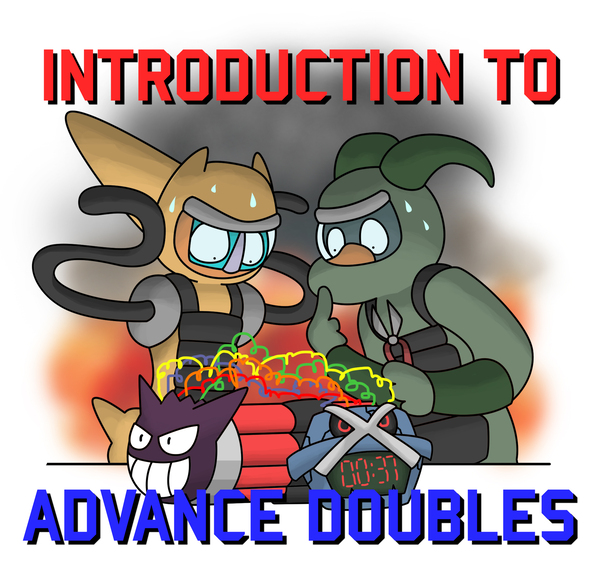
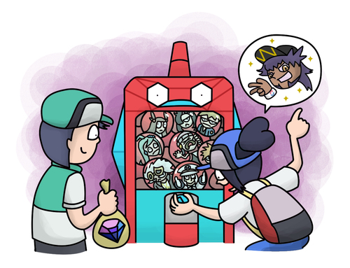
"Wait, is this for Landorus-Therian or Landorus-Incarnate? The artwork isn't actually consistent on which one is used, and the Defuse card uses the Incarnate mustache but Therian cloudy hand things?"
"You're right, clearly this artist has no idea what he's doing and should be ashamed of himself"


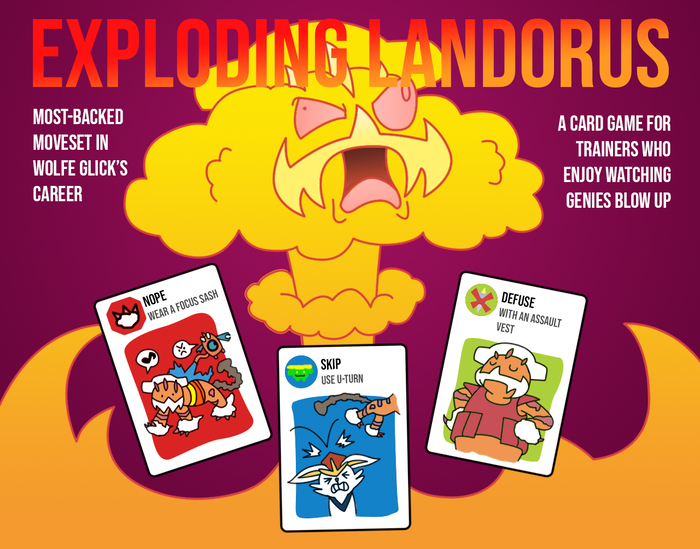
I think this work might have hit personal records for Smogon Sketch engagement counts on the Facebook page, but in retrospect it probably wasn't surprising. Look, it involves kittens and Matthew Inman; that really shouldn't need explanation. Back when I was a student in circa 2006, this was where a friend of mine introduced me to The Oatmeal and I've had a glancing relationship with Inman's brand of humour and storytelling ever since. I've actually tended to prefer his earlier work that relied more on infographic explanations of grammar, the effects of coffee on the body and why working in design is an absolutely cursed role. I personally think his more recent work based on very sketchy line quality and focusing on animal awareness or motivations for running marathons feels more Instagrammable for the sake of appealing to Gen-Z tastes. But hey, he's the guy with published books and games and an astounding social media presence, while I'm the crusty curmudgeon with a passing background in game design, absolutely no motivation to run faster than a brisk walk and I'm largely skittish around animals that aren't contained inside capsules, so the man clearly knows what he's doing.

The turnaround for this article was pretty tight given that it was already fully written and approved and scheduled for release, before inspiration happened to strike me. Having FOUR copies of Exploding Kittens lying around the house might've done it, helped in no small part by the game's ridiculous amount of social media penetration and because we're all that lazy picking Christmas gifts for each other. Contrary to what a few of the comments on Facebook have indicated, I'm not a huge fan of Exploding Kittens; part of that might be due to my experiences trying to teach my relatives in a conservative Asian context how to play, and it's not just because I have to skim over the art of a man wearing the skin of a cheetah around his crotch. Having to explain the idea of "infinite actions within a turn as long as you have resources" and "combos you can play with cards that lack instructions" is, surprisingly, not as intuitive as designers might think it is. It honestly makes me wonder how my older relatives survived learning how to play Uno or Bridge, especially when you consider poker cards don't come with illustrated rulebooks. But as Decker Shado would put it, I suppose we all have a perverse interest in watching felines BLOW THE F*CK UP.

Article author zeefable also noted that at this point I'd done the art for most of the articles she's written, referring to me as "the goat". Thanks to Overwatch I'd already learned what "the goat" means, but I couldn't resist referencing Tintin's Destination Moon:


This is going to be my response any time I'm called a goat and in my opinion, there's not much that can match up to an infuriated Belgian professor who's only hard of hearing in one ear.

https://www.smogon.com/articles/vgc-history-landorus-t
 
Last edited:
Article author zeefable also noted that at this point I'd done the art for most of the articles she's written, referring to me as "the goat".
hope you don't mind me intruding but I just had to point out: so far all three of my solo articles (plus one still in a sorta WIP phase) have been graced with grandpa spider's art and I could not be more appreciative. I even had VGC friends who barely use this site reach out to me today to say how they really liked the art on this one and I hope that speaks to how well received it was in my sphere. Your art style and the way your work in these references is just really awesome, and I'm very thankful that you've worked with me on so much so far and maybe even more to come <3
 

Shadowshocker

It shall rest here in peace. Forever, if you wish.
is a Top Artistis a Smogon Media Contributor
When a problem comes along
You must whip it
Before the cream sits out too long
You must whip it
When something's going wrong
You must whip it

- Devo, Whip It (Freedom of Choice, 1980)


Media HQ watchers will know that this isn't my first attempt at an album art parody - the first one I've done is in an article currently in QC, and I'd be lying if I said I wasn't dearly anticipating for that one to go live sooner. I should say that I don't recall what Willow Smith's "Whip My Hair" sounds like; when it had airtime where I live it was already a point at which I'd stopped listening to free-to-air radio and I generally have distaste for anything produced by kids trying to be pop stars. But if it makes the pop culture reference obvious, it works, right? To be fair, this isn't a completely accurate parody. The "W" shape for "WILLOW" in the original could easily accommodate both "WILLOW" and "WHIP MY HAIR", and the Pacman shape here clearly can't. The original also lacked any meaningful background aside from a splatter of blue in the middle, but all things considered I'd like to think the blurry fire and overlapped "artist" name were a nice touch.

Mos-Quitoxe referred to this art as "distressingly lascivious" - I think the true horror is that the original product the art was based on was intended for a nine-year-old. Music industry, am I right?

https://www.smogon.com/articles/zu-suspect-centiskorch
 

Shadowshocker

It shall rest here in peace. Forever, if you wish.
is a Top Artistis a Smogon Media Contributor
"This Grimer is enjoying this way too much." - TMan87


If you've ever had a brief brush with learning how to draw, you'll probably realise that drawing humans - even stylised humans, or anime pretty boys and kawaii girls - isn't easy. Outside of my heavily deformed approach, attempting to sketch other human characters is something I regularly have issues with. On the other hand, I can't say I relish sketching intricate motorcycle parts either. I'm pretty sure there's some Harley Davidson enthusiast who died a little inside looking at my attempt to blow up the Generation IV sprite.

So instead of going with drawing human NPCs dissatisfied about their lives as someone to be punched for lunch money, I had a "what if" moment - what if Trainers were the ones being collected, battled with, and discussed by Pokemon in a mirror universe? The branched evolution of the Punk Guy really sold the concept, since it'd provide an actual point of discussion between two Pokemon kids and what they should evolve their Punks into. I wish I could say that Mankey and Grimer were shortlisted as a statement on Generation 1's design legacy, but nah. I picked Mankey and Grimer because I needed Pokemon that were relatively easier to draw and had hands to hold their folded paper DSes with. The fact that their expressions mirror the skeptical moody kid and his overenthusiastic best friend on the playground is a happy coincidence, but I like to think this evokes memories we all had as children discussing our passion with like-minded peers. There's a Grimer that's enjoying this way too much in all of us.

https://www.smogon.com/articles/life-of-trainer-lines-2
 

Shadowshocker

It shall rest here in peace. Forever, if you wish.
is a Top Artistis a Smogon Media Contributor
"Keep Hyperoffensing and Nobody Explodes" - Mos-Quitoxe


Ah, the joys of last-minute work on tight deadlines for articles that have passed the GP and HTML team. It's like actual design work, except that it doesn't give me a sickening feeling in my stomach or the sudden urge to plot someone's tortuously painful demise. This piece was frankly going to be a lot more boring until I somehow got the idea to shade Deoxys and Houndoom the same way I did the Yveltal for Dynamax in AG - portray a light source coming from underneath instead of above. I think it ended up making the double Explosion disposal squad more dramatic than they actually are. At the same time, I tried to learn how to paint a background explosion with basic Photoshop brushes. It did not turn out well, which I don't exactly mind - layout art is a time-consuming, thankless task for something that usually isn't in focus. I tip my hat to those willing to put in the time to paint better backgrounds than the poop smears I rummage together.

https://www.smogon.com/articles/adv-doubles-intro
 

Shadowshocker

It shall rest here in peace. Forever, if you wish.
is a Top Artistis a Smogon Media Contributor
"Okay, Smearglers! Get to work! ♪"
"HOORAY!"


At some point in my reckless attempt to dive into design school in the mid-2000s I decided that I was a writer. Not because it was good or I was particularly well-read, but it was likely a means of escapism from the constant pressure of putting up with classmates who not only boasted honestly superior art skills (having being brought up on a diet of Warcraft fantasy, heavy doses of anime and 3D animation), but also for the most part avoided the Cartoon Network weirdo as much as possible. Writing was very much the only way I felt I could demonstrate the thought that gets put into my concepts, but given how the tenet of "humans are visual creatures" you can imagine how well walls of text went over with most people at the time.

I still have a strange relationship with writing. For me it's not so much of a skill as it is an outlet, an opportunity to go to town with thoughts and processes where sketching would simply be an inefficient labour for portraying what I want. The drawback I've come to accept is that the written word has simply mattered very little in an age where memes and images have become the universal lingua franca, and there is no shortage of enthusiastic creators spouting video essays and gaming articles on the subjects of their passions.

The publication of Smeargle's Studio Update #4 happened to coincide at a time where several stars in my life have... not been aligning in the most ideal ways, for which I am in the early stages of seeking recovery. So to not let things be overly depressing, I'd like to say the following. Kaiju Bunny inviting me to be a guest writer on this article, first and foremost, came as a very pleasant surprise. I'd not expected that the article would be pushed out in a month's time, so I'd dropped the ball a little on iterating the art I'd initially sketched until it was a little late based on article release schedule. The fact that I was able to work in Wigglytuff's Guild vibes from Albatross having a Wingull as her avatar was a nice nudge in the right direction, and being able to work on something this wholesome has been reassuring. The fact that this was the piece that netted me Top Artist role for Smogon is... more validating that I think even I have realised.

If you've been putting up with me as an artist, as a CAP-involved individual, as a writer, as a Pokemon GO enthusiast... thank you for giving me that moment of fleeting relevance.

https://www.smogon.com/articles/smeargle-studio-update-4
 

Shadowshocker

It shall rest here in peace. Forever, if you wish.
is a Top Artistis a Smogon Media Contributor
"Everything can be hacked - and every mon!"


Well, I don't think I've had some art age as badly as this one in terms of relevance - at least not since Vullaby eventually got its diaper smacked and banished from SSLC. But that's how the Lava Cookie crumbles sometimes in the world of copywriting articles for virtual monsters theoretically fighting each other for whimsical amusement. I will quote KeeganSkymin4444 and their reaction on SS Hackmons, for lack of any personal investment: "Gen 8 Pure Hackmons was mad wack cancer. It has always been a mess, but Neutralizing Gas and Eternamax turned it extra maddening."

I will say, though: Eternamax is not fun to illustrate. Chalk it up to my questionable art direction, but Eternatus is just not an enjoyable design for me. I swear the more I look at it, it just reminds me of a kid replicating multiple meshes after discovering 3D modeling software for the first time and extruding surfaces into a vague skeleton and calling it a Pokemon. Same thing for Eternamax - I'm not opposed to its role in the story (which is in itself another can of worms that has been flogged to death by various YouTube essays at this point), but I wish the concept had been executed more competently instead of giving everyone a claw with too many overlapping details. I mean, the two Eternamax with Neutralising Gas works to make the "hacking" motif, but did we really need so many spikes crammed onto each individual finger with a miasma of pink and white that I managed to make absolutely gruesome? Or maybe that underscores the Sword and Shield state of things. You decide.

https://www.smogon.com/articles/ss-pure-hackmons
 

Shadowshocker

It shall rest here in peace. Forever, if you wish.
is a Top Artistis a Smogon Media Contributor
"Electrode used Nasty Plot!"
"Electrode used, instead, Amnesia!"
"It's not very effective..."


So this ended up being another article nearing the tail end of its release without an image, and loath as I am to lend credence to the idea that inspiration comes more easily under tight deadlines or pressure, that's basically what happened in this case. I had a look at the Play! Pokémon logo and figured, "Huh. Maybe something along that design should work as a reference... red and white? Wait a minute, Electrode's National Dex number is 101. VGC 101?" To be absolutely sure I wasn't ripping off an exact copy of an existing emoji I made sure to verify that "electrode thonk" wasn't thing, at least not the version I had in mind.

Just so this doesn't turn into yet another rant about my unfamiliarity with Illustrator, the time I spent in the TCG aspect of things probably includes some of the fondest memories I have (2011 to 2016), purely because I had the opportunity to be an absolutely unapologetic nerd. None of it genuinely went anywhere given how cheap I was when it comes to paying for good cards or travel - I've never been to a regional outside of maybe one brief tournament during a short stint in the States and my main showings were in prereleases and local Nationals. The same applied to the decks I could run, with my favourites being Empoleon/Dusknoir/Kyurem during Boundaries Crossed and Weavile/Exeggcute during Plasma Freeze, for which I celebrated with a rendition of the deck I used:

ExileVilify.png


But possibly the fondest moment I have was during a prerelease tournament for Legendary Treasures, where my opponent played Cedric Juniper and asked me for the height of Charmeleon; getting it wrong would have netted him three cards. "3 foot 7 inches", I guessed, and there was an uproar for a radius of three tables after it was revealed Charmeleon was indeed 3' 7" tall. Best 3 cards I've ever drawn, as if I needed another reason to have 37 as my favourite number.

https://www.smogon.com/articles/vgc-events-101
 

Shadowshocker

It shall rest here in peace. Forever, if you wish.
is a Top Artistis a Smogon Media Contributor
"Yeah, sure, let's add EX at the back of our game's title for no apparent reason. ...What do you mean people are laughing at our new Twitter handle?"


Years ago in design school, the general vibe of drawing humans was that it was intensely difficult to do well. There were two schools of thought on this: humans were inferior to anime style, or humans were inferior to animal hybrids. The inferiority would stem from a wide variety of reasons ranging from "humans are boring" to "I believe on a philosophical level that humans are a frightful plague and we'd all be better off having our DNA either get assimilated or go extinct". As the Cartoon Network normie of the time, naturally my opinion mattered little - but I've come to agree that acknowledging some amount of stylisation is necessary to get used to, or you're going to beat yourself up constantly over how terrible your humans look.

This was art I'd hesitated working on because trying to fit in the amount of detail needed to not completely butcher an anime waifu or husbando is something I'm not used to, but the concept was just too fun to put off forever. "This spinoff looks awfully like a pay-to-win gacha game. Someone put a pay-to-win gacha game into my monster collection spinoff!"

https://www.smogon.com/articles/spinoff-spotlight-masters
 

Shadowshocker

It shall rest here in peace. Forever, if you wish.
is a Top Artistis a Smogon Media Contributor
Frankly any witty quote, aka any lyrical reference to Eiffel 65 has already been done to death so I'm just going to link Jonathan Young's cover of the inevitable.


Sometimes the stars align and it happens that the subject of an article happens to feature a subject Pokémon that helps the joke tell itself. Shiny Blacephalon (Bluecephalon?) just happens to have the quirky anatomy for me to make a reference to the alien from Eiffel 65's music video. Who apparently also has a name: Zorotl. And has an entire article on the sparse Eiffel 65 wiki which looks to me like painstakingly transcribed fanfiction. I think this work might have the nicest brush settings I found to make a nebulous, galactic blue backdrop for the shiny blues brothers (groan), plus another one to make theatrical smoke. Sadly I've completely forgotten what those brush settings were and will probably download free brushes off DeviantArt if the need ever arises again.

I'd also add that I'm pleased more than one Facebook reader got the Eiffel 65 reference, and any time someone recognises the horrible puns I put in these things makes my day.

https://www.smogon.com/articles/best-worst-blue-shiny
 

Shadowshocker

It shall rest here in peace. Forever, if you wish.
is a Top Artistis a Smogon Media Contributor
When a fist hits your face and puts you in your place
That's a Machamp
When a mon has No Guard and it hits very hard
That's a Machamp


The more I look at Machamp the more it makes me feel inexplicably uneasy. We went from vague gray musclebound reptiles to an absolutely ripped brute with half its face taken over by its lips. It's so uncanny and yet I can't really see Machamp being any other way, but it doesn't make me less confused why that design decision was taken. But nah, Machamp is just not all that fun to draw because of its reliance on musculature, even in simplified styles. You can't just draw a few scratches like Machop or bulge a few red lines like Machoke (which I've also found somewhat unsettling. Machoke should really have those exposed fibres checked out), otherwise Machamp just falls utterly flat. Same for the toga, or really any drapery in general. I kinda don't have much else to say in advice when it comes to clothing or musculature aside from to pray that you dislike yourself a little less when it's all done.

https://www.smogon.com/articles/italian-room
 

Shadowshocker

It shall rest here in peace. Forever, if you wish.
is a Top Artistis a Smogon Media Contributor
All I do is spin, spin, spin no matter what
Got hazards on my mind, I can't ever get enough
Cuz every time I'm on the battlefield
All these damn rocks go up
AND THEY STAY THERE -


It's rare for me to do more than one piece of art for articles - the only other time I've done so as of writing was for Random Battles to sell the gameshow concept. If I do so it's probably because I had an absolute blast with the concept, and you can guess that the 1.5 year long wait for this article to launch was pretty dire. Observers will probably have noticed by now that a common expression I do is frowning and infuriated, with narrowed eyes of wry resignation coming in a close second. The original idea was to have a hazard setter run across a floor, chased by a Rapid Spinner waving a broom like a furious janitor chasing after a rapscallion trailing muddy footprints on his floor - but Jirachi and Ferrothorn making it rain quickly proved far more hilarious.

I'm not actually certain what the thought process was for why I decided to reference T-Pain's "All I Do is Win" when I already had a banner idea, but the DuckTales 2017 remake was one of the cartoons I actually bothered watching around the time, and there's one scene where Flintheart Glomgold obnoxiously lords over a supposed victory over Scrooge McDuck - dressed in bling and making it rain, while the aforementioned song plays in the background. (I'd link that scene if only ContentID takedowns hadn't removed some of the better recordings of that clip.) Come to think of it that probably had some influence on the direction of the first image, too.

https://www.smogon.com/articles/bw-entry-hazards
 

Shadowshocker

It shall rest here in peace. Forever, if you wish.
is a Top Artistis a Smogon Media Contributor
They see me mowing my front lawn
I know they're all saying DOOOOOON'T DOWNLOAD THIS MOOOOOON


Something you can't quite avoid with art in advance is the shifting of metagames when the format shifts or corrects itself - and admittedly I hadn't checked the thread to notice the original moveset of Wishiwashi with Download, Wicked Blow and Water Spout get replaced with Vibrava. Which all things considered is a pretty big shame as Wishiwashi is one of those species I feel Sun and Moon kinda did the dirty on by keeping it tied to its ability. Honestly, it's not likely the article would have easily gone another way; the idea of an awkward whitebait downloading a Mega Stone for itself feels like something we probably wished we could do at some point. Is anyone actually old enough to remember Morpheus?

https://www.smogon.com/articles/ultra-mix-intro
 

Shadowshocker

It shall rest here in peace. Forever, if you wish.
is a Top Artistis a Smogon Media Contributor
deep breath
Ba ba ba bababa ba ba ba bababa ba ba ba bababa ba ba ba baaaaa BAAAAAAAAA badabaaaaaa (bidibidibidibidi) bada ba ba ba ba ba ba ba ba baaaa baaaa baaaaaaaaa (bidibidibidbidibidi) baa baaaaaaa baaa ba baaaaa BAAAAAAA baaaa ba ba baaaaa baaaa baaaaaa


Of all the videogame series I got into over the years, Ace Attorney might be one of the strangest. It makes no sense for what's basically a linear point-and-click adventure involving hapless attorneys, ridiculous courtroom antics and "suddenly, spirit mediums" to be this wildly successful. Was it the over-the-top animations? Was it the absolute bangers of music churned out with every entry? Was it the odd sense of kinship I had with index fingers being pointed being a fan of the Kids Next Door way back when? Even now I couldn't really tell you why the series gives me such a sense of inexplicable fun, but I hope that it was portrayed through what's probably one of my favourite Flying Press images to work on to date.

Fun fact: Mega Latias was originally going to be Decidueye, partly because I thought the archer owl exemplified the Sun/Moon generation and I'd sketched it in the pose of Winston Payne recoiling in horror. Mega Latias was a request from the author and it helped that the Mega Eon's arms reminded me of Franziska von Karma's arm puffs. I might have spent more time than necessary on the logo, but it's funny when elements across different series just happen to work together - in this case Pokemon Sun's symbol matching the lens flare on the Ace Attorney logo. I still hold it's a shame that Ace Attorney Investigations 2 was never localised internationally, because the Pursuit theme in that game is insane.

https://www.smogon.com/articles/sm-ou-pursuit
 

Users Who Are Viewing This Thread (Users: 1, Guests: 1)

Top