I was kinda interested in looking at sprites across the generations, and what's something that every generation has? Protagonist, Rival, Champion, and Villainous Team. Well, it would be overkill to do all of those, so why not look just at the villainous teams we've had over the past 6 generations?
Generation 1
Yech, even with Nostalgia goggles firmly equipped that's pretty ugly. The concept art looked alright, but this sprite just doesn't live up to it. Those big white gloves makes him look like a Disney character, but the tight black clothing and whip makes him look like he's into some
really funky stuff. It can only get better from here.
Generation 2
Now that's a huge improvement. The whip is gone, the gloves no longer look like they came from a Disneyland staff costume, and overall it just looks better. You can see the influence of the anime on the female rocket uniform, although this wouldn't stick around in later generations. In any event, the depiction looks a lot more dynamic and interesting than it did previously. It really gets across the pokemon gangster theme.
Generation 3
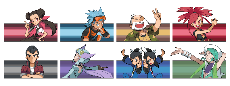
The first non-Rocket villainous teams, and a refreshing change of pace. These are also the only villainous team that buck the trend of using predominantly poison-types, although they overshoot and go a little too heavy on the dark-types rather than the thematic water and fire you'd expect. They're also a lot sillier than team rocket, with the striped sailor shirts and eared hoodies take the edge off of them. This would become the standard going forward, with almost every villainous team from this point onward having some ridiculous elements. They certainly aren't as intimidating as Team Rocket, and for good in-story reason, being more antagonist than villain in the end. Silly Team Aqua/Magma, you can't control a primal force of nature! Only 10 year old kids can do that.


Gamefreak definitely had the right feel for Team Rocket by this point, and they nailed it. We also see the final version of the female uniform. These guys are the definitive pokemon gangsters. In my view set the standards for all villainous teams to come.
Generation 4
These guys really look like they're trying to be cool and
failing at it miserably. I feel this plays in well with the in-game story where no one takes Team Galactic seriously until they suddenly start detonating bombs and
trying to unmake all of reality. There's some serious organization and manpower here, but no one could see past those stupid bowl cuts :-P
It's Team Rocket's last hurrah. These sprites hew closely to their gen 3 counterparts, mostly differing just in terms of their stance, and there's not much more to say about them.
Generation 5
Team Plasma classic's medieval knight uniform always seemed a little weird for me. I get that N was their king and there was a whole feudal theme built around him, but rather it's the name; "Plasma" isn't exactly a word I associate with knights or feudalism. Setting that aside, it's still a nice visual change of pace, and gets bonus points for being the team uniform that looks most uncomfortable to wear. I do have to really wonder why these guys weren't given steel-types. Bisharp and Pawniard in particular would have fit their theme perfectly.
The New and Improved Team Plasma actually was shocking for me when I first saw them. These guys
actually look like a threatening paramilitary force. They definitely fit in much more closely with Team Rocket than any of the other villainous teams, including their own previous incarnation. However, I'd say that this tone shift was a very good thing and it worked very well for their own games. This is possibly one of the most organized and aggressive depictions of a villainous team in any main-series games and their visual representation does this justice. It tells you at a glance that you need to take these guys seriously.
Generation 6
So ends the age of sprites. I feel comparing sprites to models is very much apples to oranges, but in terms of their aesthetic design Team Flare feels closest to Team Galactic to me, and not just because they're the only ones who don't wear hats or hoodies. I really get the sense of people desperately trying to be cool but having
no idea how ridiculous they come across as. The red suits, the ludicrous hairstyles, the embarrassingly pompous displays... it's a nice tone shift from the ruthless efficiency of Team Plasma one game earlier.
Some Thoughts
One of the trends I noticed when looking over the villainous grunts is that the female uniforms have gradually become more practical, to the point at which in generation 5 and 6 they are identical to their male counterparts. Short skirts and bare midriff were the norm in generation 2 and 3 and their remakes, and while the Galactic Grunts do have gender-specific uniforms the female version lacks revealing or impractical accentuations. Looking forward, Team Skull and
Team Aether Foundation seem to be going on two opposite directions on this, with the Team Skull uniforms having very strong gender differences (justified given their "misfits off the streets" theme) while Aether Foundation has only minor details differing between their male and female uniforms. I don't want to linger too long on them, as SuMo isn't out yet and I don't have the full context of their game to reflect on.
One of the things I dislike about villainous teams is how they tend to focus on normal/poison/dark types. Magma and Aqua looked to buck the trend, but Galactic went right back to the Team Rocket standard. While this isn't directly related to their sprites, the gameplay sets a huge amount of the tone. A team comprised of Zubats and Rattatas says
a lot about that opponent. It's inescapable that the repetitive rosters between games fail to do justice to the aesthetic differences at play here.
In terms of favorite... I really can't go with anything other than Team Rocket. That might just be these nostalgia goggles (they just don't come off!), but I feel like they really had a simple but intimidating design and appeared in enough games (four including remakes) for Gamefreak to really iterate and get the best possible design. I kinda like the pristine white of the Aether foundation uniforms, but not having played their game it's too early for me to actually rank them against the others (plus it's not confirmed that they're villains yet). Team Galactic would probably be my second-favorite to Team Rocket, if only for those charmingly awkward bowl cuts. Team Plasma version 2 takes third place, and from there it's a toss-up between the remaining teams.