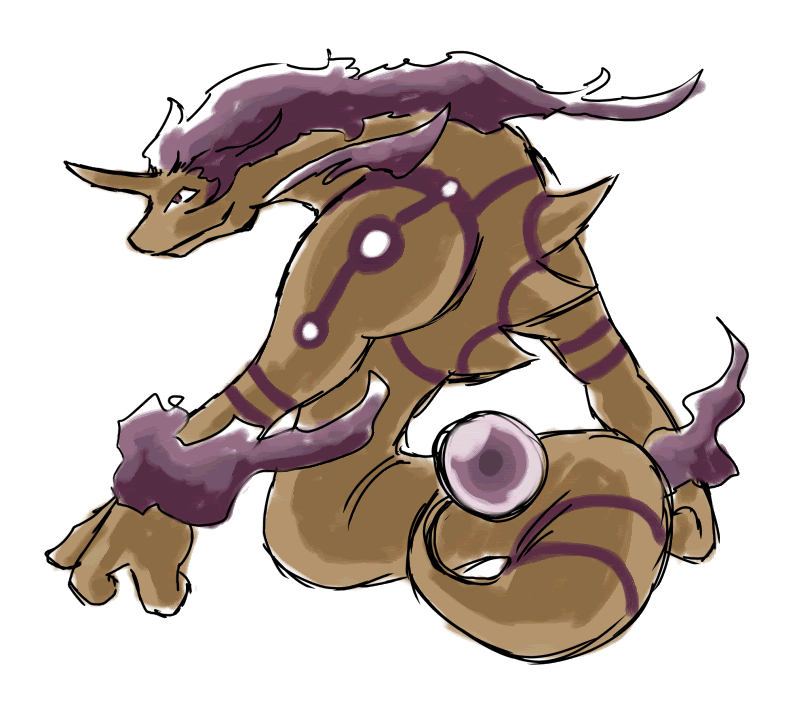
I return with a submission, although it seems I've taken my sweet time. Honestly didn't expect the art submission to have gotten here so early, though, but nonetheless here I am.
I wanted to make him large, with a sort of elegance to him. As it is he could be interpreted as a sort of reverse-Suicune, considering that's where I got the idea for his mane from.
Comments and suggestions are, as always, welcome.
That... is very cool. Not many other submissions get both the typing or the stats that are being thrown around. This does. And it's mystical touch let's it fit in with many of the moves we're talking about. Awesome job!
As for the others, I really don't think Maniac's Gila design looks like it could have the move pool that we're looking at. That doesn't look like Wish, Tailwind, Encore, or Rapidspin are appropriate, which is the entire point.
Salamenceslasher's is closer. The move pool I think is more viable with it, but I don't think it looks like a Pokemon. It's too busy. Definitely a fun design, but I don't think it works.
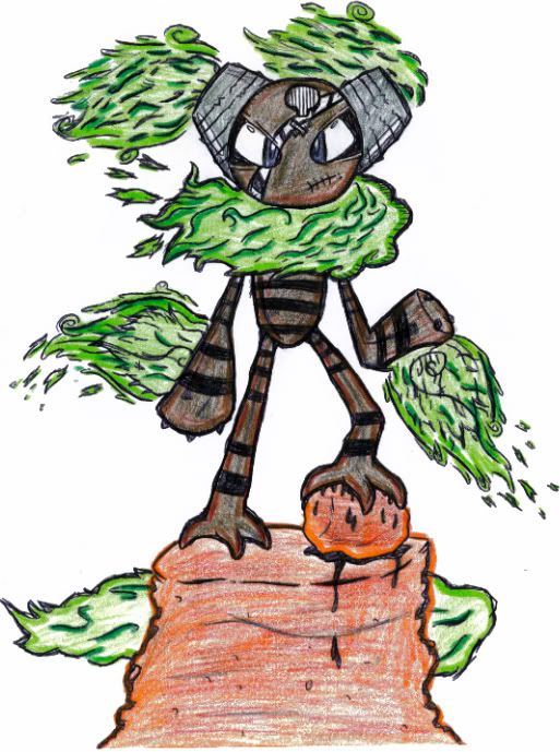
As for the Smog Imp I think it's a really nice concept, although not for this type though though, despite the Rocks that were added to the smog behind it it just doesn't look like a Ground or Poison type in anyway. It looks like the next Celebi or Jirachi with 100 stats across the board as a Dark Type. The colour scheme is just so representative of the Dark type it's overwhelming.
As for your point that it looks like Jirachi or Celebi, I'm going to have to say that most Fairy egg group members look that way. Togetic, Pikachu, Clefairy, Azumarill, Castform, etc. If you look at them completely unbiased, and put them next to Celebi or Jirachi, just visually, they all look like they could have the same stats. We know in reality that they don't, and thus perceive them differently, but design-wise? They could be the same. This is out of that same line. The Fairy egg group is, as far as I'm concerned, necessary for this Pokemon because it's the one with all the moves we want him to have, and we can't honestly just stick them all in his level-up list. That would be rediculous. So some of them have to come in through breeding.
As for your color scheme complaint, I can't dissagree. I think the dark purple looks the best, but how about these?
This first one is the darker color scheme with the original smog that I had, before I even showed you guys. I changed the smog personally because I didn't want anyone to start associated him with Sandstream, but if his types aren't coming through enough, maybe this will help a bit.
Original Imp:
This next one is, hopefully, for those that see him as being a Dark type do to the dark purple. This color scheme was ripped straight from Arbok.
Stereotypically Poison Imp:
Finally this last one is going the opposite way. While Number 2 went Poison, this one goes Sand. I personally think he should look Poison dominant because it's the main type, but if you guys like this one best, I really don't mind. And if nothing else, it could be used as the Shiny form.
Steretypically Ground Imp: