I know that. It was a joke.That was not even supposed to be in first gen games, that was compiled from a data dump of all the code they were going to used but ended up not using. Look it up on youtube Missing No. Pokemon. It showed up in yellow as well. It also really messed up your game.

-
Welcome to Smogon! Take a moment to read the Introduction to Smogon for a run-down on everything Smogon, and make sure you take some time to read the global rules.
You are using an out of date browser. It may not display this or other websites correctly.
You should upgrade or use an alternative browser.
You should upgrade or use an alternative browser.
Worst Pokemon Sprites?
- Thread starter Rankumander
- Start date
Wasn't M or L the ones who messed your game? As I remember Mno wasn't dangerous for your file.That was not even supposed to be in first gen games, that was compiled from a data dump of all the code they were going to used but ended up not using. Look it up on youtube Missing No. Pokemon. It showed up in yellow as well. It also really messed up your game.
On topic RG farfetch was really weird.
Missing No. had the potential to mess up your game as well, what a cool glitch is though is there is a way to get any pokemon to know any move you want.Wasn't M or L the ones who messed your game? As I remember Mno wasn't dangerous for your file.
On topic RG farfetch was really weird.
Missing No. had the potential to mess up your game as well
It caused a slight graphical glitch that could be easily fixed. There was no save file damaging, it only occurs with other glitch Pokémon.
Pt:
 D/P:
D/P:

I don't think that D/P was better, in fact I think it was worse because it looks like it is going to slip or something.
I don't think that D/P was better, in fact I think it was worse because it looks like it is going to slip or something.
Darmanitan's Zen Mode was off in Generation V. It is supposed to be an immobile stone statue with its arms fused to its body, but this is its sprite:

FAIL.
FAIL.
I'd rather like to see all the sprites that are bad almost purely because they don't understand the concept of the Pokémon or how it works. For instance:-Darmanitan's Zen Mode was off in Generation V. It is supposed to be an immobile stone statue with its arms fused to its body, but this is its sprite:
FAIL.


I'd rather like to see all the sprites that are bad almost purely because they don't understand the concept of the Pokémon or how it works. For instance:-
(come on, even the backsprite got it right)
Though Kingler makes you wonder if two different people worked on the front and back sprites. Wait...that's the Blue sprite. I wonder if...yep, the Red and Green sprite was accurate:Actually, some early Sugimori artwork shows those odd arms:

It was likely part of the original design that got abandoned early on with leftovers in the first generation games. And now I'm imagining RBY Mewtwo with Leftovers. It is a thing of nightmares.

The back sprite matched the more accurate Red and Green sprite. Why did they keep doing that?


And now we don't even have sprites, but fully 3D models that look like the anime's been ported to my 3DS and it is simply fantastic.
I love the 3D models, but some could do with a serious recolor. In Kalos, most of the models looked bleached of their colors as opposed to the Pokédex 3D app, which had their correct color schemes from previous generations. OR/AS looks better in the color department as well, however.
It's still poor design, because that kind of perspective (if that's what they were actually going for, which I doubt) doesn't read well at all.The Kingler sprite can be excused, as you do not see the arms behind the pincers. For all we know, the left arm can be stretched out towards the camera whereas the right one is pulled back, giving the illusion of equal size.
Not only is disco dead, it's also fossilized.
I just want you to know that this absolutely killed me. I laughed so hard I disturbed the cat and have tears in my eyes. Good lord.
THIS.I love the 3D models, but some could do with a serious recolor. In Kalos, most of the models looked bleached of their colors as opposed to the Pokédex 3D app, which had their correct color schemes from previous generations. OR/AS looks better in the color department as well, however.
Look at Scizor/practically any pokemon with a "deep" colouring for examples.
THIS.
Look at Scizor/practically any pokemon with a "deep" colouring for examples.
Oh, god. You mean the
I just noticed this today:


Shiny Dugtrio's dirt in Generation II was also shiny! (This is the Gold sprite, but both Silver and Crystal have the same color palette)
Also, regular Dugtrio looks like three Chestbursters.
Shiny Dugtrio's dirt in Generation II was also shiny! (This is the Gold sprite, but both Silver and Crystal have the same color palette)
Also, regular Dugtrio looks like three Chestbursters.
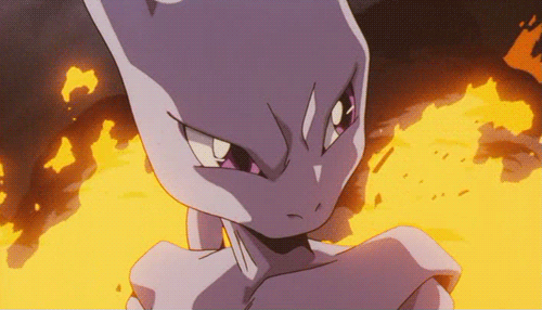
Has anyone talked about how bad HGSS Mewtwo was?

Like holy shit, why do its eyes look so weird? And why is it taking such a wide stance? Mewtwo usually stands toward you with one arm slightly raised in an imposing and threatening manner, but this one looks like a tryhard. He looks like he just watched a Kung Fu movie on TV and wants to try out what he saw on the school bullies.

The Diamond and Pearl sprite was so much better. Why did they bother to change this one so much for HG/SS? There's a reason that this one was the one they chose for Gen V.
Like holy shit, why do its eyes look so weird? And why is it taking such a wide stance? Mewtwo usually stands toward you with one arm slightly raised in an imposing and threatening manner, but this one looks like a tryhard. He looks like he just watched a Kung Fu movie on TV and wants to try out what he saw on the school bullies.
The Diamond and Pearl sprite was so much better. Why did they bother to change this one so much for HG/SS? There's a reason that this one was the one they chose for Gen V.
Has anyone talked about how bad HGSS Mewtwo was?
Like holy shit, why do its eyes look so weird? And why is it taking such a wide stance? Mewtwo usually stands toward you with one arm slightly raised in an imposing and threatening manner, but this one looks like a tryhard. He looks like he just watched a Kung Fu movie on TV and wants to try out what he saw on the school bullies.
The Diamond and Pearl sprite was so much better. Why did they bother to change this one so much for HG/SS? There's a reason that this one was the one they chose for Gen V.
I like the eyes on HGSS. They look... human, like he's scared. Don't forget that we charge into his home and attack him for no other reason than to capture him. Poor thing is terrified.
Yeah, because Mewtwo is such a softy.I like the eyes on HGSS. They look... human, like he's scared. Don't forget that we charge into his home and attack him for no other reason than to capture him. Poor thing is terrified.
Yeah, because Mewtwo is such a softy.
I never said it was, but it is a living, sentient being with intelligence surpassing humans. It can obviously feel fear and feel threatened. lol
On the other hand, I don't think anyone can deny that Golem's RSE sprite is much, much better than its FRLG one.Sorry dude, I have to disagree with you on a couple of these. However, I don't mind wasting my time so let's do this:
First of all, I don't honestly see anything wrong with Vaporeon or Flareon, they're fine. Jolteon looks a bit... I don't know, weird? Yeah, I agree with you there.
Second, there's nothing wrong with Torterra, I don't understand what you mean by "lifeless coloring". Magmortar and Rhyperior both look bad, but that has nothing to do with their sprites. Their designs are horrendous.
Quagsire is quite bad, but that's not even the worst one.

Wow, talk about ruining a perfectly good design. You can't even see its tail, it's just a lifeless blob. That's fucking horrible.
Many of the RSE sprites that you praise look just really bad in my opinion. Let's take a look.
FRLG: "Come and get some you asshole", determined and ready to kick your ass.
RSE: "Whoa! Calm down dude, I wasn't serious!". Looks shocked and/or frightened, especially because of the way its arms are positioned. It looks like it's about to run away.
FRLG: "Does this look like the face of mercy?"
RSE: "Who the hell crapped in my corn flakes?"
However, both Articuno sprites are more or less bad.
FRLG: "Surprise! Bet you didn't expect to see me here!"
RSE: "lol imma bird imma fly away now"

And why is it taking such a wide stance?
Mewtwo-LarryCraig Forme
It's probably because the dirt and the nose have the share colours within the pallete (notice the shading on the body is blue as well)I just noticed this today:
Shiny Dugtrio's dirt in Generation II was also shiny! (This is the Gold sprite, but both Silver and Crystal have the same color palette)
Also, regular Dugtrio looks like three Chestbursters.
Would be a nice touch to bring back though

Platinum Quagsire is a real mess. The lovely shade of blue it usually has becomes this odd dark shade which really clashes with the over-saturated red tongue. The arm and feet positions really bother me and just make Quagsire goofy in a very bad way and not the usual adorable goofy charm that it usually has.

Thankfully HGSS fixed these flaws and became one of my favourite Quagsire sprites with a much better, and my favourite blue/cyan. It has the best balance in terms of brightness and is a big improvement, even when comparing it to the DP version below in terms of hue.

Unfortunately, the 3D sprite transitions wasn't kind to Quagsire- it just looks like a big blob since you can't even see the few features that make it a Quagsire- which is the tail and those back fin things. It just looks like a blue blob. Not to mention the blue is really barely there.


The lack of features make the Shiny version look too much like Ditto- except it has limbs.


Scyther HGSS is also one of my disliked sprites. It just looks so awkward like it's falling over in that stance, and it has the ugliest head out of all the other Scyther sprites. If it at least had a different head position it would improve it so many levels. It's even worse with the shiny sprite.