CAP 22 CAP 22 - Art Submissions

Status
Not open for further replies.

Koumashiki

n o   h o m o
is an Artist Alumnus
WIP


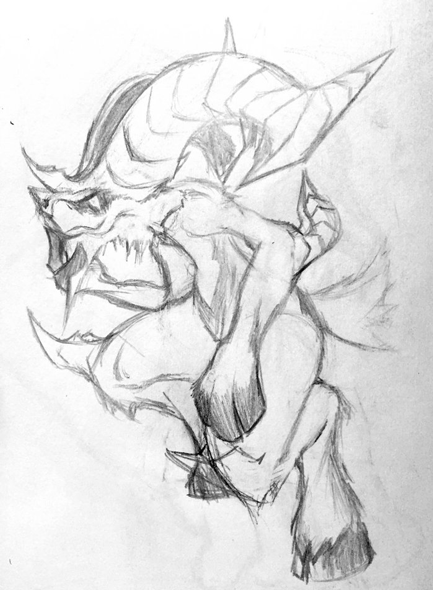
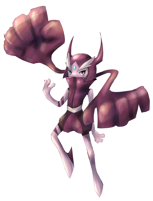
A really rough idea I'm having.

Its 'ears' and cape are supposed to look like fairy/butterfly wings. So just your typical cute fairy right there, though having the face that can sends chill down people's spine, and giant fists. A fighting Mr. Mime I guess.

It deals damage with its giant fists, sometimes it punches, sometimes it will spin around while dealing damage. It should also spin while performing Parting Shot, especially if you're expecting it to be a fast type.
 
Last edited:
WIP

My initial thought process of a Fairy using Parting Shot was the Dullahan of Celtic Mythology, the headless horseman who appears to announce someone's death. I may have taken 'Parting' Shot a bit literally. But what if instead of riding a headless horse ... it practiced Kung Fu?


... No I don't know what I was thinking either o_O

Trying to draw hands was a major struggle, as you can see. Deciding on a colour scheme is also a pain. Good thing this is an early work in progress then, huh. Here is one potential alternative where it carries a Voltorb Pokeball around in place of a head in an homage to the myth instead. I'm not sure if that counts as a legal use of prop or not, but I thought it was a cute idea anyway.

_______

Feedback time, as promised :D!

  • Magistrum: I like the Kanto-style limbs on the dwarf mixed with the kickass Drayden beard but in my opinion it looks more like a Bug than a Fairy or Fighting type. I think the satyr gets that across a lot better, but as someone mentioned it seems more like a pre-evo.
  • HeaLnDeaL: I didn't like how the mask looked before, but I think it looks a lot better now. Having something on the tail could be interesting, but it may make the design a bit busy. I get the fluffy neck making it look like its wearing some sort of shirt, but on the legs I'm not sure.
  • kbrph: I like the very chill facial expression, and how you've made a dance battler sufficiently different from Hitmontop. But besides the pink, I'm not quite sure it gets fairy across enough.
  • Sgt.Moose: I'm not sure if it's intentional, but your knight looks like its a prisoner in chains and a pillory, especially with that disgruntled expression, which is kind of weird considering the freedom a knight piece tends to have. I don't really like the hat but I can't really say why, either.
  • Integer Mova: From what little I know of wendigos, I think of whites and reds, though I think more flesh like colours are appropriate too. I think you were going for a fur look, but I think the hands and feet look more like plant roots, making it look like creepy tree monster. I don't know why, but the tail bugs me. It kind of looks too 'well fed' for a creature of insatiable hunger if that makes sense, but that's just my personal taste speaking there.
  • Sunfished: I think the pillow-fighter might be a bit less Voodoom/Banette-like if the pillow head took up more of its body? The pillows on its hand look a bit too much like paws, unless they actually are paws, in which case ignore that comment. I think the jester elements are a bit much, at least on the face - I think the idea of a pillow fighter alone is enough. Your clown lizard is fucking terrifying, enough said. I think if the snout wasn't pointing upwards on such an angle it would look less like Popplio? I don't think there's enough lizard there besides the shape of the head.
  • Ssensenh: I generally agree with the comments that it looks a lot like a Lucario, at least regarding the limbs. I personally like colour schemes #1, #4, and #5, though the purple of the wings and overall on the first one makes it look a Psychic-type in my opinion. I'm not really sure why the little blush sticker (is that the term?) is the same colour as the wings(?), though I suppose it helps keep the colours together (I'm sure there's a better term for what I tried to say there). Maybe the antlers could be bigger, maybe that could be part of why it seems NFE to you.
  • Canis Majoris: I think there are too many concepts being thrown in here - trying to bring in the red riding hood and boots of the respective tales just makes it feel like a cat wearing clothes. I think if you remove the puss in boots part it may play out better. I think the heart mask is kind of completely random and unnecessary.
  • Slapperfish: Love the idea of a bug trying to impersonate a Feraligatr, but the problem is that it seems more conventional bug than either a Fairy or a Fighting-type. The garden gnome seems pretty neat, though I don't really like the feet. For colours, I think continuing the ruse by using some blue might work, maybe consider looking at reds, greens and whites for the mushroom head? Not much help there, sorry.
  • willow616: Is the design supposed to have one eye? I think the petals on the head could be opened up a bit more, and the Japanese character doesn't seem well integrated in my opinion. You may want to try using something like imgur to host the image instead, so you don't risk automatic disqualification when voting comes.
  • Reigaheres: I'm personally getting Tyrogue vibes from your little guy. The needle sword doesn't really look like a needle or a sword in my opinion. I think going full needle, be it as an arm or as a weapon separate from the body might help. I'm unfamiliar with the story it is based on, but I'm thinking maybe more stereotypical samurai attire? Maybe the hakama (probably wrong word) since it hasn't graduated to full tetsu yet.
  • Mr Spyda: I'm afraid I'm really seeing Fairy in the design at all, but I do like how the clothes look. I don't really have much to say here I'm afraid, but that may change when I see it in colour?
  • adagi0: You speak of assymetry, but your current design seems pretty symmetrical to me? From your description, it sounds like there will be too many colours going on, but we'll have to wait and see I suppose. I think giving her slim arms like the legs would be a good idea -thick, muscular arms would be kind of awkward given how lithe the rest of it is. I cannot tell if it has a face right now or not.
  • ThePsychoBear: I'm not sure what this is based on, a bat? The boxing gloves are obvious, but I'm not seeing how fairy comes into play at all. Also, having the nose look almost identical to the 'buttons' on its chest makes it look a bit odd, but that's just my personal taste.
  • Lucy Heartfillia: Inspired by Kung Fu Panda 2? I'm not sure if the fans on the wings are necessary, given the tail seems to be doing fine on its own. Unless the tail isn't meant to be the war fan part at all, kind of unclear to me at the moment without colours. I think if they were either just wings, or the entire wing itself is a fan would look a bit nicer, possibly? The crest seems reminiscent of a Roman helmet, which is kind of odd considering the Japanese influence going on here.
  • FellFromtheSky: Of the three designs, I personally like the simple idea of the red-riding wolf the best. I am not sure if colouring it red to be reminiscent of the story will convey the fairy typing or if it will just be a bit distracting, but we'll just have to wait for it to be in colour. The fairy chess piece seems like a cute idea, but I am not sure what piece in particular it meant to be based on, or if that's what I should be focusing on at all. I like the laurel blindfolds/glasses idea on the third WIP, but I'm not really sure where the gladiator part comes in at all. Plus, in my opinion it looks a lot like Ssensenh's critter from the chest down, but its easy enough to distinguish the two.


  • Koumashiki: It seems very reminiscent of a Flabebe/Floette to me right now, I think mostly because of the shape of the overall body. The face also isn't as creepy as Sunfished's lizard, so I don't know what you're talking about there. If you're going with the exaggerate fists thing, I think making the arm stems a bit bigger and really overexaggerating the difference might be a thing to try?
  • Absolclaw: oh hai
  • hendrix96: Besides the sarong (I think there's a better word for that piece of clothing, but whatever), I'm not really seeing the moon aspects of the design. I'm not really sure what that random sword blade on the torso is there for, either.
  • Felis Licht: My first thought was "Punk Pikachu", though that's not really fair to say unless you end up colouring it yellow for some reason. From what I just read on the link you provided, I assume you are going for the Kojiki version. Personally, I like the right hare better, but I do like the face and attitude/posture of the left bunny. I think having the sarashi be some sort of bandage to illustrate the idea of it being hurt without showing it to be too fucked up/mangled might be a cool idea.
  • Krazyguy75: In its current state, your design reminds me of the Nobodies from Kingdom Hearts 2. I'm not sure if I accept the abstractness of the design as fairy-ness or not. I'm not really sure what else to say, I'm afraid.
  • QxC4eva: Hey, NO spitting! It's very cute, but right now its just a bunny. I'm not sure what the crescent moon/phantom of the opera mask is supposed to add, is it meant to be a moon rabbit? There's something about the simplicity of a bunny with a hammer that I like, but I also have a feeling its not enough.


And that's everyone so far, I think. That took far longer than I thought it would. I feel like a lot of my feedback was "It doesn't look fairy enough" but its hard to say when colour can change ones perception a lot, and pretty much everyone has plenty of room to work with.
 
Last edited:
WIP
Alright This is a rough draft with really quick line work, but its my basic idea of a moon monk pokemon.

the reason I stayed away from the usual cotton candy butterfly wing flower design is that I feel that the moon aspect of fairy types hasn't really been shown in most of the artwork, considering one of the best fairy moves is moon blast I just couldn't resist playing with it. That said i'm not sure about how I executed it so far. I went for a happy Buddha kinda face to make it seem cheerful and more whimsical, I am also considering to give it crescent wings as the torso seems kinda bland...
anyways ANY advice and constructive criticism would be HUGELY appreciated. Thanks!!! :D

WIP
So here's these two, both of which are based on jesters/clowns to fit the move parting shot.

The left guy is based on pillow-fighting, which I found fitting given the typing. However, it reminds me too much of banette and voodoom so I'll jazz it up later.

Right guy is a lizard sporting a clown getup. Suffers from the same thing as left guy, which people have stated that the nose looked too much like popplio's.

Feedback on which one you guys like better is much appreciated! I'll deal my two cents on the designs posted already once we get more designs posted too
Man sunfish I love the lizard clown Its so Bad Ass!!! it does kinda have a dark type kinda feel but overall I love the angular aggressiveness it has compared to the regular fluffiness of fairies. NICE work!
 
Last edited:
Since page 2 rolled around I felt the obligatory need to look over some of the overlooked designs, because, at heart, I'm not a douchbag.

FellFromtheSky:
I like the hood design you gave to the wolf, giving a theme evoking RRH(red riding hood) and the boxing gloves are nice, and altogether, the design synergises well with itself. The problem with it is the lack of any design on the chest area. I recommend taking design inspirations from Zoroark here, as that pokemon resembles your design in a way. You might stand to lose a bit of realism one way or another when smoothing out it's chest area, but feel free to deviate from the standard skinny torso and bulk it up if you wish.

Koumashiki:
I like this design for some reason. It's cute and floaty and I have no idea what creature it is, so that's the Fairy part doing it's work, it's dynamic looking and the huge fists go well with that, but what might be a problem is NFE syndrome. Try looking to see what you can do with the shoulder region and feel free to experiment.

Hendrix96
This might be the design I like the best. As a person who loves asymmetry in design, you have encapsulated that well with the coiled leg-tails, the mismatched pattern on the... genie towel thingie, and the sash around it's torso. The mask is also interesting, but the eybrows look weird. Try experimenting with chinese opera masks for this one.

when will people critiscize mine
I'm updating my own soon so keep your pants on.
 
WIP

Extremely rough sketches, but the basic design is based off of the Inaba Hare with a beat-up look (tail wrapped up, missing part of an ear, black eye, etc.) I'm still deciding what to add and remove. Any critique would be appreciated.
 
WIP


This is my concept, based on the concept of a drunken master.

It's 80% done, and I like parts of it, but I really want to change certain areas, like the hands. It needs a color scheme OFC, and I'm welcome to suggestions.
 

WIP design of a satyr in an attempt to make a more fierce-looking fairy than many of the ones that currently exist. Realizing it's kinda straying towards Dark type more than Fairy right now, but I have a few ideas I plan on iterating on going forward.

Koumashiki
Not sure if the hands need the spikes on the end, kinda resembles Mega Heracross's hands currently. Maybe you could try to go for something a bit more similar to a bolas for hand design, as I could see your 'mon doing a similar thing, and the idea of having a bunch of limp arms that strike using centripetal force could add the the toy-like nature many fairy types have.

Krazyguy75
Idea currently looks very humanoid, more of a person than a pokemon. Hands might not even be required. If you want a good idea of how to do a human-based pokemon, check out Sawk and Throh. Generally, exaggerating proportions can create a disconnect between the design and a basic human while emphasizing parts of the body that are more important. Since it's a drunken master style user, maybe try to think of ways to incorporate the idea of dizzyness into its design rather than just its patterning.

Absolclaw
Perhaps it could be a good idea to replace the head entirely with a custom-designed inanimate object that becomes a part of the pokemon? My initial thoughts would be a lamp or some other light source that would leave it without an actual face, and then possibly incorporating the pokemon's face into the design of its chest? Just throwing around some ideas here, as the headless horseman idea reminds me of the iterations where he has a jack-o-lantern head.

editted because @ tagging breaks hide tags apparently
 

Slapperfish

Banned deucer.
WIP

Supporting Material

I wasn't very satisfied with my elderly kung-fu gnome marmot design, so I decided to take it in a completely different direction. The new design is much more garden gnome-y, and I gave it a personality more befitting of a Parting Shot user. He's also got a hint of Owlbear in him, further driving the point home of a more fantastical design. While his aggressive, relentless attitude and maniacal grimace are reminiscent of a Redcap, this is merely a side effect of the poisonous mushroom cap atop his head, which he uses to cover up a rather humiliating bald spot. The mushroom's spores cause him to go into a mad fervor, and perhaps even hallucinate.
 
Last edited:
Well, I guess it's time to share my own idea.

WIP: Fighting Kangaroo


This is essentially a wrestler kngaroos, inspired by the various myths about punching kangaroos. I have taken some traits from both wrestlers and kickboxing players to get this idea, and there are two color variants with the regular one emphasizing its Fighting-type and its alternate one (which could be either shiny or female) emphasizing its Fairy-type. It is able to either fire kicks and punches toward its opponents, so it is overall relatively versatile.

For more concept art about this Pokémon, you can check here.


Is this any better? I gave it color that matched flesh, although I initially opted for a bloody color, such as a more red than brown.

Darklatias92 That kangaroo is very cool. Looks like it wants to kick a Dark-type's ass at some point.

aXl That satyr has a lot of gorgeous detail. I wonder what colors you have in mind.

QxC4eva That bunny(?) looks very snarky. I initially attempted various designs with anger issues, but just gave up on them for the wendigo.
 
Last edited:

boxofkangaroos

this is the day of the expanding man
Well, I guess it's time to share my own idea.

WIP: Fighting Kangaroo


This is essentially a wrestler kngaroos, inspired by the various myths about punching kangaroos. I have taken some traits from both wrestlers and kickboxing players to get this idea, and there are two color variants with the regular one emphasizing its Fighting-type and its alternate one (which could be either shiny or female) emphasizing its Fairy-type. It is able to either fire kicks and punches toward its opponents, so it is overall relatively versatile.

For more concept art about this Pokémon, you can check here.
I like this.

However, I don't get much of a fairy-type vibe from the orange/purple color scheme. Perhaps the brown/pink color scheme could be its default?
 

Sunfished

fisch
is a Top Artistis a Community Contributoris a Forum Moderator Alumnus
WIP

After some contemplation, I ended up going the full route of making this guy a pillow-fighter rather than incorporating a jester element in there as well. Thanks to everyone who helped shape this guy's design :'D

I decided to go for an anime-body pillow body, while preserving elements of having its fists resembling pillows. The face having a sorta silly look was inspired by just having a fun pillow-fight. The white part, being the main body, is actually just really fluffy fur rather than clothes. It also looks like a cat so I thought it was cute :p

In response to an earlier comment about it, the yellow shaped things on his hands are claws, posed in a clench fist sorta look. This way, it would allow it to pack a nice wallop on his foes, and then soften it to a more pillow-like strength when he's not tensing his fingers. You know, for pillow-fighting.
 
Honestly, I think something almost everyone is struggling to do is give both the Fairy- and Fighting- type feel to their Pokemon. Some look either like Dark-types, pure Fighting types, or something completely different to what we're trying to go for. Remember: Fairies are, with the semi-exception of Xerneas, cute, not demonic creatures. Sure, they may be inspired from demons, such as Mawile, but even then they have a cutesy feel. Sunfished's submission fits the typing very well so far, as it looks cute (Fairy) but also like it can punch your face in (Fighting). Magistrum's satyr also fits, but is struggling with looking like a NFE 'mon. HeaLnDeaL's submission is good as well, but the fairy-wing mask looks tacked on, and also overall gives a Fairy/Dark or Dark/Fighting (without the mask and pink) vibe.

I think everyone's doing a decent job designing though, but just thought I'd pitch in my thoughts on designs. I hope I helped anyone who's struggling with their design!
 

Deck Knight

Blast Off At The Speed Of Light! That's Right!
is a Forum Moderator Alumnusis a Top CAP Contributor Alumnusis a Top Smogon Media Contributor Alumnus
I think several of the designs are very well done, especially the ones based on Satyrs. I think the go-to Pokemon for inspiration on a design like this is Granbull. It's not really "Cute" per se and it definitely packs a punch and looks intimidating without being overly muscled or petite to a silly degree. Obviously with a Fighting typing as part of the design, you actually could "Bulk Up" the design a bit and be perfectly in line.

Probably the most odd thing is that even though only Mr. Mime is in the human-shape group, nearly all fairies are bipedal variants of either small animals or straight-up look like people with altered proportions. For some of the newer contributors, try not to pigeonhole the typing so much by forcing so much on "trying to make it look like a Fighting/Fairy mon" and utilize the in-game source material to inspire some of your design elements.

I really like the Satyrs and the takes on foxes, dwarves, and breakdancers. The chess knight doesn't fit that mold but it's too awesome to describe.
 
wip
Captura.jpg

I did not think too much about the design of this cap, I thought realisar pokemon with alien and slimy appearance (I am aware that no fighting type appearance but still participate)
 

Magistrum

DOITSU NO KAGAKU WA SEKAI ICHI
is a Top Artist Alumnus
Update:

I guess the satyr got a lot more attention than the dwarf so I'll develop the satyr concept first. When I started drawing the first wip I was kinda avoiding giving it Medicham proportions, but I guess that backfired and looked like a Riolu/NFE mon like many people here have said. So yeah, what the heck, might as well try making it taller as intended. I also added some elements that might enhance its fairy/fighting type cues.
 
WIP
CAP22WIPcolor.jpg

Probably not the first thing that would come to mind, but seen how the fairy type is strongly related to sprites, why not make it the incarnation of martial arts themselves? (Wondering how the moustache can move? Qi baby)

Edit: I'm not great at this, but I've started trying with some colors. I've tried making the fairy type more evident through the body's color as it was suggested (although I wanted to avoid it being too similar to medicham). As soon as I can I'll also try posting a concept without the third eye to see which one's the best.
 
Last edited:
WIP


So here's these two, both of which are based on jesters/clowns to fit the move parting shot.

The left guy is based on pillow-fighting, which I found fitting given the typing. However, it reminds me too much of banette and voodoom so I'll jazz it up later.

Right guy is a lizard sporting a clown getup. Suffers from the same thing as left guy, which people have stated that the nose looked too much like popplio's.

Feedback on which one you guys like better is much appreciated! I'll deal my two cents on the designs posted already once we get more designs posted too
I like the Pillow Fight concept a lot; it seems that could really go places, is fun, and is unique. I personally think that the clown lizard is a little less appealing because clowns are very creepy.
 

ethan06

⋖(☼┆☼)⋗
is a Community Contributor Alumnus
WIP

link warning (large)


Got inspired and did a quick sketch. I decided to take the Fairy/Fighting typing and the focus on Parting Shot pretty literally, drawing influence from various existing "fairies" such as the Rayman series' Lums and Navi from the Legend of Zelda. I'll probably refine the anatomy of "navi backhand" to better reflect this but I'm happy with this first sketch for now. The centre of the "lum" has been replaced with a large hand with an eye set into it. I felt that a judgemental, ever-watching Eye-of-Sauron would fit the concept behind Parting Shot very well - a death glare makes for just as effective a parting shot as a cutting remark. If there's any way to make it less illuminati then I'm open to suggestions. I imagine that the hand itself could curl into a fist in order to execute Fighting-type attacks.

Mod Edit: Removed image and replaced with link (file size too large)
 
Last edited by a moderator:
WIP

Edit

Although the design has barely changed from the previous one, I've added a bamboo flute to go along with the chinese wuxia hero look. The flute is part of the design, so it is always found on the pokemon, whether its playing it or using it as a weapon. Not sure if I should keep it this way or not, so what do you guys think?

Idea Info
It's based on the Emei Sect which is a fictional martial artists sect that has been used in multiple wuxia fiction and is said to be mostly female (at least in Jin Yong's work). Emei Sect martial arts focus on direct and deceptive attacks that are a combination of soft and rough plus short and long ranged techniques that help the martial artists overcome enemies that are physically stronger than them. I made (or tried to make) the design look steady and nimble so that it fits with that flavor. Although Parting Shot doesn't really seem fitting on something based on Buddhist martial artists, I think that if this pokémon were to encounter a dangerous foe, it'd use its words to try to discourage combat, instead of directly going into a physical confrontation with them. That's just my thought though. :P

Old Design

Everyone has great designs so far, even if they're just basic ideas atm. I like how many are thinking outside the box with these designs and am excited to see how the finished versions look like. :o Anyways, thanks for looking at my design and if you have any feedback, feel free to offer it. Catch ya'll later n_n
 
Last edited:


WIP

(Forgive the green edges, IDK why they are there XD... And my drawing skills, they suck XD)

Anyway, so I thought long and hard, and thought about trying an inanimate object, that looks fast, and can be fairy/fighting type... And there are very few that come to mind. Then... this came along. A dream catcher, with daggers... Yeah, I could go with boxing gloves, but I'd like to see whether to stick in the same direction with the dream catcher, or not. The daggers fitted more, because feathers usually are in their place. The design of the daggers was actually based off of Tomohawk's feathers, as I saw that early concept art for it made them like blades or such... yeah, I'm grasping at straws, but the punching gloves might be a bit more comical XD The dream catcher was chosen, cause it has aspects of fighting and fairy without the daggers. I'll have a go at adding punching gloves, but what do you guys think?
 
WIP


Here is Chessmon V1

Here is another version of my Chessmon!

Now it looks like its primary typing bit more. Now some justifications what I can make so far (as this cannot really bring any flavor to anything yet)

- This Pokemon is going to be a pivot using Parting Shot. Knight (the chess piece) jumps around the board creating plays and capturing other pieces. So I think it fits the concept pretty well
- Fairy type is justified now with the looks, but also the fact it is inanimated object came to life (kinda like Klefki)
- Fighting type is there with the chess aspect, and also with version 1 looking like it.

Now I just want to know which design I should go with, or should I still make a middle ground for these?
 

Jackii

pyukumukumukuyp
is a Top Artist Alumnus
WIP

i don't think this'll cut but it was fun designing something.
where's the fairy? where's the fighting? yea...it got lost somewhere >v>

a helmet wearing waifumon v--v
inspiration taken from accelgor and meloetta, but it looks more like cofag
--
a HQ version: http://sta.sh/02blliq6hlt9 **Mod Edit: Warning, this links to an image over 500kb.**

EDIT: lightened the body colour and made it a bit more "pink" due to suggestions ^^
 
Last edited by a moderator:
Status
Not open for further replies.

Users Who Are Viewing This Thread (Users: 1, Guests: 0)

Top