-
The moderators of this forum can be found in the CAP forum staff directory.
-
Welcome to Smogon! Take a moment to read the Introduction to Smogon for a run-down on everything Smogon, and make sure you take some time to read the global rules.
You are using an out of date browser. It may not display this or other websites correctly.
You should upgrade or use an alternative browser.
You should upgrade or use an alternative browser.
CAP 6 CAP 6 - Art Submissions
- Thread starter darkie
- Start date
- Status
- Not open for further replies.
nice caladbolg! i still thing the tip of the tail should be a different color and the feet are a bit wide?
hey. here's an idea i had:

what do you guys think?
here's some other sketches: http://www.kodiakber.net/forumpost/cap6dev.png
and here's a bigger version of the picture:
http://www.kodiakber.net/forumpost/cap6.png
anyway, really nice work as usual Cartoons!, your squid is really cool. also Aragornbird, i really like the idea for your pirate squid. i'd say work on the sword part a bit, maybe add the finger guard somehow, or turn it into a belaying pin, pirates liked those. anyway, really nice work all around, should be cool to see where this goes.
edit: for now this is my final submission.
Wow, veery nice...
Still not my favourite, but it's definitely better than before
Still not my favourite, but it's definitely better than before
hey. here's an idea i had:
-picture-
anyway, really nice work as usual Cartoons!, your squid is really cool. also Aragornbird, i really like the idea for your pirate squid. i'd say work on the sword part a bit, maybe add the finger guard somehow, or turn it into a belaying pin, pirates liked those. anyway, really nice work all around, should be cool to see where this goes.
i dont see how this is fighting type, and i dont see how i can be somewhat defenseive.. but its a pretty picture.
Well, here's my art submission! It's supposed to be a version of a river otter. Please tell me which picture is better or if I should change one of the colours.PLEASE COMMENT!


Would it be a good idea if the darker one was male and the lighter one was female?
And here is some of my supporting art. :D I've spent A LONG TIME to make all of this.
http://i36.tinypic.com/f3vw2f.png


Would it be a good idea if the darker one was male and the lighter one was female?
And here is some of my supporting art. :D I've spent A LONG TIME to make all of this.
http://i36.tinypic.com/f3vw2f.png
I would totally be for this if our new mon could work as a lure (and run multiple sets), however the way things going it looks like its just going to primarily be a bulky water and nothing more. Still neat and something I'm considering...hey. here's an idea i had:
what do you guys think?
here's some other sketches: http://www.kodiakber.net/forumpost/cap6dev.png
and here's a bigger version of the picture:
http://www.kodiakber.net/forumpost/cap6.png
anyway, really nice work as usual Cartoons!, your squid is really cool. also Aragornbird, i really like the idea for your pirate squid. i'd say work on the sword part a bit, maybe add the finger guard somehow, or turn it into a belaying pin, pirates liked those. anyway, really nice work all around, should be cool to see where this goes.
Final Submission

Supporting Material
Epic confrontation; Garchomp vs. Merman Warrior defending their unevolved child
Epic confrontation; closeup of Garchomp and back of Merman
Merman meditating atop a water tower and pre-evolved form revealed.
Dramatic fighting stance and demonstration of hydro pump
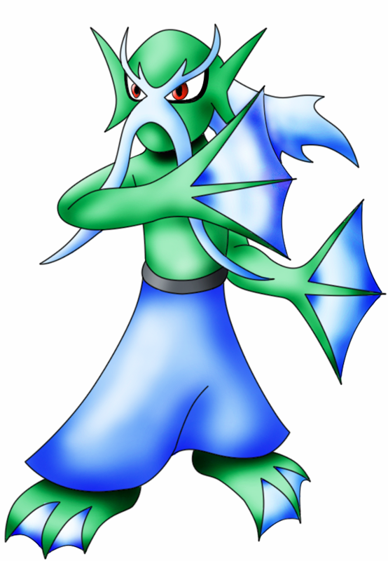
The main inspiration for this mighty silent merman warrior were the Mermen enemies from the Castlevania series. I wanted to see if I could not incorporate a pokemon derived from said enemies. On top of that, I also wanted a pokemon who could fight with organic weapons and have it look natural in the process. So I began doing some preemptive sketches and it camne to pass that I could fashion fins to looks like fans and that there was in fact a fighting style dedicated to the usage of these weaspons.
So it came to be that this Merman was a warrior of the tessenjutsu, the art of fighting with fans. It's a more graceful and elegant martial art, but still as deadly as the others, focusing more on precision aiming and keeping on the defensive. It takes many many years of training to become proficient with fans and I wanted to have a physical appearance that reflects this. That's how he came to be donned with the elder "sensei" look. When you think of excellent martial arts masters, and old man should be the first thing that comes to mind because they can and will kick your ass.
This was one of the first few times where I ran with the first idea I had for a CaP. I understand that I'm being vastly overshadowed this time around with the submissions of many others, but I'm hoping that I get at least one vote lol. Nonetheless it was jolly good fun and I will be back to kick ass in the spriting polls.
Wyverii's is my current favourite (but just barely). I'm loving it's design, but I'm trying to decide which one looks the most Unaware.
They all look pretty alert TBH, but (shameless plug) I don't think much feeling would get through those turtle shells on my design >>
<<
>>
<<
>>
Really now, you shouldn't be worried about such things like that. Unaware can always have it's name changed to fit the winning image. Another solution would be to just accept the naming and become one with the universe. After all, we only want it for it's effect, not it's namesake.I'm loving it's design, but I'm trying to decide which one looks the most Unaware.
Code:
Unaware
Not aware or informed: [URL="http://www.answers.com/topic/ignorant"]ignorant[/URL], [URL="http://www.answers.com/topic/innocent"]innocent[/URL], [URL="http://www.answers.com/topic/oblivious"]oblivious[/URL], [URL="http://www.answers.com/topic/unacquainted"]unacquainted[/URL], [URL="http://www.answers.com/topic/unconscious"]unconscious[/URL], [URL="http://www.answers.com/topic/unenlightened"]unenlightened[/URL], [URL="http://www.answers.com/topic/unfamiliar"]unfamiliar[/URL], [URL="http://www.answers.com/topic/uninformed"]uninformed[/URL], [URL="http://www.answers.com/topic/unknowing"]unknowing[/URL], [URL="http://www.answers.com/topic/unwitting"]unwitting[/URL].@Caladbolg - This is pretty much perfect, the only things I would change are the base of its tail, the thighs, and the feet. While I like the fact that thicker than the end of the tail, it seems a little too thick where it is closest to the rest of the body.
About the thighs, they seem a little too bulky compared to the rest of the body. I understand that bulkyness is kind of what we are going for on this, but in contrast with the arms, the bi and tri ceps as well as its traps are a little too small compared to the thighs.
Finally the feet seem kind of uneven.
But in the grand scheme of things these are minor nitpicks. Your design is amazing and has my vote as of now. vbmenu_register("postmenu_1658914", true);


Surely I wasn't the only one reminded of The Wind Waker, was I? (If I could find official Octorok concept art, it'd be an even better comparison.)
Not saying that's a bad thing. (In fact, quite the opposite...)
Right now, I have Atroyki, Cartoons!, Kopie, and a few others at the top of my list. I don't know who I'll go with in the end...
Also: I have a design in mind, but I won't be able to submit it until the weekend. I'm hoping I'll have time to do it, and if not, I guess I could just wait till CAP7. :P
Zantinomious is so cool. Cartoons!, and Caladbolg, too, and of course Artyoki. To be honest, I wasn't really very psyched during the Art Submission thread of CAP5, but these are really top notch, as I felt that they were in CAP4. Keep up the great work, guys! :D
i dont see how this is fighting type, and i dont see how i can be somewhat defenseive.. but its a pretty picture.
eek. i was afraid of that a little. i was going for sword-fighting... like gallade style. also hes made of rubber, so that could sort of justify a defensive build... maybe... thanks for the feedback, if you can think of a way to make him more obviously fighting/defensive let me know.
Seems pretty ghosty to me.
How so? A bubble is a water type, and the four arm/fists represent fighting. Geodude is pretty similar, and it isn't ghost type.
Anyway, I said that I'd like to build on it. Do you think that changing the bubble to some sort of "watery forcefield" would suit it better? and I think the idea seems a bit simple as of now. Another Idea I had was changing the bubble to a turtle shell. that would be quite defensive. It would basically just be a turtle shell with four arms coming off of it, and two beady eyes looking out from the middle. any help is appreciated.
Hey Kharozz - very elegant and well drawn design but it doesnt seem to stand out much at the moment. Maybe give it something extra to make it more unique.
Take Floatzel for example. He's got a fricking life vest!
Also the colours are too dull, jazz it up to get it noticed :-)
Take Floatzel for example. He's got a fricking life vest!
Also the colours are too dull, jazz it up to get it noticed :-)
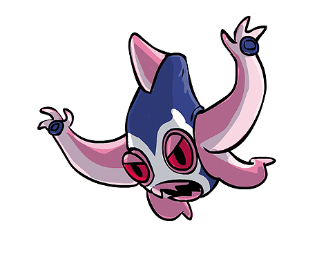
My support is now fully for Cartoons!'s Luchasquid. His supporting material is EPIC and I think its one of the few submissions that actually look like they could be pokemon.
GO GO LUCHASQUID!
GO GO LUCHASQUID!
I shaded my platypus and made a different color scheme, but I'm not sure which one looks better.


Wow, um... Caladbolg that is so fantastic... I feel smoked.
Anyways, I have another pose of my eeligator. Let me know if it ain't fighting type enough for you. I like the new colors:

I added a fin on his head and he has a chest pattern instead of a crest. Also, if you take a look at my first eeligator (not the crappy one) you'll notice a tougher looking viper with more teeth. Is that better than four?
Anyways, I have another pose of my eeligator. Let me know if it ain't fighting type enough for you. I like the new colors:

I added a fin on his head and he has a chest pattern instead of a crest. Also, if you take a look at my first eeligator (not the crappy one) you'll notice a tougher looking viper with more teeth. Is that better than four?
The first time I saw this thing I loved it and now that I see this version I think that this thing will be the winner.New Pose, new colors, effects, etc.

- Status
- Not open for further replies.


