I have made some significant changes to my tornado since my last post. Most notably, I've completely changed the colouring and shading scheme. It's still not as good as the work of others here, but it sure is better for someone like me xD
I've also changed the eyes and hands. I felt that despite the alien like eyes seemed to give it more of a ghostly/otherworldly feel, they felt tacked on. I've scrapped the hands altogether for now because I felt they were very rushed, but I probably will draw a new pair of tornado hands because he seems to lack character without them. I am content with the way the eyes are in the current artwork, but I may change the shape to either give it more expression then just "O_o".
Finally, I've tried to experiment and replace the spin lines with 'waves' of leaves., with two or three which have flown off just to emphasise these are leaves. I am still not fully happy with these leaves - they took ages to do, look like scales, and only when I reread the OP did I discover that the three freed leaves (which imo also look more like feathers) aren't technically allowed.
The things I'm planning to do are:
Fix the leaves; draw hands, and any additional tips. The hands I suspect will be easy - just follow the main scheme of the body except to a smaller scale. The leaves are what I'm concerned with. I am still uncertain as to whether I should turn the whole body into leaves, considering that my current 'skills' would make it really messy, or what to do with the spin lines/leaf waves. I am also considering drawing some sort of mouth, but that's not a very high priority. Any and all advice is appreciated <3
ProfPeanut Thank you. I had finished this current version of the tornado before I read your post though, so I'm uncertain whether these leaves are good enough (unlikely, lol) or to go full body with them.
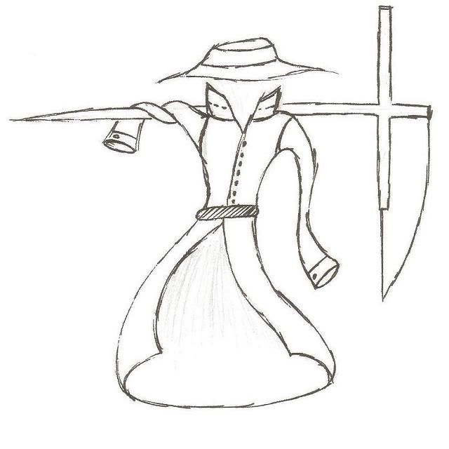
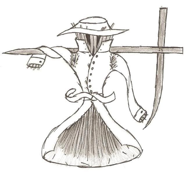
Asylum_Rhapsody Before Rawk and Sawk, I would have been iffy with the clothes. But, considering that you could easily justify a ghost going around in human clothing to scare people, I'd say it's okay. Unfortunately that means that, besides the hay, it's primarily a ghost and very little grass. I believe. needs to have an emphasis on the being in the clothes and the grass nature of the Pokemon. Turning the support into a weapon is pretty cool, but I'm uncertain as to the scythe. On the one hand, it is a bit cliche and not standard for Pokemon weapons, which iirc tend to be more blunt. On the other hand, it doesn't seem quite right just carrying a big ol' T/crucifix/whatever around.
Wyverii and
Rising_Dusk Thank goodness - my justifications regarding Sketch and the stats were on the spot (and in my opinion pretty tacky), because I thought it'd have to show in some way or form, lol. Also, have you tried giving it an ascot/cravat, Wyverii? I think that may look cute on it, but then again it may not.
puking_rainbows I personally prefer the panda thing. However, the red paint looks a bit like blood imo, and the paintbrush shtick seems like it's close to copying Smeargle and it's tail, but it's great, really. In regards to the paint, it seems more like a bulge on it's body than paint, but I don't know if you were going for that. Also, have you tried combining the two ideas, and maybe using the first Tiki mask as part of the panda like a shield or a paint palette (or whatever it's called) thing? Maybe it wouldn't work, but it could be worth a try.