Yay and Yuck: The Best and Worst of Yellow Shiny Pokémon
| « Previous Article | Next Article » |
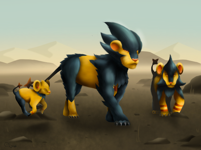
Art by Swiffix.
Introduction
On its own, yellow doesn't seem as diverse as other colors that have been featured on The Flying Press. It's just bright, right? To some extent, yellow isn't something that shows up often in ordinary Pokémon color schemes beyond Electric-types, but it's a different story when it comes to shiny shades. While yellow has not been a popular color in the West, it's a different story in the East, particularly in China—where the words for “yellow” and “royal” have the same sound in Mandarin. Across cultures from Ancient Greece to the Middle East, the brightness of yellow often alludes to intelligence, warmth, and abundance, thanks to yellow's luminance and association with gold.
For shiny Pokémon, there are a lot of Pokémon that fall under this umbrella—speaking from personal experience, having tried to do fanmade Pokémon cards featuring shiny Pokémon with types to match their shiny color, there were a lot of Pokémon I ended up reclassifying as Electric-types. So sit back, take a turn, and look how the Pokémon shine for you as we look at the ones that are all yellow.
The Best


The blue-on-black scheme that the Shinx line uses was already decent, and I like that it breaks the monotony of yellows that characterizes the Electric type. But on the other hand, yellow and black is an effective color scheme for electricity, featuring both brightness and blackouts in the same theme, so why fix what's not broken? Shinx goes from a precocious, power-packed cub into a menacing predator that you would not want staring you down in the urban jungle. Yellow makes for a threatening “stay away” color, and Luxray's family features that message loud and clear.


Yellow frequently features in public transport, first response, and penalty cards in sports because it's clearly visible as a warning sign, and the Buizel line utilize this to great effect in their shiny coloration. It's not hard to imagine these swimming speedsters charging into the fray, tearing through torrential waters to rescue drowning victims in need. If the games or anime ever featured a coastal patrol and rescue service, these guys would be up there for mascot shortlists, possibly sporting a sailor's cap to go with their white flotation sacs, a thumbs up, and a reassuring smile.


There's a few legendary Pokémon that sport the yellow color scheme, but personally I'd have to say both of Hoopa's formes carry out the aesthetic the best. I've heard a few Pokémon Masters EX players remark that Lear's Hoopa-themed Sygna Suit looks atrocious—partly because they're not a fan of the purple-on-yellow palette that Hoopa carries. Hoopa's original color palette looked fine to me, but the idea of a treasure-stealing genie possessing its own Midas touch is a clever move on Game Freak's part. Gold and genies already go together hand in hand in Middle Eastern mythology, so what happens if Hoopa's obsession with amassing gold is because it thrives on the satisfaction of avarice and ownership? Effective designs are the ones that can tell their own stories, and Hoopa stands out as one of the better shiny examples of this.

On its own, Volcarona is pretty awesome as one of the Bug type's success stories—and a gold motif to go with an insect revered for replacing the sun at one point is certainly fitting. You know a Pokémon's shiny appearance is pretty significant when they have to dedicate an entire episode of the anime around it, where Goh has to find a Volcarona's "golden scales" to progress in his character journey to find and catch Mew. It ends up involving a shiny Larvesta that evolves and uses its pyromancy and Fire Spin to put out a raging fire, before rewarding Goh with his prize of glittering golden scales as thanks for rescuing a brood of Larvesta eggs. Sure, it's not nearly the deepest episode even for the recent standards of the show, but a shiny Pokémon is always a spectacle, and the writers picked a great choice to go with it.


Creamy yellow is not a color scheme that comes up often even for shiny Pokémon, and even then it's mostly a sort of off-white that you see in the Meowth line. Sometimes you get exceptions like the Goomy family, though, and given that the three quasi-dragons enjoy a reputation in the fanbase for being endearing, adorable, and oh-so-huggable, the pastel shades really help to sell it. Come on, shiny Goomy just looks like a cute little puddle of half-melted ice cream! Sure, it's probably going to dissolve your tongue if you ever tried to lick it, and Goodra would still slather you with ooze every time you hugged it, but you can't fault it for trying.
Honorable Mentions


Arcanine: There are a lot of shiny Pokémon that successfully use the gold motif to appear bright, happy, regal, or any combination of the above, ranging from the thematic to just punny. The opinions on those are varied as to which is better or fitting for the species that yellow is used on, and honestly you could write a research paper on how glorious these Pokémon look. I've chosen to profile Arcanine here for its history as a fan favorite; personally I do prefer how Luxray uses the combination of yellow and black to greater effect, but Arcanine is pretty aesthetically pleasing. You could realistically also place Luvdisc, Sirfetch'd, Exeggcute, Altaria, Drifblim, Latias, and maybe Sableye and Lucario under this category, along with all the other yellow shinies I've inevitably skipped over.
Piloswine: Piloswine is a bit of a niche pick, since its shade of yellow isn't one that frequently appears, lying somewhere between the usual yellow and the cream color used by the Goomy line. This gives it a rather friendly and humorous appearance as a big fuzzy haystack that makes me want to fall on just to see how it feels.
Galarian Zapdos: Galarian Zapdos is a bit of a 50 / 50, as is my opinion on all the Galarian legendary birds. Sometimes I think that shiny palettes making reference to older Pokémon do a brilliant job like with the Grimer line, sometimes I think it's a cop-out where shiny Galarian Articuno looks like a toothpaste mascot, but I can't bring myself to hate shiny Galarian Zapdos for what it's trying to do.
The Worst


...Blech. The Misdreavus line might be one of the worst offenders for why you can't just take a color and smack it on a Pokémon as an alternate coloration and call it a day. Where purple Mismagius was ominous and sinister, shiny Mismagius looks just as scary but for all the wrong reasons. I get the feeling that someone tried to toy with the hue/saturation sliders and decided that stopping midway was fine, and we got a color scheme that tried to retain some of the original purple shade, resulting in what happens when you try to mix “complementary” colors and get a disappointing mess of brown.

Pokémon with shiny palettes that basically don't deviate from the original are an easy target for hate, but Scraggy just has to be one of the most egregious cases. Scrafty at least tries to look visibly different with a neon green hoodie, orange crest and sickly yellow complexion, matching its graffiti punk aesthetic and making it stand out. Shiny Scraggy simply has nothing going for it despite its reckless, roughhousing backstory. Truly wasted potential.

Plenty of Grass-type Pokémon get the withered, decaying color palette when shiny, and I'm not a huge fan of those. I'm sure there are those who are a fan of the concept for poetic reasons, but Carnivine already gets quite a lot of flak for being one of Sinnoh's most unimpressive species. Was it too much to ask for a color scheme that made Carnivine look actually menacing, like the apex predator it was meant to be? Apparently someone decided that yes, Carnivine needed to languish in the No Mon's Land of mediocrity no matter what color it was.

The Remoraid family has become one of those easy punching bags that have haunted the series ever since their introduction. I get the feeling that when the beta sprites were uncovered, many were disappointed that we could have had "literal tank octopus" instead of the otherwise generic spray nozzle cephalopod that Octillery ended up. I don't mind Octillery, really, but then you look at its shiny coloration and imagine that it could easily have gotten something like military camouflage instead of the dull gold spray-painted over its body. Octillery is one of those examples where gold doesn't always work as a shiny color.

There's underwhelming shinies, and then there's Pikachu. The more I think about this one, the more it doesn't make sense to me. Pichu at least tries to look like Pikachu when shiny, and I can respect color schemes when different evolutionary stages swap them with each other. The same cannot be said for Pikachu, which doesn't even look like normal Raichu. It really just looks sunburned like it predicted Alolan Raichu from over a decade ago. Was this really the best that Game Freak could do? Was there a concern that shiny Pikachu would outdo the original in merchandising? It just seems to me that the most recognizable face of the series deserves so much better.
Dishonorable Mentions


Kommo-o: Out of all the unimpressive yellow shinies, I don't think there's much disagreement that Kommo-o is a tall glass of “Why?” and “Nope”, but it's already been bashed enough in the article on pink Pokémon, so I'm cutting it a break here.
Abra and Kadabra: The PSI Pokémon are another of those disappointing examples who don't seem to push things hard enough. Alakazam at least gets noticeably darker and some regal purple to go with its mental mastery. Abra just looks like it had the Exposure setting on its camera turned the wrong way, with the one saving grace being it looks different enough to not share a spot in the Hall of Shame like Scraggy does.
Onix: Onix is another Pokémon that got the "dull gold" treatment that really doesn't make it look flattering. At least in some way, it's a little thematic: the rough, unpolished Onix eventually evolves into Steelix and gets a solid shimmering sheen to reflect its "diamond in the rough" transformation. Although I have heard some opine that shiny Steelix and Mega Steelix look like they've got a bad case of food poisoning, so your results may vary.
Zapdos: Zapdos... really does not need a shiny as unimpressive as this one. Considering that for its time, it was only one out of four accessible legendaries in the original games, Zapdos honestly deserved something more to reference its place in the original pantheon when shinies became available. Then again, the original legendary birds don't exactly enthrall me with their shiny forms, even the drastically different Moltres. "Frozen chicken, slightly cooked chicken, undercooked chicken" is how I usually describe them.
Final Thoughts
Yellow is not a color that features prominently in Pokémon, the logo and Electric-types aside, possibly not without reason, considering that a particular yellow rodent has become the face of the series. It still gets its fair share of representation in shiny palettes, to be fair, but as this article has shown this comes with both ups and downs. Hopefully you've gained a little more awareness and appreciation for these shiny schemes, even though their skin and bones might not turn into something beautiful, and I probably wouldn't bleed myself dry for them. And with that barrage of obligatory Coldplay puns out of the way, until next time!
| « Previous Article | Next Article » |