
-
Check out the relaunch of our general collection, with classic designs and new ones by our very own Pissog!
-
The moderators of this forum can be found in the CAP forum staff directory.
-
Welcome to Smogon! Take a moment to read the Introduction to Smogon for a run-down on everything Smogon, and make sure you take some time to read the global rules.
You are using an out of date browser. It may not display this or other websites correctly.
You should upgrade or use an alternative browser.
You should upgrade or use an alternative browser.
CAP 4 CAP 4 - Art Submission Thread
- Thread starter Sunday
- Start date
- Status
- Not open for further replies.

I like number one as a main.

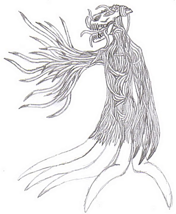
whoa damn thoe are good. i heart the imp. and i heart the whatever Elagune made. Like a unicorn on roids ro something mixed with a serpent.
awesome.
awesome.


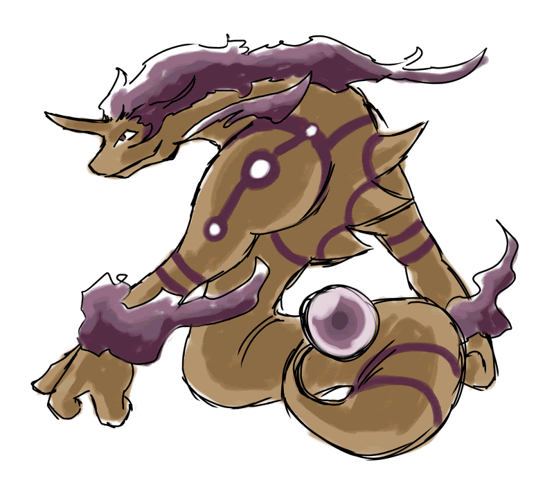
Elagune I think the Ground Type can be emphasized more in the recoloured one with more emphasis on the brown colour instead of he off-white (ish) one you have there, also I think if the pattern in the first one was emulated in a brown colour in the second one it would help with the look of the ground type a bit more.
NOTE! This is NOT an entry. I just found this, and saw this a possible inspiration for the artists:


I knew that design looks somehow familiar o.o

I think the Smog Imp design is the best one so far although looking more like a poison/dark than poison/ground pokemon...
Elagune's drawing is fitting for a bulky sweeper, imo. Maybe even for a faster sweeper, but not fitting for an utility pokemon.
Kizo's design makes me think of Cthulhu, for some reason o.o
My five cents ^^;
NOTE! This is NOT an entry. I just found this, and saw this a possible inspiration for the artists:
*Cobra pic*
Damn I would've voted for this for sure. o.o

Color Scheme:
Body: Dark Purple vs. Lavender vs. Tan
Eyes: Bright Green vs. Tan vs. Purple
Body:
Mouth: Fangs vs. No Fangs
Tail: Demon Tail vs. No Demon Tail/Smog Tail
My opinion on your Imp
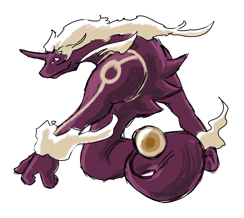
Elagune~ both version of your Naga/Fafnir drawing works as a Poison/Ground. I not really understanding why some say the first one doesn't look like a part Ground enough. I mean it's a purple Naga with white-ish clouds/fumes coming off it, what type of Pokemon could be associated with that coloring?


Oh shit. SHIIT
I'm glad I decided to check Smogon after little poke-interest for so long, I made it in time to possibly submit art! XD
I just have one question. I have a concept in mind, just got to get to drawing it tonight... only, I'm not sure I'll be able to make it pokemon-esque enough. So the question is this, if it's good enough but not pokemon-enough would anyone care to try and make it more pokemon? That, and it not being bulky-looking enough (what with how the current stat poll is going) are my main concerns.
I'll draw it later tonight, after we get done running some errands around town. Oh, and my concept should end up looking like it can use TAILWIND. AHAHA. (Which I noticed not many of the other submissions didn't seem to be able to.)
EDIT: Nevermind on that question part. I couldn't wait so I started it now, and I guess I forgot one important thing about myself: I can't draw realistically, like what I originally thought of. XD
When I can scan it tonight I'll leave it in pencil, so if there's suggestions as to how to make it better I can go back and change those things.

NOTE! This is NOT an entry. I just found this, and saw this a possible inspiration for the artists:
*Pic Here*
Man, this would have been absolutely awesome if we were making an attack poke and not a utility. But I guess it does have a sort of "ancient mystic" aura to it, which could help with utility moves like gravity or trick room.

Poison/Dragon? Poison/Fighting? Poison/Dark?I mean it's a purple Naga with white-ish clouds/fumes coming off it, what type of Pokemon could be associated with that coloring?
Don't get me wrong. I love the Naga. I think it's an awesome design. Maybe a bit too attack-ish for a utility pokemon, but other than that, I think it's great. It does remind me of Revanakh though. Both are T shapes bulky creatures, looking like they hit hard. We may not want to do the same skeleton twice so early in the project.
Maybe pull back on the massive arms? They do look bigger than most.


tennis, you obviously didn't bother to check what I typed.

That is really good. It just looks like too much like a ghost.Speaking of which, I made two colour variations on my picture.
I'm not sure which one to stay with, however. Although I'm more fond of the colour scheme on the first one, the body designs look better on the second. I'll leave it up to you guys to help.

If it's such a big deal, I will just delete the post. As you can see it inspired a couple a people, which was my goal.

Guys, I thought that now that Ground is the winning secondary type, most of the dragon concepts should be out of the picture, no offense to any of the great dragon concepts.
All the spider ideas and worms, etc look to me as if they should be poison/bug instead of poison/ground.
I think that instead, we should have a BULKY mole, who can move FAST through the ground, and let's say that it was exposed to radiation (HAHA I pulled a Marvel). It can spikes in the back, kinda hair-like, and the claws can be purple, or dripping with poison or something.
I don't have a scanner, so I can't show you guys what I think it should look like, but I hope someone can take the time to portray their understanding of it.
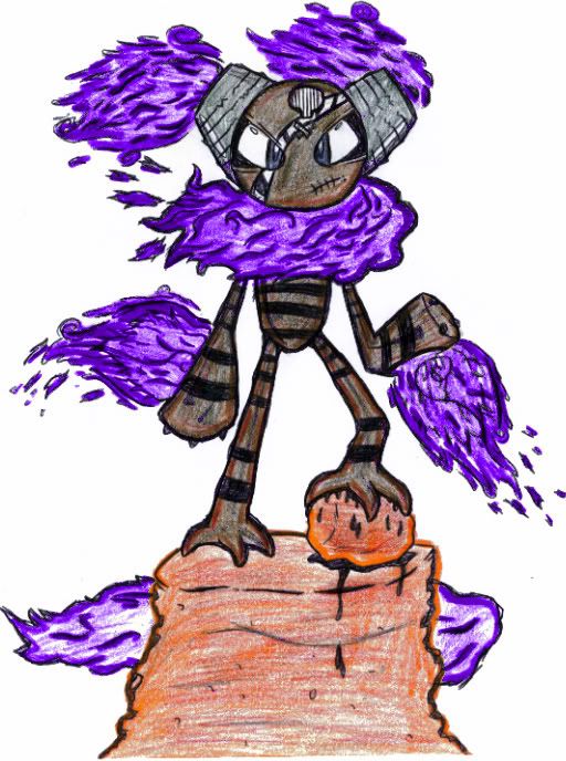
What I think would make the Smog Imp really awesome is if it were leaned forward a bit, and instead of being enveloped by the smog and dust, the cloud literally were his tail and swooped out behind him instead of swirling around him. That way, he could actually learn Tailwind!
Also, Absolution, when you put the rocks in, you said you felt it was unecessary, and I really do feel that this is the case, especially now that you've added in the sand. They just feel extraneous and distracting to me. And would some tiny little spikes up and down his forearms really ruin the feel? Just some ideas.
In any case, I think the design is excellent! Keep up the good work.
Dark purple / bright green / smog tail for me, by the way. I'm indifferent about the fangs.

Guys, I thought that now that Ground is the winning secondary type, most of the dragon concepts should be out of the picture, no offense to any of the great dragon concepts.
All the spider ideas and worms, etc look to me as if they should be poison/bug instead of poison/ground.
I think that instead, we should have a BULKY mole, who can move FAST through the ground, and let's say that it was exposed to radiation (HAHA I pulled a Marvel). It can spikes in the back, kinda hair-like, and the claws can be purple, or dripping with poison or something.
I don't have a scanner, so I can't show you guys what I think it should look like, but I hope someone can take the time to portray their understanding of it.
I agree...except for the fact that you're late.
Ground already won the vote.
It's already decided to be Poison/Ground.
So I don't think the "Dragon" people are behind, you are.
Some of these designs do look a bit "dragonic", but they are doable for a Poison/Ground.
On a side note these designs are great. I'm so proud to see the talent of this community gathered like this to create a good design. ^_^
Maybe all the artists should work together to create the best design possible.
Would you mind if i took a crack at drawing your design? as I actually like it and I wonder what another version would look like.
Please, feel free to go at it.
My rendition of your concept is shown below, you can tell me what you think of it.


Guys, I thought that now that Ground is the winning secondary type, most of the dragon concepts should be out of the picture, no offense to any of the great dragon concepts.
All the spider ideas and worms, etc look to me as if they should be poison/bug instead of poison/ground.
I think that instead, we should have a BULKY mole, who can move FAST through the ground, and let's say that it was exposed to radiation (HAHA I pulled a Marvel). It can spikes in the back, kinda hair-like, and the claws can be purple, or dripping with poison or something.
I don't have a scanner, so I can't show you guys what I think it should look like, but I hope someone can take the time to portray their understanding of it.
i did that like 6 pages back
- Status
- Not open for further replies.