There. Now to start coloring the back view.


There. Now to start coloring the back view.
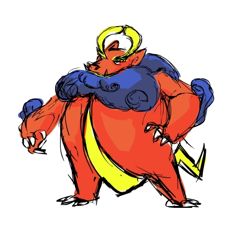
Gnarly ass dragon

@ Veedrock: Back View is fancy art talk for a view of the back. Also would a change to the more traditional electric colors be preferred?
I really like that first one Yilx the dinosaur/battery look is excellent! I can't wait to see how it turns out. But with the second one...is it just me or does it look like a pre-evo for Cartoons! poke?
Yeah, I could see it was like a dragon in a cloud (sort of like Altaria, but looks totally different) and both have that eastern dragon appearance. One little thing I really like on it is the little lightning bolts on the end of it's whiskers, they're strangely cute.Well after you mentioned it, I looked at his and it really DOES look like it lol. Not really, though... it's inspired by a cloud monster from a game I played long ago actually...
RE: Doug. I know yours is only in sketch mode, but I'm not sure if the single talons work for the feet. Maybe a thinner double or triple talon would make it look more balanced. Aside from the fairly silly looking Golbat, no pokemon seems to have only one extremity emanating from their paws/feet.
The single talons don't really bother me. I get why they are there. True, they may be a tad bit overdone, but I don't know if I would like a double or triple any better.


OP said:and any other CAP propaganda where a picture of the pokemon is needed.

@pkmn-taicho321: I like your design as well. It's hard to explain, but I think yours looks kind of "fat". I'm not sure if I'm explaining myself well, but maybe make it a bit "thinner" looking or sleeker some how. Maybe cut the width of the stomach just a bit just a tad bit.
Cartoons design is way out front for me. It has a bulky appearance, which fits the defensive style the votes are indicating this CAP will be. In that regard, I like how it appears to be based on the komodo dragon.
@Doug: Even though it's not Dragon / Flying, something about the typing of Electric / Dragon makes me think it can fly, hey Garchomp can supposedly "fly" according to its dex and it isn't part flying!, (maybe it has to do with the fact it reminds me of the dragon Teng from chinese mythology that lived in the atmosphere and could supposedly create lighting) so I envision it almost as a bird of prey in a way. That doesn't really matter, but I think a 3-toed talon much like birds of prey could like quite cool on your dragon, but still not overly complicated. Doug's is one of my favorite's so far.