CAP 8 CAP 8 - Art Submissions

Status
Not open for further replies.
I had been planning an electric guitar dragon all day and then I got home and saw doomsday's and FFFFed a little bit.

EITHER WAY.
Here is my electric guitar crocodile.
Zi6_9108.jpg


The strings of the guitar are actually electric currents that increase or decrease in amplitude depending on the sound output.
Those are speakers on its limbs.
AND YES IT IS WEARING HEADPHONES.
There isn't any black on the hind leg its just where I had issues erasing.

This is really my first ever attempt at CAP art so go easy. xD
 
cap8.png


This is my only one, so far. It's more or less based on a Chinese dragon, with some kung-fu thrown in there. I'm not perfectly happy with this one yet, though, so things might change as it goes on.
 
I changed my design a little bit, in an attempt to improve a few things that bugged me in the original design.

electricdragon2.jpg


I got rid of the single talon feet, and replaced them with three-clawed feet. I think this looks a bit more like a normal animal, and yet they still retain the overall aerodynamic look of the first design. I also changed the spikes on the neck to have more of a "lightning-esque" look to them.

Sleek... I like this design Doug. You have any thoughts on the color scheme yet?

And I agree... the replacement of the single talon feet was a pretty nice idea. Overall, I enjoy this design. Definitely has promise, methinks.
 
I appreciate the crits, Doug. X) I am indeed going to color this- I might even throw up some colortests on the thread in a few- I just want to have my actual design nailed down before I start fussing with colors. Markings are also a concern of mine when I get to that stage; markings might make it look nicer or more electric-y, but I'm worried that my design is already getting cluttered or overcomplicated.

Some belated opinions.

@DJD- Liking your design, very sleek- I like the departure from the standard jagged-ness that is the stereotype for lightning and the like, but it still conveys 'Electric!' very nicely. My only note might be that it's not screaming dragon to me- as has been commented before, I think, it harkens more towards a fish to me. Still very good, though, I'm envious.

@pkmn-taicho321- Also an interesting take. Good color picks- my beef is with the feet and legs; might they be extended forward just a bit, or enlarge the claws? It looks a bit precariously balanced; a little more stability might help.

@Beef 2.0- Cute, but I'm not getting the dragon from it- looks more like a ghost to me. Give it some more reptilian features in the general shape, maybe? Claws and vampire fangs aint gonna do it.

@Solstice- Liking it, but push more towards reptilan than amphibian- you can still keep it chunky, but it takes more than teeth to push it from that froglike appearance.

@Fuzznip- Good concept, but you have some anatomy issues, specially with the legs- tighten them and the face up and you have a solid little fellow.

@tennisisawesome- I like that you're going in a different direction from most of the designs here (more than I can say. X); ), but the little guy only barely looks electric to me, and no dragon features at all. Really, I might have mistook it for a prevo of Mawile. X) Try shifting to a three-quarters view (makes it look more three-dimensional and sold), maybe brighten the colors, and push some cutesy reptilian features? Dunno. Keep going, though, I like seeing different takes on all this.

@Elagune- Love the art, but it looks a touch too humanoid and anthropomorphic for my preferences, specially with the pole and 'clothes'. And the green on the critter works fine, but the bright green of the pole bugs me and shifts my perception to more of a grass-type.
 
@Caladbolg- I agree with m190049- maybe lengthen the face a little? You can still keep it simple, but that might give it a slightly more dragony bent. And while I'm glad that people will try dynamic poses, that pose does seem awkward- the center of gravity is waaay too far back for it to be concievable that your fellow is not falling backwards, even with the tail. His left arm also seems to be in an awkward pose. Otherwise, it's a wonderful design.
 
Just for the ones that stand out to me-
Caladbolg- This one looks really similar to the CAP 5 I believe it was, with your trident-tail wielding design. I know some people are going for cute, but this almost seems more like a prevo than a competitively used poke. Maybe change the face to a more dragon like one with possibly a snout of some sort? Just throwing out ideas.

Cartoons!- I absolutely love this one, but it could be mainly to the style in which you've drawn it. It looks just like king of Hyrule and Ganon from Windwaker combined, I think someone has said something along those lines. I like the Chinese god theme it has, and the other pieces using this work nicely as well. While it does seem godlike, it misses just a bit in the dragon department. Maybe mess around with it a bit and see what you get.

pkmn-taicho 321- Love the design you have going here, the dragon is clearly seen, but the electric is a little lacking. I know it's pretty cliche, but consider some kind of electricity of some sort, because the color scheme isn't quite enough. Also, the arms really remind me of Lati@s, but I guess that only furthers the dragon imagery.

Speaking of Lati@s, at a glance they wouldn't appear psychic, so I guess this goes for everyone in that you don't necessarily have to spell out the typing in the design. Everyone is doing great, keep up the good work.
I've looked through all the CAP art submission threads probably first thing when I joined smogon, so I think I may try entering this one if I have time.
 
Oh, yeah, the center of gravity is waay far back because I draw it diagonal.

Thanks for the comments.
Well, I'll change some things... That was the cool-one, now the cute-one:

img0001uum.jpg
 
Cally, your latest design really strikes me as being very adorable like (must be the face/wing tail). I would keep that one and maybe color it/draw some supportive material.
 
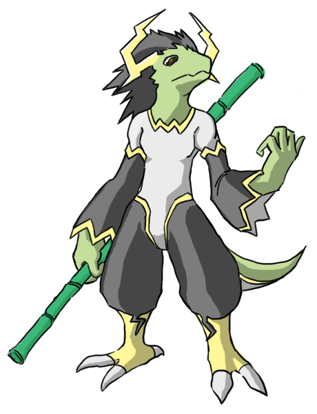
I like the direction, you're going in, Doug. My problem with the claws is less an aesthetic one, and more a visual inconsistency I find hard to get around. Long, curved claws like that are usually found on animals that dig (except for sloths I guess) which is hard to reconcile with your more aerodynamic design, which I imagine flitting about in the sky like an electron around an atom. It's the first thing I notice when looking at it, and, well, it's rather anal of me, but I can't help but yearn for claws that seem capable of gripping rather than digging.

Also, welcome back Elagune. It's a fantastic drawing you've submitted, but I have to agree with a previous poster in that its very anthropomorphic characteristics kind of put me off.

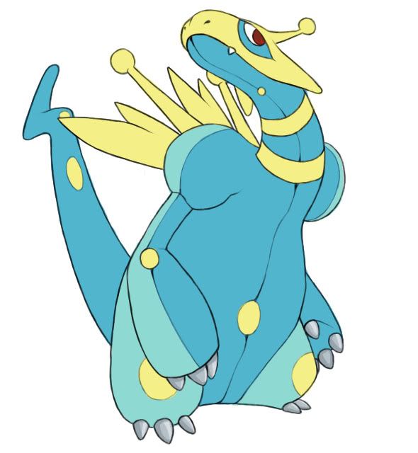
Grizzly bearz, I appreciate your sense of proportion as I see you've sectioned off his features holding the golden mean in mind. I think you've got the right idea in marrying form with function concerning his claws, but the lack of consistency in the number of digits he has on his feet compared with his hands is a bit distracting. The shape on his stomach, plus the tapering of the shoulders draws attention to the head which is nice, but the tail reminds me a little too much of Psyduck, although I guess I'd have to see the final coloring before making a full judgment.

I really like your sense of design, Caladbolg. If your previous efforts for this CAP looked like a first stage Pokemon, I'd say this new design would make an excellent second stage. It seems like he still has one more evolution in him though, but it's up to you. If you were to evolve him, I wouldn't say it'd be a question of adding more details, but rather of adjusting his proportions to make him look more adult. Clefable, for example, manages to look cute, but at the same time, is clearly an adult, due to its proportions (smaller facial features compared to the size of the body). You can see that working similarly in humans too. Again, great design, and I'm always a fan of your drawings.


edit: That coloring looks great, taicho. Because of the black holes and the original coloring, I wasn't sold on it before, but this really changed my mind!
 
pkmn-taicho 321- Love the design you have going here, the dragon is clearly seen, but the electric is a little lacking. I know it's pretty cliche, but consider some kind of electricity of some sort, because the color scheme isn't quite enough. Also, the arms really remind me of Lati@s, but I guess that only furthers the dragon imagery.

Idon't know how I could make the Electric clearer, I mean the thing on his back are like those lighting machines they have at the boston museum of science.

http://cache.boston.com/bonzai-fba/Original_Photo/2007/11/05/1194303137_6097.jpg


If you ever get the chance to go you should, it's amazing (ah, but bring earplugs it's loud XD)
 
I've been around Smogon forever lurking, and CAP since Syclant. This is my first time ever getting the motivation to try myself.

Based on the concept of a Veiled Chameleon:
(Lizards of all kinds to me have always seemed dragon-esque)

pokemonchameleon2.jpg


I know it's a blurry shot, but it was done on lined paper and the picture was taken by an iPhone. >< If some people like the concept, I'll probably bring it into a digitized draft and work from there. Would like criticism! :) Especially on how to bring it alive in the Pokémon world, or add more defining Electric/Dragon elements. I felt kind of restricted with the concept, but I liked it.
 
A coloured version of my design:
3.jpg


I'm really seeing this as having Rough Skin / Marvel Scale / Shield Dust (A kind of diamond dust version, which would be cool, no?) And not so mysteriously the abilities I want most.
Any Advice?

And pkmn-taicho321, great colouring! Wanna get your gf to do mine too?;)
 
@ Caladbolg: The fisr (cool) design was way better in my opinion, I really like it as usual your material is great!

@Doug: It is also awesome, I just have a few doubts about the feets they look a little awkward, however they aren't bad at all perhaps change them for longer Flygon-like feet? I dont know im not so experienced mysself.

@Gooey: I think your design looks alot like a Rcok/Dragon or Ice/Dragon pokemon...I dont see much of Electricity going around it.

I hope it isnt too late but I'll try to submit something tomorrow, I will need someone to help me color it however, any help is welcomed.
 
I really like your sense of design, Caladbolg. If your previous efforts for this CAP looked like a first stage Pokemon, I'd say this new design would make an excellent second stage. It seems like he still has one more evolution in him though, but it's up to you. If you were to evolve him, I wouldn't say it'd be a question of adding more details, but rather of adjusting his proportions to make him look more adult. Clefable, for example, manages to look cute, but at the same time, is clearly an adult, due to its proportions (smaller facial features compared to the size of the body). You can see that working similarly in humans too. Again, great design, and I'm always a fan of your drawings.

Thanks, Cartoons!. I feel honored.

I'm trying to give it some adult-form [I'm not completely satisfied with the design]...

Every time that I try, every time that looks like a Dragonite. I know that my cutemon with a color scheme will look different, but I want to get a unique aura with this fakemon.

img0002lha.jpg


I think that the Wing-tail is a unique detail [with a lot of Thunder-tails here]. But I want to give it some special... I'll work on it.
 
Status
Not open for further replies.
Back
Top