CAP 9 CAP 9 - Art Submissions

Status
Not open for further replies.
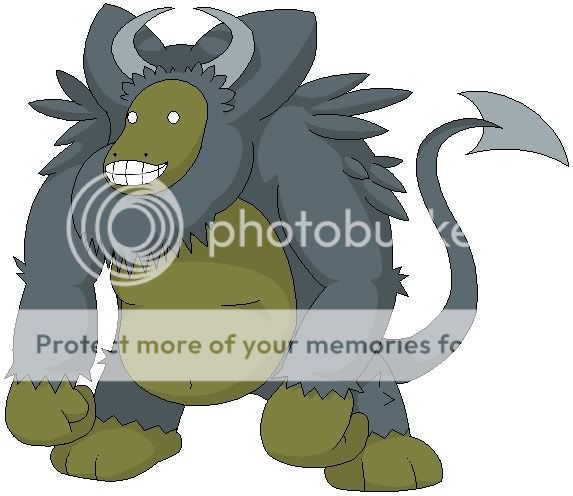
nnn fuck man I love that buffalo Doug.
More ruffies

ruffy4.jpg

My favourite of the colours I came up with.
http://img53.imageshack.us/img53/8756/ruffy3.jpg
Kinda joint favourite.
http://img376.imageshack.us/img376/5139/ruffy7.jpg
http://img183.imageshack.us/img183/5280/ruffy6.jpg
http://img2.imageshack.us/img2/1656/ruffy5.jpg


Not really sure about the colour schemes I have so far.. I liked it better as line art, and I still prefer my other concept. But I guess I'll have to go with whichever one fits the stats our CAP gets.
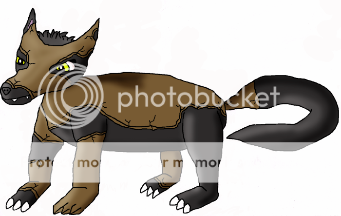
 
I give to Armadillo a "mockery" [???? ...correct me, please] mouth.
More dynamic poses:

imgbz.jpg
 
GreenMamba: I like. Good outlines, though I think the feet could use a little work and variation.
Thanks for the comment. I tried a couple of different variations on the feet, not sure which one to go with.
migh09.png

m7atli.png

Outside of the feet, any other comments would be appreciated. I think I'm going to start shading it soon.

Some comments of my own:

The Mutant: I'm with DarthVader, #5 is the best color scheme. One suggestion I think would be neat would be some mane like hair on either its front or back legs near the feet. Just a thought.

DougJustDoug: I like the buffalo, but I think it might be better served with longer legs.

Atyroki: I like the design, but I personally see it with a shorter, thinner tail myself. The tail currently seems to dominate his design too much.
 
Coloured version.


Fixed its left leg, and added extra marks on the head. I'm also experimenting with other poses and getting it to stand on two legs, though the latter makes it look an awful lot like a Digimon.
 
Caladblog, those sketches are fantastic! I really love that design now!
Oh, and DougJustDoug's buffalo is amazing. Like most of DJD's designs it has a great back story! I can't wait to see it colored!
 
I just wanted to address something that really bugs me:

Now, I realize this is going to happen and it's probably going to keep happening, but I'm continually disappointed by comments like "Your fakemon should be brown/tan because it's a ground type." (This also applies to any comments like "your poke needs to be darker or more black because it's a dark type.) In fact it does not have to follow any sort of trend like that.

In fact the trend that nintendo has laid down for us shows that around half of the ground pokemon out there do not even have tan or brown colours at all. Look here. I can list some if you want an example: Nidoqueen (tan on the belly maybe...), Nidoking, Wooper, Quagsire, Gligar, Gliscor, Phanpy, Donphan, Larvitar, Pupitar, Marshtomp, Swampert, Numel, Camerupt, Barboach, Whiscash, Gible, Gabite, Garchomp. Is that enough? It appears to me that nintendo follows the rule that the flavor behind the pokemon defines its type; not it's colour.

It's definitely one of my biggest pet-peeves but this colour ruled by type thing gets on my nerves.

Besides, if you really are going to make these comments anyway at least have some respect for the artist(s) who put work and effort in to designing and drawing these for your pleasure; don't take it for granted.
 
I think this is the first time ever that I've really, really, really liked Doug's artwork. I'd suggest using brown and red as the main colours in that design. I'm still going to wait to see if, among other things, Elegy's baboon gets a breastplate and the sand slug gets fangs and eyes, as well as seeing if anyone out there can trump the designs already here.
 
Did some mockups for the mock turtle. It was fun to have the opportunity to play with different sketching and coloring styles.

mturt_sketches.jpg


Two mopey poses sandwiched between the angries.
 
It's not finished, but i thought i should let you guys have a peek at my design. any comments or suggestions of what should change about it would be nice.
cap9l.png

Oh and about most grounds not being brown, about half of them that aren't are colored like the other type they have.
 
Well, thanks for the critique. I don't really like the thought of a breastplate, but if you guys really do want to see Monkeymon with one, i'll give it a shot.

Now here's what happens when I try this in MS paint:
MonkPaint2-1.jpg


I really do think i'm going somewhere with this, but I would like your opinion of paint vs. ink.

Also, it really has lost its Baboon style, so i'll just call it Monkeymon.
 
Did some mockups for the mock turtle. It was fun to have the opportunity to play with different sketching and coloring styles.

Two mopey poses sandwiched between the angries.
I like the design, but I think it could benefit from having an earthy tone on its belly. It looks more like Dark/Water than Dark/Ground.
 
Thanks for the comment! It really helps to know that someone is paying attention to your work, no matter how small.

That being said, this is my first ever work done in paint.NET!
Sandcastle.jpg


A rough job, but there nonetheless. If enough people seem interested, I'll clean it up.
I'm going to do things like make the sand sandier, the darkness swirlier, and the hands and feet shinier.
Before I start doing things like that and shading, I'd like criticisms on the coloration.
 
I made some changes to the mole-bear/badger thing. I incorporated some elements from my other design.
cap9molebear2.jpg

cap9molebear3.jpg


I'm not sure if I'll keep the tail or use the long or short ears.
 
Wow, huge improvement from your previous one Darthvader.
It's a tough choice but I'll have to say the first one looks better in my opinion.

Awesome poses Cartoons! =O
 
IT ARE COLOR COMPS TIEMS. (I can still alter the main design if anyone has any comments about it.)

I could really use help here- color comps are not my strong point! Feel free to comment that one set is perfect, or that I should use one set but use the mane color from another one, or suggest something entirely different that I haven't done. :V Keep in mind the typing; I want the one that looks best but still suits the typing! I know, Dark's the primary, but I could probably use more of a Ground element.)

#1. http://imgur.com/ww3jA.jpg (like this one but probably aint Ground enough)
#2. http://imgur.com/OVOOu.jpg (lots of brown but I'm concerned about the dark brown mane since I swear I will kill the next person who's all 'lol Tauros :V' )
#3. http://imgur.com/4nrDh
#4. http://imgur.com/U6Spz.jpg
#5. http://imgur.com/ohKMj.jpg
#6. http://imgur.com/DSuuq.jpg (probably too similiar to earlier ones but eh)

Feel free to do paintovers, too, if you'd like.

I like #1 the most. A violent Red color with the glowing yellow eyes makes this look appropriately demonic. The dark brown of the mane adds to both these effects.
 
2i8ix07.jpg


Mole doing Rapid Spin. I need to do a better drawing of this, it's a lot worse than I imagined in my head, and I have some other poses in mind for Rapid Spin, but I just wanted to get something up today.
 
I'd just like to note that I never draw and that, moreover, I know very little about pumpkins. So please tell me if I'm doing something wrong.

Cap9Jack-O-LanternScan.png

It's a jack-o-lantern. with horns. And claws. That's growing out of a patch of dirt (pumpkins do that, right?). It's quite rough.

It's not the most ridiculous thing ever, but it's probably pretty close.
 
Status
Not open for further replies.
Back
Top