CAP 36 - Art Submissions

WIP

ohlawdhecomin.png


iwassecretlywishingforlevitate.png


I made this fella chonkier!

 
Last edited:
WIP
CAP36A-640x.png

CAP36B-640x.png

Preliminary idea is a chained up cat that the opponent can’t help trying to free, so it attacks the bonds instead of the cat itself. Each bond covers up a spot where the cat vents heat, causing its body to overheat. When freed, it releases heat through its fiery hairs, lowering its body temperature to below freezing, enabling the use of both fire and ice attacks.
 
WIP

For the base form, I went for a steamy look, and for the CAP form, I just made it an ice skater for legitimately no reason
However, I’m afraid I might not be able to upload my final submission. This is because not only do I use Procreate, which means the canvas sizes are usually very high, but also because I need to compress them in order to submit it. Also for some reason… I can’t properly save my drawing, as it would just crash the app entirely, so I had to manually screenshot this drawing. Yeah… I understand if this isn’t qualified for a proper submission. Does anyone else here use Procreate? If so, please let me know by leaving a message in my profile page on how go around this problem. Please and thank you in advance.


EDIT: problem solved I’m just a dumbass lol
 

Attachments

  • IMG_4974.jpeg
    IMG_4974.jpeg
    347.9 KB · Views: 45
Last edited:
Derpy Chicken.png

Final product is probably gonna be completely different and much more detailed/textured, but figured I'd copyright my idea while I still can. The defensive form is the bird in its egg while the offensive form is the bird, well, outside of the egg. Gonna add more colors to the egg, like an easter egg. The bird is a chicken atm, but I'm also considering making it a peacock.

btw it's partially inspired by that chicken from Moana
 
Last edited:
WIP

Pokemon inspired in a Russian Matryoshka doll and a Japanese Geisha; The original form looks like a sad doll accumulating power inside his very strong and heavy kimono with high Defense. After doing Relic Song, she transform in a released doll with Blue flares and cold refrigerate body


Mod edit: oversized image
 

Attachments

  • WhatsApp Image 2025-04-28 at 13.45.50.jpeg
    WhatsApp Image 2025-04-28 at 13.45.50.jpeg
    1.1 MB · Views: 641
Last edited by a moderator:
WIP
New finalized design I thought about since it becomes more offensive it drops the bulky air conditioner and the broken pieces of the air conditioner turn into sort of controllable projectiles or armor in fact you can see the cracks in the air conditioner im thinking this post will also be the post I will post the coloring for the finalized design for my idea
 

Attachments

  • PXL_20250501_164736717.jpg
    PXL_20250501_164736717.jpg
    1.3 MB · Views: 38
Last edited:
WIP

Here's the current color sketches of my designs based on the King and Queen of Diamonds:

King-of-Diamonds-6.jpg
Queen-of-Diamonds-6.jpg


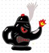
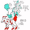
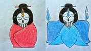
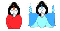
I got the inspiration when thinking about gambling and the idea of when playing card games the cards are sometimes "hot" and sometimes "cold" - which connected with our Fire and Ice theme. I then thought of the face cards and how that pulled in concepts of royalty and lots of gold, which would allow me to bring in the whole Steel typing thing. Also, I immediately thought of having the forme change be King and Queen formes, with the KIng being big and defense-oriented, and the Queen being more lithe and offense-oriented. I chose the Diamonds suit for a couple of reasons. Since it is a red suit, it allows coloring that works well with Fire typing, and red gemstones like rubies have long been associated with the sun and fire in many different cultures. Also, diamonds allow me to put some crystalline elements in the Queen forme, to support more of the Ice typing.

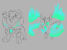
In general though, I really don't want to just slap any direct typing indications on these designs just... because. Like, I'm not gonna put flames on these just to scream to everyone "Hey look, these are Fire types!" I'm not saying there is anything wrong with doing that, and I certainly do that on most of my CAP designs. But this time, I want to let coloring and the general design theme hints carry the burden of supporting our chosen typing.

Although these sketches are pretty clean, they are just sketches. I'm not sure what I'm gonna do in terms of posing for actual submission. I might play around with making basic 3D models to help me with different perspectives, and also allow me to practice my 3D artskills. But with two designs this time around, I may not have time to do any serious work in 3D. Also, for this CAP I'm planning on doing more basic cell-shaded lineart than my past couple of CAP designs where I have gone super-detailed with the coloring and shading. Mainly because I just don't have time to do detailed renderings of two designs. But we'll see how it goes as I proceed with these designs.
 
Last edited:
Back
Top