
I didn't really notice it at first, but looking at Yilx's submission, I can see the resemblence to Mismagius, I suppose. The thing that more grabbed my attention when I first saw it was that its hat screamed Tentacool to me, with it's blue coloration and the red gem at the center. That and... right now, it just looks like a normal human girl with very long hair cosplaying as a Tentacool/Mismagius fusion. I don't really feel anything "Pokemon" about it at all--it's just too human for my tastes. There are Pokemon that are very humanlike, like Jynx and such, but they find ways of making themselves distinct from actual humans (through coloration and proportions like Jynx, through giving them other non-human attributes like Machoke and Hypno, or taking the idea in a different kind of direction like Froslass (which is a great example for the type of concept your submission is based on--Froslass is based on something distinctly human-like, but takes the idea in a direction that makes it quickly apparent that Froslass itself is quite different from humans)), which that design really hasn't done, IMO. It's a good idea, but it could really use some more work at this point.

-
The moderators of this forum can be found in the CAP forum staff directory.
-
Welcome to Smogon! Take a moment to read the Introduction to Smogon for a run-down on everything Smogon, and make sure you take some time to read the global rules.
-
Congrats to the winners of the 2023 Smog Awards!
CAP 10 CAP 10 - Art Submissions
- Thread starter beej
- Start date
- Status
- Not open for further replies.

Haha, that's a really outlandish design you got there Dragonzrule, I like it. Was it perhaps inspired by the yeti crab?
Speaking of crabs, I've decided to tinker with the hermit a little more. While the plasma ball got a lot of positive feedback, I'd like to keep multiple designs up in the air until stats and abilities are decided upon. So... here's a piece of crappy concept art!
And you thought Rotom had ridiculous forms.
Being a bit larger than your standard crab, Hermitmon is in short supply of fitting shells and usually has to resort to finding other things to stick on his ass. Each object has unique properties that benefit Hermitmon in their own special way (such as the plane engine's steel casing offering a protection against Dragon type attacks).
I'm interested in hearing ideas about what other sorts of "shell" that Hermitmon can wear, so I can add them to the concept art. What do you think?

I truly enjoy Paris Hilton's design. Although, It does appear a tad Ghosty. Thats perfectly fine as many pokemon don't look their type (Sudowoodo?).
I'd suggest changing the black face. I feel thats what's making it appear too "darky/ghosty" combined with the eerie lanturn. I like the lanturn part, as we need more farfetch'd style pokemon, but the face is the oddball.
The rest of it is amazing though, I honestly see the "electric" in there and not so much the Water, Which I feel is extremely important to this CAP because Electric is the primary typing, not Water. And I wish there were more "electrical" designs and less fish, as pokemon is already over saturated with fish.

Whoa, I wasn't kiddin when I said I was in stiff competition. Almost every submission here is win in its own way... and it'd take me too long to comment on all of them. @__@!
So I finally got to my design / conceptualization and I had my friend color it several different ways, because I wasn't sure which one looked best. Your opinions would help a lot!
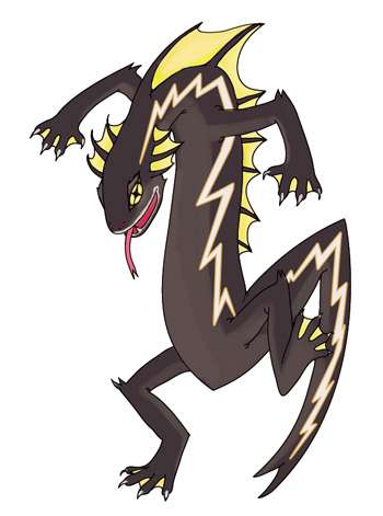
I went with a salamander / basilisk kinda theme. Like basilisks it an run on water or swim if need be. When threatened it arches its body into a more intimidating and lightning bolt shaped stance; its webbing and bolt shaped markings glow with bio-luminescence as a means of communication, aggression, warning, or a lure. I know it's catered to OU threats, but I feel like he'd have a cool rivalry thing going with Charizard and Sceptile. Maybe I'll use that for supporting artwork.
Black is beautiful.
http://img229.imageshack.us/img229/9836/salamander1.jpg - Aquamarine~
http://img411.imageshack.us/img411/4747/salamander2.jpg - Poiple~
http://img691.imageshack.us/img691/1687/salamander3.jpg - Obvious blue is obvious~
So I finally got to my design / conceptualization and I had my friend color it several different ways, because I wasn't sure which one looked best. Your opinions would help a lot!
I went with a salamander / basilisk kinda theme. Like basilisks it an run on water or swim if need be. When threatened it arches its body into a more intimidating and lightning bolt shaped stance; its webbing and bolt shaped markings glow with bio-luminescence as a means of communication, aggression, warning, or a lure. I know it's catered to OU threats, but I feel like he'd have a cool rivalry thing going with Charizard and Sceptile. Maybe I'll use that for supporting artwork.

Black is beautiful.
http://img229.imageshack.us/img229/9836/salamander1.jpg - Aquamarine~
http://img411.imageshack.us/img411/4747/salamander2.jpg - Poiple~
http://img691.imageshack.us/img691/1687/salamander3.jpg - Obvious blue is obvious~


Final Submission
Okay, Final Submission time!
The Sea Angel/Angler Fish hybrid thing.

I'll gladly alter the colour scheme again if feedback calls for it, but I definetly prefer this to the blue/yellow/orange version which I found kinda garish.

The previous pose with the new colour scheme. I've changed the hood shape slighty since this but its a cute pose, and you can see the back fin which isn't visible in the front view.

Support material using the final design. Attacks and what have you.

This is all based on the original design, but most of its still relevant.
I'd also like to take this opportunity to thank everyone for their support, this has been a lot of fun to work on, and I'm looking forward to seeing everyone else's final submissions too! And I wish everyone the best of luck!


Skymin_Flower
It's Seed Flare time.
That is really good!! I am glad you avoided the typical blue and yellow, but I can definitely see the electric type in it. I am also glad you didn't do an electric eel, because it is sooo obvious. But really, I love this concept.Hi everyone,
This is my Final Submission and also my first post ever on Smogon :)
(unless the picture doesn't show up).
Anyway, I was going for a more aggressive poke than the others suggested here, also was trying to avoid blue and yellow. Please let me know if you can't see enough electric type in it. The initial concept was for an electric eel but it sort of veered a long way off track.

Hope you like it!

Yilx: I gotta say I prefer elements of the original design, such as the more defined lightning designs on her "clothes". Its still great though regardless.
One thing I might suggest is you could make the ends of her bangs/tentacles a diamond shape, like what the ends of a squid's two larger tentacles looks like: http://static.howstuffworks.com/gif/squid-14b.jpg
One thing I might suggest is you could make the ends of her bangs/tentacles a diamond shape, like what the ends of a squid's two larger tentacles looks like: http://static.howstuffworks.com/gif/squid-14b.jpg

@Paras: I love the new design - it looks cheerful when you look closely, but also rather scary from an initial look, as the hood covers it's face. Which, in my mind, is how an angler fish would work. I can see two egg groups in the design too - Fairy & Water 1 - so that helps me decide.
@Yilx: ZOMG - I want that... it looks excellent, what with the electric tentacles and it's general feel about it. However, I disagree with the others about the "Pokeman-y" feel of things - that term is too loose and general to use to describe things.
Krabby is only a Pokemon as the crab has four legs. Similarly, this can be a Jellyfish Witch because of it's general look. If it's a Squid Witch, equally - it works fine.
@Lovebite: I think your Platypus/ Kappa seems a bit similar to Golduck in name, so the 'Dex Entry would need to be changed to compensate, so that it doesn't sound like an evolution.
That said, I think the design is brilliant - it avoids the traditional colour schemes and gives us something new. One thing I will say is that I cannot see the Electric typing, but many Pokemon have typings you cannot see in the design.

I really don't understand this apparent need for yellow and blue colour schemes. Seriously, do you really need to justify the typing even further by putting the two fundamental colours of the typing into the colour scheme? Have confidence in your designs themselves! Look at Flaaffy, Pachirisu, Luxray, Magneton and Rotom. They barely have a speck of yellow on their designs but are still clearly electric. And this is even more true of water! Psyduck, Staryu, Politoed, Octillery. I mean, sure, they're gonna be water types no matter what colour you make them, but then look at Shellos. Bright pink, and doesn't look all that water to me, but it doesn't matter. And I'm well aware that less obviously aquatic designs are often coloured blue (Suicune), but again, thats because it has no feature in its design that is obviously water type. These designs all do. Look at secondary typings. You really think Slowpoke looks psychic type? How about Starmie? Gyarados is Flying? Hell, there's a lot of existing Pokémon who don't even look remotely like their actual type. Wobbuffet as Psychic? Gengar as part Poison? I mean, granted, obviously you couldn't come up with a big fireball idea and say 'yeah, its Electric/Water', but a lot of you are being very narrow-minded, conceptually. I mean, Paras Hilton's design, (although I love the final submission) was fantastic even in its first iteration. I still don't see any Sneasel, and the fins denoted its water typing, and the lantern hints quite clearly at electric. Typings don't have to be completely-in-your-face obvious. Yilx, too. Quite clearly water/electric from the design. I'd personally like to see at least a shiny concept with the blue replaced by pink, just to see how it looked. Darkmattr, fair enough, your design doesn't scream electric, but the yellow in this instance certainly does help. But I think people need to get out of the mindsets that things are only electric if they have some yellow in them.
Attempt #3...
http://img694.imageshack.us/img694/9792/cap102.jpg -> Red Version
http://img3.imageshack.us/img3/6553/cap1022.jpg -> Bluer Version
http://img156.imageshack.us/img156/9379/cap1023.jpg -> Shiny
I'm liking the Bluer one myself, but what do you guys think?
http://img694.imageshack.us/img694/9792/cap102.jpg -> Red Version
http://img3.imageshack.us/img3/6553/cap1022.jpg -> Bluer Version
http://img156.imageshack.us/img156/9379/cap1023.jpg -> Shiny
I'm liking the Bluer one myself, but what do you guys think?
Yilx: Yeah I'm definetly liking that bluer one too. Great job!

I really like the Tiger Shark concept, but there are two main problems with your design:It's not done yet but I wanted to post it before I went to bed. Any suggestions would be helpful rright now so I can change them easier. It's hard getting the hang of this online painting program...
(Here's the link if you can't see it: http://i41.tinypic.com/2eoljk7.jpg)
Supporting Details:
I had the idea of a "tiger shark" in mind for a very long time but only recently did I realize I could make it applicable to a CaP. Sharks have weak electric fields that they can use to sense prey, which could be interpreted as the Electric and Water types in that respect. Tigers, on the other hand, are very versatile animals, living in a range of climes and conditions, but only the kind their specific species is accustomed to - similar to how CaP10 is supposed to counter only a certain grouping of threats at a time. Also, tigers are pretty bulky and that could transpose to high HP (see the stat spreads thread). I could see myself making a pre-evo of this as a "cat-fish". Any and all suggestions are welcome, but I won't see them until tomorrow. Goodnight everyone!
EDIT: I can't see my own picture...
1) The color scheme looks too much like Electabuzz/Electivire
2) It looks to much like a tiger, and not enough like a shark. I understand you want to emphasize that Water is it's secondary typing, but the only the tail, and the fins are from a shark. I'd try to add a few more shark features. (Perhaps Sharks eyes, shark face, shark teeth?)
I do have one suggestion to make your design stronger: Give it a head similar to a hammerhead shark. Why, you may ask, because that "weak electric field" that all sharks have (It's called Electroreception by the way) is the most powerful in hammerhead sharks. That's why their heads are so long, they hold more electro-receivers than any other shark. If you add a hammerhead head, it would bring out both the Electric and the Water elements on your design.
Overall, though you do have a strong concept, that's defiantly worthy of "utility counter.
Other Artists:
Yilx: I like that shiny color the best, particularity the green. Maybe you should try the green and the blue together?
Paras Hilton: Great job, great job!
alix13: For a first post ever, that's an incredible design! I really like the concept, and the coloring. You already have my support, but if you'd like some more, you should draw some pictures of your electric eel against other pokemon.

Great Work Paras! That's definitely the best entry so far. A brilliant mix of cuteness and scaryness, god it's awesome.Okay, Final Submission time!
The Sea Angel/Angler Fish hybrid thing.
I'll gladly alter the colour scheme again if feedback calls for it, but I definetly prefer this to the blue/yellow/orange version which I found kinda garish.
Although this is great too ( I know it's not the final design but i like this one better) :

Sketching up some supporting material for good measure...
http://img185.imageshack.us/img185/7103/sketchs.jpg
Thunderbolt, Rapid Spin, Reflect and... I don't know
http://img185.imageshack.us/img185/7103/sketchs.jpg
Thunderbolt, Rapid Spin, Reflect and... I don't know
Apparently, I'm the only other one who thought this, as mine seems to be the only entry that doesn't borrow from Lanturn's color scheme... =0 Not tht mine's more likely to win over the ones that are actually really good. >.>I really don't understand this apparent need for yellow and blue colour schemes. Seriously, do you really need to justify the typing even further by putting the two fundamental colours of the typing into the colour scheme? Have confidence in your designs themselves! Look at Flaaffy, Pachirisu, Luxray, Magneton and Rotom. They barely have a speck of yellow on their designs but are still clearly electric. And this is even more true of water! Psyduck, Staryu, Politoed, Octillery. I mean, sure, they're gonna be water types no matter what colour you make them, but then look at Shellos. Bright pink, and doesn't look all that water to me, but it doesn't matter. And I'm well aware that less obviously aquatic designs are often coloured blue (Suicune), but again, thats because it has no feature in its design that is obviously water type. These designs all do. Look at secondary typings. You really think Slowpoke looks psychic type? How about Starmie? Gyarados is Flying? Hell, there's a lot of existing Pokémon who don't even look remotely like their actual type. Wobbuffet as Psychic? Gengar as part Poison? I mean, granted, obviously you couldn't come up with a big fireball idea and say 'yeah, its Electric/Water', but a lot of you are being very narrow-minded, conceptually. I mean, Paras Hilton's design, (although I love the final submission) was fantastic even in its first iteration. I still don't see any Sneasel, and the fins denoted its water typing, and the lantern hints quite clearly at electric. Typings don't have to be completely-in-your-face obvious. Yilx, too. Quite clearly water/electric from the design. I'd personally like to see at least a shiny concept with the blue replaced by pink, just to see how it looked. Darkmattr, fair enough, your design doesn't scream electric, but the yellow in this instance certainly does help. But I think people need to get out of the mindsets that things are only electric if they have some yellow in them.
I do appreciate Yilx's and Paras' creative designs though. :3
Eh, I think it's pretty much fine:I really like the Tiger Shark concept, but there are two main problems with your design:
1) The color scheme looks too much like Electabuzz/Electivire
2) It looks to much like a tiger, and not enough like a shark. I understand you want to emphasize that Water is it's secondary typing, but the only the tail, and the fins are from a shark. I'd try to add a few more shark features. (Perhaps Sharks eyes, shark face, shark teeth?)
1.) Eh... I suppose, but it seems like a distinct enough Pokemon here. The colors may be the same, but I'm not getting much of a vibe of the Pokemon themselves being that similar, so this doesn't bother me too much.
2.) Which are quite enough to get across the point that its water, especially when those aspects are more than what some Pokemon have as Wizwum pointed out (ex. Slowpoke's Psychic subtype, Gastly line's Poison-type, Azurill as a whole (seriously, who would have guessed that thing was Normal at first sight?). That and when Pokemon like Mareep and Flaffy have subtle, but clearly notable ways of cluing us into their typing, similar stuff like this is just as good IMO. We can clearly gather that it's a Water-type (and that it's probably a subtype and not the main typing) from the design, and that's enough; it doesn't need to scream it with every feature.
Got all my college work finished so I found time to do a new set of supporting materials, woop! http://img693.imageshack.us/img693/4827/finalangel4.jpg
I'll add that to the final submission post now.
Yilx: The new tentacles are really working in your support material. "I Don't Know" is my favorite attack.
I'll add that to the final submission post now.
Yilx: The new tentacles are really working in your support material. "I Don't Know" is my favorite attack.

Yilx:I like the blue one too and your supporting art is very convincing. Great work!
(I liked the 'arms' a little better on your original submission I think but the difference is negligible.)
Darkmattr: I don't think I ever said how much I like your design. It has to be one of my top three at least and will definitely be vying for my vote. The supporting art you put up did a great job of showing us how he moves and works.
You did a great job with the supporting material! Those alt. colors fit your Pokemon perfectly! Gonna vote for you for sure!
Paras Hilton: That supporting material is fantastic! I particularly like it using Flatter/Attract, and how Seaking & Golduck reacted. Gonna vote for you too!
I'm gonna whip up some more supporting material for my Lucky Sea Ocelot, while pkmn-taicho321 continues to perfect it.


I actually found the blue/yellow/orange much more fitting to the theme. Also, when the lightning bolt shapes on the concept were yellow, they much easier came off as electric-symbols. Right now, with them white, you don't get quite the electric feel from them. That's my only complaint, honestly, and I think going back to that color scheme would be appropriate. Some people might claim "It's unoriginal!" but let's face it, that color scheme works for a reason - the visual cues for what the 'mon is supposed to do are obvious. That's important.Paras Hilton said:
I definitely think the thing looks better without a pre-evolution. Your concept has a very standalone feel to it, which is something I rather like.Paras Hilton said:
I don't know why people keep congratulating everyone on avoiding using the colors blue and yellow. Right now, your concept has no hint of electricity anywhere in it. It looks like a Water/Dragon, if I had to guess at all. I think following the typing is far more important than using some non-standard coloring. Definitely try to get some more electrical shapes or cues in there, otherwise this just won't fit the primary typing of the CAP.alix13 said:
This one is looking a lot better. It looks really good without borrowing too heavily from Mismagius, as it clearly appears like a squid now and not a witch-pixie-thing. Still, though, my biggest strife with the current design is that it is lacks a lot of excitement. It looks like the pre-evolution to something else that's more intricately designed and has more substance. I'm not sure what exactly could be done to the concept to get it into a final-stage appearance, but Aragornbird had a similar issue with his shrimp design. If you can get it looking more 'final', that'd be great. I also feel as though maybe a few more electric cues would be great. It isn't plainly obvious right now that the tentacles are lightning bolts, and that's basically all there is at present. Keep it up!Yilx said:
I find this a troubling point of view. The reason a lightning bolt reminds you of a lightning bolt at all is because of the visual cues a yellow lightning bolt give you. For instance, if we look back at Cyclohm's Concept, and you recolor the heads to be, say, white, instead of yellow, the thing looks completely out of place and you lose a huge part of what makes it feel electric at all. However, also note that his tail and toes are light-blue! That sort of lightning bolt, alongside yellow ones, shakes up the color scheme without taking away from the feel! (That's good!) The yellow is a very important cue for the electric typing. Granted, lightning bolts aren't the only electric visual cue that exist (take a look at Caladbolg's electric plug and light bulb cues), they're the one that fits with the most designs without disturbing the aesthetic flow. You couldn't just slap an electric socket on Paras Hilton's entry, for instance, and make it work.Wizwum said:I really don't understand this apparent need for yellow and blue colour schemes. Seriously, do you really need to justify the typing even further by putting the two fundamental colours of the typing into the colour scheme?
Anyways, tl;dr, don't complain if people use yellow and blue. It's not borrowing from Lanturn's color scheme, it's using a very clear-cut way to give people the visual cues necessary to believe that yes, this Pokemon is Electric- and Water-typed.
I agree, it doesn't have to scream every feature, but right now, this Tiger Shark is looking a little like a feline version of "Garchomp." Or in other words, a tiger with shark features, rather than a creature based on a Tiger Shark.Eh, I think it's pretty much fine:
1.) Eh... I suppose, but it seems like a distinct enough Pokemon here. The colors may be the same, but I'm not getting much of a vibe of the Pokemon themselves being that similar, so this doesn't bother me too much.
2.) Which are quite enough to get across the point that its water, especially when those aspects are more than what some Pokemon have as Wizwum pointed out (ex. Slowpoke's Psychic subtype, Gastly line's Poison-type, Azurill as a whole (seriously, who would have guessed that thing was Normal at first sight?). That and when Pokemon like Mareep and Flaffy have subtle, but clearly notable ways of cluing us into their typing, similar stuff like this is just as good IMO. We can clearly gather that it's a Water-type (and that it's probably a subtype and not the main typing) from the design, and that's enough; it doesn't need to scream it with every feature.
He doesn't have to add a whole bunch of new features to his design, but he should probably add one or two more shark features, perhaps with different eyes, or a different face, or even a different pose. This will still allow him to look primarily like an Electric type, while keeping his design rooted in the idea of a "Tiger Shark" rather than a "Tiger with a tail & fin from a shark."

--Huge Edit--
This is the piece shaded and finished, with catfish whiskers and fixed claws/ears. I also flipped its tail out of the ground. If there is anything to change, please tell me, and I'll change it real quick before submitting.

Comments-
Apocalypse: Whiskers done! Like it?
Mathioks: I think if I made it snakey-eel like, the literal meaning of a "tiger shark" would be lost. However, since it sounds kind of easy, I might end up trying it out to see if I like it. Also, please quote the link rather than the entire pic.
SEO: Wow. That is incredible. Not much more I can say.
Wyverii: Looks very good. One minor thing, if you can somehow smooth out the top part of the snout, it will allow it to appear more polar bear-y and less like a dog. If you look closely, polar bears have a very slightly curved flat part on the top of their heads, and it thins near the tip, becoming wide where it meets the eyes.
Sanglunaria: Very nice concept. I would love to see it colored.
Objection: Does mine scream Water/Electric enough?
Darkmattr: That Draco Meteor picture is simply amazing! Great concept and design!

Kassidy, really liking the design. My only comment is on the whiskers, which, to me at least, make it resemble Raikou, so perhaps using something like a catfish like whisker to add more 'fishness' to it.
If you see this, those whiskers are exactly how I saw them, and it looks really good for it.
Also, I, like many others really like Paris Hilton's design, and am I the only one who could see it as being an Evolution of Lanturn?
If you see this, those whiskers are exactly how I saw them, and it looks really good for it.
Also, I, like many others really like Paris Hilton's design, and am I the only one who could see it as being an Evolution of Lanturn?
- Status
- Not open for further replies.