
alix13: Don't make this your final submission yet! There's no hurry to do so! It's a really great design, but I think it'd stand a much better chance it you wait for a while and accept some feedback first. For starters, someone before me pointed out that the Electric aspect isn't clear enough. Maybe try out colour scheme variants and slightly edit the fins? Also, try and upload a much larger pic; a smaller one does no justice to the details. All in all, don't be in a rush! You've got a really promising design there. Take your time.

-
The moderators of this forum can be found in the CAP forum staff directory.
-
Welcome to Smogon! Take a moment to read the Introduction to Smogon for a run-down on everything Smogon, and make sure you take some time to read the global rules.
-
Congrats to the winners of the 2023 Smog Awards!
CAP 10 CAP 10 - Art Submissions
- Thread starter beej
- Start date
- Status
- Not open for further replies.

personally, I don't like the Turtle Serpent at all. the Sea Cucumber is much more unique and whimsical, which I prefer. it also has a cape. Thats all preference though; I think the Sea Cucumber, with it's multiple limbs and crown & cape of majesty and win, is more fitting of the "Utility Counter" title.Thank you ^_^. still not sure if I'll go with this or the Turtle Serpent but hey I thought I should give this design fair chance sine Cartoons! seemed to like it.

Taicho: I prefer the cucumber soooo much over your turtle. It's drawn wonderfully, has a hilariously solemn expression, and still manages to be cute! However, I do feel as if it needs the electric typing to be conveyed in a way more obvious than the electric cloud inside of it. In general Taicho, your entries never cease to amaze me.
edit: I seriously have no idea. I lack creativity when it comes to art, so when I thought of electricity, I thought of making that a bionic sea cucumber.
edit 2: Now that I look at it again, I think that the electric cloud simply isn't obvious enough since it's more or less black lines on the skin tone. Perhaps you could modify the colors where the electric cloud is to make it really stand out?
Lightening bolts at the tips of his tentacles? I think an Electric cloud inside is pretty darn Electric, but hey I'll take advice, comments and compliments as they come.Taicho: I prefer the cucumber soooo much over your turtle. It's drawn wonderfully, has a hilariously solemn expression, and still manages to be cute! However, I do feel as if it needs the electric typing to be conveyed in a way more obvious than the electric cloud inside of it. In general Taicho, your entries never cease to amaze me.

Just as a quick preface--thank you, everyone, who's had the testicular (or ovarian, as the case may be) fortitude to post art up here. You guys are infinitely more brave than I, and you all deserve kudos for it.
My only main criticism is that, as stated previously by others, it seems a bit more like an 'ice' type than a 'water' type. You might be able to get away with a subtle emphasis on the water typing by adding in something small--perhaps a few deep- or electric-blue accents here and there, nothing big but still noticeable? Beyond that, I'm truly floored with this. I'm going to stop gushing now before I start sounding fanboyish :P
Bloody hell Wyverii! I was browsing through the thread, not finding anything I felt drawn to comment on...and then I saw your first one! This is OUTSTANDING!
My only main criticism is that, as stated previously by others, it seems a bit more like an 'ice' type than a 'water' type. You might be able to get away with a subtle emphasis on the water typing by adding in something small--perhaps a few deep- or electric-blue accents here and there, nothing big but still noticeable? Beyond that, I'm truly floored with this. I'm going to stop gushing now before I start sounding fanboyish :P
This has a lot of promise, SEO! I love the creativity you've put into it--it's something very different from everything else here, and refreshingly so. I'd love to see some supporting art for it!
Definitely another favorite here, Yilx. I know this is your final submission, so there won't be any edits coming, but I think you've done a very good job and I'm sure your sea-witch will go places! :D

Oh, what fun.
Now, lets see.. Mine is based on a gharial, more so than a crocodile/alligator. Also, gave it a lightning bolt like shape.

The tiny thing would be its pre-evo, so ignore it.
Here is some bit of supporting material (yes its biting down on Lucario's head in the early early sketch) Thumbnailed for your safety.

This was fun

well heres another idea i threw together which will look so much better when i get the hang of gimp :/ .
http://s967.photobucket.com/albums/ae155/chum_breath/CAP art/?action=view¤t=Thenewguy.jpg
its a lot better than my old freak of a creation :L .
http://s967.photobucket.com/albums/ae155/chum_breath/CAP art/?action=view¤t=Thenewguy.jpg
its a lot better than my old freak of a creation :L .

it was too water for that one CAP.
user Keishinkae did this and I like it a lot and seems to go along with supporting material.
http://img17.imageshack.us/i/grizz.jpg/


I usually love your designs but I'm not inspired by this one just yet. I know the rubber-glove-esque arms/legs are a feature but it's just so difficult for me to imagine a polar bear without claws of some kind. The way the digits end in such a wide, blocky manner makes it seem like it's been de-clawed. I don't know if there would be any way to make them seem rounder and more finger/toe-like without losing the effect, at least for the forepaws.http://i165.photobucket.com/albums/u65/wyverii/bipolar-3.png
Hopefully i've fixed as many issues with the piece as possible. I do take on as much advice as possible from people after all you guys are the soul of CaP.
As a little backstory to the making of this I picked a polar bear based partially on it's name. A pun on the word polar if you will. I really wanted something that didn't scream water and took on a lot of electric characteristics.
As far as random things, yeah, I know everyone hates the whole blue/yellow paradigm, but I think if there were a few spots with blueish highlights it might have an effect. It wouldn't need to be a regular blue, even mane highlights of a dark seagreen type color would work. The White/Yellow scheme by itself just seems more Electric/Ice given the animal base.
This is really amazing art, almost to the point of being too realistic to conceive of as a Pokemon rather than something you might find on Galapagos. It's a compliment but at the same time sort of a hindrance.Kassidy said:
One thing that might help is if you shortened up the tail. Right now it looks like it extends out 10 feet behind the rest of the body. If you put it at an angle parallel to the rest of the body before it curves downward and start narrowing the tail to the upper-righthand side with a fin that fits the new proportions, it might look more characteristic of Pokemon, who tend to have shortened (but exaggerated) features compared to their real-life equivalents. In real life a tail that long would be a great help for balancing when running on land or keeping straight while at sea. In pokemon various laws of physics are altered, and pokemon are more apt to shoot bolts of electricity or fire as defensive mechanisms rather than actual running or swimming. Dragonite's proportions don't even make sense for what speed it supposedly flies at.
Not sure if that helps any.
bear: Nice to see you're back! And this time, I think your concept actually stands a really good chance if you can tidy up the art a little. I mean, it's simple, actually quite elegant, and portrays the typing and possible stat spread very well. Good luck with it!
keishinkae: I'm always on the lookout for designs that make you go: "Man, why didn't I/Nintendo/someone else think of that first", and I must say, yours (along with all the others you've submitted) is a great example of this! It solidly communicates the Water/Electric-ness of the CAP without having to spike everything and/or throw lightning bolts everywhere, which is worth a lot of points in my book. Can't wait for the colouring!
keishinkae: I'm always on the lookout for designs that make you go: "Man, why didn't I/Nintendo/someone else think of that first", and I must say, yours (along with all the others you've submitted) is a great example of this! It solidly communicates the Water/Electric-ness of the CAP without having to spike everything and/or throw lightning bolts everywhere, which is worth a lot of points in my book. Can't wait for the colouring!

Now that my big project is done, I can focus on CaP again \o/. And not a moment too soon, with all of the high-quality designs rolling in! While working on supporting material and general fixes on my Kinesta v2 design, I came up with a novel idea: a reverse angler fish.

I am still working on supporting material for kinesta v2, and will have a few more designs fleshed out, including an old face all the way from CaP 6...

I am still working on supporting material for kinesta v2, and will have a few more designs fleshed out, including an old face all the way from CaP 6...
Cyzir, most solid representation of water/electric yet imo. Extremely awesome and solid design, jut the composition of the lantern's body is so similar to Bronzong. He just looks a lot like Bronzong. Don't know where I'm going with this.
One of my favorites though.
EDIT: Submit the Kinesta anyway.
One of my favorites though.
EDIT: Submit the Kinesta anyway.

Many old artists have disappointed me in this CAP.
Wyveriis design doesn't seem too innovative, and the water is also somewhat lacking in the design. The head and foot proportions seem odd to me, but that may just be in my eye. The beast could be maybe more streamlined, so the aquaticness would come through. I can see the aquaticness after reading the backstory, but...
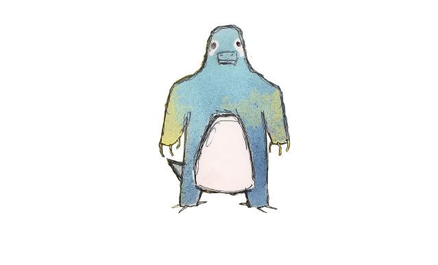
Cyzirvisheens design seems robotty like, and it seems that the body shape looks also quite fat. Maybe design for example the thing on it's head some bit longer. The body could be more penguiny like, since now it looks like little girl inside an armor.
Caladbolgs bugs my eye, I don't know why, but maybe the shuckleness.
On the other hand, there are more consepts here that I like compared to the previous Cap (With only 1 that I really liked).
pkmn-taichos squid looks great, although I prefered the sea cucumber.
Paras Hiltons is Creative, and looks like the typing despite the lack of "obvious" aquatic/electric features. The lantern is well drawn, and I can really imagine this to be utility counter.
Alix13 has really great design, although it looks maybe more offensive rather than utility counter. But definately great concept. Don't alter it just because of me, since it is now in the top notch of these submissions.
Yilx. Great fairy like creature, having the aspects of utility counter in the same way as Mesprit, able to really plow through despite looks.
SEO. The design of yours actually looks for me Ghost/Electric/Water, but I can see this being maybe some sort of water spirit? It definately looks like utility counter, which is good.
darkmattrs creation is beautiful. Definately utility counter, and the support material is fantastic. This one has my vote.
Wyveriis design doesn't seem too innovative, and the water is also somewhat lacking in the design. The head and foot proportions seem odd to me, but that may just be in my eye. The beast could be maybe more streamlined, so the aquaticness would come through. I can see the aquaticness after reading the backstory, but...
Cyzirvisheens design seems robotty like, and it seems that the body shape looks also quite fat. Maybe design for example the thing on it's head some bit longer. The body could be more penguiny like, since now it looks like little girl inside an armor.
Caladbolgs bugs my eye, I don't know why, but maybe the shuckleness.
On the other hand, there are more consepts here that I like compared to the previous Cap (With only 1 that I really liked).
pkmn-taichos squid looks great, although I prefered the sea cucumber.
Paras Hiltons is Creative, and looks like the typing despite the lack of "obvious" aquatic/electric features. The lantern is well drawn, and I can really imagine this to be utility counter.
Alix13 has really great design, although it looks maybe more offensive rather than utility counter. But definately great concept. Don't alter it just because of me, since it is now in the top notch of these submissions.
Yilx. Great fairy like creature, having the aspects of utility counter in the same way as Mesprit, able to really plow through despite looks.
SEO. The design of yours actually looks for me Ghost/Electric/Water, but I can see this being maybe some sort of water spirit? It definately looks like utility counter, which is good.
darkmattrs creation is beautiful. Definately utility counter, and the support material is fantastic. This one has my vote.


Taicho: As much as I like your sea-turtle, you stand a MUCH better chance with the cucumber. I mean, you don't get much more creative than a ballin' cucumber. Just sayin'. I think the suggestion to bring out the cloud somehow is good. It kinda reminds me more of a brain as is; like Krane from TMNT but I digress.
Glad you made it back to work on CAP as I was afraid you were finished!
Glad you made it back to work on CAP as I was afraid you were finished!
I made a few more sketches, and made the fins more jaggedy to make it look more electric.
http://i673.photobucket.com/albums/vv95/tubbabubba12/FC3D702C.jpg?t=1269267404
Thunderbolt on hastily drawn Blissey/Light Screen
http://i673.photobucket.com/albums/vv95/tubbabubba12/1698431A.jpg?t=1269267696
Thunder Wave on Luvdisk
at the very least, this guy is a lot of fun to draw! XD
http://i673.photobucket.com/albums/vv95/tubbabubba12/FC3D702C.jpg?t=1269267404
Thunderbolt on hastily drawn Blissey/Light Screen
http://i673.photobucket.com/albums/vv95/tubbabubba12/1698431A.jpg?t=1269267696
Thunder Wave on Luvdisk
at the very least, this guy is a lot of fun to draw! XD

Hooray! Your stellar design for CAP 8 is back! Plus, now there won't be dumb comments such as "That looks like a platypus bear, not an Electric Dragon" Right now, the art design doesn't need to be tweaked much, if at all. Right now, I think what you need to win over voters is some supporting material for this guy, so we can picture how he can counter anything in OU, but not everything.it was too water for that one CAP.
user Keishinkae did this and I like it a lot and seems to go along with supporting material.
http://img17.imageshack.us/i/grizz.jpg/
CyzirVisheen: Your reverse Angler Fish is definitely one of the most creative art concepts yet. And that's saying something, because there are a lot of unique concepts going 'round. Unlike kopien, I don't think it looks mechanical at all. I'd love to see this pokemon in color!
Keishinkae: Lightning gharial is another great concept. Right now, both the art design, and the supporting material is fantastic! I don't see anything that needs to be changed, so continue to roll with this design, and color it!
InHell 13: That's an incredibly creative concept, and design, but the color scheme looks way too much like Plusle & Minun. Change the color scheme, and we'll have another amazing art design for CAP 10!
Aviator99: The core concept is very cool, and the supporting material is very well done, but the actual art design is lacking... pizazz? It looks like a real life sword fish with lightning bolts for fins, rather than an electric pocket monster based on a sword fish. Look at Sharpedo's art design. Although it's without a doubt based on a shark, it also doesn't look like one in real life, since it also shares elements with torpedoes. Since your design is not only based on swordfish, but also lighting rods, you should spice up your design. Perhaps you can add more lightning rod elements, or take off his gills. (There are plenty of fish Pokemon without gills.) But as I said before, your concept is cool, and your supporting material is polished, so continue working on this design, and I know you can make it better!
I hope these criticisms help!

alright, so my original idea was to do a ninja design, because of the countering aspect of the pokemon
so now i've gone from THIS:
http://i11.photobucket.com/albums/a182/eyckzim/jelly-3.gif
to THIS:
http://i11.photobucket.com/albums/a182/eyckzim/jelly-4.jpg
please forgive the low quality of the art, but i am out of town currently and cannot really color the image.
so, thoughts on the shift? i think it's a huge improvement.

Hey guys, this is my first post I hope it is within the rules and doesn't break any restrictions.
Anyway here is my first attempt, it's based on a Puffin. Sorry for the terrible quality.
http://i873.photobucket.com/albums/ab296/Argetlam1/Puffindude.jpg
Thanks.
Anyway here is my first attempt, it's based on a Puffin. Sorry for the terrible quality.
http://i873.photobucket.com/albums/ab296/Argetlam1/Puffindude.jpg
Thanks.


This is a cool concept, but it would suggest changing the yellowish color; it currently risks looking a bit like genitalia. : /


This is my contribution. This pokemon is based on a rain meter but it is still in the early stages so any creative comments would appreciated, that is assuming you guys like it.
Apologies for the low quality of the picture, my scanner isn't working so I used my cell phone.

Apologies for the low quality of the picture, my scanner isn't working so I used my cell phone.


here is my idea. its based off an hourglass i dont have photoshop or anything fancy but i think its good enough for a main idea maybe someone else can work with it to get something better out of it
 [/ png]

- Status
- Not open for further replies.