CAP 11 CAP 11 - Art Submissions

Status
Not open for further replies.
i think cricketpar's echidna thing is the best for this idea, not only for the way it looks, but it also reminisces of the concept
for once, it's supposed to be able to compliment togekisss, but it doesn't need to look like it; in fact, most synergic couples don't look alike at all (skarmbliss, anyone?)
plus, it reminds me of last airbender...you know, flying bisons invented airbending while the blind moles things invented earthbending....so togekiss could be one and this thing the other (?)
(ignore that part)
i would simply change the egg design on it so that it looks different, and maybe rougher
(to contrast with the flyingness of togekiss)

EDIT: hadn't seen all these badgers and racoons and little mammals
totally liking them, hope something good (yet simple) comes out from all of it
 
Hi all,
I love the badger design:)
Anyway, here's a sketch I did - should I keep going? Its essentially a gargoyle, except it uses its arms and tail to move. Its not a rock type, in the same way Sudowoodo's not a grass type, if that makes sense:)

Hope you like him:)
I can add colour pretty quickly, I was thinking general stone colour for most of the body, different for the tail and wing membrane, and then maybe some snazzy eyes:)

C+C would be great.
 
Thanks for the feedback Doug, here's my refined design.. Anymore suggestions? This is his attack and defense modes. I tried to make it look more specially oriented yet still distinctly and surely a fighting type while having a fast looking body.


Here is a, hopefully, better attempt at coloring. This one will probably be used as supporting art for my final submission. I attempted to give my creation a darker sort of coloring to it, without going with the obvious black and grey route. I also experimented with white hair, and I liked it quite a bit; hopefully you will too! If you guys like it, I'll color my original submission with the same color scheme. Otherwise, please feel free to give me some color ideas. Well, here it is. I hope you like it!

http://i731.photobucket.com/albums/ww313/MarceloSM/cap11part2.png

It's not quite finished, but I think it gets my point across.
 
The lemur could look good, give it a try Seewell.
SEO, I love the design, but I'm not sure if that great washed out look could be sprited. I'm never tried spriting so I'm not sure though:)

This is the first palette I'm trying. Please tell me if you can see anything which would work better.
 
[/IMG]

heres my first entry, still working on it but here is my rought sketch idea.
havent thought of a name as yet so rotty will do :)
backstory-

this powerfull pokemon defends togekiss whenever trouble comes, the actually reason why they protect them is some what unknown but scienentist believe its because "rottys" live off the young and the eggs of togekiss, so they protect them to keep there own kind surviving

i chose to use this design because when i think of a dark animal, with fighting instint a rotty came to mind instantly. also because in history they were used as herding dogs, so naturaly i thought it made sence to have an idea.

c+c

cheers

ps. how do you get picture to show? i'm pasting in the IMG code and its not coming up?
 

Yilx

Sad
is a Top Artist Alumnusis a Smogon Discord Contributor Alumnus
ckpmax you're amazingly good at this... that badger looks really awesome and I feel it captures both types extremely well.

From the little feedback I've had, I'll try to make mine look less human-like and more Pokemon-like... I'll have a proper version done up by Friday, but for now all I can do is sketch supporting material...

P.S. I'll probably only be able to post a 'finished' version on Friday because I'm serving National Service right now which means no outside world for me, unless I get the rare opportunity to use the computer like today. :(


Going out of lurk-mode to give some much needed attention to SEO's work. Especially the first draft seemed so fitting and gloomy and great overall!

Sure, there are other good submissions - ckpmax1108's badger and the CAP art-allstars (for instance Caladbold~, Cartoons! or Wyverii) come to mind here - but I nevertheless wonder, why there is so little attention for what I believe to be a at least equally good piece of art.

Just saying; keep it up!
 
ckpmax1108: It's sad for me that the rooster went dwn :( Anyway, love the badger.

ZakkiOrichalum: I love Shazman. I don't see a connection to Togekiss... But a dfferent troph set will fix that.
 
@SEO

Those colours are great for it. I also very much like the blue glowing pieces beneath the eyes (symbolic of tears). White hair works, but darker hair might work even better. I can't really tell which I'd like more.....
By the way, its hands look a bit too large in your latest rendition. The first design had very well defined hands and large lower arms.
Anyway, your design is still my favourite. Sorry for all of the criticism ;)
 
Hi, this is my first post ever.

This is a preliminary design; additional details/refinements will be added later

 
Here is another concept I have been working on. Its another take on the Evil Cymbal Monkey type thing, albeit with a more Gorilla-esque body. Also, I have altered the other design slightly.

Which design do you guys think I should go with for the final concept? (Click for full view)


Any C&C would be welcome as usual xD
 
C dog, definitely go for the original one, it just looks cooler and like it can do more things. The Gorilla body is, well, plain. MONKEYS FOR THE WIN!!!!

I really would like to give you feed back, but I can't think of anything to make it better. It just looks like a cool fighting/dark type with fighting being the main typing. You could try making it a bit more puppit-ish, like showing joints, but I don't think it would make it any better or worse.
 
The almost complete CAP11 "A little more physical than others" Minotaur!


I dediced immediate that the horn will be like crescent moon. Instead of just putting it on top of its head(which suspiciously makes it look like an Egyptian god), I make it more like a forehead protector, which I also used on its fists and knee

Pokedex entry #1
"After evolving through happiness and joy, it will protect the happiness and well being of its trainer with its life. its shoots a powerful Dark Pulse from the center of its horn"

Pokedex entry #2
"Being the protector of jubilee, it is most seen protecting the Togebi evolutionary line. The bigger joy it has experienced in its life, the stronger it is"

I love the idea of Togekiss and CAP11 sharing the same ideal and goal, since many artists seems to be more interested in creating a Dark/Fighting pokemon... Fighting/Dark is hard to create, I can understand them...

Oh! here's a good one for its devolved form
Pokedex entry #1
"This calf is ill mannered and rude, it will always seek mischief, but it is said that those who win its love and trust shall forever be protected by the Crescent Moon"

Yeah, it evolves on maximum happiness and the devolved form is dark type to represent its mischief nature.
 
@ckpmax - One of the most menacing designs I've ever seen for a Pokemon. The only thing is that its stature is so werewolf-like that its badger-ness seems to get overshadowed a bit. I would love to see this design sprited though!

@darkmatr - One of the best I've seen! It seems to perfectly grasp what CAP11 is about. I love the design, the pose, the intensity, the flaring collar floating menacingly around it, and everything else! It strikes me as one of the most thoroughly thought out designs so far.
 
@ SEO - That is amazing. You said you wanted help on the colour scheme. I would suggest going with the genral consesus in the thread of Deep Purples do portray the dark side to it. Also at the moment the yellow on the legs makes it look like you are trying to make it an electric type so maybe a Black instead. Purple Brown and Black don't scream good mix of colours to me but I think it would look good.

@ Buffalo Wings - Yours is my second favorite. It captures the fighting part of the Pokemon while still being unconventional. Would it be posible to show a design which doesn't look like it's hovering?

@ Doug - Yours would probably be my favorite if it lost a little bit human. I would try and intergrate the clothes as vaguer skin markings if you get what I mean. I do like it though.
 
Thanks C~Dog. I changed it up a bit, but didn't go full gloveless though...I left the color in the fingers and it turned out.....quite awesome! hahaha


Thanks again man!

EDIT: MAN..This is hard to say but...sigh....I made the decision to stick with Badger for my Cap submission, all I need to do is get more feedback for him and make necessary changes/additions. I'll probably post my Final Sub before the end of the day.
I think thats wise (and not just because I was working on a badger myself before you posted yours, lol). Your chicken is great but it will inevitably end up looking like a streamlined blaziken. The badger is great and I think it will go to the end! Has my vote at least, lol.
 

az

toddmoding
is a Community Contributoris an Artist Alumnusis a Community Leader Alumnusis a Smogon Media Contributor Alumnus
hello cap!

introducing:

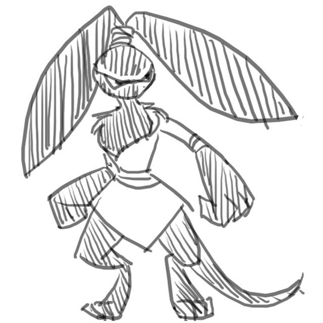
tanuki ninja/"little warrior dog"

this is very unrefined, but i thought it would be best to post a wip in order to make changes in the beginning stages as and when i get feedback


the basic concept is of a small raccoon dog (or tanuki, or magnut) mixed with various ninja/samurai-esque features

why a ninja? more immediate a connotation than that is the combination of dark/fighting. ninja was the first thing to come to mind! what else to display attributes of darkness and fighting than shadow warriors? as well as this, togekiss is very dove-like, and doves are commonly regarded as symbols of peace. the ninja, then, a symbol of war and terror, is an exact opposite! following this theme, i've shown a swatch of togekiss's colours versus approximate opposites because i think a complimentary colour scheme would emphasise the raccoon dog's complimentary nature to togekiss. the earthy brown is not quite an opposite, but as a approximates togekiss is white and so a dark colour close to black would be favourable, and raccoon dogs are often dark earth browns themselves!

i just want to draw your attention to and run you through some of the features. first of all the head is a mixture of the features of a raccoon dog's facial shape and the shape of a typical samurai-esque helmet, which is a coincidence i wanted to use to my advantage! the shape of the helmet is emphasised in the dog's facial markings, which are of course based on an actual raccoon dog's markings. the ear's protrude from the back of the head to keep the impression of a "helmet", although there is none

the markings beneath the eyes are intended to be a nod of the head to togekiss's own random markings and would hopefully be coloured in the appropriate opposite colours. markings under the eyes are also reminiscent of warpaint, so this emphasises fighting type!

top-right was a concept for a stylisied "topknot" sort of hairstyle, commonly seen in popular culture renditions of japanese warriors. this has instead been incorporated into the design as the raccoon dog's tail, as they are known for short stubby tails! i think it's p cute n__n

beneath i depicted the raccoon dog riding his ally into battle and forming archetypical ninja "hand seals". the concept of riding togekiss was inspired by the idea of ninja being airlifted by huge kites and dropped into enemy territory, which may or may not be a myth, but is still super cool! this idea is also helped by togekiss's odd shape

i've given that raccoon dog a little spiky fringe as a stylistic touch to spice up the centre of his forehead, though it doesn't look too clear here. how does it look? i wanted to give the idea of this little dog's youth and vitality, because whilst a ninja i wanted him to look vivacious and cheeky, like a naughty little scamp! how did i do?

any comments and criticisms at all would be welcome!

i've never entered a cap before and it looks like there's a lot of stiff competition, but don't disregard this entry because of the sketchy preliminary concept design! i promise to deliver a worthy entry!

also everything looks great so far but if i had to choose one i'd go with caladbolg~!
 
I've been trying pretty hard to get a good color scheme going, but so far I haven't had much luck. This time I tried to use a darker, purple based scheme to emphasize the dark typing. I really like the blue markings, although if anybody has a specific suggestion I'd be very happy to make changes to reflect that. For right now I'll be coloring on the supporting material because it's just much simpler for me. So here it is.

http://i731.photobucket.com/albums/ww313/MarceloSM/cap11part21.png

If people particularly like a certain color scheme, I'll move on and color the other drawing.

My main inspiration for this design is a lonely guardian. When I heard Dark/Fighting I immediately began to think of different warriors that could be portrayed as Dark. The first thing that came to mind was a ninja, but ended up dumping that idea. Instead I simply began to sketch. After several failed attempts, I finally decided upon this one. This design, at least to me, portrayed both typings without particularly shoving one type down your throat. I imagined this pokemon being used in ancient times to guard temples that house great treasures or secrets. Over time though, as temples became rarer and more abandoned, these pokemon began to lose their purpose. When sighted nowadays, they are often seen guarding caves or other large structures from intruders.

I was also wondering, is this pokemon (and its pokedex description) supposed to involve Togekiss? I've seen numerous people doing this, I just wanted to know if I was doing it wrong.
 
Status
Not open for further replies.

Users Who Are Viewing This Thread (Users: 1, Guests: 2)

Top