CAP 11 CAP 11 - Sprite Submissions

Status
Not open for further replies.

Arcticblast

Trans rights are human rights
is a Forum Moderatoris a Tiering Contributoris a Social Media Contributor Alumnusis a Senior Staff Member Alumnusis a Community Contributor Alumnusis a Battle Simulator Moderator Alumnusis a Past SPL Champion

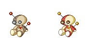
I decided to give this a try for once. I had a lot of problems with the X-shaped stitches on the front though.
 

Late to the party.

I'm much more confident at spriting then art designs, so I should be in with more of a chance here.

I'm not quite happy with the lower arms.
WIP obviously.

Edit:

I think I might have more colours then is allowed... Is there a limit?
 
I'm honestly disappointed no one has paid much attention to Wrverii's sprites. I think that those poses best display the Pokemon in a VooDoo doll fashion, while still keeping the Fighting-like appearence of the Pokemon present, and enchancing the Dark-type Pokemon. I could easily imagine that thing doing Close Combat or something of the sort.

After that, I simply think that Lord Agaron's sprites look the most professional. But, I still think that Wyrverii's sprites are the best of the lot. (I also think that the submission of the fellow with the Gengar avatar is good too.)

Too everyone here, I say great job to you all!
 

DougJustDoug

Knows the great enthusiasms
is a Site Content Manageris a Top Artistis a Programmeris a Forum Moderatoris a Top CAP Contributoris a Battle Simulator Admin Alumnusis a Smogon Discord Contributor Alumnusis a Top Tiering Contributor Alumnusis an Administrator Alumnus
Moderator
I did not plan to make any official sprites for this CAP. I did make a sprite for my avatar -- since I made the design, and always use my own sprites for my avatar. But several people have commented on my avatar, and have encouraged me to expand this into a full sprite set. I had some time on my hands, so I made a backsprite and shiny coloring. Here's the current set:


I like gold on shinies with metal (shiny Metagross ftw!), so I worked it in here. I always think of red for Fighting types, so I used a red too. I like bold shinies, so I made the whole thing rich and vibrant.

While I was at it, I worked up a set of front sprites for the pre-evo I call "Voodoll":


It's a cute little guy, IMO. Sad... but cute.

Anyway, I realize activity and critiques have died down quite a bit in this thread, since most of the active spriters have pretty much nailed down their sprites. But, I'm open to comments if any spriting fans are still out there looking for something to discuss!
 
http://i165.photobucket.com/albums/u65/wyverii/VoodoomspritesetWIP-3.png

Right, i've done some work on the front and changed the back quite a bit taking into account everything people have said so far.

Front changes: heart is rounder, needle is facing more towards the viewer, shades have been darkened, highlight on button eyes are darker and hip is less exaggerated.

Back changes: complete repositioning.

I'm probably going to tweak the back a bit more but i'm pretty happy with the front now.
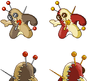
I absolutely love this. The front sprite captures the essence of Voodoom perfectly-- Dark, stalking, and absolutely menacing. I also like the back sprites much better than the older ones, as they have more of a "Bring it!" attitude.

My only suggestion is to perhaps make the top two needles on the back sprite protrude more vertically. Right now, they're looking like slicked back hair. I'm not sure if you intended that, but it looks a tad unfitting to me. Otherwise, just WOW. :)
 
I'm likin' the sprites, Doug. He's lookin' mean and aggressive. The shiny is on point as well (I also like vibrant shinies, hehe). Great job.

EDIT: aragorn, I don't think I've commented on your sprites yet, but they also look great, as expected.
 
I personally think both aragornbird and doug-just-doug's sprites are the best, but I'm still taking a crack at this cap. maybe someone will like mine. in fact, I have shiny's females and a second pose. I could use some crits, but mainly, do you like the first pose better, or the second?
___Male_____Female__

_____Male_____Female__
 
I personally think both aragornbird and doug-just-doug's sprites are the best, but I'm still taking a crack at this cap. maybe someone will like mine. in fact, I have shiny's females and a second pose. I could use some crits, but mainly, do you like the first pose better, or the second?
___Male_____Female__
http://img299.imageshack.us/img299/6940/animation1cap11.png
_____Male_____Female__
http://img638.imageshack.us/img638/1148/animation2cap11.png
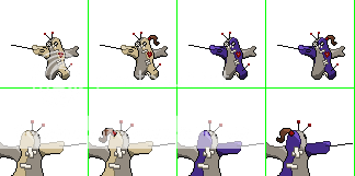
It looks actually like it's part of an opening animation where Voodoom draws the needle out to use as a weapon. Though if I had to pick, I'd say the latter really fits him.
 
Well, here is what I have to say about what has come out over the weekend…

Wyverii:

Wow. I love those new back sprites. The pose you put Voodoom in there is really nice. Your front sprites looks better now that the hip is not so exaggerated (not that I think it really should be there at all, but that’s neither here nor there).

Since you say that you want to work more on the back sprites, I will make a suggestion on it (and I think I have said this to somebody else). I think that sewing needle that is poking through needs to be a touch thinner.

Aragornbird:

Ah, the red is a fine choice indeed. The back sprites are also quite lovely and the difference between the male and the female is interesting.

Considering the gender difference on the front sprites, I am not expecting the back sprites to be any different for the female than for the male. I can’t wait to see the shiny female and the female back sprites, nonetheless.

Choascrippler:

I was on the fence on your new (regular) color scheme at first, but now that I look at it more, I think it looks great. The new shiny coloration is pretty good too (both shiny schemes were). And if you like the way the needle on the back sprite is (which I mentioned before), I’m cool with that.

Can’t give you any grand ideas on gender differences: sorry man. All I can say on that one is that whatever you’ll come up with, I’m sure it’ll be great.

DougJustDoug:

I was wondering if you were going to make a sprite set from your avatar. The sprites look really nice. The pose is good, the shiny scheme is good, the back sprites are decent, and the regular color scheme is pretty good. Voodoll is also adorable (as always).

My only suggestion is that I think the lighter colored fabric actually should be, well, lighter in my opinion. It just looks pretty close to the color of the darker fabric to me, whereas in the original artwork, the lighter and the darker fabric contrast more.

---

Anyways, that’s my two cents for now. These sprites are all really good. It will be fun to see the development continue.
 

Okay, because of the complete and utter lack of crit, I decided to move onto the backsprite. I took a few creative liberties with the back sprite, giving multiple puncture wounds because the needle was in at a different angle from usual, and adding an extra pin. Ive also added the gender diference, a tuft of stuffing bursting out the head. It's not in the correct format yet though, but it is transparent.
 
I like the backsprites. The tuft for male/female difference is a good touch as well.

What I'm not sure I like is the outlines around the puncture wounds in its back. That dark grey is the colour you've used for the stitching - right now, it looks like someone has painstakingly stiched around the outside of the doll's exit wounds. So, I'd remove the grey outlines and just leave them as (maybe slightly larger) white dots.

Otherwise I think your sprites are technically good, but the poses are less dynamic and 'interesting' than some of your competitors. For recent entries, look at the way Doran's sprite is caught in the act of drawing the needle from its heart. That needle-through-heart (and a pokemon in pain) is one of the key aspects of the artwork, and it's not coming through in your sprites for me... yours looks calm and collected, not at all like it was stabbed so many times with a needle that it turned into a mad Dark Fighter.

I think it's telling that the best sprites on show spent a long time in development, and often trialled several poses before settling on the right one. No-one gets it right first time.
 
Final Submission:


I've went for a darker version of this design than most. The colours are deep, the proportions more humaniod and the pose is menacing to accent its darker side. I never envisioned this lil' guy as a happy go lucky sort so I wanted to make it look as serious as possible.

The gender difference is something nice and simple while still being noticeable. Most gender differences within the games tend to be rather subtle with perhaps certain parts scaled differently or in the most extreme cases a colour change such as on Hippodon. I think the broken heart idea is a nice middleground.

Well this has gone through many changes since the original thanks to the helpful comments many have made here. Thanks for helping in the development of this sprite and good luck to the other competitors.
 
Okay, so I think it's clear that people prefer needle in as opposed to needle out, even if it's not in response to my own, so I've tried to tweek it so the needle isn't horizontally out like last time, but rather kind of slanted to A) match the backsprite and B) look a bit more realistic (hah).

____M_______M Shiny______F___ ___F Shiny___ Front

____M_______M Shiny______F___ ___F Shiny___ Back

I'm going to post a final submission tomorrow as I wont be around after tomorrow, so I need to post my 'so close to finishing' sprites now to see if there's anything still wrong with them.

However... how do I do a final submission?:
I know they need transparent backgrounds
Do you need them individually uploaded or on the same sheet?
Do you need a pixel border around the 80x80 square (and should that border should be transparent too)? (so 325x163 or 320x160 / 82x82 or 80x80?)
What order should the sprites be in?

Sorry, it's my first CAP entry and I don't want to be disqualified >_>

EDIT: Thanks DougJustDoug for your help, although admittedly, I feel a bit stupid for not looking at existing threads and making a decision. THANKS ANYWAY!
 

DougJustDoug

Knows the great enthusiasms
is a Site Content Manageris a Top Artistis a Programmeris a Forum Moderatoris a Top CAP Contributoris a Battle Simulator Admin Alumnusis a Smogon Discord Contributor Alumnusis a Top Tiering Contributor Alumnusis an Administrator Alumnus
Moderator
How do I do a final submission?:

I know they need transparent backgrounds
Do you need them individually uploaded or on the same sheet?
Do you need a pixel border around the 80x80 square (and should that border should be transparent too)? (so 325x163 or 320x160 / 82x82 or 80x80?)
What order should the sprites be in?

Sorry, it's my first CAP entry and I don't want to be disqualified >_>
The sprite competition is generally not as strict as the art competition regarding entries -- mainly because there are not nearly as many sprite entries, and there is not as much chaos and bitching here in the sprite contest, like we get in the art competition every time. I have seriously considered adding more definition to the sprite rules, as we have been using almost the exact same spriting ruleset since the beginning of the CAP project. But honestly, I would really prefer to keep the sprite rules simple, and hope that spriters have half a brain and a modicum of goodwill, and just "do the right thing". Unlike the art contest, which is cutthroat as hell, idiots run rampant, cheating is all over the place, and it is a constant headache for moderators.

So, if the community really feels like we need to spell out a long exhaustive list of detailed sprite rules, and moderate entries with exacting precision -- I guess we can talk about it in the next round of PR. But, my personal preference is to keep it about the same as it is now. The spriting side of this project is somewhat informal and "friendlier" IMO. I think that's a good thing. The minute we start detailing out every little rule, everything gets ugly.

I don't mean to derail this thread into a big discussion about the sprite rules. I just wanted to point out the reasoning for a lack of specificity in the spriting ruleset. Like I said, if people want to change it later -- talk to someone on the PRC and have them make a PR thread on it. If lots of people start complaining about the rules or questioning the rules, then I'll make the PR thread myself, even though I am loathe to do it.

With all that said -- here's my OPINION on your questions, since there are no specific rules on them:


I know they need transparent backgrounds
Yes, that's in the rules.

Do you need them individually uploaded or on the same sheet?
Usually spriters make a single cutsheet for all the sprites, but you can post them individually if you'd like. If you win the competition, I will ask you to cut them into individual sprites, so I can put them on the server.

Do you need a pixel border around the 80x80 square (and should that border should be transparent too)? (so 325x163 or 320x160 / 82x82 or 80x80?)
There's no rule that says you have to, and most other spriters don't do this.

What order should the sprites be in?
Most spriters post them in the order listed in the OP.

You CAN look back at previous sprite threads to get an idea how the entries are generally done. We keep every past CAP project in this forum, and all the thread titles are very clearly structured to make it easy to figure out the content of each thread. I can't imagine it's very hard at all to do a quick lookup on your own, and you can figure it out pretty quickly.
 

Arkeis

(づ。◕‿‿◕。)づ
is a Top Artist Alumnusis a Community Leader Alumnus
Got all 8 forms done. About to make my final submission soon if no one has any more suggestions.

 
Doug, your sprites are fantastic and are probably my favorite so far. One thing that's bothering me is that the two pins sticking out of his head resemble antennae too closely, perhaps change their position or just remove a pin entirely?
 
Got all 8 forms done. About to make my final submission soon if no one has any more suggestions.

sprites and stuff yeah
my first suggestion is that we make love because I very much enjoy those sprites.

My second suggestion is maybe to change the stitching color on the shiny sprites. It would look much more consistent if the stitches were changed to black, like the rest of that color was. Otherwise, yes, excellent.
 
FINAL SUBMISSION

I know someone said that the second set would fit Voodoom a bit better, but it made it feel like it was looking up too much. I have edited the first one so that it doesnt look like it is looking up as much and made the back sprites. This will indeed be my final submission.
___Male_____Female__Male Shiny__Female Shiny__
 
I decided to just keep the original direction,
I like it more.
And I actually putted it on the image on a battle scene and it looks to the opponent to me.​

I also started to work on the shinies.
I personaly would want to see something cold, evil.
I thought something greyscalish where the most oppropriat for giving that feeling.​


But I'm not really shure what colors the eyes should be,
I want something that sticks out,but stillloks good.
The last one looks the best to me, but it looks a little messy though. And somehow I'm not a fan of making the 'eyes' darker the the button.​

Anyway I would like to make my final submission soon,
So if someone wants to comment my entry, (s)he has to do it quick​
 
Status
Not open for further replies.

Users Who Are Viewing This Thread (Users: 1, Guests: 0)

Top