CAP 2 Prevo - Part 3 - Art

Status
Not open for further replies.
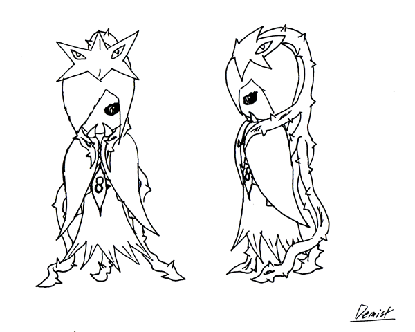
Well, that's my 'lil Necturna' concept. Prett meh, but that's what I got after several hours doodling. I found that it looked best from all of my sketches. I tried to make her both plant-ish and ghost looking. Also made it not to float entirely, while it doesn't have legs I thought it would be cool to abuse whines for that. Sorry, i pretty much suck in art, so details aren't too bright here. Will try to work a bit with another template.
P.S Lot's of awesome concepts. Keep up the good job, everybody ^^

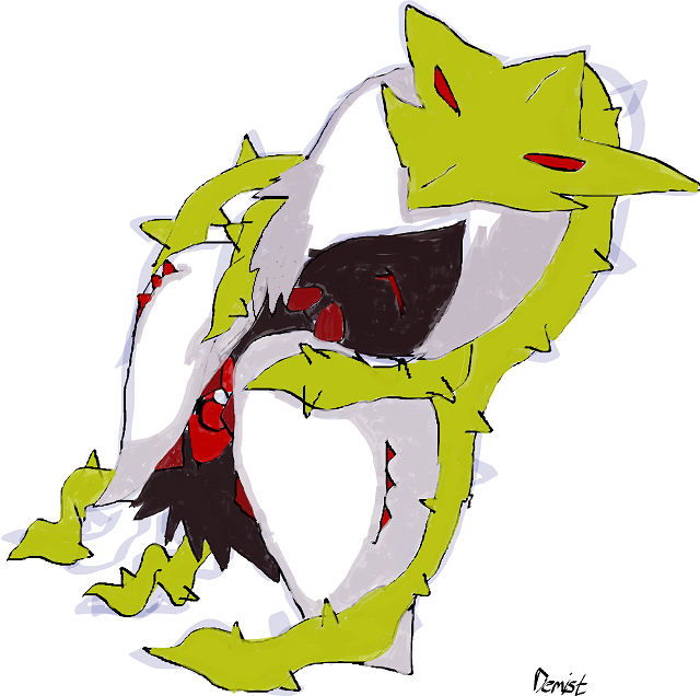
Edit: Tried new pose and coloring. Failed. Period. Added some new features that are slighly seen. It's terrible but..that's me xD
Also I'm reserving name Lilturna, ok?
 
Noobiess, I just want to let you know that your concept has stolen my heart, and I really want to see you ink and color it. It has the makings of greatness.
 
Noobiess, I just want to let you know that your concept has stolen my heart, and I really want to see you ink and color it. It has the makings of greatness.
Thanx,I'm planning to try some new designs.
But I don't mind you using the idea.
It's all about making an as good as possible design, and not really how's it is.
 

Asylum_Rhapsody

Guest
@ thornchild: This is absolutely adorable! And what I like best about it is that it's very unexpected. I think that a lot of artists here are going with a more simplistic evolution model, like what is followed by Gothitelle or Gardevoir, and that's fine, but I've always been far more intrigued by somewhat more dramatic evolution patterns, like what we see in Lilligant or Vespiquen. I think that they're a lot more creative and make the prevo feel like it's own Pokemon as opposed to just a prevo.

@ Yilx:
I like both of these, but for the reason already explained above to thornchild, I would really love to see the one on the left further developed.
 

paintseagull

pink wingull
is a Top Artistis a Forum Moderator Alumnus
Here's my design so far!
I'm going for a superbitch teen Necturna. Little girl/baby -> Necturna seems like too big of a stretch to me! I also wanted to include a less menacing flytrap (less, but definitely still menacing) and less developed spirit eyes. Here the precursor to the eyed vine appears as cute eye-buckles in her hair.
C&C welcome!


Asylum_Rhapsody

Guest
Oh. My. God.

Mos-Quitoxe, that is awesome! I love it. It's absolutely beautiful, both adorable and also kind of horrifying at the exact same time, and its very creative, substantially different enough from Necturna in design to actually justify existing as a prevo... I'm actually sort of upset with you for making such an amazing post right after I made mine, because I got in trouble for thread hogging in the last art thread, so I really wanted to be more conservative in my posting in this one, but I needed to reply to that as soon as I saw it. Don't change a thing. It's ready to be a Final Submissions and a formidable contender, at least in my book.
 
Mos, I'm not sure how you're going to make it look less like Joltik, but I like your idea so I would really like it if you could figure that out. Also, that comic is amazing :D
 
Yeah, I agree with cape, that's really awesome but at the same time really close to Joltik. I'm not quite sure how I feel about that. In one sense, I enjoy the Volcarona feel of the evolution (baby small thing to super big thing) and think it's cool to have such a vast change, but it's a huge jump to Necturna. I've always felt that Necturna is way too humanshape to justify anything other than a humanshape pre-evo...

...and that's why I really like paintseagull's. Superbitch team Necturna (Can I already reserve the name Necteen please???) is awesome in every sense of the word. I love the idea of Necturna being a angsty pre-evo and then evolving into a more mature Pokemon. It's evolution in every sense of the word, and is super sweet insofar as maintaining the Necturna style, shape, and appeal. It's also believable, which is huge.

Aragornbird's is probably my next favorite, but it takes a much more classic approach to pre-evolution Necturna. It's much more Kirlia > Gardevoir in its style, which is cool, but I almost think a bit boring compared to our other options. Still a great submission, however.

Good work guys!
 

Bughouse

Like ships in the night, you're passing me by
is a Site Content Manageris a Forum Moderator Alumnusis a CAP Contributor Alumnusis a Tiering Contributor Alumnusis a Contributor Alumnus
I actually get a little bit of a Kabuto feel from Mos' design, more than Joltik. Either way, it is a little too animalistic to be a plant's prevo in my opinion. I guess my best suggestion would be to study Cherubi a bit and try to take some sort of inspiration to make your prevo design a bit more berry-y and less animal, Mos.

Also, I have no problem with Dusk reserving Necteen... but surely there's better (that is even assuming paintseagull wins.)
 

Ray Jay

"Jump first, ask questions later, oui oui!"
is a Site Content Manager Alumnusis a Community Leader Alumnusis a Community Contributor Alumnusis a Tiering Contributor Alumnusis a Top Contributor Alumnusis a Smogon Media Contributor Alumnus
Vouching for paintseagull as I sometimes do. I think going from less threatening and more sass to more threatening and more mature is a sick concept, also Necteen lololol
 

jas61292

used substitute
is a Community Contributoris a Top CAP Contributoris a Forum Moderator Alumnusis a Battle Simulator Moderator Alumnus
I have to say I absolutely love Mos-Quitoxes design. It is really cute but still gives off a ghostly feeling, which I think is perfect for a prevo, and gives it a similar feel to other unevolved ghosts like Litwick. But what really sets it apart for me is simply that it looks like the kind of creature that would naturally grow up into Necturna. Necturna's design is very much grass type first, ghost type second. I think the carries over very well with this design, and more importantly, makes an evolution between the two feel like a plant evolution rather that the kind of change that is more common with animal based creatures.

On a similar note, some of the other designs, even some that I really like, are much more like smaller cuter (or more angsty as the case may be) versions of Necturna, taking many of her features and keeping them, but with a twist. While there are exceptions, I believe that it is much more common for Pokemon who keep the same general shape upon evolution to keep the same features with the same details, but gain important new ones upon evolution. Now I certainly don't think it is necessarily a bad thing to change details, but with many designs, I feel that by taking the same general features but changing the details it just creates a disconnect between the Pokemon and her evolution.
 
@Paintseagull: I can't help but think of Rose Lalonde when I see your entry. :3 While I like the fairy wing-esque silhouette the teasel/flytrap casts, I'm not enamoured with the tentacle arms. Perhaps some differently-coloured hands on the ends are in order?

@general public: I'm not sure how to make mine less like joltik either, since having it be a cute parasite was the game plan all along, ^^; However, I shall concede that the majority of official "motile plant" pokemon do conform to a bipedal mode of locomotion, so one is more willing to accept a bipedal grass-type as a "pure plant" over a quadrupedal one. I'll cook something up today and put it up to compare with my previous entry.
 

Quanyails

On sabbatical!
is a Top Artist Alumnusis a Community Leader Alumnusis a Community Contributor Alumnus
Final Submission


(I rounded the head oh-so slightly from my last update. :P)

Again, my inspiration:

My design started out in the spriting stage, actually; I wanted a pre-evolution that resembled Necturna in color and origin, but not too close as a supposed 'mini-Necturna'.

Inspiration came from the idea that Necturna's head resembled a bonnet. Why not make a simpler headpiece in the form of a hachimaki--a band around the head, of Japanese origin, sometimes decorated with flowers, representing spirit? That's quite a wonderful way to pull all those elements together!

I added the two vine-horns to make it look girlish (as pigtails), slightly evil (as horns), and plant-y. :P It's a contrast from the single vine of its evolution, and a nod to pokemon evolution where certain features don't just 'grow' to its next evolution, but change altogether.

As for the body: those eyes should've been included somehow, so I settled for a single one on its torso. The arms are reminiscent of those long sleeves of Necturna/a miko, with those red dots from the head of the Necturna. Mixing and matching different aspects, but not just shrinking Necturna for a pre-evolution. :)
Comments:

  • Birkal: I like the top of the design, though the bottom still makes me think of Necturna, since the band, dress, teeth, and eyes(?) are similar. The bow/wings are nice, but maybe it shouldn't be made from vines; personally, I don't like it that they make ovals, as vines don't really do that. XD
  • RitterCat: Heh, well, your inspiration is from a style associated with older women than Necturna's inspiration. The teeth on the bonnet are cool, as is the vine to make strings surrounding it. The teeth still feel shoehorned in, but I don't know if omitting it would make it better.
  • Yilx: A mix of the two, so it still looks seed-y, but still slightly humanlike, would be nice. The seed's a bit alien (though good use of design!) and the younger figure is a bit too close. So somewhere in the middle. :P
  • noobiess: It works, but how much of a hint of ghostliness is there? Don't go overboard, of course--it's just that it looks all-grass for now. The design is good, but a hint of ghostliness is better.
  • MLaRF: The eyes. O3o They went from flat to brighter to flat. They're still meant to be bright, right? Well, the bow's gone, but I still like the design, especially since the vine/ponytail looks more prominent and less distracted by the bow.
  • thornchild: :D Much improvement from your initial sketch. I don't see anything that really might adjusting. :P The design works.
  • bugmaniacbob: Dah, you mentioned on design being better than skill. Might I recommend using bezier curves for your art? It's a nice rearrangement of Necturna's design--the leaf can do well as a 'shade' for the ghost-type part of the pokemon. The bottom of the dress doesn't look too good to me; I think it's redundant with the feet and leaf.
  • jessifer: :/ The vine really is similar enough to the final evolution. That makes me think the entire thing's a simplified version of Necturna. Sorry, but could you change the vine?
  • SubwayJ: Hmm... no, it's a bit distant from Necturna; the ribbon is more 'prop' than 'part'. Maybe if, well, if there was more attention on detail and perspective, I'd contemplate it more.
  • DarkShiftry: Now, for yours, I'd actually suggest putting more grass-themed elements in. The sketch resembles Darkrai for me, with more white and teeth being in a different place. A hint of grass (whether it be a leaf or vine or something different) will make it a better contender.
  • DarkOrbX: Might I also recommend the bezier curve tool for you? Your current drawing is hard to identify what you're trying to do. It looks like a mini-Necturna to me.
  • tea_and_blues: Interesting... very interesting. So that thing on the end of the vine is the 'body' of the Necturna, as flavor might have made for the initial design? I can see that very well! The 'mouth' by the eye on the left body looks a bit out of place, so could you change the 'wisp' or make the mouth part of the wisp or something?
  • Ugouka: If you're using that as your story, perhaps there should be less of those ghostly features on the main body; I'd say the 'claws' on the headdress should go. That'd make it more youthful while still drawing attention to it being a host.
  • Demist: What's the 8 in the middle? Is that thing around the torso (at the shoulders and stuff) a cloak or arms or both? :P Outside of that, design works as being not too dissimilar or similar to Necturna, with a good mix of ghost and grass.
  • Mos-Quitoxe: I said it before, and I'll say it again. IT'S A NECTURNA HEAD. But yeah, it's strange but usable as a pre-evolution. I do wish there was more attention to more eye-like eyes; yes, Joltik as those beady eyes, but they weren't decorative dots on its evolution. Still, very amusing, unique, and oddly plausible.
  • paintseagull: Am I the only one reminded that the eyes in its hair look like they're happy? Well, continuing on: The wings are good as homologous to a flytrap, though they look a bit too feathery, leafy, or bush-like. I think that's just your artist style, but they might need more detail to make it look like a flytrap.
 
48 hours from this post, 9 miles southwest of South City, the first CAP 2 pre-evo art poll will arrive. Let's wrap things up, yo!

Remember: You MUST mark your final submission post as "Final Submission" to get on the poll!

EDIT: make that midnight between March 1 and 2 EST.
 
FINAL SUBMISSION

FINAL SUBMISSION

Why must the deadline be so soon? Oh well. Off for three days without internet, so this is my final. I hope it's uniqueness will pull it to victory.
If there are any problems with my submission, let me know now. I will not have internet tomarrow or the next day.
 
Final Submission

Lengthened the stem slightly, and fixed one of the spikes. Barely noticeable, but one becomes picky about that sort of thing.
ecology comic: http://dl.dropbox.com/u/31563939/Nectacomic.png

I'm sorry to all of those people who wanted more drastic changes, but I simply don't have the time to make detailed alternate concepts! Best of luck to all successful entrants!

(Actuallly it seems that using dropbox lets changes to existing links happen without incident, so no need to mention that the two pictures are exactly the same ;))
 
  • Demist: What's the 8 in the middle? Is that thing around the torso (at the shoulders and stuff) a cloak or arms or both? :P Outside of that, design works as being not too dissimilar or similar to Necturna, with a good mix of ghost and grass.
Well, it is supposed to be lightning on eye. Yeah it kinda serves like cloak and arms at the same time Also thanks.
Good luck people.
I think I am not doing final submission unless it is allowed to submit my second drawing... as it's not clean, normally colored and all the good stuff xD
 
Mos, I see ghost/bug, but I love it, I don't mind that confusion, and will be supporting your entry. It's adorable. I simply don't have time to flesh out my concepts. Good luck all, some great entries. Yilx, I'd still really like to see your "seed" design in the mix!
 
FINAL SUBMISSION

Alternatively, final something else.

Okaysohifolks, I was gonna get around to givin' more beedfack, but suddenly, two weeks to finish three major assignments. Pretty great!

Best of luck to everypony involved!
 

bugmaniacbob

Was fun while it lasted
is an Artist Alumnusis a CAP Contributor Alumnusis a Top Contributor Alumnusis a Top Smogon Media Contributor Alumnus
'kay, last post before final submission

I honestly tried to redraw my concept to make it look better and also tried to rejig the lines so that they looked neater, but I didn't have enough time to do either. So I just made some minor alterations. I have removed the sundew crown as I didn't see noobiess's submission, and I don't feel right in taking an element from somebody else's submission that was completed prior to mine. It probably makes it less busy, anyway.

@Quanyails, thanks for the advice. I agree that the bottom of the leaf looks weird, so I changed it. Also bezier curves are horrible.

Anyways:


Seemed that the colour of the leaf was rather contentious, so I'm putting up a bunch of greens I tried out to see which one is favoured. Of course, if I don't get any replies I'll just put down the default as my final submish.

This looks like a marvellous slate, and I'm pretty sure this is the first time I actually don't care which entry wins (unless it isn't cute, which all of them are). Cheers all.


Oh, I'll do it now. Thanks to those on IRC who offered critiques and whatnot.

Final Submission


Supporting Material


(Will update at some point)
 
Status
Not open for further replies.

Users Who Are Viewing This Thread (Users: 1, Guests: 0)

Top