Follow along with the video below to see how to install our site as a web app on your home screen.
Note: This feature may not be available in some browsers.
Welcome to Smeargle's Studio! Please be sure to review the studio rules. Feel also free to check out our hub to learn more about this place!
Welcome to Smogon! Take a moment to read the Introduction to Smogon for a run-down on everything Smogon, and make sure you take some time to read the global rules.
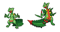
Just dropping my two cents on the Mega Sceptile discussion, but I took TrainerSplash's WIP sprite and edited it to proportions that I liked a bit better.
I felt that M. Sceptile needed to be a bit bigger than normal Sceptile, though I know sizes are always debated on here. M. Sceptile's foot needs a bit of reworking for sure. Feel free to use or edit my sprite in any way you want. :)
I like your version, Cynical. But it seems to bulky than what it should be. Also Mega Saceptile is a foot taller so not much of a difference would be shown. The red line looks waaaay to thick makes the bulbs too separated. The "christmas tree" looks very well done. and I like the cross on the chest too. I'm not sure about your arms though. But considering how very little detail you made on the tail, it looks odd, but this might just be the foot. (which I somewhat fixed)
We can probably combine the two.
I definitely agree that the red stripe is thicker than it should be. That was just a side effect of widening the sprite without altering the bulb placement. I feel as if Mega Sceptile should display some increase in bulk though, but that might just be my own taste. I'm fine with whatever alterations seem the best though.
I like your version, Cynical. But it seems to bulky than what it should be. Also Mega Saceptile is a foot taller so not much of a difference would be shown. The red line looks waaaay to thick makes the bulbs too separated. The "christmas tree" looks very well done. and I like the cross on the chest too. I'm not sure about your arms though. But considering how very little detail you made on the tail, it looks odd, but this might just be the foot. (which I somewhat fixed)
We can probably combine the two.
The main reason why Mega Sceptile looks so much larger is because of its tail being on the lower side of the sprite. The body itself isn't too large (perhaps a tad bulky, but not terribly much), it's just that the tail makes it look so much larger.
EDIT:
I attempted to fix the leg somewhat (I know it's not completely finished), but I adjusted the shading and outlined the lower leg and foot better according to the official Mega Sceptile artwork.
Ugh I just can't help but think there is something wrong with this sprite. This might just because this is my "official" sprite I have done and actually try with (quite happy so far).
The placement of those bulbs are really annoying me. If it's alright with anyone else. I'll just finish my version of Mega Sceptile to see how it comes out. But I'll probably be using some pieces of Cynical's edits.
Any sprites need shiny recoloring? I could do that. However, I really can't do recolors for animated sprites. It would be a hassle to animate every single frame.
I know I'm a random guy looking at these cool sprites and stuff, but I really hope we get to see the Animations in PokemonShowdown althought it might not. These just look more cool (imo)!
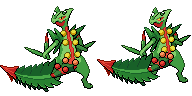
here's two different versions of the sceptile.
The current one that has the bulkiness and stuff on the left. MY version with the christmas tree and X on his chest instead on the right.
BTW I made a slight edit on the left but it's not major.
Alright, y'all. I'm back from my Vegas vacation, and already burning the late-night oil continuing my Mega Pinsir project. I'm seeing the likes on my most recent one, so I'm hopeful this back sprite will do well. I have an update on both the front and the back here.
Mega Pinsir Update:
Before anyone says anything, the back sprite is clearly a work-in-progress (I've managed to get the body entirely done, for one). When I prepared for the back sprite, I took a gander at the game's Mega Pinsir via the Pokédex, and I immediately noticed something wrong with the pattern on the wings, so I corrected it (as shown in the back sprite majorly, and corrected in the front sprite, albeit being only a slight difference in appearance). The horns will be modified to correspond with the shading; I placed them on the body to get an idea of how it would look. The shell will be the last part that I do for this sprite.
I plan on hitting the hay sometime soon, so I decided to show that I had at least covered some ground. I plan on finishing it either tomorrow or Thursday - whichever comes first (I'm working tomorrow and I have an appointment on Thursday).
EDIT: Also, I forgot to mention that, although the arms are barely visible right now, I am working on the whole arms and legs, so as to prepare for animation. It'll be shown in a parts sheet like last time, which will probably be in the next update or two.
Managed to finish the back sprite two hours before I had to leave for work today! I have to say that the hardest parts about this one were the arms and the shell - the former more than the latter (with the latter, I could easily reference the in-game PokéDex). Since I had already reached the colors limit, the "spikes" of the shell were colored with the red-orange hues used with the patterns on the wings. I dunno if I could try making the spikes completely orange-ish with the red outline, but I could see it working. Below are the parts for the front sprite and back sprite respectively:
Because it would take so much less time to do the arm parts for the whole sprite, I decided to take care of the whole arms first, then combine them with the rest of the body.
I'll leave them here, open to feedback. I'm here for another hour and a half, so I'll potentially see the comments made. If not, I'll see them when I get back at around 9'ish PST.
Kyuzeth Well, I said I'd post this up yesterday on my DA, but at least I'm only one day late instead of several weeks/months, so that's always a plus.
Ok, so it's been awhile since I've shown my face here with any actual work. Why is that? Well, to be fully honest, I've still been quite active, its just been more behind-the-scenes then I've been previously. I had some recent contributions in the form of Noibat and Furfrou QC jobs, but I never got around to posting them since I'm lazy. But I have been working hard, especially these past four days when I cranked out one full QC'd sprite a day. As a fair warning, this post took multiple hours to type, so feel free to click the links in each Pokemon's name for some music (namely a Megaman cover and Alt-J) to pass the time. So without further ado, here are our guests of honor.
Mega Heracross New----------Old----------
Literally the only reason I wanted to QC this guy is that he was blue and I needed to work with something blue. Turns out he had quite a few issues previously though, so it happened to be a worthwhile endeavor.
-General outline and proportion correction
-Lengthening Mega Heracross's horn and giving it a smoother curve. Now it doesn't bend at a 17 degree angle anymore!
-Color correction. The old Megacross had a pallet too similar to Heracross-Basic, when the Mega gains a hue shift. Colors have been changed to match the alteration. Also, removed a shade of blue from the frontsprite, added one to the backsprite.
-Chest vents added to the frontsprite. Yes, Megacross has chest vents. Apparently his arms also open up like a beetle in order to vent steam after murdering the metagame as well. Thanks for that tidbit of information, Kyuzeth , as his design makes a lot more sense to me now than it previously did.
-The backsprite's legs have been edited to put Megacross lower to the ground. Also, the old legs were from Heracross-B, and since his legs do shift subtly upon Megavolution, they needed to be altered.
-Shading just generally redone. Much of the shading is based on shading present in either Pinsir-B, Heracross-B or Electrode, depending on what part of the body is in question.
-The red lines present on Megacross no longer have their own outlines, as the lines were too thick before now.
-Megacross now has a mouth, and is veeeery grumpy about it.
I think that just about wraps up Mega Heracross. But as mentioned above, I still have another 2 QC'd sprites to reveal to you all! Whatever could they-
Goodra New----------Old---------- [URL=http://s305.photobucket.com/user/XandZero2/media/Goodra_zps6e38e5b4.png.html][/URL]
This one I arguably did on even more of a whim than Megacross. On Tuesday, I randomly decided to go on Showdown to try to make a UU team, which is odd considering I haven't played PS! in months. The first Pokemon I selected was Goodra, and then, of all things, the shading on its arm irked me enough to take matters into my own hands. I never came back to the teambuilder, sadly.
-General color correction. The old Goodra's brightest shade was too white and created too much contrast with its darker shades, so the brightest shade has been darkened as a result. Also, the yellow goo has been hue-shifted to a radioactive green color, because it just so happens that princessofmusic was right about the dripping goo being that color. This also works in the pallet swap for the shiny as well, as the drippy goo shares the brightest shade with Goodra's green spots, and the shiny's goo can continue that pattern. Speaking of the green spots, they are no longer weirdly neon. MIDPOST EDIT- I noticed when typing Point 4 that the two old Goodra sprites had different colors for their ventral sections. Go figure. The sprite has since been updated with Front Goodra's purple shades.
-Outline smoothing. Goodra is a pokemon with no straight edges and a lot of flowing lines, so I tried to make the lines flow a bit more naturally and have less straight/hard edges. I used a lot of outline color to pull this off, so that might be up for some minor contention.
-Facial restructuring. The old Goodra was missing his signature snout, so I added it in while giving the eyes a softer outline and turning the head of the backsprite so that we can catch a glimpse of his right eye.
-Reshading. Old Goodra had a distinct outline separating the ventral and dorsal colors, and it has been removed, as it creates a seem where none should exist. Otherwise, the shading has been editted to be smoother and more appropriate for Gen V style, especially in regards to the backsprite which was almost purely white previously.
-Both Goodra's main tail and head tails have been lengthened, as old Goodra's were too short. Honestly they could probably still be longer, but since this isn't a side view, this should be an appropriate length.
-Legs are (ironically) less pudgy.
-Arms now more naturally flow from the body, and the shoulder from the left arm is now visible on the backsprite.
As per usual, comments and criticisms on BOTH of the above sprites are always welcome. +)
Now, I just need to take a look at what's been happening in my silence.
Legitimate Username I'll see what I can do about getting you Zygarde Tail v2. It might take me awhile though, since making a decent tail for old Zygarde was what 90% of the revisions boiled down to, but I'll see what I can manage.
Tyrell D. Barnes Sorry I haven't been posting anything about your Mega Pinsir progress. Let me preface this by saying I think you've done an amazing job with it so far. With that said, I can spot a few minor edits you can make to improve it even more. First off, the orange spikes on the back of Mega Pinsir's shell need a proper outline. In order for a sprite to match the Gen V style, every part of the sprite needs a cohesive outline. Since you still have a few extra shades to play with, an outline color might be a good choice for the spikes, as it would keep the edges where they hit the light fairly bright. Using the darker shade of orange as part of the outline color could work as well.
Aside from that minor issue, the main things that catch my eye are mainly proportions issues that can be easily fixed. I've listed them all the ones I can spot below for convenience. Again, great work on Mega Pinsir! I look forward to seeing what you intend to tackle next, and if you ever want a critique from me and I'm not active in the thread, feel free to shoot me a PM and then I'll feel obligated to reply. +)
-The talon closest to the viewer on the front sprite's right leg should begin a little lower on the leg.
-The wing veins could be a bit wider at where they are visible from the front sprite. Also, I'd recommend using an outline shade other than black on the tops of the wings, since most bug Pokemon rarely use black outlines on wings as far as I can remember. Feel free to call me out on that, as I might be forgetting one or two, but having worked with Mega Scizor, I'd recommend it.
-The legs could probably benefit from being one pixel thinner horizontally, as they seem a bit thick currently.
-The lowest inner spikes on the horns are a bit thick, and could probably be thinned out a bit. This is reflected in both the official art and the 3D model if you would like a reference for it.
-His right eye would benefit from ditching the last stripe of yellow and replacing it with more of the skin color.
-I'd recommend replacing the black with an outline color where the horn spikes meet the main horn, as it makes them look slightly more attached and less separate from the primary horn.
-Last bit of advice that I'd recommend is seeing if you can base more of the horns' shading off of basic-Pinsir's style. I noticed you do have a third bone shade, so it shouldn't put you in a bind in regards to the 15 color limit to make MPinsir's horns have harder shading.
That's all I've got. Sorry I waited so long to give you a dedicated post, but hopefully this makes up for it. Also, sorry if you think this is a harsh criticism, but the fact that I'm just giving you advice on a lot of minor subjects means that the sprite is near perfect in my eyes and I have faith you can make it reach perfection. +)
I'm just going to post this now before my computer runs out of power or the internet goes out or something to ensure I don't lose 3 hours of typing.
Happy spriting everyone, and I'm glad to see you guys have been holding down the fort in my absence. +)
aXL Thanks a mil for the feedback and the tips (which have now been made into a checklist, so I can actively monitor my progress as I'm correcting each change). I'll be leaving in a few, but when I return, I should have enough time to make... maybe four or five corrections before I sleep tonight. Also, I love what you've done with MegaCross; and yeah, the horn was bothering me for a while. Goodra looks much more like it does in-game, especially with the purple shades.
Kyuzeth Well, I said I'd post this up yesterday on my DA, but at least I'm only one day late instead of several weeks/months, so that's always a plus.
Ok, so it's been awhile since I've shown my face here with any actual work. Why is that? Well, to be fully honest, I've still been quite active, its just been more behind-the-scenes then I've been previously. I had some recent contributions in the form of Noibat and Furfrou QC jobs, but I never got around to posting them since I'm lazy. But I have been working hard, especially these past four days when I cranked out one full QC'd sprite a day. As a fair warning, this post took multiple hours to type, so feel free to click the links in each Pokemon's name for some music (namely a Megaman cover and Alt-J) to pass the time. So without further ado, here are our guests of honor.
Mega Heracross New----------Old----------
Literally the only reason I wanted to QC this guy is that he was blue and I needed to work with something blue. Turns out he had quite a few issues previously though, so it happened to be a worthwhile endeavor.
-General outline and proportion correction
-Lengthening Mega Heracross's horn and giving it a smoother curve. Now it doesn't bend at a 17 degree angle anymore!
-Color correction. The old Megacross had a pallet too similar to Heracross-Basic, when the Mega gains a hue shift. Colors have been changed to match the alteration. Also, removed a shade of blue from the frontsprite, added one to the backsprite.
-Chest vents added to the frontsprite. Yes, Megacross has chest vents. Apparently his arms also open up like a beetle in order to vent steam after murdering the metagame as well. Thanks for that tidbit of information, Kyuzeth , as his design makes a lot more sense to me now than it previously did.
-The backsprite's legs have been edited to put Megacross lower to the ground. Also, the old legs were from Heracross-B, and since his legs do shift subtly upon Megavolution, they needed to be altered.
-Shading just generally redone. Much of the shading is based on shading present in either Pinsir-B, Heracross-B or Electrode, depending on what part of the body is in question.
-The red lines present on Megacross no longer have their own outlines, as the lines were too thick before now.
-Megacross now has a mouth, and is veeeery grumpy about it.
I think that just about wraps up Mega Heracross. But as mentioned above, I still have another 2 QC'd sprites to reveal to you all! Whatever could they-
Goodra New----------Old----------
This one I arguably did on even more of a whim than Megacross. On Tuesday, I randomly decided to go on Showdown to try to make a UU team, which is odd considering I haven't played PS! in months. The first Pokemon I selected was Goodra, and then, of all things, the shading on its arm irked me enough to take matters into my own hands. I never came back to the teambuilder, sadly.
-General color correction. The old Goodra's brightest shade was too white and created too much contrast with its darker shades, so the brightest shade has been darkened as a result. Also, the yellow goo has been hue-shifted to a radioactive green color, because it just so happens that princessofmusic was right about the dripping goo being that color. This also works in the pallet swap for the shiny as well, as the drippy goo shares the brightest shade with Goodra's green spots, and the shiny's goo can continue that pattern. Speaking of the green spots, they are no longer weirdly neon. MIDPOST EDIT- I noticed when typing Point 4 that the two old Goodra sprites had different colors for their ventral sections. Go figure. The sprite has since been updated with Front Goodra's purple shades.
-Outline smoothing. Goodra is a pokemon with no straight edges and a lot of flowing lines, so I tried to make the lines flow a bit more naturally and have less straight/hard edges. I used a lot of outline color to pull this off, so that might be up for some minor contention.
-Facial restructuring. The old Goodra was missing his signature snout, so I added it in while giving the eyes a softer outline and turning the head of the backsprite so that we can catch a glimpse of his right eye.
-Reshading. Old Goodra had a distinct outline separating the ventral and dorsal colors, and it has been removed, as it creates a seem where none should exist. Otherwise, the shading has been editted to be smoother and more appropriate for Gen V style, especially in regards to the backsprite which was almost purely white previously.
-Both Goodra's main tail and head tails have been lengthened, as old Goodra's were too short. Honestly they could probably still be longer, but since this isn't a side view, this should be an appropriate length.
-Legs are (ironically) less pudgy.
-Arms now more naturally flow from the body, and the shoulder from the left arm is now visible on the backsprite.
As per usual, comments and criticisms on BOTH of the above sprites are always welcome. +)
Now, I just need to take a look at what's been happening in my silence.
Legitimate Username I'll see what I can do about getting you Zygarde Tail v2. It might take me awhile though, since making a decent tail for old Zygarde was what 90% of the revisions boiled down to, but I'll see what I can manage.
Tyrell D. Barnes Sorry I haven't been posting anything about your Mega Pinsir progress. Let me preface this by saying I think you've done an amazing job with it so far. With that said, I can spot a few minor edits you can make to improve it even more. First off, the orange spikes on the back of Mega Pinsir's shell need a proper outline. In order for a sprite to match the Gen V style, every part of the sprite needs a cohesive outline. Since you still have a few extra shades to play with, an outline color might be a good choice for the spikes, as it would keep the edges where they hit the light fairly bright. Using the darker shade of orange as part of the outline color could work as well.
Aside from that minor issue, the main things that catch my eye are mainly proportions issues that can be easily fixed. I've listed them all the ones I can spot below for convenience. Again, great work on Mega Pinsir! I look forward to seeing what you intend to tackle next, and if you ever want a critique from me and I'm not active in the thread, feel free to shoot me a PM and then I'll feel obligated to reply. +)
-The talon closest to the viewer on the front sprite's right leg should begin a little lower on the leg.
-The wing veins could be a bit wider at where they are visible from the front sprite. Also, I'd recommend using an outline shade other than black on the tops of the wings, since most bug Pokemon rarely use black outlines on wings as far as I can remember. Feel free to call me out on that, as I might be forgetting one or two, but having worked with Mega Scizor, I'd recommend it.
-The legs could probably benefit from being one pixel thinner horizontally, as they seem a bit thick currently.
-The lowest inner spikes on the horns are a bit thick, and could probably be thinned out a bit. This is reflected in both the official art and the 3D model if you would like a reference for it.
-His right eye would benefit from ditching the last stripe of yellow and replacing it with more of the skin color.
-I'd recommend replacing the black with an outline color where the horn spikes meet the main horn, as it makes them look slightly more attached and less separate from the primary horn.
-Last bit of advice that I'd recommend is seeing if you can base more of the horns' shading off of basic-Pinsir's style. I noticed you do have a third bone shade, so it shouldn't put you in a bind in regards to the 15 color limit to make MPinsir's horns have harder shading.
That's all I've got. Sorry I waited so long to give you a dedicated post, but hopefully this makes up for it. Also, sorry if you think this is a harsh criticism, but the fact that I'm just giving you advice on a lot of minor subjects means that the sprite is near perfect in my eyes and I have faith you can make it reach perfection. +)
I'm just going to post this now before my computer runs out of power or the internet goes out or something to ensure I don't lose 3 hours of typing.
Happy spriting everyone, and I'm glad to see you guys have been holding down the fort in my absence. +)
The new M-heracross looks beter in all aspecct than the old. About Godora, I like more the old FRONT face, if it could possible to add at the new sprite, it would perfetc.
Another cracking effort, but I feel this needs a little more work. If I recall correctly, the palettes for the entire line are almost exactly the same - and with Goomy already signed off:
It'd make sense to reuse that palette for the majority of Goodra - which I've noted below:
Only other issue I can possibly see is the angle of the face on the front sprite, though I'd say that's a minor issue, as it most certainly is nowhere near as bad as Tyrunt used to be in that regard XD
Keep up the good work :)
EDIT: Seems like I was out of the loop on what was going on with Goomy and it's palette is getting changed. Ignore the whole palette thing above :p
Hey everyone, I drew the M_Sableye this morning.
The size of the sprite is 96*96.
There are actually more than 15 color in this character.
However, I donnot know how to select the spare color and change it.
Is there anybody who can teach me how to limit the amount of the colors?
Hey everyone, I drew the M_Sableye this morning.
The size of the sprite is 96*96.
There are actually more than 15 color in this character.
However, I donnot know how to select the spare color and change it.
Is there anybody who can teach me how to limit the amount of the colors?
On this, I'd say there's far too many different colours on the 'shield' and the eyes which is where the issue lies. Have a look at the original Sableye sprite and you'll see that there are just four colours (not including white) that encompass the eye and any jewels. On first count, I see at least double that on your Mega Sableye sprite - plus there are 3 different shades for the mouth unaccounted for on your palette chart. Might sound like I'm getting at you but it's a pretty decent start. As a small checklist of sorts, I'd look at the following:
1. Try and reduce the number of colours you're using for the jewel shield and eyes. As previously said, check the original Sableye and see if you can use that as a starting point. I'm thinking maybe 5 or 6 colours would be best given the amount of shades on the shield itself (but in general, see if you can make the eye the same style as the original sprite).
2. Check the anatomy in general compared with the original sprite and the concept art for M.Sableye - for instance, that visible part of the head is wider than the whole of the original sprites head. Looking at what we've seen of Mega Sableye, the body doesn't get any bigger than it's original counterpart.
3. If you're struggling to reduce the number of colours, perhaps considering leaving the mouth closed.
Thanks for your advice!
The second point is which I have already discoverd before I finished this character,
It took me quite a long time to draw this sprite and I feel it is horrible to make it again.
However, as you said, it is just a start,
I think I won't give up!
To whomever will animate Mega Heracross: It'd be really nice if the arms could fold open like beetle wings, just like what happens when Mega Heracross uses Earthquake and comparable moves. It may be hard to pull off, but it's just a suggestion.
If you need a reference, make your own Mega Heracross in XY use Earthquake or watch a video with Mega Heracross in which it uses the move.
Also Layell the new palettes look great on Goomy. :o
-Antennae correction.
-Same color correction as was in Goodra.
-General outline smoothing, copy & paste flavor text from Goodra.
-Snail "foot" (why doesn't it have some name other than foot) has been altered to be more oozy and less goopy. Yes there is a difference in those words, I swear.
-Face is no longer visible from the back sprite, as the eyes are too front-facing to be visible from this angle.
-Eyes are now pointing forward instead of at the sun; mouth has been corrected accordingly.
-Added shading.
-Shell has no outline separating it from the body of the backsprite.
As always, comments and criticism are appreciated. +)
Also, glad to hear everyone seems to like Megacross. In regards to Goodra, I tried my best to recreate his face based on the game model, since it's a pretty characterful face. If we wanted to fix the angle, it'd start to look a little odd, as I don't really imagine Goodra to be the type to look down its snout at people. But eh, just my thoughts on the matter.
Milkvetch Viper said everything I would have told you about Mega Sableye for the most part. I'd highly recommend having any Mega Pokemon's base form open while you're working on the Mega, as it provides you with a great style guide. Since the Mega is still the same Pokemon, the better the styles match, the better the Mega Form will look when it makes the transition. I'd recommend basing the jewel's shading more off of in-game footage rather than the Sugomori art, as the games seem to prefer portraying it as transparent instead of magnifying, and the ingame footage is less prone to proportions issues as well. Another idea would be to base the jewel's shading off of Regice, as it's likely the closest thing to a jewel of that size in the entire existing Pokemon universe. Aside from that, I'd give Mega Sableye a more distinct outline, as the outline seems to disappear at points in the sprite. All Gen V sprites tend to have a continuous outline, so it'll further make it fit in alongside other sprites from Gen V and fit the project theme even moreso.
EDIT: Missed the bit about limiting the colors. If you're trying to replace one color with another similar shade in order to reduce the colors present in the color pallet, most paint programs have a Color Swap tool. These typically involve setting the color you want to replace as the secondary color and the color you want to replace it with as the primary color, and then just running it over the entire sprite. This is also a helpful trick if you're trying to quickly change the hue or saturation of a shade on the entire sprite. Hopefully this helps with your issue; if not, could you perhaps elaborate a bit more as to the issue you're having?
In regards to Mega Diancie, I'd hold off on making its sprite until we get in-game footage, as the official art is all either too dynamic or too static, and is bad for creating poses due to that. Also, the ingame model will probably be more coherent than the Sugomori art, considering there is a LOT to take in there for a 2D representation.
Kyuzeth I second using that as a rare animation for Mega Heracross, even if it would require another sprite frame. Might need to be worked on a lot farther down the line because of that, unfortunately, but it would definitely be awesome.