HGSS Gen I Eeveelutions


Vaporeon's head looks huge compared to the rest of its body, Flareon's pose is really awkward and Jolteon's...ugh, don't get me started. What a trainwreck.
DP sprites


 I think DP had a pretty low sprite standard, overall. A lot of the sprites either lack detail (I only found out Magmortar retained its tail in the PBR models), have bland poses (Rhyperior) or lifeless coloring (Torterra). This goes for many sprites and is one of the reasons why I'll never play DP again.
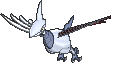
Pt Quagsire
 Platinum has had some awesome sprites, but WHAT IS THIS? Agh, my eyes...
Many, many FRLG sprites


 Lord Mega Rayquaza above are some of these sprites just godawful. I get that they wanted to go with a simple style for the FRLG sprites to reawaken that nostalgic feeling of simplicity that RGBY had, but that plan really backfired... I've seen people harp on the RSE sprites and I'll give that some of them are indeed kinda bad, but I feel like RSE mostly did a far better job in the sprite department, what with the lively poses and vibrant colors. Here are a few examples to compare:
 The FRLG sprite may have more accurate colors, but there's almost no detail to it at all, the lineart is crap and the tail fur is discolored. The RSE Tauros looks like it's ready to charge at whatever's in front of it, which is compounded by the bright colors to make it livelier.

 FRLG Charizard is boring. It's all "Mwahahahaha I'm Charizard!", but the colors are dull and the eyes look lifeless. The RSE one, one the other hand, has a fittingly maniacal expression that screams "You want some o' this?!"; the Emerald animation makes this absolutely hilarious by adding a layer that's all "THEN COME AND GET SOME!". I dunno, that RSE Charizard just works so well.

 Nidoking is in a similar scenario to Charizard. The FRLG one looks menacing, but nothing beyond that. I can only imagine it grunting, that's all. RSE Nidoking has an almost psychotic look in its eyes and the Emerald animation makes it look like it's roaring at its enemy. Really good. Also, the spikes on RSE actually look sharp, in contrast to those on FRLG.

 Bleh. That is all I can say about FRLG Muk. This sprite is so fucking boring. RSE Muk looks like a goddamn rapper and I imagine it'd be a WAY better one than Lil' Wayne, 2Chainz, Drake or any other of those scumbags. Made even better by the fact that Muk can hold Nuggets and Big Nuggets in Gen V; this guy knows he's got bling and ain't afraid to show it.
 The FRLG Articuno just looks kind of awkward. Due to the pose it's in, it kinda looks out of proportion, since its body looks so small compared to its other body parts. Again, it has bland coloring and as a result just doesn't give that regal vibe that the RSE one possesses. That sprite is absolutely gorgeous and they've made excellent use of the 64x64 canvas by posing it like that. It's just like it's flying by and noticing its opponent.
I may be somewhat biased towards RSE, but as I've said, I know RSE has some bad sprites as well. Still, I believe FRLG has some of the very worst altogether.
The FRLG Articuno just looks kind of awkward. Due to the pose it's in, it kinda looks out of proportion, since its body looks so small compared to its other body parts. Again, it has bland coloring and as a result just doesn't give that regal vibe that the RSE one possesses. That sprite is absolutely gorgeous and they've made excellent use of the 64x64 canvas by posing it like that. It's just like it's flying by and noticing its opponent.
I may be somewhat biased towards RSE, but as I've said, I know RSE has some bad sprites as well. Still, I believe FRLG has some of the very worst altogether.
Vaporeon's head looks huge compared to the rest of its body, Flareon's pose is really awkward and Jolteon's...ugh, don't get me started. What a trainwreck.
DP sprites
Pt Quagsire
Many, many FRLG sprites