aim - I like this design! Maybe try fleshing out the whale parts a bit while making him the same size, so it doesn't look too large to Dragon Dance :D
Blue Frog - He looks pretty much complete to me. I think the area where his arms are at feel sorta empty, maybe because of how heavy the bottom half looks compared to the top.
Bramblestein - I like the idea of a manatee representing a DD/CM user! My only concern is that the mechanical parts seem a little too forced into his design, such as the bolts.
Charniodiscus - His neck frills fit so well with his design. I like it :D
Derexon - This one really fits the mold for a DD user, but I can't really see it utilizing CM, due to how "mechanical" it looks.
Doran Dragon - This one is adorable! I love the mercury aspect of it the most :D
Emvee - The design looks very creative, with the crustacean parts fitting DD and the shell brain fitting CM. I'd like to see how this one turns out.
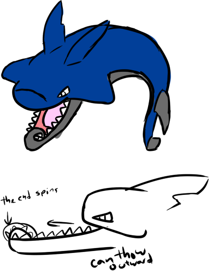
Golurkyourself - I really love the presentation of this guy. My only concern is that the steel-type aspect is hard to see, unless I'm assuming his body has some mercury theme.
hendrix96 - While it looks a little too simple in my eyes, I like the design nonetheless. It using CM is kinda hard to see as well.
Key - The blush makes it so adorable >w<. I can see the water type well enough, but the steel typing seems almost nonexistent, mostly because it only seems like it's put on those 2 spikes. I'd say try to play around with the face to make it more iron-like.
Igloo the Almighty - While this one is fits the water/steel type well, I'm finding it hard to understand how it would still look steel typed if it closed its mouth. Maybe if you made some of his fins mechanical, it'll make the cannon feel more in place than it is now.
Integer Mova - This one is cute! Really simple and straightforward.
Involuntary Twitch - The concept is very great, but I feel like the pipes feel "plastered" on, especially the ones in the back. Maybe try incorporating the pipes in a more natural way, because right now they seem like a completely different entity.
justinjiaxinghu - The narwhal fits very well with this theme. Very straightforward :D
Knirp - As what Paintseagull said earlier, It peering out of the helmet make it seem strange to me. I do like the diving helmet + fish theme though!
macle - The steel type is very obvious, but the water typing only seems to be loosely connected to it being a flamingo.
P3DS - While simple in design, I think you can do a bit more with the body, as it's somewhat plain at the moment. I like the sword part though!
Quanyails - This one is super adorable @w@. The typing is very noticable, but I can't seem to see it using DD well, due to the very stumpy legs. Like what other people had said before, I think a claw-footed tub would help it fit that move better :D
RiCH HOMiE CHRiS - I think the sudden shift from dragon head and human torso is a tad weird. I'd say to make the shift more gradual in its design, instead of making it pop up from the body. Also, I don't know if it's complete or not, but I don't see it being steel typed, unless the silver thing is some sort of cloth/armor.
Sgt.Moose - This one is also on my list of adorable CAPS :D. I think it's a bit too simplistic, but that's just my opinion.
Shelmet - I like the idea of using a hypocampus as a theme to revolve the CAP around, since they're very knowledgable and can pack quite a punch in their mythology. Out of the two, I'd say the bottom one looks like it has more potential.
Slapperfish - Like what Pixelmoniac_ said in his comment, I think the grey bits make it more like rock. If you're planning to shade it, I'd say to make it somewhat shiny so it would look like bits of steel. I really like the staple remover part too XD
The Unseen Potato - This one is also very straightforward in its design. I like it! ^^b
unfixable - As what I said about Golurkyourself's entry, it does an amazing job looking very water-like, but the steel aspect is very hard to see.
Wobblebuns - This one is really neat. I'm assuming the helmet is supposed to look like it was taken from Clauncher?
Yilx - Otohime was a fabulous choice to use :D. The design appeals to me for the use of mercury/liquid metal, and how adorable it is. I don't think there's anything for me to suggest to change about it, since it looks quite detailed already.