behold its the laziest comic in the world


was doing a prep comic to prepare myself for some more botw stuff
the joke was terrible and immature so i didnt finish, but heres the single panel that did get completed, might as well show it
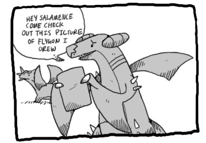
you guys can invent your own joke to go with it
I'm dying to see what happens, so I think I'll follow in PK Gaming's footsteps. Mine is probably way more terrible than what you didn't post, but what can I do.
you guys can invent your own joke to go with it
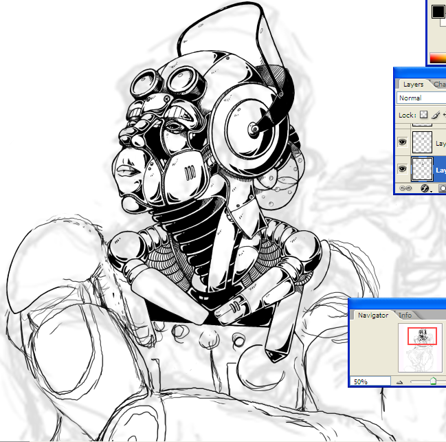
It's more about filling your own gallery with different stages of unfinished work than filling the inbox of the watchers (which isn't much), but if you've been told to chronicle the assignment then I guess that's what you got to do.And sorry about spamming inboxes on dA! I'm doing it picture by picture because the teacher asked me to keep a record of them, so dA gives me a nice little permanent home for each one (I should probably start making more of them scraps, though).


requesting you to draw all pokemons owait they're over 500 now nevermind