

Just a note AB, you should either add an outline to the glow on the antennae or remove it altogether, as it contradicts the outline rule.

-
Check out the relaunch of our general collection, with classic designs and new ones by our very own Pissog!
-
The moderators of this forum can be found in the CAP forum staff directory.
-
Welcome to Smogon! Take a moment to read the Introduction to Smogon for a run-down on everything Smogon, and make sure you take some time to read the global rules.
You are using an out of date browser. It may not display this or other websites correctly.
You should upgrade or use an alternative browser.
You should upgrade or use an alternative browser.
CAP 10 CAP 10 - Art Submissions
- Thread starter beej
- Start date
- Status
- Not open for further replies.


Just a note AB, you should either add an outline to the glow on the antennae or remove it altogether, as it contradicts the outline rule.
Fixed.
No I suck at naming things.


Right, nearly there now... I just need to decide on the best colour scheme, and get rid of any stylistic complaints.
Which of these, if any, is ideal?


All comments and criticism appreciated.
Which of these, if any, is ideal?
All comments and criticism appreciated.
Kind of looks a little like an alternate form of Arceus due to leg shape...but oh well.
The first one looks less like Arceus and more like Water/Electric mon.
The first one looks less like Arceus and more like Water/Electric mon.

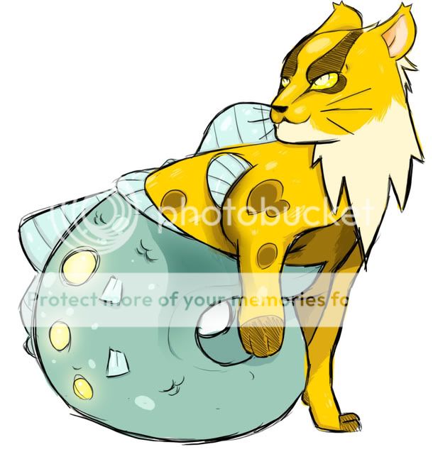
Here's my design using Aqua Tail on a poorly drawn Tyranitar. But my character isn't necessarily aggressive. It's actually playful, and curious. Here's my design playing with a ball of seaweed, the same way a cat would play with a ball of yarn.

Brilliant, Aragornbird. This is one of the few entries where I'm really convinced this is CAP10. Though I am a bit curious, have you proposed a name? Even if it isn't official, it never hurts to propose some kind of name to your art to complete the vision. I was thinking something like Scampali, personally.
BTW, I think sweeping the feelers back was definitely the right move, AB. I dig the new pattern. The final product design looks awesome. I imagine the feelers acting like a Jacob's Ladder whenever it gets excited.
I'm also digging noobiess's design and Galactic Grunt's design.


While this thread is certainly a little bit more laid back than the threads with a competitive spin, be sure to follow all the rules in place for this forum. That means no polljumping whatsoever - don't discuss names until the name threads come up. It bogs down discussion of the art itself and makes the thread/process harder to follow.

I had a sudden realization when looking at my previous designs that would make their appearance rather invalid: no hands-which means no thunderpunch, ice punch, and pretty much every fighting move ever. So here's a new design(very near the end to start a whole new concept I know) of my CAP, the sea monkey:
http://ticketmeister.deviantart.com/art/CAP-Design-3-159100489
http://ticketmeister.deviantart.com/art/CAP-Design-3-159100489


I had a sudden realization when looking at my previous designs that would make their appearance rather invalid: no hands-which means no thunderpunch, ice punch, and pretty much every fighting move ever. So here's a new design(very near the end to start a whole new concept I know) of my CAP, the sea monkey:
http://ticketmeister.deviantart.com/art/CAP-Design-3-159100489
Wooper used Ice Punch!
Flavor doesn't matter in the least, do whatever you want with your art.

Don't forget kitsunoh and gastly too. Kitsunoh can learn the punches but it doesn't make much sense. Gastly doesn't even have a tail it could punch with!Originally Posted by Fat The Ticketmeister
I had a sudden realization when looking at my previous designs that would make their appearance rather invalid: no hands-which means no thunderpunch, ice punch, and pretty much every fighting move ever. So here's a new design(very near the end to start a whole new concept I know) of my CAP, the sea monkey:
http://ticketmeister.deviantart.com/...gn-3-159100489
This is tennisace's post now.
Wooper used Ice Punch!
Flavor doesn't matter in the least, do whatever you want with your art.
I had a sudden realization when looking at my previous designs that would make their appearance rather invalid: no hands-which means no thunderpunch, ice punch, and pretty much every fighting move ever. So here's a new design(very near the end to start a whole new concept I know) of my CAP, the sea monkey:
http://ticketmeister.deviantart.com/art/CAP-Design-3-159100489
It's too big when I expand it on deviantart. 900 x 602. And when it's too small compressed or thumbed. 300 × 203.
- It must be no larger than 640 pixels on either axis, no smaller than 320 pixels on either axis, and in a compressed digital format. Uncompressed bitmaps and/or high-resolution images are not allowed.
I made my enty less complicated :
http://www.iaza.com/work/100401C/lionfish224120648415-iaza.gif
Yours, too.
It's too big when I expand it on deviantart. 900 x 602. And when it's too small compressed or thumbed. 300 × 203.
Since it's not his final submission and it's a link it's not against the rules
It's too big when I expand it on deviantart. 900 x 602. And when it's too small compressed or thumbed. 300 × 203.
1. Once again, only flavor moves really have to have anything to do with the Pokemon in question whatsoever. Hence, YOUR MON CAN STILL GET COMPETITIVE MOVES IN SPITE OF BAD FLAVOR.
2. Just copy the 300*203 into MSPaint, resize the screen to 600*405, then Ctrl+A, right-click, select resize/skew. Resize the image to 200% by 200%, and voila, you have a perfectly legal drawing.
I have no idea how to do it on a Mac. I would use my first option if that were the case.
Also, I demonstrate how a sponge with guns can express both speed and bulk.
http://www.majhost.com/gallery/ToaNeya/kits/CAP-9/CAP10/SnipongeSupportart/cap10firepunch.png
Jetting with its sniper gun, it dashes forward to melt Scizor's defense to slag...somewhat literally...with Fire Punch. Note that it tends to use swipes with its claws for punches, and does not use a "true punch." On the other hand,
http://www.majhost.com/gallery/ToaNeya/kits/CAP-9/CAP10/SnipongeSupportart/zapcannon.png
And, of course, I finally demonstrating it using its STAB. Of course, being pelted by a million leaves, even IF you're so bulky and awesome that you can stand up to it is STILL going to make you mad enough to want to use this even IF it's just for flavor...
http://www.majhost.com/gallery/ToaNeya/kits/CAP-9/CAP10/SnipongeSupportart/snipongemagicguard.png
Also, since the secondary ability polls are about as tight as Primary Typing Poll 2, I decided to try putting a little more emphasis on its visor. Here, it is used for projection instead of scanning, namely, it is projecting a shield that blocks damage from status.
Final entry coming soon as I suspect Beej will close the polls soon, but any last minute criticisms or commentary would be appreciated.
It's easier to just upload it to Photobucket and use their resizing feature and resize it to 'large'1. Once again, only flavor moves really have to have anything to do with the Pokemon in question whatsoever. Hence, YOUR MON CAN STILL GET COMPETITIVE MOVES IN SPITE OF BAD FLAVOR.
2. Just copy the 300*203 into MSPaint, resize the screen to 600*405, then Ctrl+A, right-click, select resize/skew. Resize the image to 200% by 200%, and voila, you have a perfectly legal drawing.
I have no idea how to do it on a Mac. I would use my first option if that were the case.
Final Submission
A huge thanks to pkmn-taicho321 for helping me with this design!
Supporting Material:
Design Origin: The original idea behind the design was based on the Maneki Neko. That's also how I came up with some of the Pokedex entries. The visual concept was based on Mermaids, Leopards, and Ocelots (close cousins of the leopard.)
Pokedex Entries:
Entry 1: [CAP 10] has the power to summon intense thunder storms. However, before doing so, it warns both people and Pokemon
Entry 2: [CAP 10] can defend itself from other Pokemon by cloning their special ability with mystical lightning.
Entry 3: Apparently, [CAP 10] gets along with other Water type Pokemon. There have been reports of it sharing food with a Lanturn.
Entry 4: [CAP 10] lives at the bottom of the ocean. It only comes to the surface to warn others of upcoming thunder storms.
Entry 5: According to legend, if you see [CAP 10] waving at you, you will be blessed with good luck.
Action Sketches:
Using Flamethrower on Scizor.
Using Ice Beam on Breloom.
Using Aqua Tail on Tyranitar.
Tracing Snorlax's Thick Fat.
Tracing Flash Fire from the ugliest Heatran ever drawn.
Tracing Gyarados' Intimidate, and warning others of a storm.
http://i613.photobucket.com/albums/tt216/VeryFunnyDoug/OceanLotPoisonheal.jpgUsing Magic Guard.
Sharing a caught Magikarp with a Lanturn.
Preparing to fight a Dragonair.
There's even more Supporting material coming soon.
Woot for speed marathon semi-spriting!
Quick WIP of my Final. Color scheme heavily inspired by Tortferngatr's comment on it looking Native American. Tell me what you guys think! Might make a better sprite for it later if I have time.
Speaking of Tortferngatr, liking the revamped design allot better than the old one. +)
Expect mor supporting material before the night is done. +)
Woot for speed marathon semi-spriting!
Quick WIP of my Final. Color scheme heavily inspired by Tortferngatr's comment on it looking Native American. Tell me what you guys think! Might make a better sprite for it later if I have time.
Speaking of Tortferngatr, liking the revamped design allot better than the old one. +)
Expect mor supporting material before the night is done. +)
Might want to lighten the eyes up a little bit, or give them a tiny spark, and, of course, maybe double the size to bring it within the 320*320 range. Still, the more I look at it, the more I think "Great job." Keep up the good work!
(final submission coming soon as the secondary abilities poll closes, as it will affect how I lay out my final submission.
Unless, of course, the art closes as soon as the secondary abilities do, though I feel that would be a bad move on Beej's part if he didn't allow at least 24 hours extra after polls close or at least a warning of a deadline.)
So I sat down tonight to do some sketches of my CAP10 design doing some moves, since everyone's doing something like that, and ended up running across a pose that I now wish was my Final Submission.

Yeah, it's using Thunderbolt, which would obviously be edited out if this were a main piece. But dang. >< I wish I hadn't put so much work into the other one (getting the lineart perfect in Illustrator took a long time), because I like this way too much. =P

Yeah, it's using Thunderbolt, which would obviously be edited out if this were a main piece. But dang. >< I wish I hadn't put so much work into the other one (getting the lineart perfect in Illustrator took a long time), because I like this way too much. =P

Final Submission
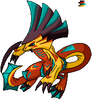
CAP 10 submission - thinking of calling it Voltray (Voltrage?)

lemme know what you think :)
-regirubber
CAP 10 submission - thinking of calling it Voltray (Voltrage?)
lemme know what you think :)
-regirubber

The other pose was great Nyasu but damn... I really like the new one better; especially the new front view of the head. There is nothing Swamperish about that pose either which completely eliminates one of the concerns you had from the beginning. Your old one is good enough but I like this one better.

eeeeeeee everyone's got such good lookin subs - I'm bout dead in the water here. Ohoho pun.
two new lil supportin materials to be added
http://img189.imageshack.us/img189/3972/earthquak.jpg - Earthquake, maybe Earth Power'ing a Jirachi w/its tail
http://img196.imageshack.us/img196/8915/preevo.jpg - aaaaaaand a pre evolution, probly name it Flotsamp haha
two new lil supportin materials to be added
http://img189.imageshack.us/img189/3972/earthquak.jpg - Earthquake, maybe Earth Power'ing a Jirachi w/its tail
http://img196.imageshack.us/img196/8915/preevo.jpg - aaaaaaand a pre evolution, probly name it Flotsamp haha

Contrary to what others have said, I do not like this pose. It makes your concept look dainty. It looks as though he's trying to cast a spell but that really doesn't fit what he looks like. He's a big mammal, not a wizard. The first pose wasn't exactly fantastic either, but I think you're taking a step in the wrong direction. Get a more primal look is what I would suggest.So I sat down tonight to do some sketches of my CAP10 design doing some moves, since everyone's doing something like that, and ended up running across a pose that I now wish was my Final Submission.
Yeah, it's using Thunderbolt, which would obviously be edited out if this were a main piece. But dang. >< I wish I hadn't put so much work into the other one (getting the lineart perfect in Illustrator took a long time), because I like this way too much. =P

I just drew something right just now because I was incredibly bored~
(and because I just got a scanner)~
Hey look, a new-coming design, even though I probably only have maybe 1 or 2 days maximum to finalize it?

It's a Rockhopper Penguin!
Oh LORD I can use some crit and comments on this.
And yes, it is supposed to look eerily sage-like.
...With eyebrows that sometimes look like DREADLOCKS~~~!
Random supporting art:
The original crappy concept art <-- Fail
Rockhopper attacking a Remoraid, while some Mantine swim by. <-- Includes art totally not stolen from This Pokemon Card.
Backstory, uhhh...
They live with colonies of Piplup, Prinplup, and Empoleon, maybe? They can channel electricity out of the crests on their head, and their tail. And perhaps something with those large wings and the claws? I Dunno. I am really just making this part up right now, as I type it.
So, yeaah. Got a concept down. After some editing, gotta make some cleaner art, I guess.
...So I meet the problem that I had the last two CAPs. Clean, colored art. Exactly what I can't do. Damnit.
Too bad Taicho's thread is closed, as I could use something like that right about now. >_>
Oh well. I guess I'll get by, somehow.
(and because I just got a scanner)~
Hey look, a new-coming design, even though I probably only have maybe 1 or 2 days maximum to finalize it?
It's a Rockhopper Penguin!
Oh LORD I can use some crit and comments on this.
And yes, it is supposed to look eerily sage-like.
...With eyebrows that sometimes look like DREADLOCKS~~~!
Random supporting art:
The original crappy concept art <-- Fail
Rockhopper attacking a Remoraid, while some Mantine swim by. <-- Includes art totally not stolen from This Pokemon Card.
Backstory, uhhh...
They live with colonies of Piplup, Prinplup, and Empoleon, maybe? They can channel electricity out of the crests on their head, and their tail. And perhaps something with those large wings and the claws? I Dunno. I am really just making this part up right now, as I type it.
So, yeaah. Got a concept down. After some editing, gotta make some cleaner art, I guess.
...So I meet the problem that I had the last two CAPs. Clean, colored art. Exactly what I can't do. Damnit.
Too bad Taicho's thread is closed, as I could use something like that right about now. >_>
Oh well. I guess I'll get by, somehow.
- Status
- Not open for further replies.