CAP Website Workshop

Status
Not open for further replies.
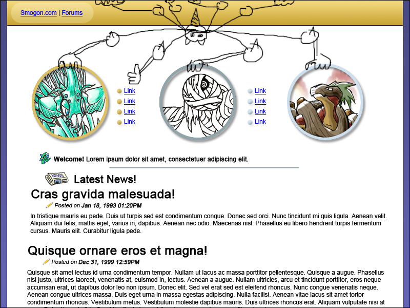
Over the past several months, the CaP project has grown immensely. To help accommodate the many new users, Doug has enlisted me to design and create the CaP site which will be hosted on Smogon's server. In this thread, I will update with progress, show the general public what is going on with the site, and generally use this thread to help facillitate the process. I will also need to enlist volunteers who know how to use HTML.

Right now, I'll need the help of the artists who have created the various designs for the four CaP created Pokemon, specifically Cartoons!. Anyone who knows HTML and wants to help can post in this thread, as well, though I may not need your help for a little while.

Santa's Little Helpers:

darkie (Lead Designer)
-
Tennis (Head of Coding)
Flounder (Coder)
Blue Kirby (Coder)
-
Cartoons! (Art)
-
Deck Knight (Editor)
-
Poopazing (misc.)
Hybrid (misc.)
Son of Thunder (misc.)
 

tennisace

not quite too old for this, apparently
is a Site Content Manager Alumnusis a Top Social Media Contributor Alumnusis a Community Contributor Alumnusis a Researcher Alumnusis a Top CAP Contributor Alumnusis a Tiering Contributor Alumnusis a Contributor Alumnusis a Smogon Media Contributor Alumnusis an Administrator Alumnus
First off, KoA isn't here, though he may see this and HOPEFULLY color Revenankh's concept art. Second, as I said on the server, I'll help all I can, in exchange for a fancy title =P We can do this!

Woot fancy.
 
I could try to help. I don't know much about HTML aswell but if there's anything else I can do, I would be more then honored to help.
 

SoT

I leave and they change my avatar to this?
is a Top Team Rater Alumnusis a Forum Moderator Alumnusis a CAP Contributor Alumnusis a Battle Simulator Moderator Alumnus
It's a great start darkie. Can't wait to see the end result. The Fidgit drawing at the top is freaking amazing. Cartoons has some competition now. ;D

In all seriousness I really like how this is going, and would like to thank you on behalf of the CaP community for doing this.

And put me down for Misc.
 

DougJustDoug

Knows the great enthusiasms
is a Site Content Manageris a Top Artistis a Programmeris a Forum Moderatoris a Top CAP Contributoris a Battle Simulator Admin Alumnusis a Smogon Discord Contributor Alumnusis a Top Tiering Contributor Alumnusis an Administrator Alumnus
Moderator
Wow, darkie!! You completely nailed it! This is exactly what I was hoping for! I'm completely serious -- this is exactly the sort of thing I was envisioning. Actually, it's even better than I was hoping for. You perfectly captured the Smogon-ish look, without making something that looks like a direct ripoff or copy.

BRAVO!!!

I really wish we could get a good artist to submit three pictures of the first three CAP pokemon. That way, all three pics on the front page would share the same artistic style, not unlike the pics by Aragornbird on the main Smogon site. Perhaps we could make it a competition? Considering the quality of art we get in the CAP design threads, I know we have a lot of talented artists around here.
 
I like Doug's idea of a contest, I know I'd enter...

As for the layout, I don't like how Revenankh and Pyroak have similar colours outlining there images, but Syclants is pretty far off.
 

Deck Knight

Blast Off At The Speed Of Light! That's Right!
is a Forum Moderator Alumnusis a Top CAP Contributor Alumnusis a Top Smogon Media Contributor Alumnus
I can be your copy editor so that you don't make egregious spelling and grammar errors! Good job darkie.

Is that Latin or Greek?
 

SoT

I leave and they change my avatar to this?
is a Top Team Rater Alumnusis a Forum Moderator Alumnusis a CAP Contributor Alumnusis a Battle Simulator Moderator Alumnus
Yeah it's Latin

And I was telling darkie about the sprite thing over aim. It would be better if they all had the same design or concept, not each having it's own style. And I do think Revvy needs to be colored in. I like how Pyroak is drawn, and I think that if Syclant and Rev where drawn like that style it would look awesome. However, that is just my opinion.

I still say that his Fidgit is awesome. I love how you layed this out darkie.
 

tennisace

not quite too old for this, apparently
is a Site Content Manager Alumnusis a Top Social Media Contributor Alumnusis a Community Contributor Alumnusis a Researcher Alumnusis a Top CAP Contributor Alumnusis a Tiering Contributor Alumnusis a Contributor Alumnusis a Smogon Media Contributor Alumnusis an Administrator Alumnus
I'd love to see Cartoons!, Elagune, CyzerVisheen, or Lorak do all the pictures. Cartoons!, Elagune, and Cyzer because they all made one, and Lorak because he's neutral and I love his style (Hence my avvy.)

I also think that we should have the Smogon seal in the top Left, because we are part of Smogon.

Just minor nitpicks.

EDIT: I think the rings would look better Silver/Gold/Blue. Light/Dark/Light always looks better to me. also, make links after every circle, and make them under the circles.
 

Lorak

*leekspin*
is an Artist Alumnus
I'm tempted to give it a try, but locating all the references pictures we have of the final form of each in one place would be greatly appreciated.
 
Thanks Doug! I'm glad you like it. A contest would be pretty cool, and a great way to get uniform artwork.

I used Latin Lorem Ipsum for the filler text. http://www.lipsum.com

Thanks, Deck Knight. I'll edit you into the first post. :D

Tennis, I didn't put the seal, because while this site may be a part of Smogon, it isn't Smogon itself. I'll change the order of the colors. chaos used Red/Blue/Yellow (RBY) for the circles on smogon.com. I used Gold/Silver/Crystal, to keep with the theme.

Lorak, Syclant, drawn by CyzirVisheen; Revenankh, drawn by KoA; Pyroak, drawn by Elagune; Fidgit; drawn by Cartoons!

Thanks, Blue Kirby! :D

Also, if anyone is wondering why I poorly drew Fidgiti, there is a reason to my madness. I want Fidgiti to be holding up the three circles, while upside down (sort of in a spiderman-esque pose).
 
Haha, nice work Lorak. But I think the Pyroak looks a bit... Not Pyroak. Syclant is great and Rev is really workin' there. Good job!
 

Lorak

*leekspin*
is an Artist Alumnus
Haha, nice work Lorak. But I think the Pyroak looks a bit... Not Pyroak. Syclant is great and Rev is really workin' there. Good job!
Rev was mostly a headtrace, to be completely honest; I didn't want to mess up any placement of the bandages. :(
 

tennisace

not quite too old for this, apparently
is a Site Content Manager Alumnusis a Top Social Media Contributor Alumnusis a Community Contributor Alumnusis a Researcher Alumnusis a Top CAP Contributor Alumnusis a Tiering Contributor Alumnusis a Contributor Alumnusis a Smogon Media Contributor Alumnusis an Administrator Alumnus
Can you color Revenankh's head? Its a tan color. Also, you have creative license with the bandage placement. Great job!
 
Has CyzirVisheen been around? I love his style, and his coloring is closest to Sugimori's watercolor approach, I find.
 
Status
Not open for further replies.

Users Who Are Viewing This Thread (Users: 1, Guests: 0)

Top