CAP 10 CAP 10 - Art Submissions

Status
Not open for further replies.
Since the mods aren't around currently.. Please remember that you shouldn't quote the images themselves, since they clutter the thread, but should instead just use URLs to the images. You can see Wyv warning about it here.
Yadon said:
It's interesting. He seems to have a very cardinal-esque (Like the Pope) appearance to him. It's a neat aesthetic, even if it wasn't intentional. Still, though, I feel as though it's lacking a bit of necessary detail. At present, it looks a little bland and lacking in design features.
 
Since the mods aren't around currently.. Please remember that you shouldn't quote the images themselves, since they clutter the thread, but should instead just use URLs to the images. You can see Wyv warning about it here.
I'm sorry about that, I edited my post to only show the link to the image.
 

bugmaniacbob

Was fun while it lasted
is an Artist Alumnusis a CAP Contributor Alumnusis a Top Contributor Alumnusis a Top Smogon Media Contributor Alumnus
New concept: ElectroCuttlefish


I don't have much else to go on, so I think I'll pursue this course of action for the time being (assuming anybody likes the design, of course. I'll probably draw it out properly for the Final Submission).
 
I don't have much else to go on, so I think I'll pursue this course of action for the time being (assuming anybody likes the design, of course. I'll probably draw it out properly for the Final Submission).
I love cuttlefish-- they're some of my favorite foods. Although I think you should make it more Pokemony. As it is, it just looks like a cuttlefish.
 
I came up with this little guy:

http://i98.photobucket.com/albums/l246/BlackRoija/poke.jpg
Inspired by the structure of a water molecule. The two hydrogen nuclei comprise the "hands", using one of the hydrogen's electrons and one of the electrons shared with the oxygen nucleus (the head/body) as "fingers" for each. The remaining electrons float just above the "head", which is encompassed in an "orbital shell". Atoms and molecules are very much electrical, and overall these in particular come together to create water! I just tried to think of something that wasn't a fish/dolphin/amphibian/whatever.

It's pretty rough and simplistic, but if I get any good feedback I'll pretty it up with what photoshop skills I possess. :p
Crap...you beat me to it...on the other hand, PowerPoint may be the perfect medium to do it myself with...


Stupid fact glow effects aren't allowed due to solid line rule. (And the electrical effect is integral to the concept: It's holding the sections of it together...)

Also, I did a revamp of my Bilge Rat concept.

-Torterra-Infernape-Feraligatr-


A cleaner version of my sea 'pixie'. Probably not the final version as I'll want to draw it in Photoshop rather than Flash.

Also have some junk moving around to go with it.
 

Zystral

めんどくさい、な~
is a Contributor Alumnusis a Top Smogon Media Contributor Alumnus
Cartoons I love your animations. hilarious. also how it takes down common OU threats.
My only complain is its eyes. I think normal eyes would suit it better.

What is peeving me is the amount of people using Blue/Yellow in their colour schemes.
I like Bugmaniacbob's because the orange shows the distinct Electric, yet is the original colour of the fish itself.

that said, I am working on my own, and it should be scanned quite soon. tomorrow, hopefully.
edit; actually, looking at it now, my drawing is terrible, if anybody would be willing to help be get it into a nice digital format then that would be much appreciated.
 
In contrary to ZystraL's post, I really like the eyes on Cartoon's sea pixie. The design itself is incredible too, being "flexible" is one of the things I was looking for in these art submissions. It really shows that his design is versatile too.

I love the animation also! I've never seen anything that impressive before!

Good luck, you're all very talented! Definitely a lot better than I could ever be!
 
Liking cartoons!' design the most so far. It pulls away from the "fish with electricity" that most people are doing (including me). it's also well designed in general; very unique.
 
I like Cartoons' design in all ways except one. The lack of eyes, or rather the little dots as a substitute for eyes, is very disconcerting and gives it less character. As a character or just as a rule of thumb for making something less creepy and more personable, having eyes helps a ton.
 
I like Cartoons' design in all ways except one. The lack of eyes, or rather the little dots as a substitute for eyes, is very disconcerting and gives it less character. As a character or just as a rule of thumb for making something less creepy and more personable, having eyes helps a ton.
That was kind of why I liked it. It makes it look really unpredictable. Like, "Holy shit, what does that thing do?".

EDIT: Cartoons, ily.
 
Final Submission


I return after sitting through a couple of CAPs due to lack of ideas, and I’m glad to see the quality of submissions is as good as always. This time I contribute this manatee merman, inspired on the story about Christopher Columbus mistaking these animals for mermaids. You could also think of this as a mix between Zeus, Poseidon, and of course a manatee. Special thanks go to my friend BonzaiRob for giving me some very useful advice regarding the shading.

This pokémon has dexterous flippers that are just as useful as real hands, despite the lack of fingers. It can use its trident to increase the range of its attacks, and it can even spin it to create huge whirlpools. When in dire need of raw power, it can burn its body fat quickly to produce large amounts of electricity. It can also move quite fast despite its bulk. Here's a quick picture of it dashing forward.

So this is it, I hope you like it.
 
Two people have already beat me to the punch of a water molecule, but I'm gonnna go ahead and draw my version.

Cartoons has one of the best so far, but I agree with others about the eyes. The dots aren't working for me...


Admittedly this looked about 9000x better when I sketched it out. If I can find a scanner I'll probably do a refined version of the original sketch and scan it. If not, I'll have to get a friend to do the shading, because unfortunately my artistic skills (what there is of them, anyway) don't translate all that to the computer art programs.

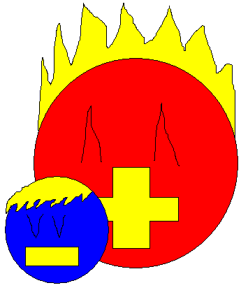
....in any case, explanation time. This guy's based on a hydrogen atom. Thus, it has exactly one proton and one electron. However, in this case, each particle has a distinct personality and are in some ways separate entities, despite being fused together. The electron (the smaller, blue particle) is negatively charged, and thus has a perpetually negative mood; either melancholy or sometimes enraged, depending on the situation. The electron emulates the Water typing of the pokemon the most, and is the part of the atom that launches attacks. The proton (the larger, red particle) is positively charged, and is therefore constantly cheerful and happy. The proton emulates the atom's Electric typing, and plays the role of support and defense for the atom. The atom spins at high speeds to charge energy, which is then stored within the bond between the proton and the electron for later use.

(Hydrogen makes up 2/3 of a water molecule, and pure hydrogen is an energy carrier, like a battery. Hey, why not?)

[not set on the color palette; may actually go with a deep purple and hot pink over blue and red....honestly not sure yet. Guess I'll just keep looking for the combo that looks the best to me....]
 
As far as chemistry goes, I wouldn't say hydrogen makes up 2/3 of a water molecule except in terms of the chemical notation, but the concept is excellent. A single hydrogen atom would also be slightly unstable, hinting at unpredictability, overall very neat. I slightly leans more towards the entire H2O molecule, but perhaps it is too focused on water, and not the electricity part.

Anyway, as far as the rest of the art goes, I'm deeply impressed. Only have heard great things regarding the artists of CAP, and it all applies. And Cartoons, I dig the eyes the way you made it, pretty much for one reason already explained.
That was kind of why I liked it. It makes it look really unpredictable. Like, "Holy shit, what does that thing do?".
 
I really liked my Marlin, but it looked to glass cannon-ey and 2 dimensional. Didn't really work with the concept.


Larger

An ocean sunfish. I also have a fatter kappa-looking thing. Pretty much a Golduck evo. I'll post it if I find it. C&c?
 
As far as chemistry goes, I wouldn't say hydrogen makes up 2/3 of a water molecule except in terms of the chemical notation, but the concept is excellent. A single hydrogen atom would also be slightly unstable, hinting at unpredictability, overall very neat. I slightly leans more towards the entire H2O molecule, but perhaps it is too focused on water, and not the electricity part.

Anyway, as far as the rest of the art goes, I'm deeply impressed. Only have heard great things regarding the artists of CAP, and it all applies. And Cartoons, I dig the eyes the way you made it, pretty much for one reason already explained.
That's a good point. I really like the H2O idea. Why not add an Oxygen molecule in the middle, similar to Exeggcute or Magneton? I think it's a neat idea and I hope you can upload your sketches!
 
Cartoons, your art skills will never cease to amaze me. The water pixie is amazing (although I also like the Electro-cuttlefish and the water molecules).

I like the dots for eyes...it makes the pixie seem fearsome and evil, something that I find downright adorable.
 
Put some plating on the salamander so it can look more bulky/defensive. I'm thinking of adding "feathery" gills or whatever they'll called like Wooper or Swampert have, to add to the water-ness of it.

 
Caladbolg, i honestly loved the first image you posted of this guy. the updates since have just seemed so much more lacking in creative and action-y-ness. i think it'd be best the way you originally designed it. it was cute, and looked the part.
 
I got around to making a quick sketch of my design, I'll color it later...


Explanation:
The design itself is based off a water molecule (H2O). If your familar with chemistry, all particles have a charge, positive, negative, or neutral. Some particles must combine with other in order to become neutral (balanced), thus water is made up of 2 hydrogen atoms and an oxygen molecule. However, for my design I changed the roles: 2 oxygen and one hydrogen. This makes an unstable molecule that is unpredictable, but also gives the molcule a charge (hence the electrons flying off). So in a sense this is a water molecule, but also has electric properties due to its charge. The middle molecule is the H and the other two with the circle eyes are the O's. I know the sizes aren't correct and the whole electron thing is not scientifically correct, but I like the concept.

Tell me what you guys think...
 
Caladbolg, great design, but I liked one of the earlier versions better with the plug prongs on the limbs. Maybe combine that with this (and some of the detailing on the "helmet" from the first design?) But it's got a lot of promise.

Cartoons!, awesome work as always, but I'm not fond of the color scheme. Maybe a yellower orange for the body? Maybe that can be the shiny coloring?
 

Mario With Lasers

Self-proclaimed NERFED king
is a Forum Moderator Alumnusis a CAP Contributor Alumnus
http://i399.photobucket.com/albums/pp78/otaku-dono/001-1.jpg

http://i399.photobucket.com/albums/pp78/otaku-dono/002.jpg

I changed a few things about my design, but since I can't reproduce what I draw for shit I just outlined the original and coloured it in. I know it's quite generic but I'm not so good at colouring stuff. =/
Oh haha, NOW I see it had a face all the time. And I guess all those tentacles (except for the short pair in the front) are the limbs, correct?
 
Status
Not open for further replies.

Users Who Are Viewing This Thread (Users: 1, Guests: 0)

Top