CAP 10 CAP 10 - Art Submissions

Status
Not open for further replies.
That's a fantastic design Paras Hilton! I love the concept of a mischievous angler sea angel. I know that you want to capture the evil aspect of Angler Fish (angler fish Are really scary.) but, as others have pointed out, it looks a bit too evil, making it look like a dark type. I think the best way to make it look less like a dark type, is to tone down the teeth on it's "hoodie." But even with those minor flaws, I still support your design 100%!

In other news, I'm whipping up some more supporting material for my "sea ocelot."


Hey guyz, here with my entry. It's a polar bear if you're wondering. I felt that the water typing should be less prevalent and the electric brought out, there's also a hint of steel there but metals do tend to make good conductors. The idea for this was more tailored towards the high HP spreads and defensive side.

As for the design itself it's visible skin is made of rubber which can be shaped or molded towards certain tasks. Want a more offensive Poké? It'll stretch it's fingers into claws. More defence? Thick stocky arms will do the job. It's really a reference to being able to adapt to counters. As for the metal parts since rubber doesn't conduct very well the steel horn and tail act as oppositely charged poles.

Hopefully the electric type comes out well and the water type as well. I'd be happy to take on any advice for later.
 
@Wyverii: Love the design - it's very detailed and well-explained, and it's definitely brought out the electric-typing. Plus, I find it interesting that you're maximising our primary typing and making CAP10 a bit like Venasaur, by which I mean it's secondary typing isn't obvious from design alone.
Though perhaps you can submit some flavour artwork in order to show what you mean exactly: I can understand the rubber arms, but it's a little out there.

@Yilx: That's actually an awesome and unique jellyfish. Plus, I see parts of Black Mage from Final Fantasy in the design, and to me, that screams "I can use lots of different types!".
Can't find much to critique design-wise, as it looks like it would be light-weight too, giving the people who wish to avoid Grass Knot what they want too.

@Paras Hilton: Love the design, I must say. However, you may want to change the colour scheme slightly - if it had different colour fins, then it wouldn't be as "Sneasel-like". I personally love the idea of it having a tertiary typing of Dark - it brings out the design more.
 
My first attempt at anything like this, so I thought I'd give it a shot.

I'm useless at making pictures with software, but not with a pencil. So here's my attempt. Apologies for the relatively poor quality of the picture, for I don't have access to a scanner.

It's a design I'm pretty satisfied with, after many failed ideas. I figured something anthropomorphic might be interesting. No ideas on the colour scheme yet, so I've left that out for now.
 
Geez... I'm seeing so many designs that it's IMPOSSIBLE to comment on them all. It's kinda sad, considering how may of them are interesting and are designed well.

@ Cartoons!: Ah, yes. I knew I probably should have said something about this little guy earlier. Anyways, I think this "pixie" fellow is probably the most unique out of this bunch. Although several of them tend to shape shift, as yours appears to from the little animation you have provided for us, I'd say nothing even closely resembles him and it probably took a heck of a lot of imagination on your part to come up with him.

I really had to hunt for something to suggest, but I think I have one little nit-picky detail that I want to point out in regards to the artwork itself. In the sprite of this guy in your avatar, the bottom part is yellow. Meanwhile, in your artwork, it is difficult for me to tell weather it is yellow as it is in the sprite, or orange (like is arms) because of the way it is shaded. I'm pretty sure that its supposed to be yellow based on the sprite in your avatar, but, like I said, I am unsure. When doing this guy in photoshop, could you make that a little more obvious?

@ Umbreonage: Your dolphine design certianly has potential. It's not quite there yet, but it's getting there. The design itself is certianly interesting. There are, howevere, a couple of problems with the artwork. First of all, I strongly suggest that you get rid of the electrical effects around the fins: it doesn't look good. Second of all, I think the jagged armor does not work with the design: I'd say simplify the armor and have the flippers go armorless. One last nit-picky detail is that the tail (as lovely as that is, by the way and the armor on the rest of his design should be modled after that) looks like it is detached from the body: if that is not what you were going for, that ought to be fixed.

@ aragornbird: Hmm... I guess the standing pose for your shrimpy isn't so bad after all. But what I really dig about the new version of your design is the lights: the fact that the lights change color is just sick, so good on you. In regards to your own remark about it not looking much different from your previous version, I don't think that you really want to deter much from that. Needless to say, this design is certianly comming along well and I can't wait to see how the shrimp develops.

@ Paras Hilton: Wow... I really dig the lanter-carrying fish design you have for us here. The color scheme goes away from what I'm seeing in a lot of the designs here, which makes this design even more interesting: I don't think the coloration makes it look like a dark type (which is what other people seem to be saying), but even if it DID look like a dark type, that really shouldn't have any bearing on the design itself anyway. Overall, I think that your design is very well thought out and I really like the imagination that you put into this little guy.

That said, I think you could change the coloration of the red parts: that might help quieten the complaints about it "looking like a dark type." I'm thinking something along the lines of a light blue, but you can experiment with different colors in those areas.

@ Wyverii: Your polar bear design certianly does bring out the primary electric typing. The choice of critter that you've based your design off of is enough to bring out the water typing as well. Since you don't want to bring out the water typing all that much, I think that this will be fine. The fact that the skin is rubbery and can be changed into anything is a nice touch. I'd certianly like to see some supporting artwork depicting this if you have the time to create any.

I would think that the fur could also be static charged, which would allow for the use of electrical attacks, but the metal horn and the tail (which you've already mentioned would be the source of electrical attacks) also work well for those purposes. The only thing that I would suggest is to play with the eye color a little bit and see if you want to keep the eye color yellow or not: it certianly could add a little more variety to your design's color pallet, which in this case wouldn't hurt (although the design is fine without it).

---

It's really hard to pick a favorite design: I really like too many of them to be able to do so. You all are putting out designs that are imaginative: some of them are cool, some of them are cute, but they all have had hard work put into them and it really makes me happy to see these designs.
 
Final Submission

Main Design


Supporting Material
http://i991.photobucket.com/albums/af34/HHO_xZACHly/H2Osupportingmaterial.jpg
http://i991.photobucket.com/albums/af34/HHO_xZACHly/H2Osupportingmaterial2.jpg

Description
The design is based off a water molecule (H2O). If your familar with chemistry, all particles have a charge, positive, negative, or neutral. Some particles must combine with other in order to become neutral (balanced), thus water is made up of 2 hydrogen atoms and an oxygen molecule. However, for my design I changed the roles: 2 oxygen and one hydrogen. This makes an unstable molecule that is unpredictable, but also gives the molcule a charge (hence the electrons circling around it). So in a sense this is a water molecule, but also has electric properties due to its charge. The middle molecule is the H and the other two with the circle eyes are the O's. It can use its electrons and the electric fields it generates to command the elements as well as fire bolts of electricity.
 
Yilx said:
Your design is rather neat, and I actually like it a lot, but it looks way too much like Mismagius with a different color scheme and marginally different proportions. It's cool, but I think that similarity is too significant to let go.
Paras Hilton said:
I like your design a lot, but similarly to Yilx', it carries way too many features of a Ghost pokemon. It has the flowy bottom-side, which despite being a fin, is a distinct feature on many Ghosts. Furthermore, the head coloring and structure is very Ghost-like or shadow-like, suggesting Ghost. It lacks any semblence of an Electric typing, I'd say. The lantern is cool and all, but seems like more of a prop for a Ghost Pokemon, rather than the core of an Electric Pokemon. If the typing were Water/Ghost, I'd be all in favor of it, but it's not, so I'm very shaky. The quality is excellent, though, and I particularly enjoyed your concept page and explanations of its different parts and pieces.
Wyverii said:
I love polar bears, they're my favorite animals. That aside, the Pokemon looks very mono-electric. It doesn't have the feel of being of the Water-type at all except for, well, it's a polar bear and polar bears can swim. I'm not sure what exactly you could do to get the watery feel back in there somehow, as I don't even think coloring would do it well enough. Either way, though, I definitely enjoy the polar bear idea as well as the rubbery flexibility you describe for it. That makes it very interesting.
 
Wyverii, maybe it is just me but something about his head makes me think more dog than bear and so it reminds me just a tinge of arcanine. I like the concept and the electric approach rather than water but I agree with Rising Dusk that it could afford to hint at the water secondary a bit more. Great art though. It even feels pokemon...y, pokemony? There's certainly a better word but you know what I mean.

Paras Hilton: I agree with Rising Dusk that it does strongly hint at a ghost type and you may get more support for it if you tone that down a little but I personally like the ghost flavor of it a LOT. I think it is my favorite thing about it honestly but if you can bring out the actual typing a little more without sacrificing the mischievousness that makes it my favorite post so far you would probably stand a better chance.
 
Hey guyz, here with my entry. It's a polar bear if you're wondering. I felt that the water typing should be less prevalent and the electric brought out, there's also a hint of steel there but metals do tend to make good conductors. The idea for this was more tailored towards the high HP spreads and defensive side.

As for the design itself it's visible skin is made of rubber which can be shaped or molded towards certain tasks. Want a more offensive Poké? It'll stretch it's fingers into claws. More defense? Thick stocky arms will do the job. It's really a reference to being able to adapt to counters. As for the metal parts since rubber doesn't conduct very well the steel horn and tail act as oppositely charged poles.

Hopefully the electric type comes out well and the water type as well. I'd be happy to take on any advice for later.
I love the idea of an Electric/Water Polar bear, and it does look like it can be a "utility counter", but right now it looks more like an Ice/Electric type, which could have to do with the white fur. I know that Polar Bears are white, but your design already looks plenty like a Polar Bear, so I'd recommend trying some different colors for the fur. I'd also take off that metal "fin" by his neck. The metal tail looks great, but the "fin" looks like somebody glued a steel shark fin on his back. Other then that, I can't complain about your design! It's super awesome!


And now, while taicho works on improving on my art design, here's some supporting material to go with it. (I've currently nicknamed this guy "Oceanlot 'cause it's an Ocelot [A type of leopard.] that lives in the ocean.)

Pokedex Entry 1: Oceanlot has the power to summon intense thunder storms. However, before doing so, it warns both people and Pokemon.

Pokedex Entry 2: Oceanlot can defend itself from other Pokemon by cloning their special ability with mystical lightning.

Pokedex Entry 3: Apparently, Oceanlot gets along with other Water type Pokemon. There have been reports of it sharing it's food with a Lanturn.


Rough Sketches:

Oceanlot doesn't have physical claws, but he can use his electricity to make "energy claws." He can also freeze water into ice sickles making "ice claws."

Oceanlot is good friends with the water pokemon that live at the bottom of the sea. Here it shares the Magikarp it captured with his pal Lanturn.

Oceanlot dislikes dragons. They're always trying to fight it due to it's control over weather. Plus, Oceanlot's STAB moves aren't very effective against them, giving the dragons an upper hand.

Oceanlot Traced unseen Snorlax's "Thick Fat!"

Oceanlot traced "Flash Fire" from the ugliest Heatran ever drawn.

Oceanlot fries Scizor with a Flamethrower!

Oceanlot freezes a poorly drawn Breloom with Ice Beam.
 
I thought I might as well post my idea even though it is highly unlikely to win. o_o


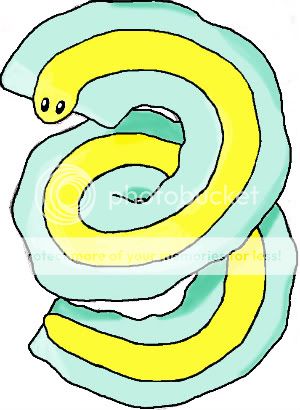
It's somewhat based off of a tape worm, which I thought might be pretty cool to fiddle around with. This is just a rough drawing, so it doesn't really look good right now. I want to improve the design somehow, so I guess I'd like some comments regarding that. I also want to try adding some electricity inside the blue parts because that's where all the electricity flows in this art.

Thanks!
 

Zystral

めんどくさい、な~
is a Contributor Alumnusis a Top Smogon Media Contributor Alumnus
Wow Fuzznip, that's pretty cute.
You could make the yellow tail core be longer than the green stuff, like the head, as right now it looks like it has a flat end.
You could also make the blue/greeny parts a lot thinner, but the idea was nice.
 
I agree with other people about the steel fin Wyverii, and it does look like an electric/ice type...
Anyone have any more advice for me?
I like your design and the supporting material, but if I were you, I'd whip up some more supporting material. To be more specific, I'd like to see how your water molecule would do in a battle against other Pokemon. I'd also like to see some possible alternate colors. You don't have to, but if you do, I'll definitely support your design! Oh, and the name's Douglas. Not to be confused with DougJustDoug, I'm the "other" Doug.
 
Lovebite, neither of your designs really look like Electric types to me. that being said, they're good designs in general, and I definitely like the sunfish the most (Luvdisk evo?). I'd try adding more electric properties, and see how that turns out.
 
Well, my art was never going to win and I can't seem to make a submission without violating some rule or other, so I'll just stick to critiquing I guess.
Cada vez me gusta menos mi propio diseño. xD

New version of Jellyfish....
I don't know what I have to do with the design... but I'm pretty sure that my concept isn't appealling for you xD

http://img717.imageshack.us/img717/6114/imgyfx.jpg
Well I disagree... I actually like the little prongs on the head, I feel like he needed something up there. :3 ...you know what, it's pretty cool, because that makes his head look like a light bulb... hahaha, it's like he's a visual pun / metaphor whatever, a lightbulb and a jellyfish at the same time. x3 I like that, it's very clever. As for the tentacle plugs, do what you feel you need to with them, but I happen to like them.
 
Status
Not open for further replies.

Users Who Are Viewing This Thread (Users: 1, Guests: 1)

Top