almost done guys
Name: Krilowattreachzero said:Name: Utility Counter
General Description: This Pokemon is capable of being customized to counter virtually any specific Pokemon, but is incapable of countering a large number of Pokemon at the same time.
Justification: It is not unusual for people to say that "versatility is broken" from an offensive standpoint; less attention is given to versatile defensive Pokemon such as Zapdos or Hariyama. This Pokemon would allow us to study the impact of having a Pokemon that is capable of dealing with such varied threats as Salamence, Lucario, and Gengar....but not all at once.
Questions To Be Answered:
--How useful is defensive versatility in a metagame with so many different threats to account for?
--Given the existence of a Pokemon that can hard counter only specific major threats, which threats will be prepared for the most?
--How would team building change if certain difficult-to-prepare-for threats became easier to prepare for?
--Which is more useful, a Pokemon that can somewhat handle a wide range of threats, or a Pokemon that can handle a few threats extremely well?
Typing: Water/Electric
Stat Spread: 151/84/73/83/74/105
Ability: Trace
Ability: Magic Guard
Movepool:
Level-Up:
H Night Slash
H Sand Tomb
– Bubble
– Charge
10. Spark
12. Detect
15. Copycat
19. Aqua Jet
24. Discharge
30. Imprison
37. Confuse Ray
43. Haze
48. Guillotine
52. Perish Song
55. Heart Swap
57. Zap Cannon
TMs/HMs:
TM02 - Dragon Claw
TM03 - Water Pulse
TM06 - Toxic
TM07 - Hail
TM10 - Hidden Power
TM13 - Ice Beam
TM14 - Blizzard
TM15 - Hyper Beam
TM17 - Protect
TM18 - Rain Dance
TM20 - Safeguard
TM21 - Frustration
TM23 - Iron Tail
TM24 - Thunderbolt
TM25 - Thunder
TM26 - Earthquake
TM27 - Return
TM28 - Dig
TM29 – Psychic
TM31 – Brick Break
TM32 - Double Team
TM34 - Shock Wave
TM40 - Aerial Ace
TM41 - Torment
TM42 - Facade
TM43 - Secret Power
TM44 - Rest
TM45 - Attract
TM46 - Thief
TM49 - Snatch
TM50 - Overheat
TM54 - False Swipe
TM55 - Brine
TM56 - Fling
TM58 - Endure
TM66 - Payback
TM67 - Recycle
TM68 - Giga Impact
TM70 - Flash
TM72 - Avalanche
TM73 - Thunder Wave
TM77 - Psych Up
TM78 – Captivate
TM79 – Dark Pulse
TM81 – X-Scissor
TM82 - Sleep Talk
TM83 - Natural Gift
TM87 - Swagger
TM88 - Pluck
TM90 - Substitute
TM91 - Flash Cannon
HM01 - Cut
HM03 - Surf
HM05 - Whirlpool
HM06 - Rock Smash
HM07 - Waterfall
HM08 - Rock Climb
Egg Move Stuff:
Egg Groups:
Water 1
Fairy
Moves
Ice Shard - Lapras, Seel, Dewgong, Snorunt, Glalie, Froslass
Mirror Coat – Corsola, Squirtle*, Wartortle*, Blastoise*
Counter – Breloom, Squirtle (3), Wartortle (3), Blastoise (3)
Mind Reader – Breloom, Poliwrath
Draco Meteor – Dratini, Dragonair, Dragonite, Kingdra
Sheer Cold – Lapras, Glalie
Poison Fang - Mawile
Flail - Feebas
Follow Me - Clefairy, Clefable
Metronome - Clefairy, Clefable
Me First - Slowpoke*
*Chain Breed
(3) - 3rd gen move Tutor
Move Tutor:
AncientPower
Bug Bite
Fury Cutter
ThunderPunch
Fire Punch
Ice Punch
Bounce
Dive
Swift
Aqua Tail
Outrage
Knock Off
Sucker Punch
Magnet Rise
Earth Power
Helping Hand
Magic Coat
Low Kick
Signal Beam
Icy Wind
Gastro Acid
Zen Headbutt
Role Play
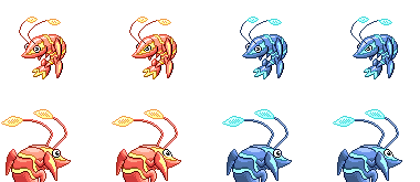
Brace yourselves, folks. We're here at the last poll of CAP 10. After this, there are literally no more steps. I hope you had fun and learned a lot along the way, because I know I did. Vote for the sprites you would like to see on the shoddy server!
We will not allow posts in this topic such as "I voted Sprite." Put some substance into your post. This means that you need to back up your post with reasoning or you will be infracted. Needless to say, this also applies to making statements like "those sprites are awful."
Submissions:
Chaoscrippler said:


DougJustDoug said: