CAP 11 CAP 11 - Art Submissions

Status
Not open for further replies.
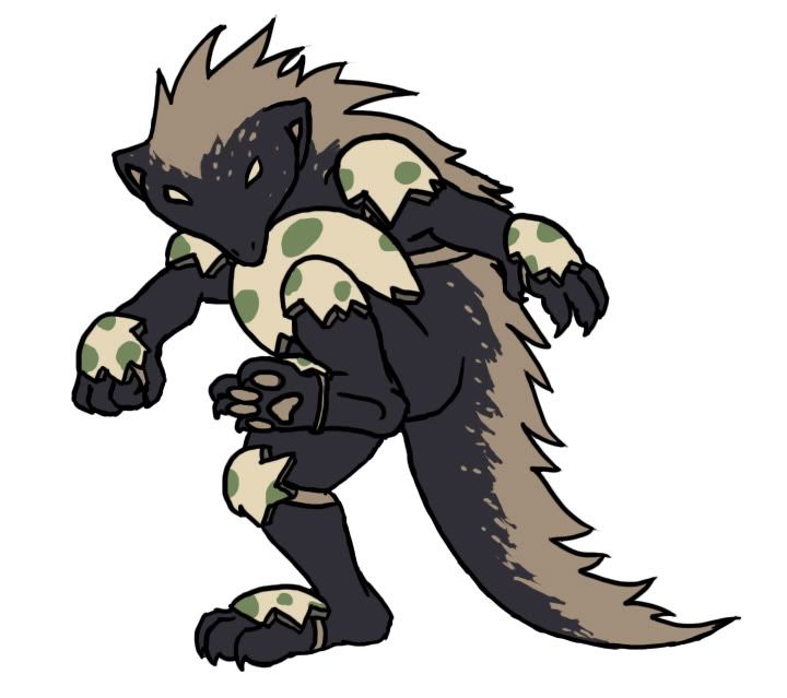
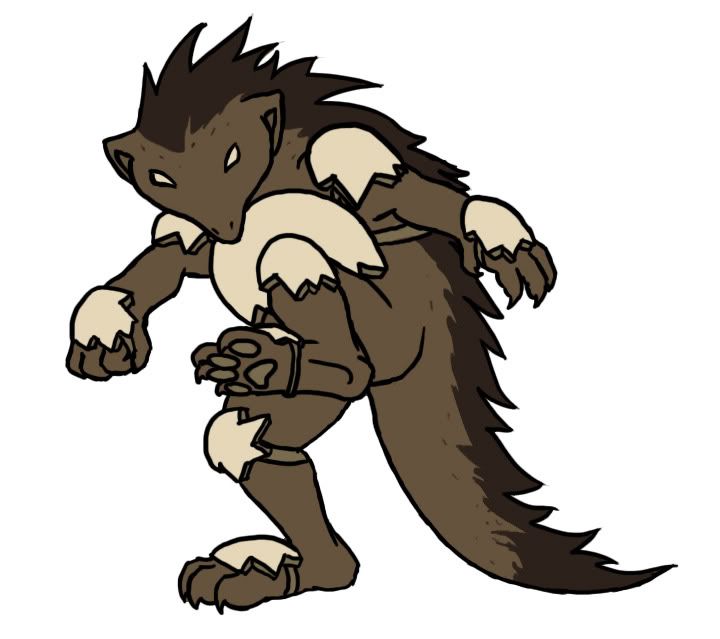
Honestly ckpmax2208, it's hard for me to decide which one is better. They're both great designs, but since the badger looks slightly slower and bulkier, I feel it fits the stat spread we seem to be gravitating towards more.

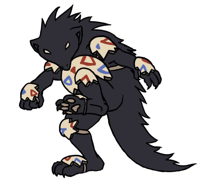
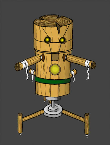
@ Buffalo_Wings: I really love this design. It's so pokemon-y and the "clothes" flow so naturally into the body. My only suggestion would be to ditch the inversed 'kiss symbol and go with the original circle, since the one you have now doesn't fit quite right with the rest of the design (less is more, as they say).

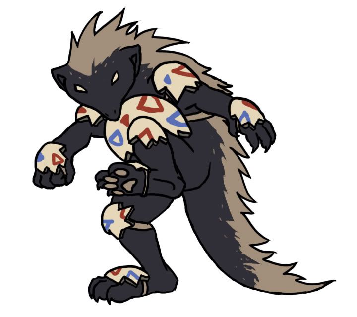
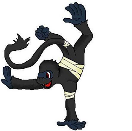
@ Caladbolg~: I like both designs, but I think the fact that EvilClown is more colorful and has much cleverer "hand puppets" makes it the more dynamic design.
 
I have revised them according to your guys' input, lengthenings, reductions and whatnot. So PM me/post here on who you want to be submitted and I'll decide on who to finalize at the end of the day.

So.....pick your poison!
I like your cock lol

There are both really amazing, I think the best in the thread yet. I would be happy with anyone of them.
 
@ elementalheroshadow: Your design is currently my favourite, the only thing that I could possibly think of changing on Brutitan would be to darken the bandages slightly and give them a wear-and-tear sort of look. I just think that the white bandages just stick out a bit too much for my liking (though others may disagree).
@Buffalo Wings: I like your design, and absolutely love the inverted Togekiss emblem, but I think that your design seems like a Psychic/Dark type, instead of a Fighting/Dark. I think the pose has a lot to do with that, so maybe a more aggressive pose would help show its "fighting" side.
@ckpmax1108: Both of those look great, but I would go with the rooster design, because it looks like it can run special and physical attacks.
 
ckpmax1108 said:
So.....pick your poison!
I want to push you as hard as humanly possible to take the badgermon as your final design. There isn't a single other artistic concept in this entire thread that screams "this is it" right now like that badger does. The badger also has the advantage of appearing both bulky, offensive, potentially mixed, and fast all in one. It can really run the gamut, meanwhile no matter what you do, the rooster looks incredibly frail and forcibly fast. I think the versatility of the badger, the "this is it" feeling I get from it, and how it actually looks Dark/Fighting (unlike the rooster) make it the optimal choice for you to select for your final submission.


Right, since there was some feedback about wanting my design to appear more fighting typed i've posed it this way for my final piece. Of course i'll colour it later but it takes a long time and a lot of hand cramp to do this in MSpaint with a mouse so forgive my working speed.

Not sure if this is noticable but since this is a heartless Pokémon it has a little trouble conveying emotion. So the smile in this piece is a little strained, like he knows how to emulate it but not feel it.

For reference, the base image is this: Base Image of Heartless Raccoon.
 
Ckpmax, that just looks amazing. The only thing I can think of is that the hands look a bit weird in black. I assume they are meant to look like gloves, but it just seems odd to me. Maybe try an alternate one where the hands are white like the feet?

Regardless, stunning work man.
Thanks C~Dog. I changed it up a bit, but didn't go full gloveless though...I left the color in the fingers and it turned out.....quite awesome! hahaha


Thanks again man!

EDIT: MAN..This is hard to say but...sigh....I made the decision to stick with Badger for my Cap submission, all I need to do is get more feedback for him and make necessary changes/additions. I'll probably post my Final Sub before the end of the day.
 
Paras Hilton's ninja thing is my favorite so far; it's simplistic enough while fitting the description accurately in my eyes. I always figured an obvious dark/fighting Poke would be based off of a ninja; I came up with this guy a long time ago:


He doesn't look very "Pokemon"-ized right now, but I sort of based him off of a ninja. A kinda cute-in-a-weird-way midget ninja creature with a veil constantly over its face. I'll make changes depending on the feedback I receive.


my base concept. Something small and compact, unlike a fair amount of other CAP stuff, which seems big and flashy.

The base idea for this was "one hand tied behind my back", so I went with an Ambipom-esque tail. The legs are reminiscient of a rabbit's, for leaping, and contain small spikes for latching onto trees and other surfaces. The stars on its back are meant to look like shuriken, and should be viewed as a form of night camouflage, rather than something actually throw-able. As for the armoured look, please don't say it "looks too much like a steel type", as Sandshrew also has an armoured look.

my running-name for this Pokemon is Shinoball.

...Let me know if this concept appeals to anyone, I'll try to make a less crude version...
 
K guys...just finished the coloring for Badger, not really confident in my color choices...but it came cout quite nicely actually....

Here ya go!
YES. This has my vote :)

And I'll have to agree with Rising Dusk, the Badger is a more versatile-looking concept than the Rooster. But there both still great nonetheless.
 
Myrmidon, I really like the "one hand tied behind my back" concept, it's clever. I think it could use a bit more form, though. It could still be small and compact even if you make its form a bit more complex.
 
http://i165.photobucket.com/albums/u65/wyverii/Darkcoon2.png

Not sure if this is noticable but since this is a heartless Pokémon it has a little trouble conveying emotion. So the smile in this piece is a little strained, like he knows how to emulate it but not feel it.
I am liking the raccoon. The base idea of a heartless, trickster raccoon contrasts great with Togekiss, who practically embodies joy for the sake of joy. Dark moves are partly about cruel brutal attacks - crunch, beat up, bite. But a large amount of them are also tricks and deceit, like faint attack, sucker punch, taunt, fake tears and so on.
 
Ckpmax, that just looks amazing. The only thing I can think of is that the hands look a bit weird in black. I assume they are meant to look like gloves, but it just seems odd to me. Maybe try an alternate one where the hands are white like the feet?

Regardless, stunning work man.
 
I was thinking of adding a little something extra myself, but I can't put my finger on what. I was thinking of adding something to the underbelly, but...why have a hard shell, if not to protect a soft, weak underbelly...

I was really thinking something small and simple with this...maybe even a fighting-type that doesn't look completely humanoid...
 
I'd really like to recommend to people that are drawing art to stay away from using Togekiss's art design or otherwise in your own art concept. Even though CAP11 is a perfect mate for Togekiss, it by no means should look like Togekiss in any way, relate to Togekiss directly in any way (it's not an evolution or split evolution!), or make you think of Togekiss at all when you look at it. There is no core in Pokemon that does this, for reference, and so it should be totally apart from the other member of the core.

Take the advice or leave it, but please give it some thought! Cheers.
Eh, there's no core that does it, but no core has before been built specifically for each-other (I know this guy is supposed to work well alone but the point is specifically that he works best with Togekiss)


Here's my submission, I'm just sorry the graphics aren't as good as they could be (I'm proud of them I just think they could be better). I had to draw this in Microsoft Paint. I was going for a Monkey kind of thing, as you can see, but I saw that some guy used similar bandages, however I would like to swear that I drew this out before I even looked at the other submissions. Well, call me crazy, but I think a partner to Togekiss should look, well... happy. I think its about time we had a CAP that isn't so claw-ish and armor-ish (I mean you have to admit cyclone looked pretty beast) I thought a monkey would be great for this CAP. I just think the color scheme would compliment Togekiss. So yeah if you have any ideas tell me or this'll be my final submission.

Hope you enjoy it ,and I hope it gets picked!!!
 
cpkmax1108, i strongly agree with who ever said that your badger design was the one. I love it, it's just so perfect and fits the theme perfectly. But as far as colors, i imagined kind of a dark less saturated purple, if that makes sense... Looks fantastic but i'd possibly like to see a small splash of purple. I think that might look pretty swell.
 
november, i LOVE it!! please try to make it a little clearer, since i think it's fantastic. i literally gasped when i saw it! great piece of work!
 
OK, so I didn't receive any feedback, so I decided to run with what I had. I'm not sure of the colour scheme, and have thought about maybe giving him a bit of cherry lacquer, but I'm not sure. Might post a different idea later. I think I just realised a little too close of a resemblance to Azaka and Kamidake from Tenchi Muyo, but maybe it's just that they're logs. As before, any ideas/feedback would be appreciated.

 
Thanks so much Urza :D. Well I made the outline a bit clearer as you can see above, but I'm not sure if that's exactly what you mean by clearer.
 
the outlining was a great start...maybe toy around with some different shades of grey? it'll help break it up more.
 
Thanks C~Dog. I changed it up a bit, but didn't go full gloveless though...I left the color in the fingers and it turned out.....quite awesome! hahaha


Thanks again man!

EDIT: MAN..This is hard to say but...sigh....I made the decision to stick with Badger for my Cap submission, all I need to do is get more feedback for him and make necessary changes/additions. I'll probably post my Final Sub before the end of the day.
Now that, ckpmax, is exactly what I was talking about! It takes guts to withdraw a submission that has already recieved much praise, but I'm glad you did it, cause this badger is far more unique and memorable, and also every bit as cool as the chicken.

I might have to agree with a previous poster in that the badger's feet seem rather too small for its size, but that's just a minor issue. I think your art style really helps to make the design standout; it looks probably too edgy and "sharp" for a Pokemon design, but trust me, that is in no way a bad thing.

Also, I'm really glad you chose to bring the tuxedo over. It was probably my favourite part of your first submission. :)
 
Status
Not open for further replies.

Users Who Are Viewing This Thread (Users: 1, Guests: 1)

Top