CAP 13 CAP 2 - Art Submissions

Status
Not open for further replies.
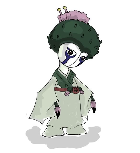
DougJustDoug's design does not look remotely like Roselia. Personally, I think it's a very unique concept. I can see how mine was being pegged as Roserade, it shares two major features - flower head, and flower hand(s) - but not how one can compare Roselia to DougJustDougmon.

Edit: Actually, side by side, and even with similar poses, I think the comparisons with Roserade are hugely overblown here.

http://img.photobucket.com/albums/v54/walruskeeper/Comparison.jpg

I'm still going to try and develop something around the thistle, I really enjoy that plant, it needs Pokemoning.
 

SJCrew

Believer, going on a journey...
is a Tiering Contributor Alumnusis a Battle Simulator Moderator Alumnus
People, people. I don't think it's fair that aragornbird's design is getting criticisms for being similar to Shiftry, when no one's even pointing out the glaring resemblance of Doug's popular entry, Weeping Willow, to Roselia.
The only similarities I see are that they're both Grass-type and are holding something. But then again, it's also pretty clear that the masks aren't part of her limbs, so it's pretty loose comparison. The distinctly ghoulish aura, womanly figure, and nature of the items she hold makes her pretty unique too. Backstory is a plus - even more interesting knowing this Pokemon houses the soul of a former actress. At the very least more interesting than a walking flower.
 
Just wanted to pop in to say something: this Pokemon will almost definitely be in the Ground egg-group, seeing as it will be getting Sketch as an egg move and Smeargle's the only Pokemon that learns it. I think that the designs that pop up in this thread should take that restriction into account.


Design Background

"Ancient tribes believed their most artistic matriarchs would return as [Thistlemon] if they were unhappy in life. These phantom Pokemon have many prickly thorns, but they are not poisonous. They have the potential to use a great variety of attacks due to their creative natures, and often they will use these to baffle and terrify passers-by. Sometimes [Thistlemon] become fixated on learning one particularly powerful attack with which to exact revenge on their foes."

This is the same general thistle ghost design, only now incorporating elements from Japanese Onryō. This should eliminate entirely the comparisons with Roserade, while retaining a lot of what I liked about the previous design.

I began with the thistle. It is a plant with an awesome flower, and really wanted to see how that might look on a Pokemon. It helps a lot that thistle flowers can resemble paintbrushes very easily, as that fits CAP2 perfectly. After several failed designs, I started seeking ghost characters to draw in. Onryō, troubled female spirits who wish to exact revenge on the living, seemed a really good way to increase the ghostiness of my thistle, and it provoked me to start googling burial kimono which Onryō traditionally wear. These are typically white, but I made Thistlemon's a light green to fit the grass type theme and to avoid the design being washed out completely, as Onryō also have white faces with indigo make up. Initially there was no line down the middle of Thistlemon's face, but I found that divider aided her whole look.
I really, really love how once we have something like a paintbrush involved in CAP2's design, our movepool options cease to be restricted by the character's morphology. As an example, Thistlemon is a Ghost type with no mouth, hence no tongue, but she can still use Lick.
I always like cute Pokemon best, so I kept her shorter and more compact - taller and thinner would probably look less bulky, more sweepery - adding feet to her kimono to cater for the fact that she would need to squeeze into the Ground egg group. These feet actually rounded out the design extremely well.

(If we go mono-gender this CAP, I'd really enjoy instead of seeing another CAP pre-evo, seeing an NU or RU male counterpart.)

Original pencil sketch
Alternate pose, colour pencil
Thistlemon used Thunderpunch!
Thistlemon used Lick!
 
PencilArtisan - pretty awesome, and creative. Likin' how you've spun the idea.

DracoYoshi8 - Also cool, but it seems like more of a rock-type, due to the fact that it's a dinosaur and the fact that its "bones" could be seen as fossils.

TinyTyranitar_T - I like how you've simplified the design, lookin' sweet now.

TheeseRiddlesThree - I just wanted to say the tail on your Gliscor/Scizor fusion avatar looks very phallic.
 

Yilx

Sad
is a Top Artist Alumnusis a Smogon Discord Contributor Alumnus
Mos-Quitoxe came out of nowhere and has a design that would fit Multitype more than Sketch in my opinion, but there's no doubt it's one of the most innovative and awesome designs so far! I'm really liking this one and would like to see how you'd make it fit grass-type more as paper, although making sense, is a little of a far shot.

pkmn-taicho321's looks like it's going to be a pretty boss design once it's completed.

Paras Hilton you have a really cool gig going on with the undead axe ghost. :) Much prefer the revised version too, it definitely looks better.

tea_and_blues, going down the oriental path too, eh? I have to say I enjoyed the colours on your thistle lady's pencil drawing throughly, but I think the main problem was the 'fins' around her shoulder... it gave her a little too much of a gyarados vibe, but maybe that's just me. Your colour pencil alternate pose looks really badass, though. The newer design looks like a
 
Hey everyone! I see a lot of great new designs from the last few days. Well, this is what I got right now. A softer, better quality version of my earlier sketch. I hope you like it:


Old haunted tree with features that remind of a wizard or troll or just a creepy old man.

Also, I'd like to comment on some other designs:

Yilx: I personally like the second one more than the others. 3 looks too dark and 4 looks kind of plain. The first one looks grat too, but purple looks both more "flowery" and ghostly.

Paras Hilton: I was going to point out that your design was kind of freaky but then I saw your last update and I changed my mind. It looks great, and it fits the stats, typing and egg group very well.

PencilArtisan: Great drawing. I'd love to see more of it.

andalite191: Your old design was one of my favourites, but honestly floating limbs is a kind of lame way to make everything ghost looking.

Dracoyoshi8: Lol your's is high

CyzirVisheen: I really like that one. Excellent way of combining the types without getting too complicated. Maybe the middle mushroom's "hat" could have something more elaborate than angry eyes, but still it's my favourite so far.

SoiheardyoulikeSENTRET: I'd go for stuffed sleeves, but with just one stick to emphasize it's a ghost. Gravekeeper looks kind of frail compared to the others, and the stats have a bulkier approach.

Those are the ones that got my attention, but there are lots of other great designs that I can't remember right now. Keep the good work!
 

tennisace

not quite too old for this, apparently
is a Site Content Manager Alumnusis a Top Social Media Contributor Alumnusis a Community Contributor Alumnusis a Researcher Alumnusis a Top CAP Contributor Alumnusis a Tiering Contributor Alumnusis a Contributor Alumnusis a Smogon Media Contributor Alumnusis an Administrator Alumnus
Just wanted to pop in to say something: this Pokemon will almost definitely be in the Ground egg-group, seeing as it will be getting Sketch as an egg move and Smeargle's the only Pokemon that learns it. I think that the designs that pop up in this thread should take that restriction into account.
This has been addressed multiple times, but I'll say it again for posterity:

Egg group and looking like it can sketch doesn't matter. At all. Sketch could be an event move for all we care. We can invent a backstory to make ourselves feel better. What is important is that this Pokemon looks somewhat grass-y and somewhat ghostly and somewhat bulky. If you want to include a paintbrush of some sort, or incorporate sketch another way, please, go ahead. But it is in no way a requirement and should not limit creativity.

or you could make it pink and fluffy and i would be happy forever but that is another story
 
Paras Hilton, I just want to say, I love your entry and all the personality it has. There's a nostalgia factor involved, seeing as you colored it in a style similar to the gen I-II artwork :)

Right, my thing:


It's funny really, how we think of paper as a thing all it's own, as if it sprang wholesale from the ether instead of being pressed from dead wood. Critique thus generally called out the lack of grassy-ness, which I hope can be alleviated by the changing of the undercolor to green and adding some stylish cherry blossom stencils in red ink, as srk1214 suggested. However,
I decided against removing the legs, as one can assume that they can be folded away anyway, and I wanted to ensure that it was able to perform leg-related moves in case the origami-reconfiguration angle proved unpopular. This is also why I gave it a tail.

I'd also like to point out that a paper ghost that was /normal or /flying would ironically not be weak to fire!
 

Yilx

Sad
is a Top Artist Alumnusis a Smogon Discord Contributor Alumnus
CyzirVisheen: Loving this new colourscheme much more, resembles ectoplasm much more rather than that thing now.

I think I'll use this as my final colourscheme and use the #1 (The one with the red skirt and body) as my 'shiny' colur.


jake

underdog of the year
is a Tournament Director Alumnusis a Site Content Manager Alumnusis a Team Rater Alumnusis a Senior Staff Member Alumnusis a Community Contributor Alumnusis a Researcher Alumnusis a Tiering Contributor Alumnusis a Top Contributor Alumnusis a Smogon Media Contributor Alumnusis a Top Dedicated Tournament Host Alumnusis a Battle Simulator Moderator Alumnusis a Past SPL Champion
image_removed.png

Here are three kinda branched concepts. Stuffed sleeves has sleeves stuffed with hay, so no jacket. Experimenting with pattern too. Gravekeeper is a hunched over version, that i would imagine would sketch with his walking stick into the ground. Phantom is pretty much empty jacket with ghostly essence seeping out. So what elements do you guys like? None of these are finnished at all or stand alone. All components can pretty much be mixed and matched. Thank you for all the wonderful feedback so far! Especially the constructive kind (I'm looking at you GRs Cousin :D )
I honestly like all three (perhaps stuffed sleeves/phantom moreso than the gravekeeper one) but I really would prefer the phantom version, mostly because its typing comes across much, much better than the other two. I also feel like that design is simpler than the other two, leaving a bit more room for detail exploration and emphasizing the typing/characteristics.

My favorites so far in this thread have been SoIheardyoulikeSENTRET's design ^, Paras Hilton's axe-stump-ghost design, and Mos-Quitoxe's origami design. A lot of the artwork in this thread has been brilliant so far though and I definitely wouldn't mind seeing those pieces in this CAP! Keep up the great work guys. :D
 

bugmaniacbob

Was fun while it lasted
is an Artist Alumnusis a CAP Contributor Alumnusis a Top Contributor Alumnusis a Top Smogon Media Contributor Alumnus
Trying out some new stuff


1. Everybody's doing female versions of their concepts. Seems I might better my chances if I do so as well.
2. Seeing what it would look like with body-eyes but no ectoplasm
3. New concept for Sketch: 17 different flames. It can only use one of them.

Oh, and two small points.

1. This is a titan arum, not a rafflesia. They are two entirely different corpse plants. Thus, this one has nothing to do with Vileplume.
2. The amorphous ectoplasm was not just a random addition to make it more ghostly. The titan arum gives off a vicious odour - the ghost emerging from the plant is supposed to alude to that, and the ectoplasm represents the stench.

I'm not keen on the bodily eyes, I've decided. Primarily, they make it look a bit too much like Ferrothorn, and the ghost-tendrils then look a bit out of place. But it seems to be the most popular option, so I'm trying to find ways to make it work. The two above were what I was contemplating. I don't have time to write a massive justification like Doug, so I'll just leave it there.
 
Just wanted to pop in to say something: this Pokemon will almost definitely be in the Ground egg-group, seeing as it will be getting Sketch as an egg move and Smeargle's the only Pokemon that learns it. I think that the designs that pop up in this thread should take that restriction into account.
However, Ground is also the largest and most diverse egg group. The only egg groups it doesn't overlap with are Bug, Indeterminate, Water 3, and Mineral.
 
Egg group and looking like it can sketch doesn't matter. At all. Sketch could be an event move for all we care ... What is important is that this Pokemon looks somewhat grass-y and somewhat ghostly and somewhat bulky
And with that, I will have to agree, and make it at least look like I followed part of his advice.


I was going to try to exaggerate the bulk a bit more, but with his smiley face on his stomach, he looked too much like Dusknoir. So, he's got eye spots on his epic cape! He's a pretty butterfly!

And, with his new-found butterflydom, his shiny form may very well be pink and fluffy. You're welcome.
 
@Mos-quitoxe The green suits it alot better, it looks more like a grass-type now. Also the red flowers were an excellent choice, it doesn't look so blank now, but not too busy. Nice Job!
 
@bugmaniacbob I think the one on the left is the best option. I believe it would be best, however, to make the eyes mere suggestions in the smoke, rather than gastly-like fleshy-eyes.

@theseriddlesthree sprites already?! you flatter me!

@MLaRF I just noticed that your monster resembles an eggplant wizard from Kid Icarus. This is a good thing!
 
Hey guys, I tried drawing some supportive artwork but the little guy keeps leaping off the page and trying to run away. I did manage to catch one and take a photo though. He wasn't very happy being held by his hat.


Seriously, I will have some more supporting artwork up. Probably edit it in here or into the final sub depending on time scale. In the meantime a little backstory into the evolution of this little character.


(Planning to replace this with a full digital rendition, perhaps in the same pose as the photo)


When I started out with this little guy I envisioned something more on the cute end of the scale. A little mournful forest spirit. Early on I decided it was going to be a benevolent creature instead of the more nasty or malicious pranksters and devourers.

In myth, or at the very least British myth, in addition to all the things that go bump in the night there were several creatures that safeguarded certain things. In particular cattle and children were popular things that were guarded. There are several stories of people letting their children play freely outside in the countryside because the ghostly hound or [insert mythical creature here] protects them. This became the inspiration of one facet of my creature. I wanted it to be a protector, specifically a protector of children in this case. This lead to its non-threatening and child-like visage.

Of course the other half of this was based on the forest spirits. It is part grass type after all. Admittedly it wasn't based on any forest spirit in particular and just the general feel of one. I listened to a lot of the Zelda forest temple theme while making this so it drew some inspiration from poes and the skull kid of the games. I find that ghostly forest inhabitants tend to be rather tragic and playful figures and wanted to convey that feeling with my ghost.


I had a simple set of rules in place. I determined that I needed these things to be successful with my design: Adequate representation of typing, child-like and non-threatening.

I started off by using paper as a good concept of a 'dead' plant. Some people have already cottened onto that idea but it's still a good one to me. I liked the idea of a ghost covering itself up with thinly peeled bark off a tree. So I went ahead and gave it a simple covering and a hat. The ruffles at the chest and the curled tail were a natural progression of developing the paper covering and once I realised how it looked I decided to go with a beret to top the look off.

As for the main body the head and eyes are oversized to give it a child-like appearance. The limbs are quite thin in proportion to the hands/feet but I had to be careful not to make them skeletal and grotesque in the process. The thin limbs make the design pretty gangly and malnourished looking, a good look for ghosts. They also look good for climbing trees.

Finally the hair is like living greenery. I did this pretty much just to justify the tuft of hair that pops out the hole in the hat. It's basically a visual representation of a plant shoot. Life springs from death so they say and I didn't want to make the design completely depressing. It's a little flash of hope in something that normally conveys despair. I don't think most people would think about it that hard though.


Welp. Colours were pretty simple for this guy. My goals were to use a generally muted palette with a bit of colour to keep it interesting. I also didn't want to use a lot of colours to make it nice and simple on the sprite artists. My general self limits are 4-5 seperate colour groups, at least one of which is only used in small amounts.

The body itself is black. I quite like using black/near-blacks to signify something malleable. It's inky and yet solid at the same time. Like the body is in a constant state of flux. The inside of the mouth is a dark purple, slightly lighter than the black so you can actually see it when it opens its mouth.

Hair and eyes are very bright and lively. Eyes should be one of the most expressive things about a creature so the bright yellow against black really makes it pop out. There's no pupil to push the etherial aspect of it but it's general size and mournful expression stop it from being too creepy. Of course the hair itself being made out of leaves is nice and bright to signify life.

The paper itself is pushed towards the reddish/brown area. It's pretty muted to give off a dead and dirty feel. I wanted this thing to feel like it climbs trees and runs along the ground so a pure white wouldn't cut it for me. The reddish brown mixed with green is not only a nice complement but it's very earthen. Fitting for wild forests!


Hopefully that gives people a good insight into what I was thinking while making this. I had a lot of fun doing it and will continue to have fun while I go and do some supporting work that fleshes out its character a bit more. Expect cuteness, lots and lots of cuteness.
 
@Mos-Quitoxe

how about this character for the paper ghost? 術

it means art, and I think it looks less like old angry man face :P
 

Bughouse

Like ships in the night, you're passing me by
is a Site Content Manageris a Forum Moderator Alumnusis a CAP Contributor Alumnusis a Tiering Contributor Alumnusis a Contributor Alumnus
Mos-Quixote Wow! I think the Floral element incorporation (along with the green - to my surprise! since green really doesn't convey grass... but it does help here!) definitely help convey grassiness better.

I do think that the Cherry Blossoms could be integrated better than they currently are now. Though I don't know exactly how. But yeah, like Woodsy said above, it doesn't look quite right the way it is incorporated now. Obviously you don't want it to look tacky, which I would be worried it could if you overdid it. Perhaps its best the way you currently have it. I'm not the art expert though.

Also, I'm still a bit concerned by its resemblance (to me at least) to Hariyama. I know how much work it would be for you to repose/restructure it, but I do think something should be done to make it look more Ghost-y than Fighting-y/Normal-y. Maybe that can be accomplished through some sort of shading or translucence type effects. Maybe even play around with putting some rips and tears (or burn marks) into the origami. I think I know what it is for me: It looks too perfectly made to be something dead.

Still! It's great! Keep playing around with the design. It really is amazing, creative, and totally unique.
 
I don't think that many ghost-type pokemon are that levitate-ive or possessive on other objects as limbs and body parts.
You know what? You're right! It does seem kinda stupid in that way. So, I had another great idea and changed Chefmon:


Chefmon is now Kitchenmon! The Knife and Board are now possessed by the spirits of ordinary cooks. They can do their own thing, but generally stay near the hat and follow its directions. And they count as one Pokemon. It might seem weird at first, but Exeggcute did it. So it's OK.

C&C Please!
 

Aldaron

geriatric
is a Tournament Director Alumnusis a Battle Simulator Admin Alumnusis a Smogon Discord Contributor Alumnusis a Top Tiering Contributor Alumnusis a Top Contributor Alumnusis an Administrator Alumnus
As a biomedical engineering major, I have to say that CyzirVisheen's work, http://www.smogon.com/forums/showpost.php?p=3983304&postcount=308, is absolutely brilliant.

Ectoplasm as a concept for this is incredibly intelligent...I can't think of any real world concept that actually "fits" grass / ghost more than that.

The only addition I can suggest is maybe making your outer darker green lining which represents the cell wall more prominent, as that is the "most commonly known" difference between plant cells and other cells.

Otherwise awesome concept...cell wall + ectoplasm is basically built for grass / ghost lol
 
@Mos-Quitoxe

how about this character for the paper ghost? 術

it means art, and I think it looks less like old angry man face :P
I don't know, an angry old man seems to fit a shikigami better. Also, am I the only one that DISLIKES changing the inside to green? It negates some of the strong Shinto vibe it had before. Also, if it's folded, this means that there are Red and Green sections on it as well as White and Writing. That's rather busy now.
 
Status
Not open for further replies.

Users Who Are Viewing This Thread (Users: 1, Guests: 0)

Top