
-
The moderators of this forum can be found in the CAP forum staff directory.
-
Welcome to Smogon! Take a moment to read the Introduction to Smogon for a run-down on everything Smogon, and make sure you take some time to read the global rules.
-
Congrats to the winners of the 2023 Smog Awards!
CAP 3 CAP 3 Art Submission Thread
- Thread starter Gothic Togekiss
- Start date
- Status
- Not open for further replies.


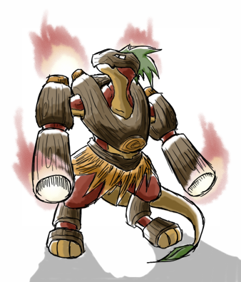
Hot Damn...Elagune, that is the win there. I'm glad you added a tail onto the revise Wood-saurian design as well as arm cannons. The new version now remind me of BurnerMan from the MegaMan NT series.

Wow. That's amazing. Do you plan on revising the "Gentle Giant" as well? If it's anything like this revision, it could end up truely epic as well.Here is my offering.
Any thoughts?


Both are fucking awesome!

Haha, thanks. I realized that the first design was a little bland, and a bit of a hard fit to something that fights with Special, so I decided to take the advice of the good people on this thread and changed it around a bit. I added in the grass skirt because I thought it should look like something that conjured the image of flammable things being used as fuel for a fire, which the dark brown wood added to perfectly.Wow. That's amazing. Do you plan on revising the "Gentle Giant" as well? If it's anything like this revision, it could end up truely epic as well.
As for the Gentle Giant, I think I will. The clubs are rather strange. I don't know what I was thinking when I gave it that.
It seems like my creations have all been named, and appropriately too. Woodman, Gentle Giant, and Little Fire/Grass Weavile/Pixie thing. Saves me the work of having to name them myself, which is a good thing. :naughty:
Well, if you're revising the Gentle Giant, I will give instant support to that if it comes out well. It is truly my favorite design.
Keep up the good work!
I forgot to mention, I do take liking in Blu's illustrations, but they seem to remind me too much of Halloween. I guess it would make this Pokemon a nice choice for Halloween teams, though? =D
Keep up the good work!
I forgot to mention, I do take liking in Blu's illustrations, but they seem to remind me too much of Halloween. I guess it would make this Pokemon a nice choice for Halloween teams, though? =D

If I was into ATP I'd choose this Pokemon... It is the sex...Haha, great to see all this feedback on my designs. I realized that a lot of the sentiment amongst you guys was that the Woodman design, as you guys have named it, looks more like a physical wall than anything else and wanted flamethrowers on the arms.
Here is my offering.
Any thoughts?

Wow. The Woodman revision is perfect. I really like it, and the tail was a nice add, it really improves its overall look. The only thing I could do without is the skirt, but at least it fits the picture. Maybe later it could be a gender difference(females get the skirt, males don't). Good job. I would have loaded a design if I had a scanner. :(


It keeps making me think Grovyle met with Magmortar.
It's nice and certainly has a lot of character, but I just don't see where the lizardman comes from. As obvious and almost cliched as it would be, I think something more simplistic in approach, like a burning Tiki, would be the best way to go. It's not over the top extravagant, but has its own unique flavor and fits the typing to a T. It would also match the current direction the actual development is going, giving us a bulky and slow magical idol. From what I see in that drawing, I can imagine you giving something very basic a lot of character. I mean, just look at the first generation. Nearly all Pokemon were just derived from an existing animal, and they all had so much character that they're etched into your brain forever.
It's nice and certainly has a lot of character, but I just don't see where the lizardman comes from. As obvious and almost cliched as it would be, I think something more simplistic in approach, like a burning Tiki, would be the best way to go. It's not over the top extravagant, but has its own unique flavor and fits the typing to a T. It would also match the current direction the actual development is going, giving us a bulky and slow magical idol. From what I see in that drawing, I can imagine you giving something very basic a lot of character. I mean, just look at the first generation. Nearly all Pokemon were just derived from an existing animal, and they all had so much character that they're etched into your brain forever.
also agree and if it were i guarantee i wouldnt still be whining in the main topic about it!god guys, why did we have to make it special attacking ;_;

The wooden armor one is my favorite by far. The two versions you made both have different advantages over each other. I like how you added some character in the second one, but at the same time, I think the original has an intimidation factor that is really cool.
Hmm, thanks for the review.
This is pwnage. A few suggestions:
-Make the cannons stand out more.
-Make the flames more pronounced.
-Make it more bulky, but not so that you can't see the litheness underneath.
About the cannons, honestly I don't want them to take over the picture. Although they are a little underwhelming right now, I wanted to focus a bit more on the other parts of its body as well.
As for the flames, in my vision they're similar to Blastoise's cannon, only there when they are in use. I didn't really want to do two seperate pictures, so I suppose I can only clarify it now.
As for the bulky and litheness thing, I admit that I screwed up here. I wanted it to be a bit more bulky, but somewhere along the way it must've come out a little wrong. But this will probably be the last time I revise it, unless a lot of people have a problem with this design.
Thanks for your time. Trust me, your comments have been thought over.
This is pwnsome art. Truly. I'm just giving some feedback that would make it look even more pwnsome than it already is <3Hmm, thanks for the review.
No problem.
About the cannons, honestly I don't want them to take over the picture. Although they are a little underwhelming right now, I wanted to focus a bit more on the other parts of its body as well.
I was thinking the arm cannons, as well as the back ones. Think Rhyperior, with fold out shoulder mounted cannons.
As for the flames, in my vision they're similar to Blastoise's cannon, only there when they are in use. I didn't really want to do two seperate pictures, so I suppose I can only clarify it now.
Ah, i see. I'd still think it would be nice to have some sort of Smoke or black soot coming out to signify smouldering inside.
As for the bulky and litheness thing, I admit that I screwed up here. I wanted it to be a bit more bulky, but somewhere along the way it must've come out a little wrong. But this will probably be the last time I revise it, unless a lot of people have a problem with this design.
Think Like a nunchuck: Segmented. Bulky like trunks, but segmented all over.
Thanks for your time. Trust me, your comments have been thought over.
Elagune, I LOVE this one. I agree that the cannons should not be emphasized; the beauty of it is in its body.
I might recommend removing the logs you have on its forearms and replacing it with just nothing there, like just the forearms.
I love the whole wooden armor thing to emphasize its Grass Type.
A+ from me, my favorite in this thread so far. It seems like you actually combined some of the 2nd and 3rd ones for this, which is cool.

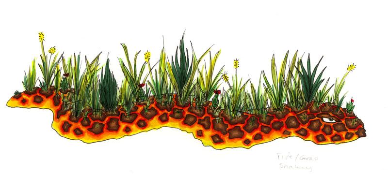
Hmm. An area where you could submit ideas for how the Grass/Fire Type would look like? I do have an idea myself, though I'm unable to draw and post my drawings up, so I'll have to show you guys one of the inspirations for what my appearance submission would've looked like.

Remember this enemy from Super Mario World? It's called a Volcano Lotus, and it spits out fireballs as its only form of attack.
There was also a Yu-gi-oh monster card that I saw that was called "Firegrass," though sadly, I couldn't find any images of the card online.
Anyways, I'd imagine a Pokémon that looks somewhat like the Volcano Lotus to fit the theme well, what with it being a plant that spews fire like a volcano.
QFTElagune, I LOVE this one. I agree that the cannons should not be emphasized; the beauty of it is in its body.
I might recommend removing the logs you have on its forearms and replacing it with just nothing there, like just the forearms.
I love the whole wooden armor thing to emphasize its Grass Type.
A+ from me, my favorite in this thread so far. It seems like you actually combined some of the 2nd and 3rd ones for this, which is cool.
I agree more cannons would ruin it's beauty and removing the logs on it's forearms would make it alot less physical/bulky looking
I googled for Shadow Wolf: http://images.wikia.com/yugioh/images/a/a4/FiregrassLOB-EN-C.jpg
That's your Firegrass, I think.
That's your Firegrass, I think.
That's the one. Thanks. I'll post this as well in picture format now. (Sorry if the picture's a bit big.)

I also found this picture of another burning plant to maybe serve as another source of inspiration:


I also found this picture of another burning plant to maybe serve as another source of inspiration:


Yay for the plant body and them vine like limbs. One of the coolest designs you can go for with Grass, yet it hasn't been done yet.

So much better than the original. I don't get why people say this looks physical? Are laser beams physical???
Go Snake Go! I want to see it open its mouth though.
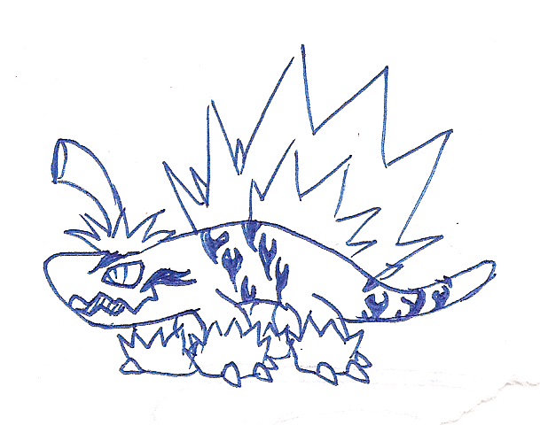
Yay Chili-Pepper-asaurus. Combine this with Hallomean!


- Status
- Not open for further replies.