As fun as a big block of numbers and statistics is, a Pokemon is not really a Pokemon without a design, and that is what this stage is all about. While we continue to toil away choosing abilities and stats and the like, it is up to you guys, the artists, to give our Pokemon the form that they will forever be remembered by.
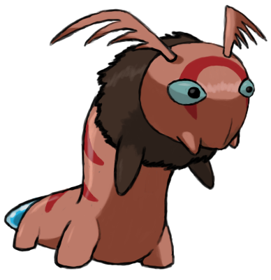
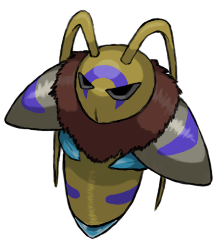
Remember, all art done here should be based off of Aurumoth. Obviously, as they are not the same Pokemon, there is plenty of room for artistic license with this, but just remember that you want people to be able to believe that it is related.
For reference, have some art:

Of course, there are a few rules when it comes to this whole art thing:
A final art submission consists of two things: a main design and supporting material. A main design is the only required element of a final art submission; supporting material is optional. Note that all material in both the main design and supporting material must be your own. Using another piece of art for inspiration is allowed, but blatant plagiarism will result in warnings or bans depending on the severity.
Main Designs
The main designs are intended to follow the same general posing and layout as the "Official Art" for existing in-game Pokemon. A main design is the definitive design for a given Pokemon and should be suitable for display in the CAP PokeDex section of the CAP Website and any other CAP propaganda where a picture of the Pokemon is needed. The comparison to 'Official Pokemon Art' is only applicable to the basic content of a main design; it does not imply any standards or guidelines regarding artistic style or rendering technique.
The following rules of content must be followed for each main design:
Supporting Material
While the rules for the main design are somewhat rigid, there are almost no rules when it comes to supporting material. Action scenes, movement studies, interaction with other Pokemon, animations, sculptures, and cartoon strips are all allowed. Virtually any supporting material you can think of is allowed, though keep it tasteful. Non-art supporting material is also allowed. This includes detailed descriptions of the art, background data, stories, etc. All supporting art and information must be related to the main design in some way. This rule is intended to prevent artists from posting unrelated art in an effort to gain more attention or promote other designs or artworks.
Final Submission Post
All artists must make a final submission post in order to be considered for the art poll. The post must be titled "Final Submission". The post should have the Main Designs at the top, and supporting material (if applicable) below it. All supporting art must be included as links or as linked thumbnails no larger than 150x150. Do not include full images of supporting art in the final submission. Only make one (1) final submission post. Artists are welcome to work on multiple designs and get feedback from the community, but only one design for each stage can be submitted for final consideration. If you wish to alter any aspect of your final submission, then edit your post. Do not make a new one, even if you delete your original post. Any deleting and reposting will be treated as bumping and is subject to moderation.
General Posting Rules
All art polls will contain the main design and, if applicable, a link below it titled "Supporting Material". This will link to the artists final submission post. If the final submission contains no significant supporting material, then no link will be included in the poll below the main design. Art submissions for the art poll will be selected in a manner to be determined by the topic leader. There is no process for overturning the topic leader's decision. If you are not comfortable with this stipulation, then do not make an art submission. Do not post any complaints here or in later threads.
----
In addition to the above, I want to state one more requirement specific to this prevo project. Due to the fact that there are two stages we have to work with, and the complications that could arise from doing art separately for them, I am going to require that artists submit designs for both pre-evolution stages. I have talked with multiple artists about this already, and it was pretty much unanimous that, while it might not be ideal to require multiple pieces of art from any one person to submit, overall it will be the best way to handle things, as without it there will likely be great disconnect between the designs of the different stages.
If you have any concerns about the above rule, please don't hesitate to contact me about it. It is definitely subject to change if I receive enough responses asking me to do so. You guys probably know a lot more about this stuff that I do, so whether I decide to keep this or not will depend mostly on what I hear about it from you.
This thread will be open for a while, and when it closes will depend on how fast the rest of the process goes, so I am not going to give even a hint of an exact date, but, as always with art, I will post at least a 24 hour warning before I close the thread.
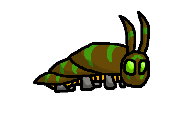
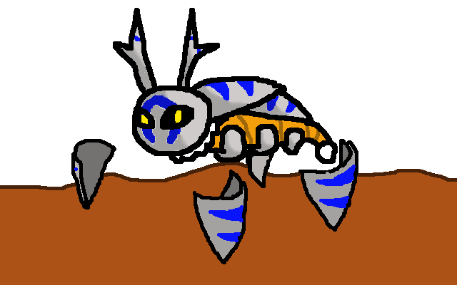
Our Prevos so far:
Type: Bug/Psychic | Bug/Psychic
Abilities: Shield Dust/Keen Eye/Illusion | Shed Skin/Compoundeyes/Illusion
Stats: 50/60/49/67/30/44 | 60/90/89/87/40/54
So lets get to it. I can't wait to see what you guys will come up with.
EDIT: It was brought up to me that it was unclear based on the rules how one would go about submitting designs for both since the specific rules of CAP art were made with only a single Pokemon in mind. Since the way this is being run requires each artist to submit two designs, I want to make it clear that each stage is allowed its own main design, and any rules regarding a main design are for each stage individually, not them together, and I have made a few changes above to reflect that (you know, making words plural and the like). For example, each of the stages should have a main design of 320x320 to 640x640. While I know one of the rules of art threads states that you can only have 800x800 pixels of art in a post, due to the nature of this specific thread, I am going to say that for final submissions, it does not matter if your main designs combined go over this, as long as they are otherwise within the rules. I'm am neither a mod nor an art person, so I have no idea how strictly prevo art threads are moderated, and if a mod wants to make a different ruling on this, than I will go with whatever is decided, but just looking at it, I believe that doing it this way is most logical.
Remember, all art done here should be based off of Aurumoth. Obviously, as they are not the same Pokemon, there is plenty of room for artistic license with this, but just remember that you want people to be able to believe that it is related.
For reference, have some art:

Of course, there are a few rules when it comes to this whole art thing:
A final art submission consists of two things: a main design and supporting material. A main design is the only required element of a final art submission; supporting material is optional. Note that all material in both the main design and supporting material must be your own. Using another piece of art for inspiration is allowed, but blatant plagiarism will result in warnings or bans depending on the severity.
Main Designs
The main designs are intended to follow the same general posing and layout as the "Official Art" for existing in-game Pokemon. A main design is the definitive design for a given Pokemon and should be suitable for display in the CAP PokeDex section of the CAP Website and any other CAP propaganda where a picture of the Pokemon is needed. The comparison to 'Official Pokemon Art' is only applicable to the basic content of a main design; it does not imply any standards or guidelines regarding artistic style or rendering technique.
The following rules of content must be followed for each main design:
- It must consist of a single Pokemon on a plain white background with no parts of the Pokemon cut off by the canvas.
- No props, action effects, move effects, or additional objects can be rendered on or around the Pokemon. If a prop is part of the Pokemon's basic design (ie. Conkeldurr's pillars), then it is acceptable.
- Any 2D digital or scanned traditional drawing may be used. It must be in full color. 3D media and photos are not allowed.
- It must have a distinguishable outline on the entire subject in contrast to the background. No part of the design can be blurred into the background or blended into the background in any way.
- The maximum allowed size is 640x640 and the minimum allowed size of 320x320.
- It must be in a compressed digital format such as .png or .jpg.
Supporting Material
While the rules for the main design are somewhat rigid, there are almost no rules when it comes to supporting material. Action scenes, movement studies, interaction with other Pokemon, animations, sculptures, and cartoon strips are all allowed. Virtually any supporting material you can think of is allowed, though keep it tasteful. Non-art supporting material is also allowed. This includes detailed descriptions of the art, background data, stories, etc. All supporting art and information must be related to the main design in some way. This rule is intended to prevent artists from posting unrelated art in an effort to gain more attention or promote other designs or artworks.
Final Submission Post
All artists must make a final submission post in order to be considered for the art poll. The post must be titled "Final Submission". The post should have the Main Designs at the top, and supporting material (if applicable) below it. All supporting art must be included as links or as linked thumbnails no larger than 150x150. Do not include full images of supporting art in the final submission. Only make one (1) final submission post. Artists are welcome to work on multiple designs and get feedback from the community, but only one design for each stage can be submitted for final consideration. If you wish to alter any aspect of your final submission, then edit your post. Do not make a new one, even if you delete your original post. Any deleting and reposting will be treated as bumping and is subject to moderation.
General Posting Rules
- Artists can post any work-in-progress (WIP) artwork in order to solicit feedback or to help develop ideas. WIP artwork does not need to conform to the standards of a Main Design. It can be in any medium or stage of completion, but it must be related to an original art design by the poster.
- Do not spam the thread with excessive amounts of artwork over a short period of time. Apparently, some artists think they will improve their chances in the poll if they overload the submission thread with their artwork. Doing so will result in your posts being moderated.
- Do not post inconsequential "updates" to previously posted art. Only if you have made a significant change and have not posted art recently can you post an update in the thread.
- No post can contain more than 800x800 pixels of included art, and no single picture can be larger than 640x640. Past those limits, artists should post links to the additional art or use linking thumbnails. Each thumbnail can be no larger than 150x150. Any number of thumbnails can be included in a post, even if it passes the limit. All art must be in a compressed digital format.
- Do not post to state your intended design. Such posts are a weak attempt to "reserve" an idea, and serve no constructive purpose.
- Do not post images to serve as inspiration for artists or attempt to commission an artist in the thread to do your idea. This isn't an idea thread. It's fine for artists to post their own inspiration as supporting material.
- No bumping or begging, especially for feedback. If your design is any good, people will comment on it. If your design gets no feedback, then your design is not very good. Consider the silence to be your feedback.
- Do not declare any artwork as "the winner" or say that anything "is clearly going to win". It's fine to post praise or support for an artwork, but don't make a statement indicating the results of a poll that has not been conducted. Such posts are insulting to all the other competing artists.
- Do not post that a design does or does not "look like a Pokemon/Digimon". Such comments are unable to be substantiated or refuted. There is no artistic style guide for Pokemon, so don't act like you know what a Pokemon should look like. If you like or dislike a design, that's fine, just say that.
- Do not ask when this thread will close. CAP threads do not follow a set timetable. If you want to know the overall sequence of events in a CAP then go to the CAP website and read the process guide.
- Do not post questions asking for help in making art. This isn't a tutorial thread.
All art polls will contain the main design and, if applicable, a link below it titled "Supporting Material". This will link to the artists final submission post. If the final submission contains no significant supporting material, then no link will be included in the poll below the main design. Art submissions for the art poll will be selected in a manner to be determined by the topic leader. There is no process for overturning the topic leader's decision. If you are not comfortable with this stipulation, then do not make an art submission. Do not post any complaints here or in later threads.
----
In addition to the above, I want to state one more requirement specific to this prevo project. Due to the fact that there are two stages we have to work with, and the complications that could arise from doing art separately for them, I am going to require that artists submit designs for both pre-evolution stages. I have talked with multiple artists about this already, and it was pretty much unanimous that, while it might not be ideal to require multiple pieces of art from any one person to submit, overall it will be the best way to handle things, as without it there will likely be great disconnect between the designs of the different stages.
If you have any concerns about the above rule, please don't hesitate to contact me about it. It is definitely subject to change if I receive enough responses asking me to do so. You guys probably know a lot more about this stuff that I do, so whether I decide to keep this or not will depend mostly on what I hear about it from you.
This thread will be open for a while, and when it closes will depend on how fast the rest of the process goes, so I am not going to give even a hint of an exact date, but, as always with art, I will post at least a 24 hour warning before I close the thread.
Our Prevos so far:
Type: Bug/Psychic | Bug/Psychic
Abilities: Shield Dust/Keen Eye/Illusion | Shed Skin/Compoundeyes/Illusion
Stats: 50/60/49/67/30/44 | 60/90/89/87/40/54
So lets get to it. I can't wait to see what you guys will come up with.
EDIT: It was brought up to me that it was unclear based on the rules how one would go about submitting designs for both since the specific rules of CAP art were made with only a single Pokemon in mind. Since the way this is being run requires each artist to submit two designs, I want to make it clear that each stage is allowed its own main design, and any rules regarding a main design are for each stage individually, not them together, and I have made a few changes above to reflect that (you know, making words plural and the like). For example, each of the stages should have a main design of 320x320 to 640x640. While I know one of the rules of art threads states that you can only have 800x800 pixels of art in a post, due to the nature of this specific thread, I am going to say that for final submissions, it does not matter if your main designs combined go over this, as long as they are otherwise within the rules. I'm am neither a mod nor an art person, so I have no idea how strictly prevo art threads are moderated, and if a mod wants to make a different ruling on this, than I will go with whatever is decided, but just looking at it, I believe that doing it this way is most logical.