Serious Let's Talk About Tax (thrilling, I know)

McGrrr

Facetious
is a Contributor Alumnus
This is intended as a general discussion about tax. I'm an accountant by profession, but I'm British, so I encourage my overseas counterparts to participate as I'm not an expert on e.g. US tax.

That said, I'm also an economist, and I want to kick things off by addressing the popular idea that increasing tax rates will increase government tax revenues.

A lot of people think that the relationship between tax rates and tax revenue is a straight line:

1586598415092.png


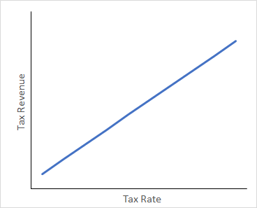
That is, tax revenue increases hand in hand with the tax rate. From a low resolution point of view, that makes a lot of sense, but this is far too simple and is an unrealistic representation of the real world.

In reality, the relationship looks much more like this:

1586599405263.png


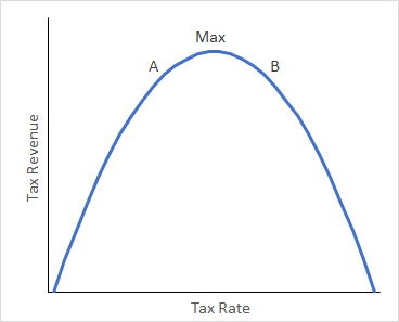
This is the Laffer Curve, named after Art Laffer (a former Reagan adviser, and truly vile person, but his contribution is widely accepted as a useful illustrative model)

Let me explain:
  • The initial gradient is steep because (in a progressive tax system) more people are caught in the lowest tax bracket than each subsequent higher bracket
  • To the left of the maximum, increasing marginal tax will increase tax revenue, albeit with diminishing returns, and that makes sense because there are fewer and fewer earners in higher income brackets
  • To the right of the maximum, increasing marginal tax actually reduces tax revenue for a number of reasons:
    • The rich begin to emigrate to countries with lower tax. In pure currency terms, the rich contribute the majority of tax revenues. In percentage terms, they arguably contribute less than a lot of ordinary people (especially if you consider consumption tax)
    • Higher marginal tax is an incentive for tax avoidance and evasion
    • Higher marginal tax is a disincentive to work/produce more at the margin
    • If marginal tax were 100%, then marginal tax revenue would be zero, because nobody would bother doing anything that would incur tax. Now extend that logic backwards and you end up with a bell curve
  • So where are developed economies on this chart? Nobody knows for sure, it is impossible to empirically prove in real time, and it changes every year
    • Politicians on the left will argue for higher taxes i.e. that the economy is at point A
    • Politicians on the right will argue for lower taxes i.e. that the economy is at point B
    • The only correct answer is that significant changes in either direction will probably reduce tax revenue, because Western economies are unlikely to be very far from the maximum point; it is no accident that tax bands are broadly comparable between developed countries
 
Last edited:
How would you account for 'delay' in government policy?

I think it's very easy to argue that any tax rate increase today would increase government tax revenues tomorrow almost linearly. The issue would be how it would affect next month or next year, or even many years out. In that sense, plotting tax rate vs. income doesn't really make sense, because it explicitly depends on time.

I think plotting it out on such a simplified model gives the wrong impression. The trade off isn't tax rate v. revenue, it's revenue now v. revenue later.
I tend to think politicians on the right are too focused on money now, while politicians on the left are too concerned about the situation years down the road.

My thought is that different government policies affect government revenue to different orders of derivatives (wrt time). Tax rates should be a first order term. Interest rates might be a second order term. Something like fundamental research might be a 4th order term or something (takes a very long time to see an effect).

You could plot out similar information using ODEs, probably. Essentially the 'best' tax rate would be a flat line between revenue and time (controlling for inflation and growth), whereas a higher tax rate would start higher but drop over time. A lower tax rate would start lower, but slope upward over time.
 

McGrrr

Facetious
is a Contributor Alumnus
You are right to point out the time lag between new policy and its impact. The y axis would more appropriately be a forward looking metric, perhaps "average 2y/3y tax revenue". However, that further highlights how limited such academic models are in the real world, because forecasting future tax revenue would just be another variable subject to bias and inaccuracy.

All things considered, I think the model is a useful reference, and it provides a relatively high resolution picture, while being accessible. If the exam question is "would raising tax rates always increase tax revenue?", the Laffer Curve is more than a serviceable refutation for the answer "yes".
 

Crux

Banned deucer.
I am deeply confused as to why we are taking the Laffer Curve, which stopped being taken seriously in economic literature in the 1990s due to empirics, seriously as a basis for an understanding of tax revenue.

1) even if the relationship were true, it would almost certainly be positively skewed not normally distributed given the advantages of operating in, say, the United States compared to other countries that are not tax rate based (e.g. fixed costs, sunk costs, exchange rates, other regulatory advantages). I agree that it is probably closer to a bell curve in developing countries though.
2) assuming it were a bell curve, you just assert we are anywhere close to the peak, when intuition and current revenue statistics present the opposite conclusion. why on earth would this be true? I also suspect that the time lag, given the above reasons the curve is positively skewed, is much longer than you or billy suggest.
3) really the laffer curve assumptions just speak to the lack of imagination of right wing economists - solutions that capture revenue from businesses or capitalists attempting to relocate are more than possible (the trump/ryan border adjustment tax springs to mind as a reasonable solution (shock)).
 

McGrrr

Facetious
is a Contributor Alumnus
That is a fair comment. I'm not the ultimate authority on the subject and, as I have caveated, it's far from a perfect model, but it does bring some nuance to the discussion.

Agreed on the point that the US is far more aggressive in capturing taxation from expatriates, than other developed economies, in addition to implementing an increasingly onerous process of renouncing US citizenship.
 
Full disclosure, I have never studied economics. I have studied physics. So there might be something I missed when looking at this.

Firstly, a core component of science is falisifiability, the potential for theories to be proven wrong. If nothing you can do can prove something wrong, there is no point in studying that because every experiment will return "works as expected." So if we can't prove where we are (or rather, where we are not) on this alleged graph, governments should be focusing on strategies independent of our location on said graph. Such as not spending way too much money on campaign advertising.

Secondly, there seems to be some assumption that there is only one tax rate. While this might be effectively true if you assume the richest citizens have so much more money than everyone else that only the highest bracket is significant, there is no reason this is true in the general case. I guess you could have multiple graphs solved individually, but only if you assume that the separate brackets are not interdependent in a complex way.

Another thing that seems odd is that most depictions of the curve I've seen with a 5-second google search have steep drop-offs at one or both ends (this includes the parabola in this thread). This would seem to imply that there is less risk of overcompensating in that direction, since most of the losses occur right at the end. I'm much more suspicious of those that drop-off steeply at the low end, since my worldview includes most people willing to put up with a small amount of taxes (though being Canadian, my definition of "small taxes" may be different than the US). That is, I would expect the low end of the curve to be mostly linear. Putting together a mostly linear low end and a steep high end is an argument for raising taxes if you don't know where you currently are on the curve, since you are statistically more likely to have a revenue increase than decrease by moving forwards on that graph. This would not necessarily hold for a graph closer to a gaussian (i.e. the most-used definition of "bell curve") distribution, but the most-used examples of a Laffer curve aren't this.

Additionally, what is stopping the graph from having multiple (local) maxima? If you consider it to be true that we are near a maximum, and consider that information to be useful for decision-making (for the record, I'm in the "no clue where we are" camp), what prevents there from being a larger amount of potential revenue off to the side somewhere that we haven't seen because we've been cycling back and forth over a smaller peak?
 

McGrrr

Facetious
is a Contributor Alumnus
I thought about your points and started drafting a response. Then I questioned myself and felt it unsatisfactory. This isn't a hill that I'm trying to die on.

... there seems to be some assumption that there is only one tax rate.
I believe this is the "average tax rate", but of course, the same average can be attained by adjusting the rate at different bands.

The more I think about it, the more I'm inclined to conclude that the one concrete takeaway from the Laffer Curve is that the optimal average tax rate is somewhere between 0% and 100%... well, no shit. The described impacts of marginal changes are reasonable (the extent of which depends on jurisdiction), but as a representative model, it's not much more useful than a straight line. If we say the resolution of the latter is 144p, then the Laffer Curve is perhaps 360p at best.
 

Users Who Are Viewing This Thread (Users: 1, Guests: 0)

Top