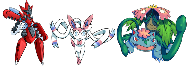
Gen VI Frontpage IconsWith the advent of Pokémon X and Y, various new Pokémon species and mega forms were unleashed into Smogon's tiers, thus leaving their mark on the metagames. It also meant that the images on Smogon's frontpage were in need of a fixer upper to reflect all the changes, and thus the attention was once again directed towards the artists of Smeargle's Studio. The mission was, once again: Three images featuring prominent Pokémon and Mega Evolutions introduced during XY and ORAS. In addition, the artwork would need to fulfill other requirements, which can be read in full in the original thread. And since Smogon is first and foremost a competitive website, the drawn Pokémon were restricted to the following species: Talonflame, Sylveon, Diggersby, Dragalge, Klefki, Hawlucha, and Chesnaught for regular species, and Charizard X & Y, Venusaur, Altaria, Metagross, Gardevoir, Gyarados, Lopunny, Sableye, Diancie, Scizor, Manectric, Medicham, Heracross, Gallade, Pinsir, and Slowbro for mega species. Contrary to the previous contest, the final results were judged by the current Art Leader at the time, Bummer. The winning entries would each get a month rotating on the frontpage, with the winning entry then remaining there until the need for new images would arise. It was a close call, but eventually a decision had been reached. Below are the winning entries, along with the Honorable Mentions that also deserves to preserved through history. 1st place - Arkeis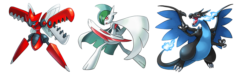
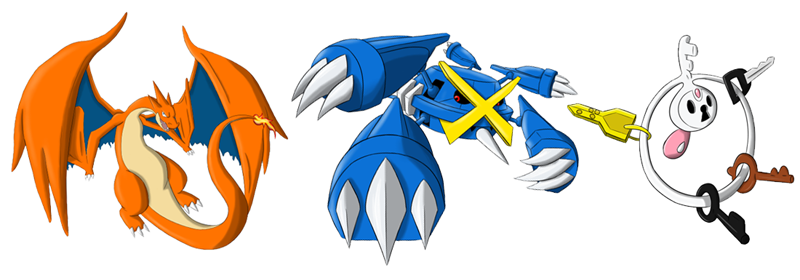
2nd place - Roadsama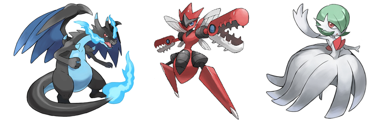
"Roadsama was the first artist to show off some early concepts for all three entries, and while he needed more time than others to finalize them, he certainly didn't finish last. His lineart is light and elegant, while still clearly visible even when his images are shrunk down significantly. The poses of all three Mega Pokémon all follow a certain direction that guides the viewer's eyes along all their features, while also giving a clear sense of depth so that it really feels that they're emerging from their frames. However, there were some notable flaws that prevented Roadsama from emerging at the top. The colors used aren't quite as vibrant as other contestants, and while their poses are stunning, their facial expressions are rather calm, which makes for a slight disadvantage seeing as they're meant to decorate a site dedicated towards Pokémon battles. But make no mistake: Been many times where I've deemed this to be the winning entry only to have second thoughts, so the marginal has been as slim as it could be. But as there can be no ties, Roadsama ended up with a solid second place as a result, one he earned well." 3rd place - aXl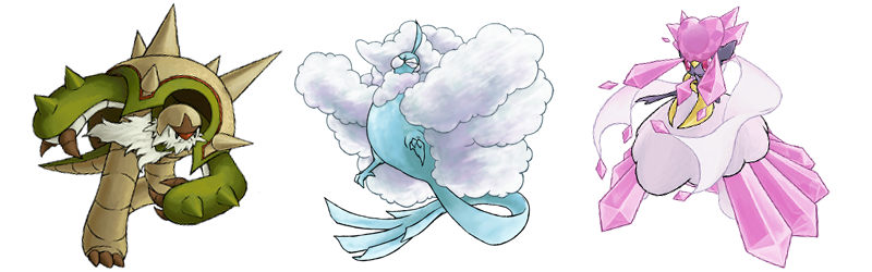
"aXl quickly got the favor of various people following the contest, and it's not difficult to see why. His Mega Diancie image, a notoriously difficult Pokémon to draw, came out quite splendidly, while his soaring Mega Altaria and charging Chesnaught makes for two stunning images as well. But while his sense for detail gives his images the edge at a higher resolution, the purpose of this contest was to create small icons for the frontpage, and at that scale, the same details don't perform as well. One could solve this by not shrinking them as much, but then you'd only get bust shots, thus missing out on other body features that makes for a stronger impression overall. And while his Diancie and Altaria were both fine specimens, his Chesnaught strayed a bit too far away from the norm with its unusual beard and oversized eyes. Some would consider these to be minor flaws, and they would be correct, because aXl's entry was practically breathing down Roadsama's neck in terms of quality, but in the end, aXl landed comfortably on a respectable third place." 4th place - Pedro Larez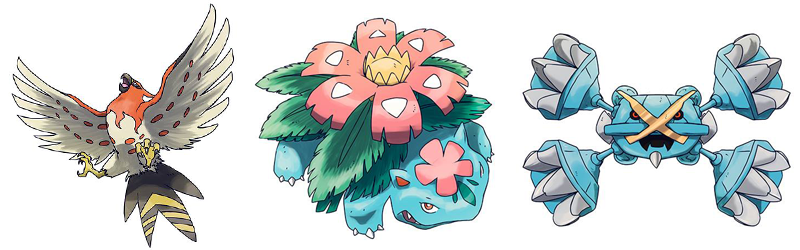
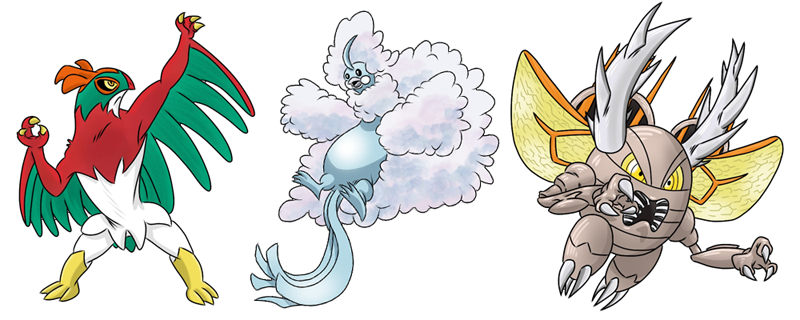
"The contest clearly stated that up to three winners will be chosen, but given the high quality of our submissions, a fourth place felt to be in order when one looks at what Pedro Larez produced. In fact, Pedro brought the heat early by slamming a complete entry merely five days into the contest, featuring three Pokémon who all have shaped OU into what it is today. His lineart is simple and firm, although less smooth compared to other participants. And while one would initially find all three images to be well crafted for their final role as frontpage icons, the sad truth is that these images can only be shrunk so far before the lineart starts to buckle and become blurry, making it difficult to feature Talonflame's impressive wingspan or Metagross menacing claws. But nonetheless, Pedro's entry was assumed to be the winning submission for quite some time, and while that didn't turn out to be the case, his efforts to quickly get the contest up and running with three solid images will be recognised by having them featured on the frontpage as well." |