
-
Follow our Instagram!
-
The moderators of this forum can be found in the CAP forum staff directory.
-
Welcome to Smogon! Take a moment to read the Introduction to Smogon for a run-down on everything Smogon, and make sure you take some time to read the global rules.
You are using an out of date browser. It may not display this or other websites correctly.
You should upgrade or use an alternative browser.
You should upgrade or use an alternative browser.
CAP 5 CAP 5 - Art Submissions
- Thread starter tennisace
- Start date
- Status
- Not open for further replies.


i really like this one. i can see it sending the little planets around it attacking others as meateor storm, meteor mash, etc. i can imagine a really cool sprite for this, but unfortunatley, i dont know how to make sprites. the eyes dont look really pokemon-y tho..
Hmmm... this is the second comment about the eyes. I'm very willing to change them, if they don't work with the design. However, if the issue is that pokemon don't have big anime eyes, I disagree. Here's the original Sugimori art for Wigglytuff:

The eyes on my design are straight out of that same general anime mold -- big, bright, multi-shaded, with pronounced eye glint. The big difference is that mine are narrower. I didn't want the round-eyed "weepy innocence" that Wigglytuff and others have. Here's some other pokes with big eyes:


Although the coloring on my eyes is very detailed, the basic design is not too dissimilar from the designs above. Considering the relative size of the "head" of my design to the rest of the design, I think big eyes are needed. I could alter the pupils to be small like Voltorb, for example:

But, a small pupil will make the pokemon look pissed off. I want this design to look intelligent and focused. It goes along the lines of some of the theme words I was using with my design -- "astronaut" and "star gazer", in particular.
If the eyes are detracting from my design, I can change them. I'm just not sure what I think will work better.

Don't change anything, if people don't like your design, they could just be blind, you never know. They could also just vote for another design, but this is overall the one that seems the best fit, and the best approved.
i dont think its the size of the eye or pupil, but the shape. i cant really think of any pokemon with that type of eyes.
try eyes like lanturn's..i think that might fit better, in my opinion.
try eyes like lanturn's..i think that might fit better, in my opinion.

Here's my finalized art:
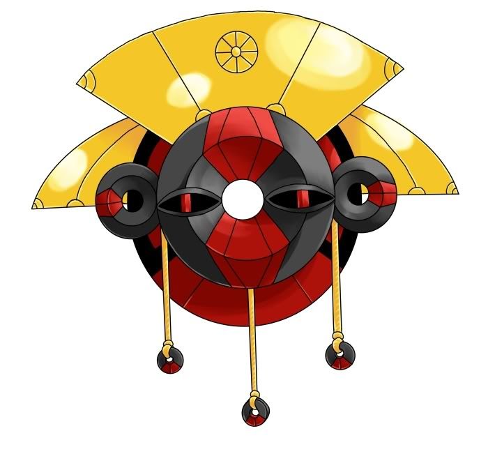
I tried to keep the color scheme to primaries, but the black worked so well I couldn't resist. And I decided I didn't like the huge pool of black in the eyes, so I've used gems for eyeballs. I think it gives it a bit more personality. ^^
This thing looks awesome.

First off, the drawings are amazing, so new contenders there, and cada, ur new colors make it seriously, #1 cap.
Also, they already have chess pieces...in DIGIMON :(
http://en.wikipedia.org/wiki/PawnChessmon
Did know one see what I said? Its a problem if there is a similar concept in 2 competing francises (even though this is a CaP project).

And finally, a brand new design: a sand serpent. Like a sea serpent, but in the desert.

Any comments?
Are you trying to steal my "Desert Serpent" from CAP 4?
(Click thumbnail)
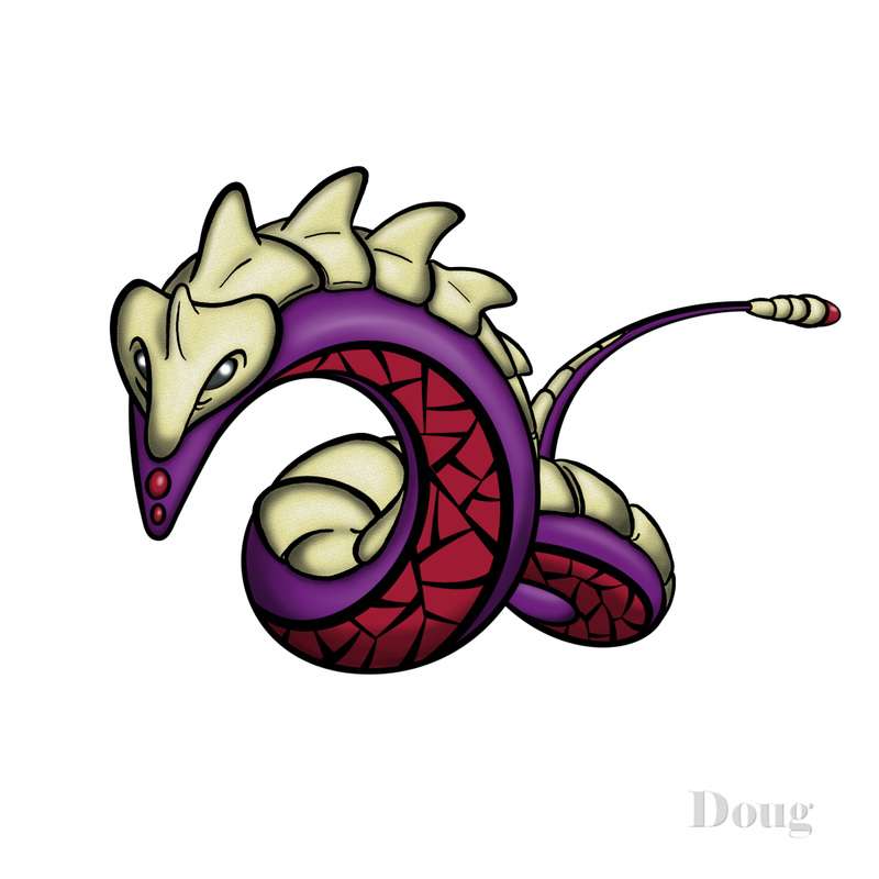
Just kidding. But there are some vague similarities.
BTW, I like your new dog design better than the original. You did a nice job of meshing the rock elements into the design.
I think you should stick with your canine. If you submit the serpent design, I think too many will equate "snake" with Poison. Also, I think the serpent design is begging for comparisons to Rayquaza. It's a nice design, and well-rendered. But, I think your canine will likely fare better in the polls.
Nice work on all your designs. I really like your artistic style.

<3_<3
I really like cactuar's design.
That was a surprisingly well-done picture turned in near the deadline.
But good job nevertheless.
I really like cactuar's design.
That was a surprisingly well-done picture turned in near the deadline.
But good job nevertheless.


I think your design has a lot of potential, Doug, but I'm afraid I also have an issue with the eyes.
I don't know why people are criticizing it for having big wet pupils as that's been a staple of Pokemon design since the beginning. However, your Pokemon doesn't have any facial features or any hope for body language, which places the hefty burden of conveying personality on the eyes.
Voltorb's eyes are intensely expressive; obviously, he's very ticked. Forretress' eyes are small, but alert, peering from the inside out, demonstrating introversion. Even in Magnemite, it's worth communicating that it is completely devoid of personality; a cold machine.
My problem with the eyes of your planetmon is that I find them rather ambiguous. Perhaps it is the shape of the eyes themselves that aren't communicating. Lanturn's eyes are smiling, while Celebi's have a pixie slant. Having a mouth is also an advantage, but it's entirely secondary considering how well the Pokemon's personalities still show through if you cover their mouths with your thumb. Perhaps it would help to have its eyes looking in a specific direction as opposed to staring out vacantly?
Whether you change the eyes or not, I still think it's a fun design and it'd be interesting to see it to the spriting stage.
Also, CactuarJoe, that's intense. I like it.


That's much better, but it are the "hands" supposed to be black as well? I think it would be better if the "hands" are the same color as the gem/eyes, and maybe the hands a little less flimsy. Plus, is this the coloring that you're going to submit, because it doesn't really seem as "rocky" as the first.
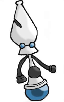
Hey, it's a Rock star!I posted three sketches earlier. I decided to go with my favorite -- the "Planet Pokemon".
…
*cough.*
:3
I think your design has a lot of potential, Doug, but I'm afraid I also have an issue with the eyes.
I don't know why people are criticizing it for having big wet pupils as that's been a staple of Pokemon design since the beginning. However, your Pokemon doesn't have any facial features or any hope for body language, which places the hefty burden of conveying personality on the eyes.
Voltorb's eyes are intensely expressive; obviously, he's very ticked. Forretress' eyes are small, but alert, peering from the inside out, demonstrating introversion. Even in Magnemite, it's worth communicating that it is completely devoid of personality; a cold machine.
My problem with the eyes of your planetmon is that I find them rather ambiguous. Perhaps it is the shape of the eyes themselves that aren't communicating. Lanturn's eyes are smiling, while Celebi's have a pixie slant. Having a mouth is also an advantage, but it's entirely secondary considering how well the Pokemon's personalities still show through if you cover their mouths with your thumb. Perhaps it would help to have its eyes looking in a specific direction as opposed to staring out vacantly?
Great critique and advice. Now that you point it out, I agree that the design needs a little more "personality". Because of the geometric nature of the design, I have no real "pose" to work with. The only avenue to imbue life into the character is through the eyes. I'll see if I can come up with something that still has big platter eyes, but has more of an expression to them. You've given me some good food for thought.

I like your design, but have the same problem with the eyes. I think its more because they have rectangular irises, unlike any of the other Pokemon you listed. In fact, the eyes you have look like those from the Mii creator. I think if you curve the irises, it will look more natural (and more like the rest of the Pokemon with large eyes).Great critique and advice. Now that you point it out, I agree that the design needs a little more "personality". Because of the geometric nature of the design, I have no real "pose" to work with. The only avenue to imbue life into the character is through the eyes. I'll see if I can come up with something that still has big platter eyes, but has more of an expression to them. You've given me some good food for thought.
Your design is my favorite, by the way.

P.S. Still waiting for Lofty's final sub...c'mon man, the suspense is killing me.
You'll have to wait till the weekend on that one -- that's where I've got the time and equipment to finish my final sub. ;)
In the meantime, I've got a sketchbook, some basic art supplies, and a digital camera, so you can expect some stuff in the interim.
Also, I'm working in the midst of a busy week at college. Just tomorrow, I've got an exam in calc, and one in chem I have to prepare for within the coming days. :(
Anyway, most recently, I've been working on color schemes. Basically, I've just been speed-sketching every color combination I can think of until something catches my eye. You can catch a glimpse of it below:


There's more where that came from. It's a messy process, but I'll decide on something soon.
Actually, though, what would help is if you all could make some suggestions (or even mock-ups with one of my sketches) so that I could see if one color scheme is particularly popular or interesting.
Also, unless I figure out how to do something nice with the Gimp this weekend, I'll probably do my final submission in something more traditional. What would you all prefer? Colored pencil? Watercolor? ...Clay? (If we're using basic colors, I bought some yesterday, and I've been messing around with it.)
Anyway, I also took in the suggestion of adding three orbiting satellite entities, and here's what my sketches turned out like:

Unless anyone prefers something else, I think my favorite is the one in the bottom right. The question is whether or not I should have those squiggly textures between the dot and the middle divider line (only one per side). Also, I like the satellite-dealies smooth, but should they be rocky...?
For flavor, I also want to make those satellite-dealies the pre-evo for the comet. :D
(If that's not allowed, just ignore it. Just thought it'd be kind of a fun thing to make them, lol.)
Anyway, I'm going to also take in that suggestion of having three crystal booster-things, and I'm going to say that that's where the satellite-dealies come out of and where they're stored(when inactive inside the comet, they're like the things that make the comet shoot forward, the thrusters). You can kind of see that in the upper-right, but the photo makes it a little hard to see.

Me testing out a tri-attack with the satellites, but I don't like how it came out so much...
Also, you can see a little of me screwing around the the rock protrusion things there and here:

Still trying to figure out how they should look, how many there should be (2&2 or 4&4?), and where they should be arranged on the comet. (I also made one design not on that paper, where it's basically just a super-flat cylinder on top of a circle attached to the base of the rocket.) Also, more messing around with the design of the back thruster-thing, if it should be encircled by a main circle-object, if I should have little flavor dots arranged around the three main ones (with one in the middle...?), etc. Suggestions here would be nice, too.
-----------
Anyway, to sum things up, I'm still a little busy, I'd still like to hammer down more details based on popular opinion, and, as long as I have the weekend (which it looks like I do...?) I'll whip up a nice (...I hope) final submission for you all, which I'll probably polish or twittle with until a night or two before the deadline.
Thanks for the support, sorry for the delays! :)
Great critique and advice. Now that you point it out, I agree that the design needs a little more "personality". Because of the geometric nature of the design, I have no real "pose" to work with. The only avenue to imbue life into the character is through the eyes. I'll see if I can come up with something that still has big platter eyes, but has more of an expression to them. You've given me some good food for thought.
a pose that i thought of was a picture viewing it slightly above it and looking down at the planet and the little meteor things are scattered and hitting the ground, causing holes in the ground. this prolly doesnt make sense, but its hard to explain from my vision. when i look at pictures i can imagine a lot of cool poses and stuff but i cant draw for my life-_-"
Okay, so I kind of cut it close to the deadline, sue me :P
In the end, I had to demolish most of my ideas, as they were either too bulky or had too much detail. I liked this idea out of the remaining ones though, so I'll toss this one in. I'll have one more post with a higher quality pic, but I'd like a bit of input on color schemes, design changes etc. before I work on that.
I'll also add a bit of backstory for the design on that post.
EDIT: Combine the Chess Piece idea with this one, eh cyberzero? Hm... That sounds awesome actually. I'll see what I can whip up... The tough part will be trying to show it has high speed.

My favorites are all the dogs and Lofty's meteor. the reason is that they are simple, and look like they are fast. All the other designs look way to slow to be bordering at 130. Also, many of the others look like they would be morse suited for physical attacks instead of special. The dogs seem mixed but lean to special in my mind.
The reson I love Lofty's is because its so detailed, especially from the side veiw. I actually like tri-attack on him and he has such a funny personality. Its great. He gets my vote.
The reson I love Lofty's is because its so detailed, especially from the side veiw. I actually like tri-attack on him and he has such a funny personality. Its great. He gets my vote.
Lol Cyzir, it reminds me of one of those flying wizard Hearless from Kingdom Hearts 2, it's nice, and it looks like it can use Levitate, which is a plus.
I just think that maybe a darker color scheme and some 'rocky' stuff in there would make it better, but it's great as it is as well.
I can see the concept of that, combined with the chess piece idea, together. It would be pretty tough putting those together, but it would really make this the best CaP ever. :)

Doug's final turned out really nice. I do hope that you can come up with a "new" final based on the many eye critiques. I like the simplicity, and that makes it a strong contender with Lofty's (love all the conceptual work that you have been sharing btw). I really can't decide now, but I like both.
I am also still rooting for Kopie's though (color it, c'mon. I don't want it to get left out because you don't do a final submission). I also like Wichu's second dog design. It is in a similar situation with Doug/Lofty with Regi's piece(which I also like).
Finally, I would like to see someone go somewhere with the chess piece idea. It is actually the greatest and most innovative designs so far. I may be tempted to render something myself...
Caladbolg said:

YourDeadGrandad said:

CactuarJoe said:
This three are my favorite designs, by far. CactuarJoe's, and YourDeadGrandad's, as they are now, are perfect, and Caladbolg's Eastern Island statue just need, in my opinion, a better coloring: less cracks (as mentioned previously), and more grey in it. I really liked that hybrid coloring someone made combining the first two colorings (making the "jacket" and some other parts grey, and the rest dark brown).
Anyway, I really like this three designs: good job guys!

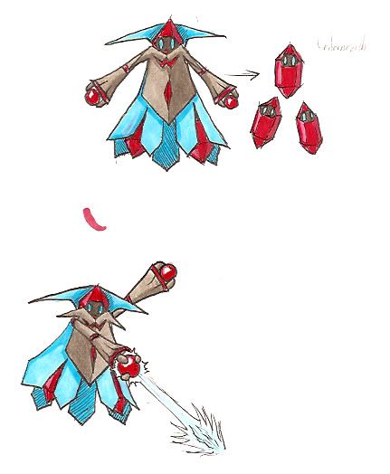
Here's my finalized art:
I tried to keep the color scheme to primaries, but the black worked so well I couldn't resist. And I decided I didn't like the huge pool of black in the eyes, so I've used gems for eyeballs. I think it gives it a bit more personality. ^^
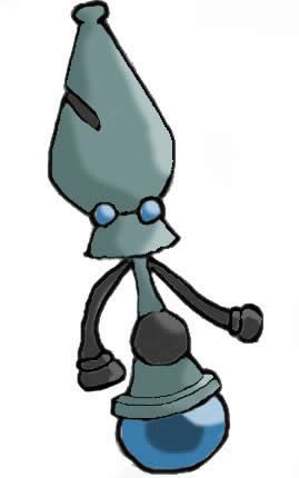
Sorry but this deosn't look rock at all. infact it looks like a Steel type.
- Status
- Not open for further replies.