
-
Follow our Instagram!
-
The moderators of this forum can be found in the CAP forum staff directory.
-
Welcome to Smogon! Take a moment to read the Introduction to Smogon for a run-down on everything Smogon, and make sure you take some time to read the global rules.
You are using an out of date browser. It may not display this or other websites correctly.
You should upgrade or use an alternative browser.
You should upgrade or use an alternative browser.
CAP 8 CAP 8 - Art Submissions
- Thread starter CyzirVisheen
- Start date
- Status
- Not open for further replies.


Yeah! The tail is absolutely AWESOME! I would keep up with that work, however I am not so sure about theeyes perhaps make them longer and smaller like an asian or manga style eyes, seriousness on the face might help, not so sure.

I'm really loving pkmn-taicho321, Wyverii, and Cartoons' concept submissions. Caladbolg~'s is great, but it's a bit too cute for me.


pkmn-taicho321...
I noticed on your smoother version, the yellow back was recolored light blue...
It actually looks a bit too blue now...
Could you maybe try the yellow back again? It looks plain now...
Also, the yellow circles now just look like... Random spots...
Somewhat out of place, almost...
When black, they looked like "charges" or something...
I liked it a bit better black, personally...


colored with spraypaint. sorry if its not very electricy.
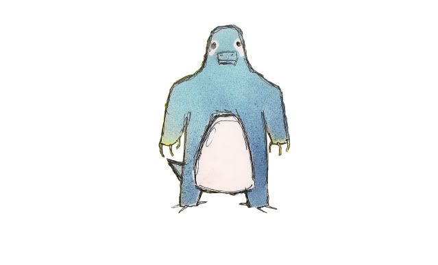
No offense, but it doesn't even look very dragon. At all. Looks like a duck, actually.

I hear you LuistheNinja (and thanks for the comment, btw, I'm grateful for any feedback) about it looking more ice or rock than electric. My only problem is that I could quite easily make it look electric by changing it's colour to yellow and giving it a couple lightning bolt markings or having some appendages end in lightning bolts. So, instead I only half sold-out. What do you think?


...Mixed with an Electric/Dragon!No offense, but it looks like a bear mixed with a platypus...
lol
On a slightly more serious note my experiment in motion (I realize it's a hack-job)
Note Not Real Colours!

Feeling slightly more electric to anybody?
Try making the yellow a bit darker-ish, and maybe make the red the purple from before... The purple was a good color. And that yellow seems a bit bright...
Feeling slightly more electric to anybody?
Also, the crystals on it's back seem to go a bit low... Almost looking like they're on it's upper arm... I like the concept, a lot really. Though maybe you can make the crystals on it's back a bit thicker, and a bit closer together... Like on that first, scrapped, design...
pkmn-taicho321...
I noticed on your smoother version, the yellow back was recolored light blue...
It actually looks a bit too blue now...
Could you maybe try the yellow back again? It looks plain now...
Also, the yellow circles now just look like... Random spots...
Somewhat out of place, almost...
When black, they looked like "charges" or something...
I liked it a bit better black, personally...
Well actually you have my GF to thank for the color choices. I rather like them myself, but I was kind of considering red for the spots (sorta like pikachu's cheeks I guess) but I was afraid that it would over complicate the color sheme.
Weird. I was actually thinking that as I was typing that, but removed that line last minute...but I was kind of considering red for the spots (sorta like pikachu's cheeks I guess) but I was afraid that it would over complicate the color sheme.
Either way, it does seem a bit plain now... I like the new palette that was used better, actually.
It's just the placement, or pattern.
Just a minor nitpick, really...
The design is still as epic as ever though.

IS COLOR TIEM. Maybe. I'm still more than open to suggestions about the base design. But if you're gonna comment, for the love of god please comment on the colors too- choosing colors is my weak point (whereas shading is my strong). X) Aaanyways. Also dunno if the markings are overboard, if I should remove em or add more or what (though I was currently considering adding some minor ornamentation on his lower jaw and elbows).
Don't mind the messiness of these; once I've pinned down the colors I'm using, I'll paint it nice and neat and fix the linework.
http://xs138.xs.to/xs138/09172/comp1981.jpg
Nicely loud Electric colors. oh god why am I so bad at this
http://xs138.xs.to/xs138/09172/comp2793.jpg
Similar, but more muted. Worried that the Pokemon as a whole doesn't look Electric enough now.
http://xs138.xs.to/xs138/09172/comp3938.jpg
Iiiidunno.
Anyways. Any crits welcomed, as always.


I have two ideas,please help me decide which one is the best :)
here's a concept based a little bit on raiijin, the Japanese god of thunders
and here is a dinosaur like pokemon

Im liking the top one there, it has to be one of my faves out of these submissions. The newer bottom one doesn't really appeal to me.. maybe it's the eyes or the color scheme i don't know.. But they're both pretty good. :D
Ima try to get a colored version of my drawing tomorrow...

Weird. I was actually thinking that as I was typing that, but removed that line last minute...
Either way, it does seem a bit plain now...
The design is still as epic as ever though.
Hmmm, well I'll talk it through with my artistic advisor. She coming over tomorrow so we should have a great chance to work on it. Currently I'm working on a secondary pose and an anilation for sopporting material. I'm having trouble animating this one T_T. it's too tall so it's just clumsy as hell to work with on the computer.
Thanks again for the support!
Yeah, the crystal is actually on the upper arm. I might try going thicker and closer together, I just don't want to make it too over the top. Haha, and what if I added a third head?! Pokemon seems to love triplets.Try making the yellow a bit darker-ish, and maybe make the red the purple from before... The purple was a good color. And that yellow seems a bit bright...
Also, the crystals on it's back seem to go a bit low... Almost looking like they're on it's upper arm... I like the concept, a lot really. Though maybe you can make the crystals on it's back a bit thicker, and a bit closer together... Like on that first, scrapped, design...

I have two ideas,please help me decide which one is the best :)
here's a concept based a little bit on raiijin, the Japanese god of thunders
and here is a dinosaur like pokemon
Im liking the top one there, it has to be one of my faves out of these submissions. The newer bottom one doesn't really appeal to me.. maybe it's the eyes or the color scheme i don't know.. But they're both pretty good. :D
Ima try to get a colored version of my drawing tomorrow...
I actually like the second one the best, I think it could be made to look a little more "evolved" but otherwise, I like it a lot.
You know, loading these pages on dial up is really annoying. Anyways, don't expect me to be light.
grizzly bears: You need a white background =/
aurasturm: That looks really fast (reminds me of ben 10's XLR8), which I doubt this CAP will muster up to.
Elagune: Looks like a fighting/grass with electric hints in there. Sorry.
InHell: The first one. The second screams hippo/torterra, while the first one has some originality to it (though appears inferior to what Doug's working on). Gooey is right that the second one does look more evolved though, but I still think the first is better.
Caladbolg: Your latest one is the best yet (the rest looked like digimon), but its still not there. It reminds me too much of Dragonite (which you've addressed), and gives too much indication towards part flying or having levitate. Also looks like something from Dragon Tales x(
Doug: The front arms are too short imo. Like, what purpose do they serve the pokemon? That's what sticks out to me the most, and 3 talon is definatly better than 1.
pkmn-taicho321: I liked your other color scheme much better. Definitely one of the best submissions.
Wyverii: Still my favorite. The first pose screams Swampert though (Swampert is defensive though, so it could go both ways), but it looks like it could Volt Tackle (which is cool). The second pose doesn't look very natural, and its leg looks awkward (doesn't look like it could go out like that based on Pic 1). I think I like the colors in pic 1 more though.
As I've said, I like Cartoons' entry just fine, but my only objection is that it can't be sprited in the same style as it's drawn (and without that style, I don't think it'd be very good). People should consider this!
I feel people should aim for a Flygon/Kingdra look (not actual look, but not stereotyped), rather than some pseudo-legend pokemon. Last thing we need is a pokemon that looks badasser than Rayquaza and hits like Altaria. Speaking of Altaria, the cute designs aren't hitting me. Meganium-ish thing with pink chest hair? It's a good drawing but not what I'd like to use on my team X_X

- Status
- Not open for further replies.