


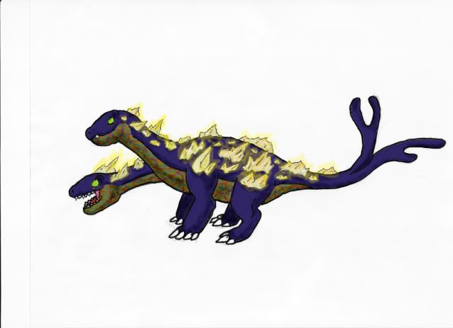
Cyzir - Your thunderstorm hydra is one of the most innovative concepts presented in this thread. I'd love to see that one fleshed out in more detail.

-
Follow our Instagram!
-
The moderators of this forum can be found in the CAP forum staff directory.
-
Welcome to Smogon! Take a moment to read the Introduction to Smogon for a run-down on everything Smogon, and make sure you take some time to read the global rules.
You are using an out of date browser. It may not display this or other websites correctly.
You should upgrade or use an alternative browser.
You should upgrade or use an alternative browser.
CAP 8 CAP 8 - Art Submissions
- Thread starter CyzirVisheen
- Start date
- Status
- Not open for further replies.


spiral tailed drawing snip
Wow, I like it a lot. Personally, I like the long tail, but I think it might work better if it were a more muscular serpentine sort of tail. The light bulb motif is cool, but I don't think you need it to show that it's electric. Plus, the coiled tail implies a more bouncy motif anyway, like spoink.
General idea: I can't draw very well, but I had an idea. So far, almost all (if not all) concept drawings have had eyes. I was thinking that it'd be neat if the dragon had no eyes and was blind, but had electroreceptors to sense subtle changes in electric fields to navigate. Kinda like the highly sensitive lateral lines of the cave dwelling mexican tetra fish.
It's nothing huge, but it could make stuff look more original.
Eyes notwithstanding, great work all, everything looks terrific!


In Need Of Opinions
I want this to be an actually competitive piece for this CaP, I have nothing on the likes of Cartoons!, Elagune, pkmn-taicho321, gizzly bearz (lol) and countless others, but I want it to be competitive nonetheless. All I need are some opinions from the people here on CaP and hopefully I may make something good from it. :) Any opinions would be great but the main issues I think I need to solve would be:
-Third head (yes or no?)
-The tail (Should I change it to a more electric look?)
-The crystals, should I scrap them, make them larger/smaller, more/less dispersed?
-coloration (Should I change it?)
-...or should I just come up with a totally new design? I do have a lot of other ideas.

I need to see that amped up version you were talkin about, Doug. Your concept is the slickest thing here. If the colors hold out, I'm voting for that, no question.
Apart from Doug's, I still also a fan of Wyverii's and Taicho's concepts. No offense, but I hate the "cute" thing everyone is going for.

I want this to be an actually competitive piece for this CaP, I have nothing on the likes of Cartoons!, Elagune, pkmn-taicho321, gizzly bearz (lol) and countless others, but I want it to be competitive nonetheless.
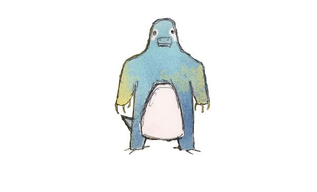
Wow I feel honored XP, That aside you have a great idea going. The whole two headed thing is very cool, but rather than all fours I think you should make it smie bipedal and do a front view. Frontal views allow use to see more of your design as it will be as a sprite so it's easier to imagine the final produce. You should also consider doing a back view, though with the side view you have now it isn't absolutly necessary. Keep it at two head. Any more and your just confusing the piece. BTW love the colors don't touch em. Purple is a nice breath of fresh air with all the yellow gray black electric blue schemes floating around. And the cystals are what make your design so make them pronouced.

added tiny wings to make it seem more dragon-like and the yellow accents on its elbows
Good? Worse?
You should play around with the eyes, make them more dragon like. Right now I think the eye and area around the eye is what scream toad. Second add a tooth or two. Don't have to be big, just something to get rid of the toothless toad mouth. Other than that as I was saying with Gooey I love the yellow/purple scheme. I wish my thunder-machine-mon could pull it off.

Cyzir, the thundercloud hydra is just amazing, I'd love to see you pursue the idea further. It might just steal my vote from atkyori or wyverii. Great work.
Wow I feel honored XP, That aside you have a great idea going. The whole two headed thing is very cool, but rather than all fours I think you should make it smie bipedal and do a front view. Frontal views allow use to see more of your design as it will be as a sprite so it's easier to imagine the final produce. You should also consider doing a back view, though with the side view you have now it isn't absolutly necessary. Keep it at two head. Any more and your just confusing the piece. BTW love the colors don't touch em. Purple is a nice breath of fresh air with all the yellow gray black electric blue schemes floating around. And the cystals are what make your design so make them pronouced.
Wow, now I'm the one that feels honored :). Thanks for the input it's very helpful, I was just about to add another head XP. I'll work on front and back views tonight, that's a great idea. I tried doing a bipedal design and I just kept getting frustrated with it, I'm just not good at them. Although, I did do one thing...I experimented with the stereotype Electric colour scheme and this is what I got:
I'm thinking stay with the purple as well, but I may change the underbelly colour or the crystal colour. Although, in my opinion this does look way more "Electric" typed. I'm also feeling torn as I really like the blue but everyone seems to like the purple. What if I made the body blue and the under-belly purple. What do you think?
@nardd: Thanks for the feedback, on the frontal and back pictures I may change the crystals like you said. Once I finish colouring my other designs I'll put them up as well, I just don't like them as much...maybe I've become too attached. :P


http://img209.imageshack.us/img209/2350/cap9toad4.gif
just chugging out another one for supporting material. I think I'm pretty happy with this guy, but I may do some experimenting still with taking the nimbus cloud away
EDIT: ok so what looks better: purple or blue? and is the neck decoration helpful? I forgot wings on the first one and decided to just play around :]


nardd, i like the blue better.
honestly, i hated this design until your current changes. now i think it's rather cool, and i could see it doing pretty well. don't know precisely why. better angle, less toad-like, but just toad enough. it's cool. i'd definitely want to see it without the nimbus cloud, fat and contented.
honestly, i hated this design until your current changes. now i think it's rather cool, and i could see it doing pretty well. don't know precisely why. better angle, less toad-like, but just toad enough. it's cool. i'd definitely want to see it without the nimbus cloud, fat and contented.
@nardd:I like the blue better and I think the cloud should stay! Also, about the wings, they look good but I think they should be slightly bigger at the base. I also agree with pkmn-taichoo321 in that it could use a tooth or two. I also think the neck ornament works very well (it draws away from the rolls lol).
Edit: Also! Estranged, I'm liking it even more, I really like that shoulder lightning spike thing, it's fantastic! But I still say the body could be even more stream-lined than it is.
Edit: Also! Estranged, I'm liking it even more, I really like that shoulder lightning spike thing, it's fantastic! But I still say the body could be even more stream-lined than it is.


some electricity running through the arms.
Looks like a platypus, almost completly water type
It's not a bill, it's a snout. We've already got this covered. I've got your back grizzly bearz, lol.Looks like a platypus, almost completly water type


Tried a brighter, more...electric color scheme.
Link to the first one for reference: http://i44.tinypic.com/dwxgsh.png
I'm kind of attached to my darker color scheme, but what do you guys think? Any suggestions on what to add/remove/edit on either one would be great, too.
- Status
- Not open for further replies.