CAP 8 CAP 8 - Art Submissions

Status
Not open for further replies.
Hey! Here is a rough draft of what I am planning. I am not a great artist so if any one wants to help me out with this feel free. It still needs to adjust the style to pokemon style and some help with porportions especially the wings and lower body....but yeah expect some cleaner versions in the near future.

Snapshot_20090421.jpg
 
LineArt.png


Personally, I don't know about this. Its more of a dragon than electric type. However, I personally don't think this is better than any artwork here (honestly, some of the artwork here was amazing) but its an attempt.

And, I did this in Paint.Net. I am much better at my sketching than my line-art skills.
 
dwxgsh.png


Here's Circuitmon (thanks ReyScarface) colored and with more detail. He holds his tail in his mouth to complete the circuit and charge himself up, the light blue parts of him get dimmer as the charge wears off so he knows when to recharge himself. He's fully charged here!
 
LOL @ Gooey.
Here's mine, when I thought Neglected Ability I kinda thought of a clumsy, lovable huggable (but strong!) Pokemon. Here's a first draft.

aaaaaa2.png

He looks dopey, haha.
 
cap82.png


I took into account some of the worries about how the previous design turned out, and so I cranked out this one. It should look a lot more like a Dragon/Electric now. And thanks, Cartoons, it's good to be back.
 
cap82.png


I took into account some of the worries about how the previous design turned out, and so I cranked out this one. It should look a lot more like a Dragon/Electric now. And thanks, Cartoons, it's good to be back.
That's pretty sweet, I think you should lose the spiral tail though.
 
@Elagune: The head and neck represent the two types well, but the Genie tail and big hands scream Ghost/Electric. Maybe try grounding it and making the right arm look more evenly proportioned like the left arm.

Also, that general design is a bit overused in CAP, but it still looks nice.
 
Thanks for the input guys. I guess I'll continue developing ideas 2 and 3 for sure, as well as 1 for kicks. Anyways, more concepts.
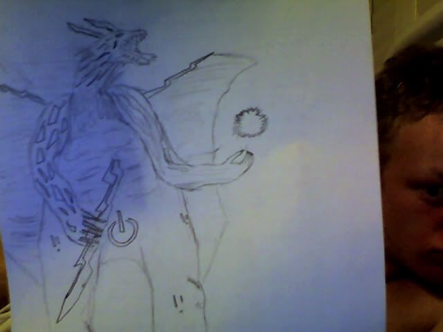
Oh, and excuse the shoddy quality, took a snapshot of it.
Photo175.jpg

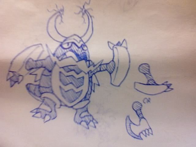
This is a Viking Dragon. I really like this one personally, moreso than my chinese lion dragon. When he shuts his mouth, he looks like a bearded viking. His arms are based on Mjöllnir, Thor's hammer. The idea was nice, but it felt a bit awkward, so I also considered giving it axe arms instead. Still debating on that matter personally...

Photo174.jpg

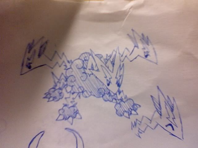
This is a Thundercloud Hydra. Even though thunder clouds have been common in the submissions, this is unique in that the dragons heads are thunderbolts. In fact, the whole thing is either lightning or clouds, which is pretty interesting. I like it, but not nearly as much as my Viking

Again, any and all suggestions and comments are welcome.
EDIT: Also, I gotta say, I have a lot of favorites submission so far. It's difficult to think of any design in this thread I don't like.
 
roughskin2.png

A hypothetical 'rough skin' variant of my original design. The pokedex entry would be something like this: Though the scales on it's body are rough, it's frill-scales are prized for their glassy consistency.
 
IS COLOR TIEM. Maybe. I'm still more than open to suggestions about the base design. But if you're gonna comment, for the love of god please comment on the colors too- choosing colors is my weak point (whereas shading is my strong). X) Aaanyways. Also dunno if the markings are overboard, if I should remove em or add more or what (though I was currently considering adding some minor ornamentation on his lower jaw and elbows).

http://xs138.xs.to/xs138/09172/comp1981.jpg

I like the overall design; it's interesting and well-drawn. One thing I have to say is that the hump sort of looks odd, given how the rest of the body is so slender. It just feels weird to have this long tail and neck but have the body be very bunched together. Color-wise, this is the color scheme I like the most out of all of them. One thing, though, is that it feels really weird for the wing to be a color different from the rest. Perhaps you could have it be the same color as the markings?
 
Cyzir, I personally think your thunderstorm cloud is a cooler idea. In my opinion, the Viking Dragon, while cool, looks a lot more like a bug than a dragon. I would love to see the hydra colored.
 
Cyzir, that Hydra is completely awesome, and very original. Any chance that you could keep going with that one?
 
good god cyzir, i love your last two submissions, especially the viking dragon. it's so badass!

here's an idea: if you're going for viking, maybe you could add like a hammer or some other characteristic from Thor, the god of thunder? just a suggestion, anyway. thought it'd fit

AAAA IM DUMB and dint read the whole description underneath the drawing


Tried some new colours and removed the allaround spikiness.
So far my favourites are CyzirVishnees and Cartoons' works but there are a couple who are not far behind.
 
Thing's are looking good so far.
I don't think 'cute' will be easy making with a poke that's supposed to be a bulky Dragon/Electric... though it's worth a shot. good luck ^_^
 
Status
Not open for further replies.
Back
Top